Showing posts with label Mobile Branding. Show all posts

Thursday, November 12, 2020

Create React App: Get React Projects Ready Fast

Starting a new React project isn’t that simple. Instead of diving straight into code and bringing your application to life, you have to spend time configuring the right build tools to set up a local development environment, unit testing, and a production build. Luckily, help is at hand in the form of Create React App.

Create-React-App is a command-line tool from Facebook that allows you to generate a new React project and use a pre-configured webpack build for development. It has long since become an integral part of the React ecosystem that removes the need to maintain complex build pipelines in your project, letting you focus on the application itself.

How Does Create React App Work?

Create React App is a standalone tool that can be run using either npm or Yarn.

You can generate and run a new project using npm just with a couple of commands:

npx create-react-app new-app
cd new-app
npm start

If you prefer Yarn, you can do it like this:

yarn create react-app new-app
cd new app
yarn start

Create React App will set up the following project structure:

new-app
├── .gitignore
├── node_modules
├── package.json
├── public
│   ├── favicon.ico
│   ├── index.html
│   ├── logo192.png
│   ├── logo512.png
│   ├── manifest.json
│   └── robots.txt
├── README.md
├── src
│   ├── App.css
│   ├── App.js
│   ├── App.test.js
│   ├── index.css
│   ├── index.js
│   ├── logo.svg
│   ├── reportWebVitals.js
│   └── setupTests.js
└── yarn.lock

It will also add a react-scripts package to your project that will contain all of the configuration and build scripts. In other words, your project depends on react-scripts, not on create-react-app itself. Once the installation is complete, you can fire up the dev server and start working on your project.

Basic Features

Local Development Server

The first thing you’ll need is a local development environment. Running npm start will fire up a webpack development server with a watcher that will automatically reload the application once you change something. Starting from v4, Create React App supports React’s fast refresh as an alternative to Hot Module Replacement. Like its predecessor, this allows us to quickly refresh parts of the application after making changes in the codebase, but has some new features as well. Fast Reload will try to reload only the modified part of the application, preserve the state of functional components and hooks, and automatically reload the application after correcting a syntax error.

You can also serve your application over HTTPS, by setting the HTTPS variable to true before running the server.

The application will be generated with many features built in.

ES6 and ES7

The application comes with its own Babel preset — babel-preset-react-app — to support a set of ES6 and ES7 features. Some of the supported features are:

  • Async/await
  • Object Rest/Spread Properties
  • Dynamic import()
  • Class Fields and Static Properties

Note that Create React App does not provide any polyfills for runtime features, so if you need any of these, you need to include them yourself.

Asset Import

You can import CSS files, images, or fonts from your JavaScript modules that allow you to bundle files used in your application. Once the application is built, Create React App will copy these files into the build folder. Here’s an example of importing an image:

import image from './image.png';

console.log(image); // image will contain the public URL of the image

You can also use this feature in CSS:

.image {
  background-image: url(./image.png);
}

Styling

As mentioned in the previous section, Create React App allows you to add styles by just importing the required CSS files. When building the application, all of the CSS files will be concatenated into a single bundle and added to the build folder.

Create React App also supports CSS modules. By convention, files named as *.module.css are treated as CSS modules. This technique allows us to avoid conflicts of CSS selectors, since Create React App will create unique class selectors in the resulting CSS files.

Alternatively, if you prefer to use CSS preprocessors, you can import Sass .scss files. However, you’ll need to install the node-sass package separately.

Additionally, Create React App provides a way to add CSS Resets by adding @import-normalize; anywhere in your CSS files. Styles also undergo post-processing, which minifies them, adds vendor prefixes using Autoprefixer, and polyfills unsupported features, such as the all property, custom properties, and media query ranges.

Running Unit Tests

Executing npm test will run tests using Jest and start a watcher to re-run them whenever you change something:

 PASS  src/App.test.js
  ✓ renders learn react link (19 ms)

Test Suites: 1 passed, 1 total
Tests:       1 passed, 1 total
Snapshots:   0 total
Time:        0.995 s
Ran all test suites.

Watch Usage
 › Press f to run only failed tests.
 › Press o to only run tests related to changed files.
 › Press q to quit watch mode.
 › Press p to filter by a filename regex pattern.
 › Press t to filter by a test name regex pattern.
 › Press Enter to trigger a test run.

Jest is a test runner also developed by Facebook as an alternative to Mocha or Karma. It runs the tests in a Node environment instead of a real browser, but provides some of the browser-specific globals using jsdom.

Jest also comes integrated with your version control system and by default will only run tests on files changed since your last commit. For more on this, refer to “How to Test React Components Using Jest”.

ESLint

During development, your code will also be run through ESLint, a static code analyzer that will help you spot errors during development.

Continue reading Create React App: Get React Projects Ready Fast on SitePoint.


by Pavels Jelisejevs via SitePoint

Monday, November 9, 2020

Getting Started with React Native

Getting Started with React Native

With the ever-increasing popularity of smartphones, developers are looking into solutions for building mobile applications. For developers with a web background, frameworks such as Cordova and Ionic, React Native, NativeScript, and Flutter allow us to create mobile apps with languages we’re already familiar with: HTML, XML, CSS, and JavaScript.

In this guide, we’ll take a closer look at React Native. You’ll learn the absolute basics of getting started with it. Specifically, we’ll cover the following:

  • what React Native is
  • what Expo is
  • how to set up an React Native development environment using Expo
  • how to create an app with React Native

Prerequisites

This tutorial assumes that you’re coming from a web development background. The minimum requirement for you to be able to confidently follow this tutorial is to know HTML, CSS, and JavaScript. You should also know how to install software on your operating system and work with the command line. We’ll also be using some ES6 syntax, so it would help if you know basic ES6 syntax as well. Knowledge of React is helpful but not required.

What is React Native?

React Native is a framework for building apps that work on both Android and iOS. It allows you to create real native apps using JavaScript and React. This differs from frameworks like Cordova, where you use HTML to build the UI, which will then just be displayed within the device’s integrated mobile browser (WebView). React Native has built-in components which are compiled to native UI components, while your JavaScript code is executed through a virtual machine. This makes React Native more performant than Cordova.

Another advantage of React Native is its ability to access native device features. There are many plugins which you can use to access native device features, such as the camera and various device sensors. If you’re in need of a platform-specific feature that hasn’t been implemented yet, you can also build your own native modules — although that will require you to have considerable knowledge of the native platform you want to support (Java or Kotlin for Android, and Objective C or Swift for iOS).

If you’re coming here and you’re new to React, you might be wondering what it is. React is a JavaScript library for the Web for building user interfaces. If you’re familiar with MVC, it’s basically the View in MVC. React’s main purpose is to allow developers to build reusable UI components. Examples of these components include buttons, sliders, and cards. React Native took the idea of building reusable UI components and brought it into mobile app development.

What is Expo?

Before coming here, you might have heard of Expo. It’s even mentioned in the official React Native docs, so you might be wondering what it is.

In simple terms, Expo allows you to build React Native apps without the initial headache that comes with setting up your development environment. It only requires you to have Node installed on your machine, and the Expo client app on your device or emulator.

But that’s just how Expo is initially sold. In reality, it’s much more than that. Expo is actually a platform that gives you access to tools, libraries and services for building Android and iOS apps faster with React Native. Expo comes with an SDK which includes most of the APIs you can ask for in a mobile app development platform:

Those are just few of the APIs you get access to out of the box if you start building React Native apps with Expo. Of course, these APIs are available to you as well via native modules if you develop your app using the standard React Native setup.

Plain React Native or Expo?

The real question is which one to pick — plain React Native or Expo? There’s really no right or wrong answer. It all depends on the context and what your needs are. But I guess it’s safe to assume that you’re reading this tutorial because you want to quickly get started with React Native. So I’ll go ahead and recommend that you start out with Expo. It’s fast, simple, and easy to set up. You can dive right into tinkering with React Native code and get a feel of what it has to offer in just a couple of hours.

But as you begin to grasp the different concepts, and as the need for different native features arises, you might find that Expo is kind of limiting. Yes, it has a lot of native features available, but not all the native modules that are available to standard React Native projects are supported.

Note: projects like unimodules are beginning to close the gap between standard React Native projects and Expo projects, as it allows developers to create native modules that work for both React Native and ExpoKit.

Setting Up the React Native Development Environment

To quickly get started with React Native, the recommended method is to set up Expo.

The only prerequisite of setting up Expo is that you need to have Node.js installed in your machine. To do this, you can either head to the official Node download page and grab the relevant binaries for your system, or you can use a version manager, which allows you to install multiple versions of Node and switch between them at will.

Once you have Node.js installed, install the Expo CLI. This is used for creating, serving, packaging, and publishing projects:

npm install -g expo-cli

Next, install Yarn, the preferred package manager for Expo:

npm install -g yarn

That’s really all there is to it! The next step is to download the Expo client App for Android or iOS. Note that this is the only way you can run Expo apps while you’re still in development. When you’re ready to ship the app, you can follow this guide to create standalone binaries for iOS and Android which can be submitted to the Apple App Store and Google Play Store.

What We’ll Be Building

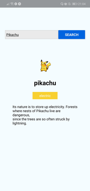
Now that your development environment is set up, we can look at the app we’re going to create — a Pokémon search app. It will allow the user to type the name of a Pokémon into an input box, before fetching the Pokémon’s details from an external API and displaying them to the user.

Here’s what the finished thing will look like:

Pokémon Search App

As ever, you can find the source code for this in our GitHub repo.

Bootstrapping the App

On your terminal, execute the following command to create a new React Native project using Expo:

expo init RNPokeSearch

Under Managed Workflow, select blank. By default, this will install the dependencies using Yarn.

expo init

You might be asking what this Managed workflow and Bare workflow is. These are the two types of workflows that Expo supports. With a managed workflow, you only have to deal with JavaScript and Expo manages everything for you. While in Bare workflow, you have full control over the native code. It gives you the same freedom as the React Native CLI, but with the added bonus of Expo’s libraries and services. You can visit this managed vs bare intro page if you want to learn more about workflows in Expo.

Just like in a web environment, you can install libraries to easily implement different kinds of functionality in React Native. Once the project is created, we need to install a couple of dependencies: pokemon and axios. The former is used for verifying if the text entered in the search box is a real Pokémon name, while axios is used to make an HTTP request to the API that we’re using, namely the PokeAPI:

yarn add pokemon axios

React Native Project Directory Structure

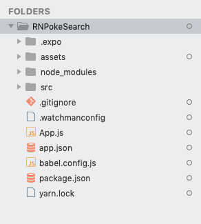
Before we proceed to coding, let’s first take a look at the directory structure of a React Native project created with Expo:

Expo project directory

Here’s a breakdown of the most important files and folders that you need to remember:

  • App.js: the main project file. This is where you’ll start developing your app. Any changes you make to this file will be reflected on the screen.
  • src: acts as the main folder which stores all the source code related to the app itself. Note that this isn’t included in the default project created by Expo CLI. The name of this folder can be anything. Some people use app as well.
  • assets: this is where the app assets such as icons and splash screens are stored.
  • package.json: where the name and versions of the libraries you installed for this project are added.
  • node_modules: where the libraries you installed are stored. Note that this already contains a lot of folders before you installed the two libraries earlier. This is because React Native also has its own dependencies. The same is true for all the other libraries you install.

Don’t mind the rest of the folders and files for now, as we won’t be needing them when just getting started.

Running the App

At this point, you can now run the app by executing the command below. Make sure that you’ve already installed the corresponding Expo client (Android or iOS) for your phone and that it’s connected to the same network as your computer before doing so. If you don’t have an Android or iOS device you can test with, you can use the Android Studio Emulator or the iOS simulator so you can run the app on your machine:

yarn start

Once it’s running, it will display a QR code:

Expo yarn start

Open your Expo client app, and in the projects tab click on Scan QR Code. This will open the app on your Android or iOS device. If you have an emulator running, you can either press i to run it on the iOS simulator or a to run it on the Android emulator.

Expo client app

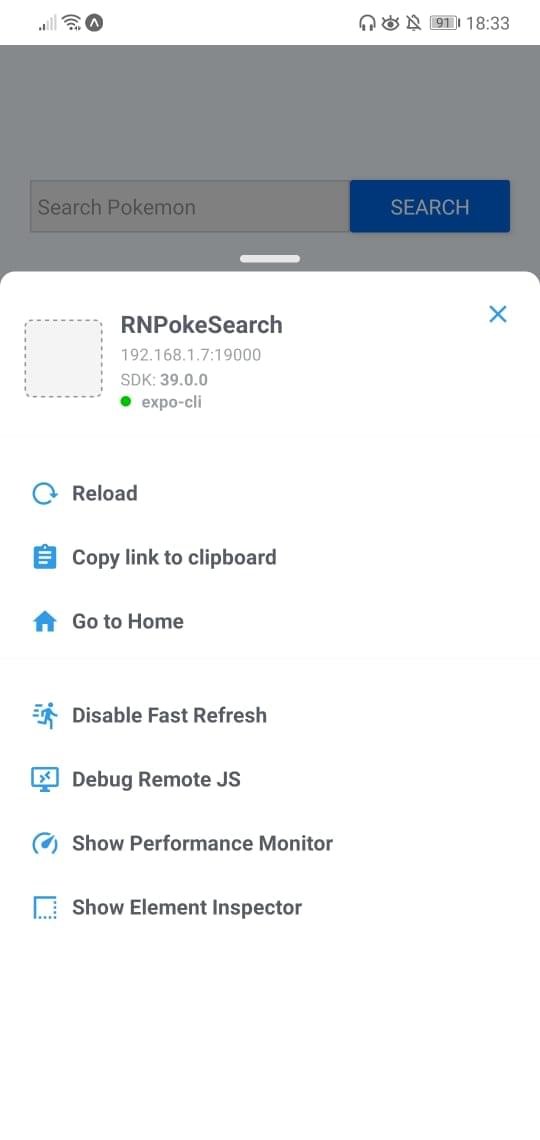
If you’re testing on a real device, shake it so the developer menu will show up.

React Native developer settings

Make sure that Fast Refresh is enabled. This allows you to automatically reload the changes that you make on your components.

Continue reading Getting Started with React Native on SitePoint.


by Wern Ancheta via SitePoint

Thursday, November 5, 2020

How to Find & Fix Common Website Accessibility Issues

It’s the 2020s, so we shouldn’t any longer have to make the case for accessibility. An accessible site means you reach more people, the people you reach (even abled ones) all have an easier time using your site, and you won’t get sued. And with the tools and resources available to developers and designers, it’s now easier than ever to make sure you have an accessible site.

At Polypane, accessibility is one of the three core areas we focus on, the other two being performance and responsive design. If you’re not familiar with Polypane, it’s a web browser specifically for web developers. It has all sorts of tools you won’t find in regular browsers — tools that make you more effective and efficient. To learn more about Polypane, check out the introduction article.

In this article, we’ll focus on a few common accessibility issues and find ways to audit and fix them in your site to make sure it’s as accessible as possible. Here’s what we’ll look at:

  • Does my text have enough contrast, and where it doesn’t, how do I fix that?
  • How does my site look for people with visual impairments like color blindness or farsightedness? What about situational impairments like bright sunlight or a device with night mode?
  • Does my page structure make sense for people that depend on it?
  • How do I make sure I don’t have any code quality issues in my site, and are the things I did to improve accessibility actually helping?
  • Does my site work well on smaller screens?
  • How do I make sure my site works well for users that prefer dark colors or don’t deal well with motion?

Contrast

Does my text have enough contrast, and where it doesn’t, how do I fix that?

Ideally, text contrast is dealt with during the design, with tools like Stark making it easy to test individual text and background pairs. But unfortunately, this isn’t always the case. While there are plenty of places online to check a given text color and a given background (we even built our own online color contrast tester), your web pages likely have many different colors and backgrounds, and for any reasonably complex site, you might not know all combinations beforehand.

And that makes it really easy to overlook that one grey text that’s normally shown on a white background, but has this one place where it’s on light gray, or a dark text color with opacity that only works for certain backgrounds.

In Polypane, nearly all interactions with an element will do a quick contrast check for that specific element. Our algorithm determines the real text and background colors, taking into account the color, opacity and all background colors. We then merge that into the actual perceived text and background color and compare that.

comparing text and background color

We’ll show the result in an element tooltip and in the elements panel alongside other information like font family and font size. That way, your text contrast is always glanceable.

That still relies on chance, though, so Polypane also has a color contrast overlay. This will go through your entire page and find all unique text and background combinations, check all of them and add labels to each element. All passing contrast pairs get a single label with the contrast, and any failing contrast gets a warning label for each instance, so you don’t overlook any.

passing and warning labels on a website

We made it really easy to find contrast issues. But how do you fix them?

If you’re lucky, you can use another color from your design system, but if you don’t have one, or if this is a one-off color pair, you have to go back to your designer or use an online contrast tester and find another color yourself — a tedious and time-consuming process, and something I wanted to do something about.

A GIF showing that valid color options appear as you hover over a warning label

For every failing contrast pair, Polypane calculates a text color that has enough contrast with the background, and suggests that to you for easy copying. You can even preview it just by hovering over it. (The online contrast checker we mentioned also suggests improved colors for you.)

Visual and Situational Impairments

How does my site look for people with visual impairments like color blindness or farsightedness? What about situational impairments like bright sunlight or a device with night mode?

Not everyone that visits your site is going to have perfect vision. In fact, a large number of your visitors will definitely have some form of visual impairment. And while you can make sure to follow guidelines around minimum text size and not communicate anything just through use of colors, it can be easy to overlook an issue. The best way to get empathy is to try to simulate how other people experience your site.

A visual showing multiple test results for a page based on impairment

Color blindness

Between 8 and 10% of men worldwide are color blind (women much less so, at 0.5%), and they fall in three different groups: red-green color blindness, blue-yellow color blindness, and full color blindness. Polypane lets you simulate all of these with our accessibility overlays.

You should test with these simulators to make sure that you don’t rely on just color to bring across messages. For example, if you just make the border of an input field red when you make an error, you’ll find that’s barely noticeable, or unnoticeable with any of these simulators turned on. Rather, you should provide a second, non-color indicator like an error message to communicate the issue to your user.

Red-green color blindness is the most common and the vast majority of people with color blindness have this. In Polypane, we offer four different simulators: Deuteranopia, Deuteranomaly, Protanopia and Protanomaly. The -anomaly variants here are the less severe version, while the -opia variants would be classified as “full” red-green color blindness.

As the name implies, people with this type of color blindness have difficulty seeing the difference between red and green, but also brown and orange and certain shades of blue and purple. You can see how, for example, the common “green is good, red is bad” coloring of elements can become an issue.

Blue-yellow color blindness is much more rare, at just 0.0002% of men worldwide. The technical name for it is “tritanopia”, and tritanomaly is the less severe version. This type of color blindness makes people less sensitive to blue light, making the blue part of anything grey.

Lastly, full colorblindness is the most rare at 0.00003% of men worldwide. Its proper name is “Achromatopsia”, with “achromatomaly” being the less severe version where people see some color, but it’s severely dulled.

It’s worth noting that the simulators in Polypane (and any simulator really) are approximations. Especially the less severe variants come in a range from nearly unnoticeable to close to the full thing, and so the simulator chooses a middle ground there.

various states of the SitePoint home page

Continue reading How to Find & Fix Common Website Accessibility Issues on SitePoint.


by Kilian Valkhof via SitePoint

Monday, November 2, 2020

How to Organize a Large React Application and Make It Scale

An astronaut constructing a space colony in the shape of the React logo

This article is by guest author Jack Franklin. SitePoint guest posts aim to bring you engaging content from prominent writers and speakers of the Web community.

In this article, I’ll discuss the approach I take when building and structuring large React applications. One of the best features of React is how it gets out of your way and is anything but descriptive when it comes to file structure. Therefore, you’ll find a lot of questions on Stack Overflow and similar sites asking how to structure applications. This is a very opinionated topic, and there’s no one right way. In this article, I’ll talk you through the decisions I make when building React applications: picking tools, structuring files, and breaking components up into smaller pieces.

An astronaut constructing a space colony in the shape of the React logo

Build Tools and Linting

It will be no surprise to some of you that I’m a huge fan of webpack for building my projects. Whilst it’s a complicated tool, the great work put into version 5 by the team and the new documentation site make it much easier. Once you get into webpack and have the concepts in your head, you really have incredible power to harness. I use Babel to compile my code, including React-specific transforms like JSX, and the webpack-dev-server to serve my site locally. I’ve not personally found that hot reloading gives me that much benefit, so I’m more than happy with webpack-dev-server and its automatic refreshing of the page.

I use ES Modules, first introduced in ES2015 (which is transpiled through Babel) to import and export dependencies. This syntax has been around for a while now, and although webpack can support CommonJS (aka, Node-style imports), it makes sense to me to start using the latest and greatest. Additionally, webpack can remove dead code from bundles using ES2015 modules which, whilst not perfect, is a very handy feature to have, and one that will become more beneficial as the community moves towards publishing code to npm in ES2015. The majority of the web ecosystem has moved towards ES Modules, so this is an obvious choice for each new project I start. It’s also what most tools expect to support, including other bundlers like Rollup, if you’d rather not use webpack.

Folder Structure

There’s no one correct folder structure for all React applications. (As with the rest of this article, you should alter it for your preferences.) But the following is what’s worked well for me.

Code lives in src

To keep things organized, I’ll place all application code in a folder called src. This contains only code that ends up in your final bundle, and nothing more. This is useful because you can tell Babel (or any other tool that acts on your app code) to just look in one directory and make sure it doesn’t process any code it doesn’t need to. Other code, such as webpack config files, lives in a suitably named folder. For example, my top-level folder structure often contains:

- src => app code here
- webpack => webpack configs
- scripts => any build scripts
- tests => any test specific code (API mocks, etc.)

Typically, the only files that will be at the top level are index.html, package.json, and any dotfiles, such as .babelrc. Some prefer to include Babel configuration in package.json, but I find those files can get large on bigger projects with many dependencies, so I like to use .eslintrc, .babelrc, and so on.

React Components

Once you’ve got a src folder, the tricky bit is deciding how to structure your components. In the past, I’d put all components in one large folder, such as src/components, but I’ve found that on larger projects this gets overwhelming very quickly.

A common trend is to have folders for “smart” and “dumb” components (also known as “container” and “presentational” components), but personally I’ve never found explicit folders work for me. Whilst I do have components that loosely categorize into “smart” and “dumb” (I’ll talk more on that below), I don’t have specific folders for each of them.

We’ve grouped components based on the areas of the application where they’re used, along with a core folder for common components that are used throughout (buttons, headers, footers — components that are generic and very reusable). The rest of the folders map to a specific area of the application. For example, we have a folder called cart that contains all components relating to the shopping cart view, and a folder called listings that contains code for listing things users can buy on a page.

Categorizing into folders also means you can avoid prefixing components with the area of the app they’re used for. As an example, if we had a component that renders the user’s cart total cost, rather than call it CartTotal I might prefer to use Total, because I’m importing it from the cart folder:

import Total from '../cart/total'
// vs
import CartTotal from '../cart/cart-total'

This is a rule I find myself breaking sometimes. The extra prefix can clarify, particularly if you have two to three similarly named components, but often this technique can avoid extra repetition of names.

Prefer the jsx Extension over Capital Letters

A lot of people name React components with a capital letter in the file, to distinguish them from regular JavaScript files. So in the above imports, the files would be CartTotal.js, or Total.js. I tend to prefer to stick to lowercase files with dashes as separators, so in order to distinguish I use the .jsx extension for React components. Therefore, I’d stick with cart-total.jsx.

This has the small added benefit of being able to easily search through just your React files by limiting your search to files with .jsx, and you can even apply specific webpack plugins to these files if you need to.

Whichever naming convention you pick, the important thing is that you stick to it. Having a combination of conventions across your codebase will quickly become a nightmare as it grows and you have to navigate it. You can enforce this .jsx convention using a rule from eslint-plugin-react.

One React Component per File

Following on from the previous rule, we stick to a convention of one React component file, and the component should always be the default export.

Normally our React files look like so:

import React from 'react'

export default function Total(props) {
  …
}

In the case that we have to wrap the component in order to connect it to a Redux data store, for example, the fully wrapped component becomes the default export:

import React, { Component, PropTypes } from 'react'
import { connect } from 'react-redux'

export default function Total(props) {
  …
}

export default connect(() => {…})(Total)

You’ll notice that we still export the original component. This is really useful for testing, where you can work with the “plain” component and not have to set up Redux in your unit tests.

By keeping the component as the default export, it’s easy to import the component and know how to get at it, rather than having to look up the exact name. One downside to this approach is that the person importing can call the component anything they like. Once again, we’ve got a convention for this: the import should be named after the file. So if you’re importing total.jsx, the component should be imported as Total. user-header.jsx becomes UserHeader, and so on.

It’s worth noting that the one component per file rule isn’t always followed. If you end up building a small component to help you render part of your data, and it’s only going to be used in one place, it’s often easier to leave it in the same file as the component that uses it. There’s a cost to keeping components in separate files: there are more files, more imports and generally more to follow as a developer, so consider if it’s worth it. Like most of the suggestions in this article, they are rules with exceptions.

Continue reading How to Organize a Large React Application and Make It Scale on SitePoint.


by Jack Franklin via SitePoint

Wednesday, October 28, 2020

Higher-order Components: A React Application Design Pattern

Higher-order Components: A React Application Design Pattern

In this article, we’ll discuss how to use higher-order components to keep your React applications tidy, well-structured and easy to maintain. We’ll discuss how pure functions keep code clean and how these same principles can be applied to React components.

Pure Functions

A function is considered pure if it adheres to the following properties:

  • all the data it deals with is declared as arguments
  • it doesn’t mutate data it was given or any other data (these are often referred to as side effects)
  • given the same input, it will always return the same output.

For example, the add function below is pure:

function add(x, y) {
  return x + y;
}

However, the function badAdd below is impure:

let y = 2;
function badAdd(x) {
  return x + y;
}

This function is not pure because it references data that it hasn’t directly been given. As a result, it’s possible to call this function with the same input and get different output:

let y = 2;
badAdd(3) // 5
y = 3;
badAdd(3) // 6

To read more about pure functions you can read “An introduction to reasonably pure programming” by Mark Brown.

Whilst pure functions are very useful, and make debugging and testing an application much easier, occasionally you’ll need to create impure functions that have side effects, or modify the behavior of an existing function that you’re unable to access directly (a function from a library, for example). To enable this, we need to look at higher-order functions.

Higher-order Functions

A higher-order function is a function that returns another function when it’s called. Often they also take a function as an argument, but this isn’t required for a function to be considered higher-order.

Let’s say we have our add function from above, and we want to write some code so that when we call it, we log the result to the console before returning the result. We’re unable to edit the add function, so instead we can create a new function:

function addAndLog(x, y) {
  const result = add(x, y);
  console.log(`Result: ${result}`);
  return result;
}

We decide that logging results of functions is useful, and now we want to do the same with a subtract function. Rather than duplicate the above, we could write a higher-order function that can take a function and return a new function that calls the given function and logs the result before then returning it:

function logAndReturn(func) {
  return function(...args) {
    const result = func(...args)
    console.log('Result', result);
    return result;
  }
}

Now we can take this function and use it to add logging to add and subtract:

const addAndLog = logAndReturn(add);
addAndLog(4, 4) // 8 is returned, ‘Result 8’ is logged

const subtractAndLog = logAndReturn(subtract);
subtractAndLog(4, 3) // 1 is returned, ‘Result 1’ is logged;

logAndReturn is a higher-order function because it takes a function as its argument and returns a new function that we can call. These are really useful for wrapping existing functions that you can’t change in behavior. For more information on this, check M. David Green’s article “Higher-Order Functions in JavaScript”, which goes into much more detail on the subject.

See the Pen
Higher Order Functions
by SitePoint (@SitePoint)
on CodePen.

Higher-order Components

Moving into React land, we can use the same logic as above to take existing React components and give them some extra behaviors.

Note: with the introduction of React Hooks, released in React 16.8, higher-order functions became slightly less useful because hooks enabled behavior sharing without the need for extra components. That said, they are still a useful tool to have in your belt.

In this section, we’re going to use React Router, the de facto routing solution for React. If you’d like to get started with the library, I highly recommend the React Router documentation as the best place to get started.

React Router’s Link component

React Router provides a <NavLink> component that’s used to link between pages in a React application. One of the properties that this <NavLink> component takes is activeClassName. When a <NavLink> has this property and it’s currently active (the user is on a URL that the link points to), the component will be given this class, enabling the developer to style it.

This is a really useful feature, and in our hypothetical application we decide that we always want to use this property. However, after doing so we quickly discover that this is making all our <NavLink> components very verbose:

<NavLink to="/" activeClassName="active-link">Home</NavLink>
<NavLink to="/about" activeClassName="active-link">About</NavLink>
<NavLink to="/contact" activeClassName="active-link">Contact</NavLink>

Notice that we’re having to repeat the class name property every time. Not only does this make our components verbose, it also means that if we decide to change the class name we’ve got to do it in a lot of places.

Instead, we can write a component that wraps the <NavLink> component:

const AppLink = (props) => {
  return (
    <NavLink to={props.to} activeClassName="active-link">
      {props.children}
    </NavLink>
  );
};

And now we can use this component, which tidies up our links:

<AppLink to="/home" exact>Home</AppLink>
<AppLink to="/about">About</AppLink>
<AppLink to="/contact">Contact</AppLink>

In the React ecosystem, these components are known as higher-order components, because they take an existing component and manipulate it slightly without changing the existing component. You can also think of these as wrapper components, but you’ll find them commonly referred to as higher-order components in React-based content.

Continue reading Higher-order Components: A React Application Design Pattern on SitePoint.


by Jack Franklin via SitePoint

Working with Forms in React

Working with Forms in React

Almost every application needs to accept user input at some point, and this is usually achieved with the venerable HTML form and its collection of input controls. If you’ve recently started learning React, you’ve probably arrived at the point where you’re now thinking, “So how do I work with forms?”

This article will walk you through the basics of using forms in React to allow users to add or edit information. We’ll look at two different ways of working with input controls and the pros and cons of each. We’ll also take a look at how to handle validation, and some third-party libraries for more advanced use cases.

Uncontrolled Inputs

The most basic way of working with forms in React is to use what are referred to as “uncontrolled” form inputs. What this means is that React doesn’t track the input’s state. HTML input elements naturally keep track of their own state as part of the DOM, and so when the form is submitted we have to read the values from the DOM elements themselves.

In order to do this, React allows us to create a “ref” (reference) to associate with an element, giving access to the underlying DOM node. Let’s see how to do this:

class SimpleForm extends React.Component {
  constructor(props) {
    super(props);
    // create a ref to store the DOM element
    this.nameEl = React.createRef();
    this.handleSubmit = this.handleSubmit.bind(this);
  }

  handleSubmit(e) {
    e.preventDefault();
    alert(this.nameEl.current.value);
  }

  render() {
    return (
      <form onSubmit={this.handleSubmit}>
        <label>Name:
          <input type="text" ref={this.nameEl} />
        </label>
        <input type="submit" name="Submit" />
      </form>
    )
  }
}

As you can see above, for a class-based component you initialize a new ref in the constructor by calling React.createRef, assigning it to an instance property so it’s available for the lifetime of the component.

In order to associate the ref with an input, it’s passed to the element as the special ref attribute. Once this is done, the input’s underlying DOM node can be accessed via this.nameEl.current.

Let’s see how this looks in a functional component:

function SimpleForm(props) {
  const nameEl = React.useRef(null);

  const handleSubmit = e => {
    e.preventDefault();
    alert(nameEl.current.value);
  };

  return (
     <form onSubmit={handleSubmit}>
       <label>Name:
         <input type="text" ref={nameEl} />
       </label>
       <input type="submit" name="Submit" />
     </form>
   );
}

There’s not a lot of difference here, other than swapping out createRef for the useRef hook.

Example: login form

function LoginForm(props) {
  const nameEl = React.useRef(null);
  const passwordEl = React.useRef(null);
  const rememberMeEl = React.useRef(null);

  const handleSubmit = e => {
    e.preventDefault();

    const data = {
      username: nameEl.current.value,
      password: passwordEl.current.value,
      rememberMe: rememberMeEl.current.checked,
    }

    // Submit form details to login endpoint etc.
    // ...
  };

  return (
     <form onSubmit={handleSubmit}>
       <input type="text" placeholder="username" ref={nameEl} />
       <input type="password" placeholder="password" ref={passwordEl} />
       <label>
         <input type="checkbox" ref={rememberMeEl} />
         Remember me
       </label>
       <button type="submit" className="myButton">Login</button>
     </form>
   );
}

View on CodePen

While uncontrolled inputs work fine for quick and simple forms, they do have some drawbacks. As you might have noticed from the code above, we have to read the value from the input element whenever we want it. This means we can’t provide instant validation on the field as the user types, nor can we do things like enforce a custom input format, conditionally show or hide form elements, or disable/enable the submit button.

Fortunately, there’s a more sophisticated way to handle inputs in React.

Controlled Inputs

An input is said to be “controlled” when React is responsible for maintaining and setting its state. The state is kept in sync with the input’s value, meaning that changing the input will update the state, and updating the state will change the input.

Let’s see what that looks like with an example:

class ControlledInput extends React.Component {
  constructor(props) {
    super(props);
    this.state = { name: '' };
    this.handleInput = this.handleInput.bind(this);
  }

  handleInput(event) {
    this.setState({
      name: event.target.value
    });
  }

  render() {
    return (
      <input type="text" value={this.state.name} onChange={this.handleInput} />
    );
  }
}

As you can see, we set up a kind of circular data flow: state to input value, on change event to state, and back again. This loop allows us a lot of control over the input, as we can react to changes to the value on the fly. Because of this, controlled inputs don’t suffer from the limitations of uncontrolled ones, opening up the follow possibilities:

  • instant input validation: we can give the user instant feedback without having to wait for them to submit the form (e.g. if their password is not complex enough)
  • instant input formatting: we can add proper separators to currency inputs, or grouping to phone numbers on the fly
  • conditionally disable form submission: we can enable the submit button after certain criteria are met (e.g. the user consented to the terms and conditions)
  • dynamically generate new inputs: we can add additional inputs to a form based on the user’s previous input (e.g. adding details of additional people on a hotel booking)

Validation

As I mentioned above, the continuous update loop of controlled components makes it possible to perform continuous validation on inputs as the user types. A handler attached to an input’s onChange event will be fired on every keystroke, allowing you to instantly validate or format the value.

Continue reading Working with Forms in React on SitePoint.


by Nilson Jacques via SitePoint

Tuesday, October 27, 2020

20 Essential React Tools for 2020

20 Essential React Tools for 2020

The React ecosystem has evolved into a growing list of dev tools and libraries. The plethora of tools is a true testament to React’s popularity. For devs, it can be a dizzying exercise to navigate this maze that changes at neck-breaking speed. To help navigate your course, below is a list of essential React tools, techniques and skills for 2020.

Hooks

While not strictly a tool, any developer working with React in 2020 needs to be familiar with hooks. These are a new addition to React as of version 16.8 which unlock useful features in function components. For example, the useState hook allows a function component to have its own state, whereas useEffect allows you to perform side effects after the initial render — for example, manipulating the DOM or data fetching. Hooks can be used to replicate lifecycle methods in functional components and allow you to share code between components.

The following basic hooks are available:

  • useState: for mutating state in a function component without lifecycle methods
  • useEffect: for executing functions post-render, useful for firing Ajax requests
  • useContext: for accessing component context data, even outside component props

Pros:

  • mitigates state management complexity
  • supports function components
  • encourages separation of concerns

Cons:

  • context data switching can increase cognitive load

If you’d like to find out more about hooks, then check out our tutorial, “React Hooks: How to Get Started & Build Your Own”.

Function Components

With the advent of hooks, function components — a declarative way to create JSX markup without using a class — are becoming more popular than ever. They embrace the functional paradigm because they don’t manage state in lifecycle methods. This emphasizes focus on the UI markup without much logic. Because the component relies on props, it becomes easier to test. Props have a one-to-one relationship with the rendered output.

This is what a functional component looks like in React:

function Welcome(props) {
  return <h1>Hello, {props.name}</h1>;
}

Pros:

  • focuses on the UI
  • testable component
  • less cognitive load when thinking about the component

Cons:

  • no lifecycle methods

Create React App

Create React App is the quintessential tool for firing up a new React project. It manages all React dependencies via a single npm package. No more dealing with Babel, webpack, and the rest. All it takes is one command to set up a local development environment, with React, JSX, and ES6 support. But that’s not all. Create React App also offers hot module reloading (your changes are immediately reflected in the browser when developing), automatic code linting, a test runner and a build script to bundle JS, CSS, and images for production.

It’s easy to get started:

npx create-react-app my-killer-app

And it’s even easier to upgrade later. The entire dependency tool chain gets upgraded with react-scripts in package.json:

npm i react-scripts@latest

Pros:

  • easy to get started
  • easy to upgrade
  • single meta-dependency

Cons:

  • no server-side rendering, but allows for integration

If you’d like to find out more about using Create React App, please consult our tutorial, “Create React App – Get React Projects Ready Fast”.

Proxy Server

Starting from version react-scripts@0.2.3 or higher, it’s possible to proxy API requests. This allows the back-end API and local Create React App project to co-exist. From the client side, making a request to /my-killer-api/get-data routes the request through the proxy server. This seamless integration works both in local dev and post-build. If local dev runs on port localhost:3000, then API requests go through the proxy server. Once you deploy static assets, it goes through whatever back end hosts these assets.

To set a proxy server in package.json:

"proxy": "http://localhost/my-killer-api-base-url"

If the back-end API is hosted with a relative path, set the home page:

"homepage": "/relative-path"

Pros:

  • seamless integration with back-end API
  • eliminates CORS issues
  • easy set up

Con

  • might need a server-side proxy layer with multiple APIs

PropTypes

PropTypes declares the type intended for the React component and documents its intent. This shows a warning in local dev if the types don’t match. It supports all JavaScript primitives such as Boolean, Number, and String. It can document which props are required via isRequired.

For example:

import PropTypes;

MyComponent.propTypes = {
  boolProperty: PropTypes.bool,
  numberProperty: PropTypes.number,
  requiredProperty: PropTypes.string.isRequired
};

Pros:

  • documents component’s intent
  • shows warnings in local dev
  • supports all JavaScript primitives

Cons:

  • no compile type checking

TypeScript

JavaScript that scales for React projects with compile type checking. This supports all React libraries and tools with type declarations. It’s a superset of JavaScript, so it’s possible to opt out of the type checker. This both documents intent and fails the build when it doesn’t match. In Create React App projects, turn it on by passing in --template typescript when creating your app. TypeScript support is available starting from version react-script@2.1.0.

To declare a prop type:

interface MyComponentProps {
  boolProp?: boolean; // optional
  numberProp?: number; // optional
  requiredProp: string;
}

Pros:

  • compile type checking
  • supports all React tools and libraries, including Create React App
  • nice way to up your JavaScript skills

Cons:

  • has a learning curve, but opt out is possible

If you’d like to find out more about using TypeScript with React, check out “React with TypeScript: Best Practices”.

Redux

Predictable state management container for JavaScript apps. This tool comes with a store that manages state data. State mutation is only possible via a dispatch message. The message object contains a type that signals to the reducer which mutation to fire. The recommendation is to keep everything in the app in a single store. Redux supports multiple reducers in a single store. Reducers have a one-to-one relationship between input parameters and output state. This makes reducers pure functions.

A typical reducer that mutates state might look like this:

const simpleReducer = (state = {}, action) => {
  switch (action.type) {
    case 'SIMPLE_UPDATE_DATA':
      return {...state, data: action.payload};

    default:
      return state;
  }
};

Pros:

  • predictable state management
  • multiple reducers in a single store
  • reducers are pure functions

Cons:

  • set up from scratch can be a bit painful

React-Redux

If you want to use Redux in your React apps, you’ll soon discover the official React bindings for Redux. This comes in two main modules: Provider and connect. The Provider is a React component with a store prop. This prop is how a single store hooks up to the JSX markup. The connect function takes in two parameters: mapStateToProps, and mapDispatchToProps. This is where state management from Redux ties into component props. As state mutates, or dispatches fire, bindings take care of setting state in React.

This is how a connect might look:

import { bindActionCreators } from 'redux';
import { connect } from 'react-redux';

const mapStateToProps = (state) => state.simple;
const mapDispatchToProps = (dispatch) =>
  bindActionCreators({() => ({type: 'SIMPLE_UPDATE_DATA'})}, dispatch);

connect(mapStateToProps, mapDispatchToProps)(SimpleComponent);

Pros:

  • official React bindings for Redux
  • binds with JSX markup
  • connects components to a single store

Cons:

  • learning curve is somewhat steep

It should also be noted that, with the introduction of hooks and React’s Context API, it’s possible to replace Redux in some React applications. You can read more about that in “How to Replace Redux with React Hooks and the Context API”.

React Router

React Router is the de facto standard routing library for React. When you need to navigate through a React application with multiple views, you’ll need a router to manage the URLs. React Router takes care of that, keeping your application UI and the URL in sync.

The library comprises three packages: react-router, react-router-dom, and react-router-native. The core package for the router is react-router, whereas the other two are environment specific. You should use react-router-dom if you’re building a website, and react-router-native if you’re building a React Native app.

Recent versions of React Router have introduced hooks, which let you access the state of the router and perform navigation from inside your components, as well as a newer route rendering pattern:

<Route path="/">
  <Home />
</Route>

If you’d like to find out more about what React Router can do, please see “React Router v5: The Complete Guide”.

Pros:

  • routing between components is fast
  • animations and transitions can be easily implemented
  • connects components to a single store

Cons:

  • without additional configuration, data is downloaded for views a user might not visit
  • client-side routing (whereby JavaScript is converted to HTML) has SEO implications

Continue reading 20 Essential React Tools for 2020 on SitePoint.


by Camilo Reyes via SitePoint

React Router v5: The Complete Guide

React Router v5: The Complete Guide

React Router is the de facto standard routing library for React. When you need to navigate through a React application with multiple views, you’ll need a router to manage the URLs. React Router takes care of that, keeping your application UI and the URL in sync.

This tutorial introduces you to React Router v5 and a whole lot of things you can do with it.

Introduction

React is a popular library for creating single-page applications (SPAs) that are rendered on the client side. An SPA might have multiple views (aka pages), and unlike conventional multi-page apps, navigating through these views shouldn’t result in the entire page being reloaded. Instead, we want the views to be rendered inline within the current page. The end user, who’s accustomed to multi-page apps, expects the following features to be present in an SPA:

  • Each view should have a URL that uniquely specifies that view. This is so that the user can bookmark the URL for reference at a later time. For example, www.example.com/products.
  • The browser’s back and forward button should work as expected.
  • Dynamically generated nested views should preferably have a URL of their own too — such as example.com/products/shoes/101, where 101 is the product ID.

Routing is the process of keeping the browser URL in sync with what’s being rendered on the page. React Router lets you handle routing declaratively. The declarative routing approach allows you to control the data flow in your application, by saying “the route should look like this”:

<Route path="/about">
  <About />
</Route>

You can place your <Route> component anywhere you want your route to be rendered. Since <Route>, <Link> and all the other React Router APIs that we’ll be dealing with are just components, you can easily get up and running with routing in React.

Note: there’s a common misconception that React Router is an official routing solution developed by Facebook. In reality, it’s a third-party library that’s widely popular for its design and simplicity.

Overview

This tutorial is divided into different sections. First, we’ll set up React and React Router using npm. Then we’ll jump right into some React Router basics. You’ll find different code demonstrations of React Router in action. The examples covered in this tutorial include:

  • basic navigational routing
  • nested routing
  • nested routing with path parameters
  • protected routing

All the concepts connected with building these routes will be discussed along the way.

The entire code for the project is available on this GitHub repo.

Let’s get started!

Setting up React Router

To follow along with this tutorial, you’ll need a recent version of Node installed on your PC. If this isn’t the case, then head over to the Node home page and download the correct binaries for your system. Alternatively, you might consider using a version manager to install Node. We have a tutorial on using a version manager here.

Node comes bundled with npm, a package manager for JavaScript, with which we’re going to install some of the libraries we’ll be using. You can learn more about using npm here.

You can check that both are installed correctly by issuing the following commands from the command line:

node -v
> 12.19.0

npm -v
> 6.14.8

With that done, let’s start off by creating a new React project with the Create React App tool. You can either install this globally, or use npx, like so:

npx create-react-app react-router-demo

When this has finished, change into the newly created directory:

cd react-router-demo

The React Router library comprises three packages: react-router, react-router-dom, and react-router-native. The core package for the router is react-router, whereas the other two are environment specific. You should use react-router-dom if you’re building a website, and react-router-native if you’re in a mobile app development environment using React Native.

Use npm to install react-router-dom:

npm install react-router-dom

Then start the development server with this:

npm run start

Congratulations! You now have a working React app with React Router installed. You can view the app running at http://localhost:3000/.

React Router Basics

Now let’s familiarize ourselves with a basic React Router setup. To do this, we’ll make an app with three separate views: Home, Category and Products.

The Router Component

The first thing we’ll need to do is to wrap our <App> component in a <Router> component (provided by React Router). Since we’re building a browser-based application, we can use two types of router from the React Router API:

The primary difference between them is evident in the URLs they create:

// <BrowserRouter>
http://example.com/about

// <HashRouter>
http://example.com/#/about

The <BrowserRouter> is the more popular of the two because it uses the HTML5 History API to keep your UI in sync with the URL, whereas the <HashRouter> uses the hash portion of the URL (window.location.hash). If you need to support legacy browsers that don’t support the History API, you should use <HashRouter>. Otherwise <BrowserRouter> is the better choice for most use cases. You can read more about the differences here.

So, let’s import the BrowserRouter component and wrap it around the App component:

// src/index.js

import React from "react";
import ReactDOM from "react-dom";
import App from "./App";
import { BrowserRouter } from "react-router-dom";

ReactDOM.render(
  <BrowserRouter>
    <App />
  </BrowserRouter>,
  document.getElementById("root")
);

The above code creates a history instance for our entire <App> component. Let’s look at what that means.

A Little Bit of History

The history library lets you easily manage session history anywhere JavaScript runs. A history object abstracts away the differences in various environments and provides a minimal API that lets you manage the history stack, navigate, and persist state between sessions. — React Training docs

Each <Router> component creates a history object that keeps track of the current location (history.location) and also the previous locations in a stack. When the current location changes, the view is re-rendered and you get a sense of navigation. How does the current location change? The history object has methods such as history.push and history.replace to take care of that. The history.push method is invoked when you click on a <Link> component, and history.replace is called when you use a <Redirect>. Other methods — such as history.goBack and history.goForward — are used to navigate through the history stack by going back or forward a page.

Moving on, we have Links and Routes.

Link and Route Components

The <Route> component is the most important component in React Router. It renders some UI if the current location matches the route’s path. Ideally, a <Route> component should have a prop named path, and if the path name matches the current location, it gets rendered.

The <Link> component, on the other hand, is used to navigate between pages. It’s comparable to the HTML anchor element. However, using anchor links would result in a full page refresh, which we don’t want. So instead, we can use <Link> to navigate to a particular URL and have the view re-rendered without a refresh.

Now we’ve covered everything you need to make our app work. Update src/App.js as follows:

import React from "react";
import { Link, Route, Switch } from "react-router-dom";

const Home = () => (
  <div>
    <h2>Home</h2>
  </div>
);

const Category = () => (
  <div>
    <h2>Category</h2>
  </div>
);

const Products = () => (
  <div>
    <h2>Products</h2>
  </div>
);

export default function App() {
  return (
    <div>
      <nav className="navbar navbar-light">
        <ul className="nav navbar-nav">
          <li>
            <Link to="/">Home</Link>
          </li>
          <li>
            <Link to="/category">Category</Link>
          </li>
          <li>
            <Link to="/products">Products</Link>
          </li>
        </ul>
      </nav>

      { /* Route components are rendered if the path prop matches the current URL */}
      <Route path="/"><Home /></Route>
      <Route path="/category"><Category /></Route>
      <Route path="/products"><Products /></Route>
    </div>
  );
}

Here, we’ve declared the components for Home, Category and Products inside App.js. Although this is okay for now, when a component starts to grow bigger, it’s better to have a separate file for each component. As a rule of thumb, I usually create a new file for a component if it occupies more than 10 lines of code. Starting from the second demo, I’ll be creating a separate file for components that have grown too big to fit inside the App.js file.

Inside the App component, we’ve written the logic for routing. The <Route>‘s path is matched with the current location and a component gets rendered. Previously, the component that should be rendered was passed in as a second prop. However, recent versions of React Router have introduced a new route rendering pattern, whereby the component(s) to be rendered are children of the <Route>.

Here / matches both / and /category. Therefore, both the routes are matched and rendered. How do we avoid that? You should pass the exact prop to the <Route> with path='/':

<Route exact path="/">
  <Home />
</Route>

If you want a route to be rendered only if the paths are exactly the same, you should use the exact prop.

Nested Routing

To create nested routes, we need to have a better understanding of how <Route> works. Let’s look at that now.

As you can read on the React Router docs, the recommended method of rendering something with a <Route> is to use children elements, as shown above. There are, however, a few other methods you can use to render something with a <Route>. These are provided mostly for supporting apps that were built with earlier versions of the router before hooks were introduced:

  • component: when the URL is matched, the router creates a React element from the given component using React.createElement.
  • render: handy for inline rendering. The render prop expects a function that returns an element when the location matches the route’s path.
  • children: this is similar to render, in that it expects a function that returns a React component. However, children gets rendered regardless of whether the path is matched with the location or not.

Path and Match

The path prop is used to identify the portion of the URL that the router should match. It uses the Path-to-RegExp library to turn a path string into a regular expression. It will then be matched against the current location.

If the router’s path and the location are successfully matched, an object is created which is called a match object. The match object contains more information about the URL and the path. This information is accessible through its properties, listed below:

  • match.url: a string that returns the matched portion of the URL. This is particularly useful for building nested <Link> components.
  • match.path: a string that returns the route’s path string — that is, <Route path="">. We’ll be using this to build nested <Route> components.
  • match.isExact: a Boolean that returns true if the match was exact (without any trailing characters).
  • match.params: an object containing key/value pairs from the URL parsed by the Path-to-RegExp package.

Implicit Passing of Props

Note that when using the component prop to render a route, the match, location and history route props are implicitly passed to the component. When using the newer route rendering pattern, this is not the case.

For example, take this component:

const Home = (props) => {
  console.log(props);

  return (
    <div>
      <h2>Home</h2>
    </div>
  );
};

Now render the route like so:

<Route exact path="/" component={Home} />

This will log the following:

{
  history: { ... }
  location: { ... }
  match: { ... }
}

But now instead render the route like so:

<Route exact path="/"><Home /></Route>

This will log the following:

{}

This might seem disadvantageous at first, but worry not! React v5.1 introduced several hooks to help you access what you need, where you need it. These hooks give us new ways to manage our router’s state and go quite some way to tidying up our components.

I’ll be using some of these hooks throughout this tutorial, but if you’d like a more in-depth look, check out the React Router v5.1 release announcement. Please also note that hooks were introduced in version 16.8 of React, so you’ll need to be on at least that version to use them.

The Switch Component

Before we head to the demo code, I want to introduce you to the Switch component. When multiple <Route>s are used together, all the routes that match are rendered inclusively. Consider this code from demo 1. I’ve added a new route to demonstrate why <Switch> is useful:

<Route exact path="/"><Home /></Route>
<Route path="/category"><Category /></Route>
<Route path="/products"><Products /></Route>
<Route path="/:id">
  <p>This text will render for any route other than '/'</p>
</Route>

If the URL is /products, all the routes that match the location /products are rendered. So, the <Route> with path /:id gets rendered along with the <Products> component. This is by design. However, if this is not the behavior you’re expecting, you should add the <Switch> component to your routes. With <Switch>, only the first child <Route> that matches the location gets rendered:

<Switch>
  <Route exact path="/"><Home /></Route>
  <Route path="/category"><Category /></Route>
  <Route path="/products"><Products /></Route>
  <Route path="/:id">
    <p>This text will render for any route other than those defined above</p>
  </Route>
</Switch>

The :id part of path is used for dynamic routing. It will match anything after the slash and make this value available in the component. We’ll see an example of this at work in the next section.

Now that we know all about the <Route> and <Switch> components, let’s add nested routes to our demo.

Continue reading React Router v5: The Complete Guide on SitePoint.


by Manjunath M via SitePoint

Thursday, October 22, 2020

Learnability in Web Design: 5 Best Practices

Have you ever considered improving the learnability of your product or website? Perhaps it’s your first time reading about the concept of learnability. It’s not an easy task to build a learnable website, as it requires some experimentation and A/B testing.

Learnability’s goal is to design a clear interface that users can quickly pick up and understand. Ideally, there’s no need for documentation to educate your users on how to use your product.

Luckily, many techniques exist to create a learnable interface. This article shows you five best practices you can use to provide a more learnable interface to your users.

  1. consistency
  2. feedback
  3. sticking to known UI elements
  4. familiarity
  5. storification

But first, let’s make the point clear why learnability matters.

Learnability in web design

Why Does Learnability Matter?

Now, why does learnability matter? There are various reasons why you should consider providing a more learnable user interface.

First of all, users can adopt a new interface much quicker. Therefore, they can accomplish their goal using your tool much quicker. In other words, they can receive more value from your tool. Moreover, there’s little need for documentation or an extensive support center. Your goal is to reduce the number of support requests by providing a clear interface.

That’s not all! Think about customer experience. A user who can quickly learn your tool will have a better experience. In the end, the user wants to receive value within the least amount of time possible. They don’t want to spend a lot of time learning a new tool.

Lastly, learnability matters for your retention rate. A complex interface will scare users. Often, they’ll look for easier alternatives that provide them with the same value.

Now that we understand the importance of learnability, let’s explore five best practices to enhance learnability.

1. Consistency

First, let’s discuss the importance of consistency. Google has nailed consistency through its Material Design to give all of its products a similar look. Therefore, when users switch between Google’s products, it’s much easier to understand how the new product works.

Why? Users have seen this design before and know how to interact with it. Let’s compare the interface of both Google Drive and Gmail. Note the similarities in the positioning of elements such as the search bar, menu, and action button.

Elements in Google Drive

For example, Google Drive has a big call to action button with the text “New” to create a new file or folder. If we compare this with Gmail, we find the same call to action button “Compose” to create a new email. This allows a user who’s new to Gmail but frequently uses Google Drive to quickly understand the purpose of this large button.

The Gmail interface

In short, consistent interfaces are predictable interfaces. This predictability leads to learnable patterns. This applies to everything, ranging from sidebar menus to icon usage, or even link color.

2. Feedback

Feedback is one of those keywords you find in every UI design book. One of the most rudimental forms of feedback is hyperlink feedback.

A hyperlink can have three different states. First of all, a hyperlink sits in its normal state. When the user hovers the hyperlink with its cursor, the link color changes or the user sees a small transition animation. This small feedback moment tells the user that the element is clickable. Once the hyperlink has been clicked, you’ll see its active state. Again, this is a form of feedback to tell the user that the click request has been received and is being processed.

Three different button states: normal, hover and active

Feedback can be very subtle. We refer to this as micro-interactions. Micro-interactions can take the shape of:

  • animations or transition effects
  • color changes
  • a checkbox being checked

These micro-interactions are crucial, as a user needs evidence that what they’ve done affected the page. Imagine you click a button to submit a form and the button doesn’t provide any sort of feedback. In other words, the page remains static. I bet you’ll hit the submit button a second time because you didn’t receive any evidence of your actions.

Therefore, be kind, and provide feedback to your users. It will make their experience so much nicer and less confusing.

Continue reading Learnability in Web Design: 5 Best Practices on SitePoint.


by Michiel Mulders via SitePoint