Simple, responsive website for a small digital design and web development studio.
by csreladm via CSSREEL | CSS Website Awards | World best websites | website design awards | CSS Gallery
Simple, responsive website for a small digital design and web development studio.
Bright and colorful portfolio website from TACO – Talking Colors Creative Studio, built to showcase the recent works and to publish some thoughts about design.
When it was first introduced, responsive design was one of the most exciting web layout concepts since CSS replaced tables. The underlying technology uses media queries to determine the viewing device type, width, height, orientation, resolution, aspect ratio, and color depth to serve different stylesheets.
If you thought responsive design was reserved for CSS layouts only, you'll be pleased to hear media queries can also be used in JavaScript, as this article will explain.
In the following example, cssbasic.css is served to all devices. But, if it's a screen with a horizontal width of 500 pixels or greater, csswide.css is also sent:
[code language="html"]
<link rel="stylesheet" media="all" href="cssbasic.css" />
<link rel="stylesheet" media="(min-width: 500px)" href="csswide.css" />
[/code]
The possibilities are endless and the technique has long been exploited by most websites out there on the Internet. Resizing the width of your browser triggers changes in the layout of the webpage.
With media queries nowadays it's easy to adapt the design or resize elements in CSS. But what if you need to change the content or functionality? For example, on smaller screens you might want to use a shorter headline, fewer JavaScript libraries, or modify the actions of a widget.
It's possible to analyze the viewport size in JavaScript but it's a little messy:
window.innerWidth and window.innerHeight. (IE before version 10 in quirks mode required document.body.clientWidth and document.body.clientHeight.)window.onresizedocument.documentElement.clientWidth and document.documentElement.clientHeight but it's inconsistent. Either the window or document dimensions will be returned depending on the browser and mode.Even if you successfully detect viewport dimension changes, you must calculate factors such as orientation and aspect ratios yourself. There's no guarantee it'll match your browser's assumptions when it applies media query rules in CSS.
The post How to use Media Queries in JavaScript with matchMedia appeared first on SitePoint.


This "Most Loved" One Page website round-up is brought to you by hosting provider, Bluehost.
Bluehost is the most affordable hosting option to host your One Page websites. They have an incredible $2.95/month deal exclusive to One Page Readers where you can host your website with 50GB diskspace and unlimited bandwidth. They also throw in a free domain!
If you want to get notified about the "Most Loved" awards each month, subscribe to our Inspiration Newsletter.
Below are the Top 5 One Page websites awarded “Most Loved” in July – hope you enjoy!
Beautifully designed informational One Pager built using Webflow showcasing eleven plants – each paired with a lovely typeface to express its leafy personality. On a typeface-related note, I published a video tutorial on how to identify fonts in a webpage.

Elegant One Pager for Bellevoye French Whisky featuring slick load transitions, parallax scrolling elements and beautifully styled product images in the info modals.

Loads to love in this wonderfully unique One Pager for Apostrophe Copywriters. Check out the fun alphabetical client shout-outs, the gorgeous big typography, the team bios written by each other, the original contact form and not to mention the fittingly cheeky copy.

Brilliantly unique One Pager filled with personality for Argentinian designer, Mariano Pascual. The website mimics an interactive desktop on a vintage Operating System featuring a taskbar, menubar and draggable windows. One of the most unique and inspiring websites you’ll see this year.

Dann Petty is back with another awesome Epicurrence event and of course announced with an even more awesome One Page website. The design just oozes style from unique button hover effects, slick parallax scrolling, a beautiful color scheme and gorgeous illustrations. Really love how they added inline credits to certain elements in the page that link out to the relevant designer or developer.

Hope you enjoyed these beautiful One Pagers from July!
Big love to hosting provider Bluehost for sponsoring the round up < 3
This article was created in partnership with BAWMedia. Thank you for supporting the partners who make SitePoint possible.
Booking appointments would seem to be a minor task, but managing appointments takes up more time, energy, and money than you might imagine, especially in very active businesses like consulting firms, health and fitness clubs, and beauty salons.
Manual booking methods often work reasonably well, but they are by no means flawless. Mistakes will be made, appointments will slip through the cracks, and appropriate parties can fail to be properly informed when changes occur.
An excellent way to avoid these pitfalls is to simplify the booking process while at the same time making it totally reliable and error-free. That way has a name. It’s Amelia, and Amelia even works while you sleep.
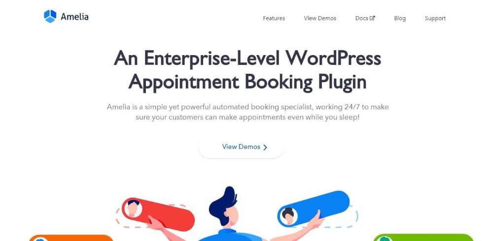
Its users will tell you that it was high time for a tool like Amelia, a WordPress plugin that makes and manages appointments without fail and does so 24/7. Amelia was created with individuals and businesses like coaches and personal trainers, private clinics and health clubs, consultants, and beauty salons in mind.
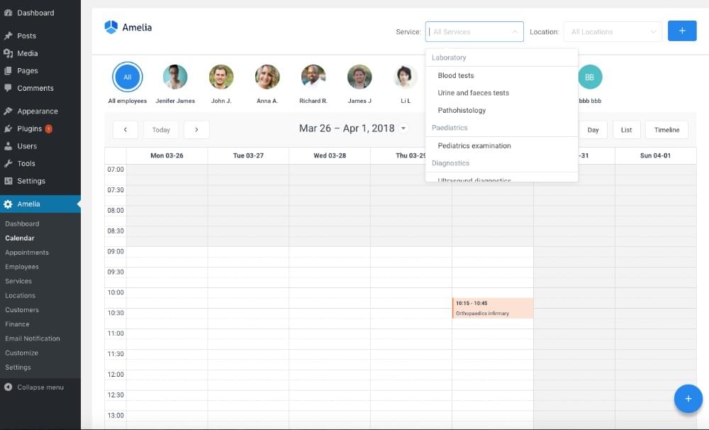
Amelia requires no technical expertise whatsoever to install, it’s easy to set up, and once that’s done it’s 100% automated. Clients can make appointments at any time day or night with just a few clicks, and you can set your calendar, view those appointments and manage your business team, flawlessly and from one place.
Install Amelia, and you’ve just replaced sticky notes, scurrying, and meeting attendance goofs with a reliable appointment system that operates flawlessly on autopilot.
You’ll save more money than you’d think. You don’t pay Amelia hourly, nor is Amelia a salaried employee. You simply pay a one-time fee for what Amelia will do for you forever, and that fee is so low that your ROI is almost instantaneous. From the minute Amelia is set up and running, you’re saving money.
The post Amelia: The Next-level WordPress Booking Plugin appeared first on SitePoint.


The scroll effect header is a kind of parallax whose difference lies in the change, if parallax usually occurs because of the movement of two objects, while this is changing and moving. Obviously if the scroll header will change blur, sepia or other effects follow movement scroll.
Features
The post jQuery Header Scroll Effect Plugin appeared first on Best jQuery.
Flipping is a library and collection of adapters for implementing FLIP transitions.
The post Flipping : Flipping Awesome Animations Library appeared first on Best jQuery.

Want to collaborate with social media influencers to promote your products and services? Wondering which influencers are a good fit for your business? In this article, you’ll find out how to get started with influencer marketing campaigns. #1: Identify Potential Social Media Influencers First, it’s helpful to understand what types of influencers you’ll encounter. While [...]
The post How to Evaluate and Partner With Social Media Influencers appeared first on Social Media Examiner.

CSS transformations are really cool, but they don't yet apply to background images. This article presents a neat workaround for those times when you really do want to rotate a background image, or to keep a background image fixed while its container element is rotate.
This article was updated in 2018.
Interested in mastering CSS3 like a pro? CSS Master, by Tiffany Brown, is available for download to all SitePoint Premium members. Alternatively, you can grab your copy of the book for just $19.
Scaling, skewing and rotating any element is possible with the CSS3 transform property. It's supported in all modern browsers without vendor prefixes. (I've added in the -webkit- just in case you want to support some older browsers.)
[code language="css"]
#myelement {
-webkit-transform: rotate(30deg);
transform: rotate(30deg);
}
[/code]
Great stuff. However, this rotates the whole element — its content, border and background image. What if you only want to rotate the background image? Or what if you want the background to remain fixed while the element is rotated?
Currently, there's no W3C proposal for background-image transformations. It would be incredibly useful, so I suspect one will appear eventually, but that doesn't help developers who want to use similar effects today.
Fortunately, there is a solution. In essence, it's a hack which applies the background image to a before or after pseudo element rather than the parent container. The pseudo element can then be transformed independently.
The post How to Apply CSS3 Transforms to Background Images appeared first on SitePoint.


Philip Walton goes into great detail about the new Page Lifecycle API, which allows browsers to better manage resources if you have a crazy amount of tabs open. (developers.google.com)
Harry Roberts gives some sound tips about getting to know a codebase that is unfamiliar. (csswizardry.com)
Andrew Clark discusses React’s vision for how async rendering can improve data fetching, code delivery, prefetching, view transitions, and more. (youtube.com)
A short concise post by Ethan Marcotte about why the ‘fr’ unit has become one of his favourite parts of the CSS Grid specification. (ethanmarcotte.com)
Anthony Zhang shares 6 lessons on how to successfully communicate, create, and organise a team to build a design system. (medium.com)
An epic post by Sara Soueidan that has arisen from doing research from her talk. If you want to go deep into toggle switches this is for you. A great insight into how a developer thinks and works. (sarasoueidan.com)
A good post that sheds some light on the lesser-known features in Chrome DevTools. (medium.com)
Learn to blend information architecture and experience design with branding and messaging in Northwestern’s online master’s program for designers. (northwestern.edu)
Preview themes from the VSCode marketplace. (vscodethemes.com)
The world’s largest icon library just got even better. (streamlineicons.com)
Build robust integrations 10x to 100x faster. (onegraph.com)
Pixlee is seeking a hungry and empathetic Product Designer to join the team at our NYC office! As one of the members of product design team, your work will impact and drive the future of our product and how it shapes the behavior of both marketing professionals and everyday consumers around the world. (pixlee.com)
As a Design Curator on the Design Team, you will be the embodiment of the design team’s mission and vision. These will be reflected in all aspects of your shop and product curation work. (creativemarket.com)
The post Web Design Weekly #328 appeared first on Web Design Weekly.
There has been an increasing demand for creators to develop their own custom video platform which they can use to advance their own advertising, marketing or branding goals. Although YouTube and other similar platforms are generally more promising, hosting videos on your own and using a video player of your choice offers more control over how your videos are used.
Irrespective of whether you are a YouTube video creator or social media influencer, we've compiled a list of 5 of the greatest HTML5 video players. This list has been compiled after taking into consideration a few important needs, such as:
Now that we have an idea what to look for, here is a list of the top 5 HTML5 Video Players.

VideoJS, an open source HTML5 video player is built using JavaScript and CSS. It's an HTML5 video player with optional support for Flash. Having Flash as a fallback option is especially helpful when you're using it on browsers that do not support HTML5. It can extend its support to Vimeo and YouTube.
Launched in the year 2010, VideoJS currently serves more than 400,000 websites across the internet. VideoJS is equally compatible on mobile devices as well as desktops.
Some of the top features of VideoJS include:

JW Player has been around for ages and was one of the most popular Flash video players for the web. Later on, it extended its support for HTML5 video playback. JW Player is completely customizable, has a responsive HTML5 video and has a large variety of features right from analytics support to accessibility and full HTML5 video controls.
It has perhaps the best website video player with its wide array of video supported solutions. JW player also works very well as an HTML5 video player for WordPress websites. It can also be used as an alternate option for YouTube's video player. Interestingly, before Google purchased YouTube, the original YouTube video player was based on JW Player.
One of the key reasons that the JW Player is above its peers in this category because of the sheer amount of features it provides via a number of different add-ons. These can range from advertising partnerships to closed captions as well as popular social networking tools.
As mentioned earlier, the player is completely customizable and supports a number of custom user-defined themes. It also comes with an integrated API. It has a number of different plugins to support the more popular CMSs, which makes integration fairly simple.
Kaltura Player is a free-to-use, open source HTML5 video player that can be used to create multiple and custom inter-browser and inter-device skins that can match or complement the design of your website. The Kaltura player comes with numerous player templates to choose from.
Some of the key features include:

Flowplayer is an extremely simple video player for creators who wish to include video playback on their websites. Integrating and the markup process for Flowplayer is decidedly straightforward, which is one of its major benefits.
At the outset, it is important to note that Flowplayer is primarily aimed at those creators who host video files independently. In case creators are using a streaming service such as Vimeo or YouTube, both streaming services provide code that can be used to embed the player itself onto the website or landing page.
Flowplayer is 100% customizable as well as skinnable and comes with support for including subtitles, modifying the playback speed, including video analytics and monetization opportunities.
The post 5 Great HTML5 Video Players appeared first on SitePoint.
Elegant One Pager for Bellevoye French Whisky featuring slick load transitions, parallax scrolling elements and beautifully styled product images in the info modals.
This article was created in partnership with YOOtheme. Thank you for supporting the partners who make SitePoint possible.
Starting July 2018, Google started ranking their mobile search results according to mobile page speed. This makes PageSpeed optimization even more important than before. Fortunately, there are tools that can help you speed-up your website. YOOtheme Pro, a new WordPress theme and page builder, ensures a high page speed ranking of your website thanks to its small, clean code base and the use of latest web technologies. Here is how it works.
For those of you who are not familiar with YOOtheme Pro, it is a powerful theme and page builder for WordPress and Joomla. These are its main features:
YOOtheme Pro is built with the JavaScript library Vue.js and the front-end framework UIkit. Thanks to these two libraries, YOOtheme Pro is extremely modular and extendable, and its fast and lightweight JavaScript provides a great user experience. The page builder generates small, clean and semantic markup, which is optimized for fast loading times. So let's take a closer look at the technologies YOOtheme Pro uses to speed up your browser's rendering time.
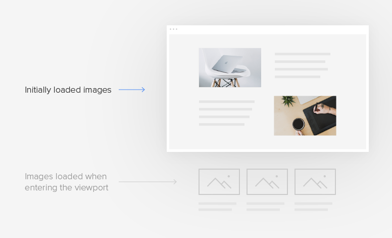
Images make up most of your website's total size, which can significantly impact the loading times. To improve page speed and decrease server traffic, YOOtheme Pro uses lazy loading. This means that initially only above-the-fold images are fully loaded. Other images are loaded as they enter the viewport. To prevent content from jumping, an empty placeholder image is generated instantly. Your visitors will not even notice that images are lazy loaded, and the first meaningful paint will get faster on the screen. You can also lazy load video elements.
To make sure you get the best resolution on every device, YOOtheme Pro auto-generates srcsets. These are multiple versions of the same image in different sizes each used for a specific device. When you upload an image in YOOtheme Pro’s page builder and set a width or a height value, YOOtheme Pro generates seven srcset images. The first two are 100% and 200% of the target size. Other five images have the most frequently used device resolutions: 768, 1024, 1366, 1600 and 1920. Of course, these are only generated if the image size allows it, which is why you should always upload images with the highest resolution possible. This feature will guarantee the best user experience from mobiles to retina displays.
While srcsets really improve performance, they are usually not served for background images used as section or column backgrounds. These images extend to the full width and are often quite large, so loading them on mobiles takes a lot of bandwidth. To solve this problem, YOOtheme Pro also generates srcsets for background images, which is great for your mobile page speed rank.
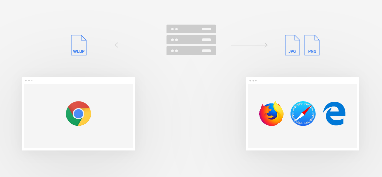
To save bandwidth, Google also recommends using next-generation image formats like WebP. This format has a superior compression and quality characteristics as compared to the most common used image formats JPEG and PNG. Using WebPs saves size and consumes less cellular data. YOOtheme Pro automatically generates and serves images in WebP format for Chrome browsers. In case a visitor uses other browsers, the original JPEG or PNG images will be served.
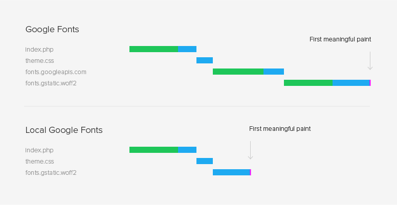
YOOtheme Pro stores Google Fonts locally. When you select a Google font in YOOtheme Pro, the `woff` and `woff2` font files are downloaded to your server and included into the CSS. This is not only helps with GDPR compliance, but it also largely improves the speed of your website since there is no round-trip to Google servers anymore. And if your web server supports HTTP/2, there is no round-trip at all.
Apart from providing a fast user experience, YOOtheme Pro is also very developer-friendly. It allows you to override and extend everything, add custom elements, CSS, JavaScript and even create new theme settings. YOOtheme offers an extensive documentation on YOOtheme Pro, which includes a section specifically written for developers. There you will find information, tutorials and examples on custom assets, child themes, custom elements and much more.
As you can see, YOOtheme Pro is a very versatile theme and page builder for WordPress that really cares about speed. It integrates more optimizations for your Google PageSpeed rank than any other page builder on the WordPress market right now. It is a great tool for designers that gives them the power to create with none of the coding. But it was also built with developers in mind giving them the possibility to customize everything. YOOtheme Pro regularly releases theme packages on a particular topic including a thought-through content structure. Beautiful layouts, various styles and free-to-use images along with regular feature updates make YOOtheme Pro the next WordPress theme and page builder to watch for. So get YOOtheme Pro and try it out for yourself.
The post Speed Up Your WordPress Website with YOOtheme Pro appeared first on SitePoint.