Tuesday, November 1, 2016

26 Steps of Product & Dashboard Design

What I have learned during my 4-year journey as a Product Designer & Dashboard Designer.

Computer workstation

For the last four years, I have continued to design dashboards and applications and I have learnt how to deal with different departments, and utilize their knowledge in order to make product designs both better and more efficient.

Today, I’m going to share all the steps I have learned and incorporated into my daily routine. These steps I believe have helped to make me a much better designer, and I want to share them with you.

Overview

1. Pre Design

Get as much information as possible (Ask for three examples)

For me, nothing gives me more clarity than seeing a real working example. When I am working with a new client or on a brand new landing page for a product, I find as the easiest to ask the client to provide three or four inspirational pages, because this really helps both parties. Getting your client to put ideas onto the table gives you an opportunity to easily understand what they like, and what they expect from the finished design.

If you’re working with multiple teams you should aim to spend as much time with the developers on a product as you do with your designer colleagues. What I’ve learned while working on Tapdaq the key to making an effective design decision is to ensure you speak with the dev team as much as you can. In my case, there are always cases of a solution to a problem whereby I couldn’t come up with that solution by myself. I’d say the goal is to eliminate as many questions as possible before you move into development.

Learn about personas

At first, I must say I was skeptical about personas, but now it all makes sense to me.

So in complete contrast to my older process, I can see how personas are super important while working on product features, especially when the solution has many different edge cases. It helps you to understand who are you really designing for. I aim to have around four to five personas. If possible, it's best to have personas based on actual users, as this can help you identify issues while chatting or walking through your solution with them on a call or in person.

Persona Card

Setup Exact Goals - What Exactly Should We Track?

I think most designers/clients ignore this step, but one of the most important aspects of design for both parties is to understand the goals of the product you are designing. We tend to jump straight into pixels and quickly flesh out the UI of the project. If it’s a brand new website, or a new feature, be sure to set clear goals of what you want to achieve.

Since everything is trackable, speak about the exact points you’re going to track. For example, these could range from new sign ups, to a number of customers using Paypal vs. purchases with credit cards. Always make sure you know how high you’re aiming for at the start!

P.S - You’ll need this anyway for setting up funnels on Mixpanel later in this process.

Project Structure

Set up Project Folder and Start Collecting Moodboard

There are plenty of sites for inspiration — Dribbble, Behance, Pttrns, Pinterest etc. It’s really easy to find similar projects to the one you shall be working on. Additionally, there may be already a solution to a problem you’re experiencing and trying to solve.

When I start working on a new project, I always setup a folder with folders named — Source Files, Screens & Export, Inspiration & Resources. I save everything I find on the internet to Inspiration folder to be able to use it later to create basic moodboards. This folder could be filled with anything from plugins, swatches or even full case studies from Behance.

2. Going Low Fidelity

Whiteboard

If anyone can remember, I didn’t care much about the quality of wireframes in my previous article. The methods I use now are the following:

If we want to add a new feature or redesign a process we sit down and everybody at the meeting starts sketching ideas on a whiteboard, paper or even an iPad. This action allows us to put everyone on the team in the designer’s position. Later we end up with two design options to see which one works the best. We always try to go through the whole experience and discuss most of the edge cases during this part of the process. It is really crucial to address them now as opposed to during the design phase, or even worse, during the development part. That's when you can lose a lot time and energy instead.

Map out all of your screens info (What data a user needs to input)

This is the time to go beyond the whiteboard and list out all of the user’s inputs and stories. Write down what exactly should a user insert into a particular screen and how can a user achieve the desired goals.

Write down all possible states

Because all dashboards, apps or websites’ forms have different states, this is another important step you shouldn’t forget.

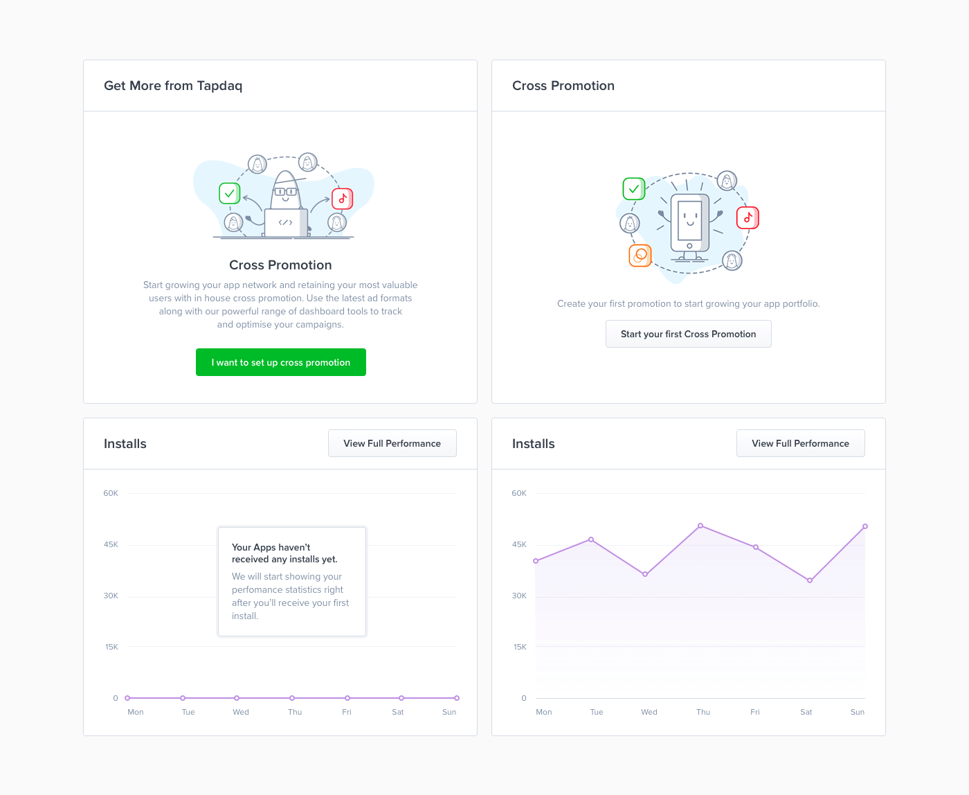
While designing we need to be sure to address all of them. It’s nice to have shiny graphs and cool profile pictures in our Sketch files or PSDs. However, most likely, users will see the opposite side of your app. Especially when they come to your product. It’s necessary to be prepared. Below is an example of how we deal with empty states in one of our data components.

Tapdaq — Cross Promotion Widget States

Prepare First Diagram

All of this leads to the final part of low fidelity. Thanks to the outcome result of the whiteboard task we now know all of the possible states, user’s inputs and goals. To sum up all interactions I create a diagram and to be honest I’ve changed the style of doing this many times: Going from Sketch files with rasterised layouts to just rectangles symbolising each page with their names below. That being said, the process was always painful, I usually end up in a situation where we want to change or add something later on in the process. With these solutions, I’m usually forced to do many more steps; such as changing the positions of lines, arrows and images.

After all we ended up with using Camunda Modeler, which is a not exactly a design tool. It’s a simple app for creating technical diagrams. Which sounds odd, but this app is developed to help you build basic diagrams. Most importantly everything created is completely scalable. You can easily drag and drop any point and it will automatically create lines and arrows for you. You can also choose from different types of points which can be helpful, for example, for highlighting when a user receives an email from Intercom. Camunda allows exporting to SVG that makes it easy to colour trackable points in Sketch.

Tapdaq Menu + Screens Structure (Export from Camunda Modeler)

3. Work / Design

Moodboard

[caption id="attachment_142461" align="aligncenter" width="2040"]Moodboard with Chronicle Display and bright blue colours Moodboard with Chronicle Display and bright blue colours[/caption]

I’m able to start with the creation of moodboard, as I collect all images to my Inspiration folder. I use moodboards mainly to discuss my thoughts with colleagues and describe some of the visual ideas, before I start with the pixel process.

First draft

Designing is always an ongoing process. You’re going to iterate a lot along your way to a great result. With first draft is also comes gathering of first feedback. You don’t have to come to pixel perfect design in order to start receiving feedback from your teammates, clients or potential users. To get their first thoughts and to start a discussion, I usually mix screens from our current designs (As you can see below). This allows us to start playing with real looking designs in less than a day. You can do a first simple prototype to test if things connect well together.

Write your copy (Tone)

Copy is one of the key aspects of users’ decisions and I take it as a crucial part of the design. Though I’m not a native english speaker, I’m still capable of setting the tone of the copy. There is nothing worse than a nice design with confusing dialogs where users are struggling to find the next step.

First Intern Test

With your first draft you can quickly create a prototype in Marvelapp or Invision. This is something that I started doing recently and it turns out it's another amazing validating aspect. With a prototype you can now easily set up a call with 3 or 4 people from your team and share the Invision or Marvelapp prototype with them and try to ask a few questions while test on them particular flows/scenarios. This way you can easily test your questioning skills and obviously test your design decisions on real users without worrying about wasted resources and time. I usually tend to choose people who are not that much involved in dashboard development. Also try to avoid watching someone who has already had a chance to play with the prototype before.

Etiquette

We all know how hard it is to stay tidy. How to deliver yet another feature. This usually leads to a messy Sketch or PSD files. I’ve learned a lot while designing the Dashboard UI Kit , especially about differences between working as a one-only designer in a startup, working in teams or working on my digital products. While I’m working in Tapdaq, I’m confident about the skills of my colleagues and even when I know I’m trying hard to keep files tidy, sometimes it’s impossible! However when you do work in a team, I think about my PSD’s like I’m creating them for someone else. I use the rule that if you have more than 8 layers in a folder, then you should create a new one.

I found one great plugin for Sketch, which saved me hours while I worked on my UI Kits. Rename - http://ift.tt/2ew0bzk

You can still take a look at these old Etiquette guidelines (most points work for any editor you’ll use anyway) — Photoshopetiquette.com

Put everything in canvas

I’ve always struggled with designing nice headers while I the rest of the canvas was white. While designing I learned to put all the content in place first - just play with the layout and typography. It’s much easier to design nice details and play with the whole concept with the content in place.

Continue reading %26 Steps of Product & Dashboard Design%


by Jan Losert via SitePoint

Getting Started With the Asset Pipeline, Part 1

In this first article of a new series on the Asset Pipeline in Rails, I’d like to discuss a few high-level concepts that are handy to fully grasp what the Asset Pipeline has to offer and what it does under the hood. The main things it manages for you are concatenation, minification, and preprocessing of assets. As a beginner, you need to familiarize yourself with these concepts as early as possible.

Topics

  • Asset Pipeline?
  • Organization
  • Concatenation & Compression?
  • High-Level Languages

Asset Pipeline?

The Asset Pipeline is not exactly news to people in the business, but for beginners it can be a little tricky to figure out quickly. Developers don’t exactly spend a ton of time on front-end stuff, especially when they start out. They are busy with lots of moving parts that have nothing to do with HTML, CSS, or the often bashed JS bits.

The Asset Pipeline can help by managing the concatenation, minification, and preprocessing of assets—for example, assets that are written in high-level languages like CoffeeScript or Sass. 

This is an important step in the build process for Rails apps. The Asset Pipeline can give you a boost not only in quality and speed but also in convenience. Having to set up your own tailored build tool might give you a few more options for fine-tuning your needs, but it comes with an overhead that might be time-consuming for beginners—maybe even intimidating. In this regard, we could talk about the Asset Pipeline as a solution that fosters convenience over configuration.

The other thing that should not be underestimated is organization. The pipeline offers a solid framework to place your assets. On smaller projects this might not seem that important, sure, but bigger projects might not recover easily from going in the wrong direction on subjects like this. This might not be the most common example in the world, but just imagine a project like Facebook or Twitter having bad organization for their CSS and JS assets. Not that hard to imagine that this would breed trouble and that people who have to work and build on such a basis would not have an easy time loving their jobs.

As with many things in Rails, there is a conventional approach of how to handle assets. This makes it easier to onboard new people and to avoid having developers and designers being too obsessed with bringing their own dough to the party. 

When you join a new team, you want to be able to get up to speed quickly and hit the ground running. Needing to figure out the special sauce of how other people organized their assets is not exactly helpful with that. In extreme cases, this can even be regarded as wasteful and can burn money unnecessarily. But let’s not get too dramatic here.

So this article is for the beginners among you, and I recommend taking a look at the pipeline right away and getting a good grip on this topic, even if you don’t expect to work on markup or front-endy things much in the future. It’s an essential aspect in Rails and not that huge of a deal. Plus your team members, especially designers who spend half their lives in these directories, will put less funny stuff in your coffee if you have some common ground that does not conflict with each other.

Organization

You have three options for placing your assets. These divisions are more of a logical kind. They don’t represent any technical restrictions or limitations. You can place assets in any of them and see the same results. But for smarter organization, you should have a good reason to place content in its proper place.

  • app/assets

The app/assets folder is for assets that are specifically for this app—images, JS and CSS files that are tailor made for a particular project. 

  • lib/assets

The lib/assets folder, on the other hand, is the home for your own code that you can reuse from project to project—things that you yourself might have extracted and want to take from one project to the next—specifically, assets that you can share between applications. 

  • vendor/assets

vendor/assets is another step outward. It’s the home for assets that you reused from other, external sources—plugins and frameworks from third parties.

These are the three locations in which Sprockets will look for assets. Within the above directories, you are expected to place your assets within the /images, /stylesheets and /javascripts folders. But this is more of a conventional thing; any assets within the */assets folders will be traversed. You can also add subdirectories as needed. Rails won’t complain and precompile their files anyway.

There is an easy way to take a look at the search path of the asset pipeline. When you fire up a Rails console with rails console, you can inspect it with the following command:

Terminal

What you will get returned is an array with all the directories of assets that are available and found by Sprockets—aka the search path.

The nice thing about all of this is easy to miss. It’s the aspect of having conventions. That means that developers—and designers as well, actually—can all have certain expectations about where to look for files and where to place them. That can be a huge (Trump voice) time saver. When someone new joins a project, they have a good idea how to navigate a project right away.

That is not only convenient, but can also prevent questionable ideas or reinventing the wheel all the time. Yes, convention over configuration can sound a bit boring at times, but it is powerful stuff nonetheless. It keeps us focused on what matters: the work itself and good team collaboration.

The assets paths mentioned aren’t set in stone, though. You can add custom paths as well. Open config/application.rb and add custom paths that you want to be recognized by Rails. Let’s take a look at how we would add a custom_folder.

config.application.rb

When you now check the search path again, you will find your custom folder being part of the search path for the asset pipeline. By the way, it will now be the last object placed in the array:

Terminal

Output

Concatenation & Compression?

Why do we need that stuff? Long story short, you want your apps to load faster. Period! Anything that helps with that is welcome. Of course you can get away without optimizing for that, but it has too many advantages that one simply can’t ignore. Compressing file sizes and concatenating multiple asset files into a single “master” file that is downloaded by a client like a browser is also not that much work. It is mostly handled by the pipeline anyway.

Reducing the number of requests for rendering pages is very effective at speeding things up. Instead of having maybe 10, 20, 50 or whatever number of requests before the browser is finished getting your assets, you could potentially only have one for each CSS and JS asset. Today this is a nice thing to have, but at some point this was a game changer. These kinds of improvements in web development should not be neglected because we are dealing with milliseconds as a unit. 

Lots of requests can add up pretty substantially. And after all, the user experience is what matters most for successful projects. Making users wait for just that little extra bit before they can see content rendered on your page can be a massive deal-breaker. Patience is not something we can expect from our users.

Minification is cool because it gets rid of unnecessary stuff in your files—whitespace and comments, basically. These compressed files are not made with human readability in mind. They are purely for machine consumption. The files will end up looking a bit cryptic and hard to read although it’s still all valid CSS and JS code—just without any excess whitespace to make it readable and understandable for humans. 

The JS compression is a bit more involved, though. Web browsers don’t need that formatting. That lets us optimize these assets. The takeaway issue from this section is that a reduced amount of requests and minimized file sizes speed things up and should be in your bag of tricks. Rails gives you this functionality out of the box without any additional setup.

High-Level Languages

You might have heard about them already, but as a beginner you might not be up to speed on why you should learn yet another language—especially if you are still busy learning to write classical HTML and CSS. These languages were created to deal with shortcomings that developers wanted to iron out. They mostly address issues that developers didn’t want to deal with on a daily basis. Classical laziness-driven development, I guess. 

“High-level languages” sounds more fancy than it might be—they are rad, though. We are talking about Sass, CoffeeScript, Haml, Slim, Jade, and things like that. These languages let us write in a (mostly) user-friendly syntax that can be more convenient and efficient to work with. All of them need to be precompiled during a build process. 

I’m mentioning this because this can happen behind the scenes without you noticing. That means it takes these assets and transforms them into CSS, HTML, and JS before they are deployed and can be rendered by the browser.

Sass

Sass stands for ”Syntactically Awesome Style Sheets” and is much more potent than pure CSS. It lets us write smarter stylesheets that have a few programming tools baked in. What are we talking about here, exactly? You can declare variables, nest rules, write functions, create mixins, easily import partials, and lots of other stuff that programmers wanted to have available while playing with styles.

It has grown into a pretty rich tool by now and is excellent for organizing stylesheets—for big projects I would even call it essential. These days, I’m not sure if I wouldn’t stay away from a large app that isn’t using a tool like Sass—or whatever non-Ruby centric frameworks have to offer in that regard.

For your current concerns, there are two syntax versions of Sass you need to know about. The Sassy CSS version, aka SCSS, is the more widely adopted one. It stays closer to plain CSS but offers all the fancy extensions developers and designers came to love playing with stylesheets. It uses the .scss file extension and looks like this:

SCSS

Visually, it’s not that different than CSS—that’s why it is the more popular choice, especially among designers I think. One of the really cool and handy aspects of SCSS, and Sass in general, is the nesting aspect. This is an effective strategy to create readable styles but also cuts down a lot on repetitive declarations. 

SCSS

Compare the example above with the respective CSS version. Looks nice to slim down these styles with nesting, no?

CSS

The indented Sass syntax has the .sass file extension. This one lets you avoid dealing with all these silly curly braces and semicolons that lazy devs like to avoid. 

How does it do that? Without the brackets, Sass uses indentation, whitespace essentially, to separate its properties. It’s pretty rad and looks really cool too. To see the differences, I’ll show you both versions side by side.

.sass

.scss

Pretty nice and compact, huh? But both versions need processing before it turns into valid CSS that browsers can understand. The Asset Pipeline takes care of that for you. If you hit browsers with something like Sass, they would have no idea what’s going on.

I personally prefer the indented syntax. This whitespace-sensitive Sass syntax is less popular than the SCSS syntax, which might not make it the ideal choice for projects other than your personal ones. It’s probably a good idea to go with the most popular choice among your team, especially with designers involved. Enforcing whitespace hipness with people who have spent years taming all the curly braces and semicolons out there seems like a bad idea.

Both versions have the same programming tricks up their sleeves. They are excellent in making the process of writing styles much more pleasant and effective. It's lucky for us that Rails and the Asset Pipeline make it so easy to work with either of these—pretty much out of the box.

Slim & Haml

Similar arguments can be made about the benefits of using something like Slim and Haml. They are pretty handy for creating more compact markup. It will get compiled into valid HTML, but the files you deal with are much more reduced. 

You can spare yourself the trouble of writing closing tags and use cool abbreviations for tag names and such. These shorter bursts of markup are easier to skim and read. Personally, I’ve never been a huge fan of Haml, but Slim is not only fancy and convenient, it’s also very smart. For people who like the indented Sass syntax, I would definitely recommend playing with it. Let’s have a quick look:

Slim

Haml

Both result in the following ERB-enhanced HTML in Rails:

On the surface, the differences are not that big, but I never quite got why Haml wants me to write all these extra % to prepend tags. Slim found a solution that got rid of these, and therefore I salute the team! Not a big pain, but an annoying one nevertheless. The other differences are under the hood and are not within the scope of this piece today. Just wanted to whet your appetite.

As you can see, both preprocessors significantly reduce the amount you need to write. Yes, you need to learn another language, and it reads a bit weird at first. At the same time I feel the removal of that much clutter is totally worth it. Also, once you know how to write ERB-flavored HTML, you will be able to pick up any of these preprocessors rather quickly. No rocket science—the same goes for Sass, by the way.

In case you're interested, there are two handy gems for using either of them in Rails. Do yourself a favor and check them out when you get tired of writing all these tiresome opening and closing tags.

CoffeeScript

CoffeeScript is a programming language like any other, but it has that Ruby flavor for writing your JavaScript. Through preprocessing, it compiles into plain old JavaScript that browsers can deal with. The short argument for working with CoffeeScript was that it helped to overcome some shortcomings that JS was carrying around. The documentation says that it aims at exposing the “good parts of JavaScript in a simple way”. Fair enough! Lets have a quick look at a short example and see what we’re dealing with:

JavaScript

In CoffeeScript, this fella would look like this:

CoffeeScript

Reads just a tad nicer without all the curlies and semicolons, no? CoffeeScript tries to take care of some of the annoying bits in JavaScript, lets you type less, makes the code a bit more readable, offers a friendlier syntax, and deals more pleasantly with writing classes. Defining classes was a big plus for a while, especially for people coming from Ruby who were not super fond of dealing with pure JavaScript. CoffeeScript took a similar approach to Ruby and gives you a nice piece of syntactic sugar. Classes look like this, for example:

Class

This language was quite popular in Ruby land for a while. I'm not sure how adoption rates are these days, but CoffeeScript is the default JS flavor in Rails. With ES6, JavaScript now also supports classes—one big reason to maybe not use CoffeeScript and play with plain JS instead. I think CoffeeScript still reads nicer, but a lot of the less cosmetic reasons to use it have been addressed with ES6 these days. I think it’s still a good reason to give it a shot, but that is not what you came for here. I just wanted to give you another appetizer and provide a little bit of context around why the Asset Pipeline allows you to work in CoffeeScript out of the box.

Final Thoughts

The Asset Pipeline has proven itself far beyond my expectation when it was introduced. At the time it really made quite the splash and was addressing a serious pain for developers. It still does, of course, and has established itself as a frictionless, effortless tool that improves the quality of your applications.

What I like most about it is how little hassle it involves getting it to work. Don’t get me wrong, tools like Gulp and Grunt are impressive as well. The options for customization are plenty. I just can’t shake the comfy feeling that Rails gives me when I don’t have to deal with any setup before getting started. Conventions can be powerful, especially whey they result in something seamless and hassle-free.


by Ed Wassermann via Envato Tuts+ Code

Android 404

Hitting a 404 page can be a frustrating experience, so the Android 404 page includes a sweet game so you can have a little fun.
by via Awwwards - Sites of the day

Neobí

opl-small

Unique parallax scrolling One Pager just bursting with color for upcoming startup, Neobí. The screenshot here doesn't capture the background color changes (as you scroll) well - definitely check the live site.

by Rob Hope via One Page Love

DD Scroll Boxes – Animated Scroll Boxes with Javascript

DD Scroll Box makes it a breeze to turn any DIV content on your page into a scroll box, animating them into view when the user scrolls up or down the page past a certain amount. Vanilla JavaScript and CSS3 powered for a lightweight, smooth experience.


by via jQuery-Plugins.net RSS Feed

How to Repurpose Your Snapchat Stories

ap-repurpose-snapchat-stories-600

Wondering how to get more value from your Snapchat content? Want to learn how to reuse your Snapchat stories? You can get a bigger return on your Snapchat marketing efforts by downloading and repurposing your stories. In this article, you’ll discover how to repurpose your Snapchat stories for other social media platforms. Download Your Content [...]

This post How to Repurpose Your Snapchat Stories first appeared on .
- Your Guide to the Social Media Jungle


by Andrew Pickering via

How to Use Twitter Website Conversion Ads

ag-twitter-website-conversion-ads-600

Want to improve the performance of your Twitter ads? Do you know how to use website conversion ads on Twitter? Whether you’re looking to increase downloads of an ebook or get more sales, the Website Conversions objective will improve the performance of your Twitter ads. In this article, you’ll discover how to get started with [...]

This post How to Use Twitter Website Conversion Ads first appeared on .
- Your Guide to the Social Media Jungle


by Ana Gotter via