[ This is a content summary only. Visit our website http://bit.ly/1b4YgHQ for full links, other content, and more! ]


by Web Desk via Digital Information World


However well-designed your user interface may be, at some point or other, the people using it are going to have to wait for something to load.
[caption id="attachment_133504" align="aligncenter" width="800"] Photo: Marco Giumelli, “Waiting” [/caption]
A 2014 MIT study showed that humans can perceive discrete images in as little as 13 milliseconds however deciding where to focus takes between 100 and 140 milliseconds. In practical terms, this gives us around 200 milliseconds to present a user interface state change in order to appear instant.
Between 200 milliseconds and 1 second, people feel they are within the flow of their actions. After 1 second without any other feedback, focus starts to shift. Beyond 10 seconds, user focus is likely to be lost entirely.
To make people happy, we need to give an indication that something is happening. This leaves us with three basic options:
Psychological studies into progress indicators show that our interpretation of them is anything but linear. Our method of processing a delay doesn’t match up with reality.
Understanding this concept leads us into the realm of manipulating interfaces in order to improve perception.
In software design, skeleton screens provide an alternative to the traditional methods. Rather than show an abstract widget, skeleton screens create anticipation of what is to come and reduce cognitive load.
Apple have incorporated skeleton screens into their iOS Human Interface Guidelines under the name “launch images”. Apple’s guidelines recommend showing an outline of the initial application screen excluding text and any elements that may change.
Apple’s Clock is a classic example of a skeleton screen. The launch screen sets the expectation of what the app will look like and creates an impression of the app loading faster than it actually does.
This launch screen shows the basic outline of the app and the four icons at the base of the screen.
Once launched, all the text and variable UI elements are filled in.
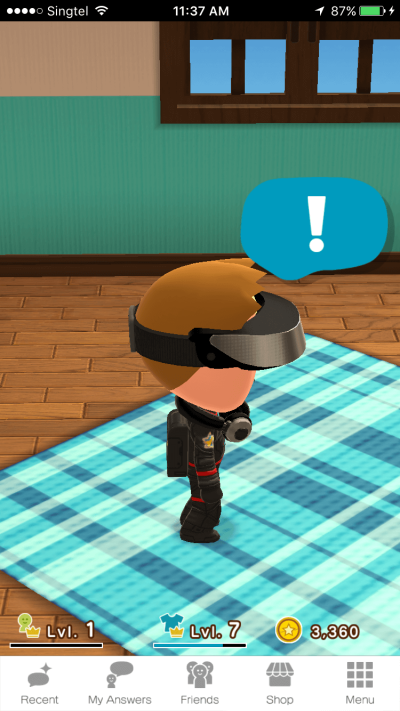
Nintendo has recently launched their first mobile application, which pays absolutely no attention to UI guidelines or common decency.
The initial launch screen shows the title of the app and a background image none of which reflect the application’s use.

After launch, a load screen first has a “Loading” text indicator as a minimalist spinner.

Then you get a numeric progress indicator.

And that’s followed by another spinner.

Finally, the application itself appears.
Over an incredible 14 second load time, Nintendo use two spinners and one progress bar, none of which do much to ease the load time. The dynamic “tips” during the load screen also act as a spinner by changing the UI state and creating a sense of progress.
Each discrete screen requires a new visual scan and makes the launch process seem even slower than it actually is.
The post How to Speed Up Your UX with Skeleton Screens appeared first on SitePoint.

Lovely subtle intro parallax effect in this slick Landing Page for Finely website development service.

Want to lower the cost of your Facebook ads? Curious how connecting with your customers can help? To explore Facebook ad sequences that cost less and improve results, I interview Amanda Bond, a leading Facebook ads expert. Her course is The StrADegy System. She’s a regular speaker at Social Media Marketing World and a HubSpot […]
The post Facebook Ad Sequences: A Better Way to Acquire Customers appeared first on Social Media Marketing | Social Media Examiner.