[ This is a content summary only. Visit our website https://ift.tt/1b4YgHQ for full links, other content, and more! ]


by Zia Muhammad via Digital Information World

Thinking about getting on the Jamstack bandwagon? If your answer is Yes, then Gatsby, one of the hottest platforms around, could be just what you’re looking for.
JAM stands for JavaScript, APIs, and Markup. In other words, while the dynamic parts of a site or app during the request/response cycle are taken care of by JavaScript in the client, all server-side processes take place using APIs accessed over HTTPS by JavaScript, and templated markup is prebuilt at deploy time, often using a static site generator. That’s the Jamstack. It’s performant, inexpensive to scale and offers better security and a smooth developer experience.
The static site model doesn’t fit all kinds of projects, but when it does it has a number of advantages. Here are a few of them.
The time it takes a website to load in the browser as the request is made for the first time is an important factor for user experience. Users get impatient very quickly, and things can only get worse on slow connections. A lack of database calls and the content being pre-generated make static sites really fast-loading.
A static site is made of static files which can be easily served all over the world using content delivery networks (CDNs). This makes it possible to leverage the data center that’s closer to where the request is being made.
Hosting for static sites can be set up in a snap. Because there’s no database or server-side code, special languages or frameworks to support, all the hosting has to do is to serve static files.
Without server-side code or a database, there isn’t anything for hackers to hack. There’s no hassle keeping the server up to date with security fixes and patches. All this means a lot more peace of mind when it comes to the security of your website.
Setting up your static website with a hosting company like Netlify or Vercel is straightforward and, with continuous deployment, you just push your changes to your code repo of choice and they’re immediately reflected in the live version.
Gatsby is one of the most popular tools for building websites today. It’s more than a static site generator. In fact, it is a “React-based, open-source framework for creating websites and apps.” As Gatsby is built on top of React, all the React goodness is at your fingertips, which enables you to take advantage of this powerful library to build interactive components right into your static website. Gatsby is also built with GraphQL, so you can query data and display it on your website any way you want.
Gatsby is put together using webpack, but you don’t need to worry about complicated set-up maneuvers; Gatsby CLI will take care of everything for you.
For this tutorial, I’ll assume you have Node.js installed locally. If this isn’t the case, then head over to the Node home page and download the correct binaries for your system. Alternatively, you might consider using a version manager to install Node. We have a tutorial on using a version anager here.
Node comes bundled with npm, the Node package manager, which we’re going to use to install some of the libraries we’ll be using. You can learn more about using npm here.
You can check that both are installed correctly by issuing the following commands from the command line:
node -v
> 12.18.4

npm -v
> 6.14.8
The first thing you need to do is install the Gatsby CLI. This is an npm package that lets you create a Gatsby site in a few seconds. In your terminal, write:
npm install -g gatsby-cli
With the Gasby CLI installed on your machine, you can go ahead and create your website. I’ll call it sitepoint-demo, but you’re free to call it whatever you like. In your terminal, type:
gatsby new sitepoint-demo
Once Gatsby CLI has installed all the necessary files and configured them appropriately, you’ll have a fully functioning Gatsby website ready for you to customize and build upon. To access it, move into the sitepoint-demo folder:
cd sitepoint-demo
and start the local server:
gatsby develop
Finally, open a window on http://localhost:8000 where you’ll find your shiny Gatsby site looking something like this:
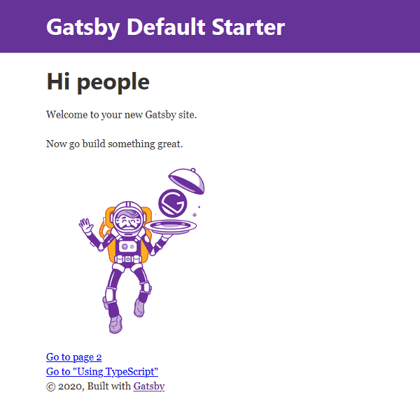
To quickly get a website up and running, Gatsby takes advantage of several official starter boilerplates as well as starters offered by the strong community around it. The site you’ve just created uses Gatsby default starter, but you can find plenty more on the Gatsby website.
If you’d like to use a different starter from the default one, you need to specify its URL in the command line, following this pattern:
gatsby new [SITE_DIRECTORY_NAME] [URL_OF_STARTER_GITHUB_REPO]
For instance, let’s say you’d like a Material Design look and feel for your site. The quickest way to create it is to use Gatsby Material Starter by typing the following command in your terminal:
gatsby new sitepoint-demo https://github.com/Vagr9K/gatsby-material-starter
Great! Now let’s take a look at the files inside your brand new Gatsby project.
A good place to start is the /src/ directory. Here’s what you’ll find.
pages DirectoryThe /src/pages/ directory contains your site’s pages. Each page is a React component. For instance, your site’s home-page code is located in /pages/index.js and looks like this:
import React from "react"
import { Link } from "gatsby"
import Layout from "../components/layout"
import Image from "../components/image"
import SEO from "../components/seo"

const IndexPage = () => (
<Layout>
  <SEO title="Home" />
  <h1>Hi people</h1>
  <p>Welcome to your new Gatsby site.</p>
  <p>Now go build something great.</p>
  <div style=>
    <Image />
  </div>
  <Link to="/page-2/">Go to page 2</Link>
  <Link to="/using-typescript/">Go to "Using TypeScript"</Link>
</Layout>
)

export default IndexPage
That’s the typical code for a React component.
Components let you split the UI into independent, reusable pieces, and think about each piece in isolation. … Conceptually, components are like JavaScript functions. They accept arbitrary inputs (called “props”) and return React elements describing what should appear on the screen. — React docs.
components DirectoryThe /src/components/ directory is where you find general components for your website. The default starter comes with the following components: Header (header.js), Image (image.js), Layout (layout.js), and SEO (seo.js). You’re free to customize these components and add your own to the same directory.
Now you’re ready to start making changes to your new site and customize it to your taste.
Let’s have a go at modifying the message displayed on the home page. Open pages/index.js in your code editor and replace the two paragraphs below the <h1> tag with this paragraph:
<p>Welcome to my SitePoint Demo Site!</p>
Of course, you can add any text you want ibetween the <p> tags.
As soon as you hit Save, your changes are displayed in the browser thanks to Gatsby’s hot reloading development environment. This means that when you develop a Gatsby site, pages are being watched in the background so that when you save your work, changes will be immediately visible without needing a page refresh or a browser restart.
Gatsby makes it easy to add new pages. For instance, let’s add an About page by creating a new file, about.js, inside the /pages/ directory and enter this content:
import React from "react"

const AboutPage = () => <h1>About Me</h1>

export default AboutPage
The code above is a React functional component which displays some text.
Save your work and navigate to http://localhost:8000/about and you should see the About Me <h1> title on your screen.
You can quickly link to your new About page from the home page using the Gatsby Link component. To see how it works, open index.js in your code editor and locate this bit of code just before the </Layout> closing tag:
<Link to="/page-2/">Go to page 2</Link>
Next, replace the value of the to property with /about/ and the Go to page 2 text with About:
<Link to="/about/">About</Link>
Save your work and you should see your new link on the screen. Click on the About link and instantly you’re on the About page.
Gatsby uses the Link component for internal links. For external links, you should use the good old <a> tag, like you would on a regular vanilla HTML website.
Now, let’s experiment with your Gatsby site’s look and feel by changing a few styles.
Gatsby offers a number of options for applying style rules to your website.
A familiar choice is to use a global .css file which contains rules that apply to the entire website. To get started, add a /styles/ directory inside the /src/ directory and add a global.css file to it: /src/styles/global.css . You’re free to choose any name you like both for the directory and the style-sheet file. Inside global.css, add the following CSS declaration, which is going to be applied to the entire website:
body {
  background-color: yellow;
}
Now, save your work. Oops, nothing happened! Not yet, anyway. To make it work you need to take an extra step. Open gatsby-browser.js in your code editor and import the stylesheet you’ve just created:
import "./src/styles/global.css"
Head back to your browser and you should see that the background color of your website has turned into a bright yellow. Not ideal as a color choice, but it works!
Continue reading Getting Started with Gatsby: Build Your First Static Site on SitePoint.

In this article, we’re going to create an iOS-inspired toggle switch using React. This will be a small, self-contained component that you’ll be able to reuse in future projects. As we go, we’ll also build a simple demo React app that uses our custom toggle switch component.
We could use third-party libraries for this, but building from scratch allows us to better understand how our code is working and allows us to customize our component completely.
Forms provide a major means for enabling user interactions. The checkbox is traditionally used for collecting binary data — such as yes or no, true or false, enable or disable, on or off, etc. Although some modern interface designs steer away from form fields when creating toggle switches, I’ll stick with them here due to their greater accessibility.
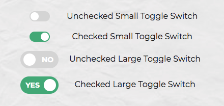
Here’s a screenshot of the component we’ll be building:
Let’s use Create React App to get a React app up and running quickly. If you’re unfamiliar with Create React App, check out our getting started guide.
create-react-app toggleswitch
Once everything has installed, change into the newly created directory and start the server with yarn start (or npm start if you prefer). This will start the development server at http://localhost:3000.
Next, create a ToggleSwitch directory in the src directory. This is where we will make our component:
mkdir src/ToggleSwitch
In this directory, make two files: ToggleSwitch.js and ToggleSwitch.scss:
touch ToggleSwitch.js ToggleSwitch.scss
Finally, alter App.js as follows:
import React from 'react';
import ToggleSwitch from './ToggleSwitch/ToggleSwitch'

function App() {
  return (
    <ToggleSwitch />
  );
}

export default App;
We can start with a basic HTML checkbox input form element with its necessary properties set:
<input type="checkbox" name="name" id="id" />
To build around it, we might need an enclosing <div> with a class, a <label> and the <input /> control itself. Adding everything, we might get something like this:
<div class="toggle-switch">
  <input type="checkbox" class="toggle-switch-checkbox" name="toggleSwitch" id="toggleSwitch" />
  <label class="toggle-switch-label" for="toggleSwitch">
    Toggle Me!
  </label>
</div>
In time, we can get rid of the label text and use the <label> tag to check or uncheck the checkbox input control. Inside the <label>, let’s add two <span> tags that help us construct the switch holder and the toggling switch itself:
<div class="toggle-switch">
  <input type="checkbox" class="toggle-switch-checkbox" name="toggleSwitch" id="toggleSwitch" />
  <label class="toggle-switch-label" for="toggleSwitch">
    <span class="toggle-switch-inner"></span>
    <span class="toggle-switch-switch"></span>
  </label>
</div>
Now that we know what needs to go into the HTML, all we need to do is to convert the HTML into a React component. Let’s start with a basic component here. We’ll make this a class component, and then we’ll convert it into hooks, as it’s easier for new developers to follow state than useState.
Add the following to src/ToggleSwitch/ToggleSwitch.js:
import React, { Component } from "react";

class ToggleSwitch extends Component {
  render() {
    return (
      <div className="toggle-switch">
        <input
          type="checkbox"
          className="toggle-switch-checkbox"
          name="toggleSwitch"
          id="toggleSwitch"
        />
        <label className="toggle-switch-label" htmlFor="toggleSwitch">
          <span className="toggle-switch-inner" />
          <span className="toggle-switch-switch" />
        </label>
      </div>
    );
  }
}

export default ToggleSwitch;
At this point, it’s not possible to have multiple toggle switch sliders on the same view or same page due to the repetition of ids. We could leverage React’s way of componentization here, but in this instance, we’ll be using props to dynamically populate the values:
import React, { Component } from 'react';

class ToggleSwitch extends Component {
  render() {
    return (
      <div className="toggle-switch">
        <input
          type="checkbox"
          className="toggle-switch-checkbox"
          name={this.props.Name}
          id={this.props.Name}
        />
        <label className="toggle-switch-label" htmlFor={this.props.Name}>
          <span className="toggle-switch-inner" />
          <span className="toggle-switch-switch" />
        </label>
      </div>
    );
  }
}

export default ToggleSwitch;
The this.props.Name will populate the values of id, name and for (note that it is htmlFor in React JS) dynamically, so that you can pass different values to the component and have multiple instances on the same page. Also notice that the <span> tag doesn’t have an ending </span> tag. Instead, it’s closed in the starting tag like <span />, and in terms of JSX this is completely fine.
Test this out by changing the contents of App.js as follows:
function App() {
  return (
    <>
      <ToggleSwitch Name='newsletter' />
      <ToggleSwitch Name='daily' />
      <ToggleSwitch Name='weekly' />
      <ToggleSwitch Name='monthly' />
    </>
  );
}
Inspect the resultant output at http://localhost:3000/ (possibly using your browser’s dev tools) and ensure everything is working correctly.
I recently wrote about styling React Components, where I compared the various ways this was possible. In that article, I concluded that SCSS is the best method, and that’s what we’ll use here.
For SCSS to work with Create React App, you’ll need to install the node-sass package:
yarn add node-sass
We’ll also need to import the correct file into our component:
// ToggleSwitch.js

import React, { Component } from 'react';
import './ToggleSwitch.scss';
...
Now for the styling. This is a rough outline of what we’re after:
75px wide and vertically aligned inline-block so that it’s inline with the text and doesn’t cause layout problems.::after and ::before pseudo-elements needs to be styled and made into elements to get them into the DOM and style them.And this is what that looks like in SCSS. Add the following to src/ToggleSwitch/ToggleSwitch.scss:
.toggle-switch {
  position: relative;
  width: 75px;
  display: inline-block;
  vertical-align: middle;
  -webkit-user-select: none;
  -moz-user-select: none;
  -ms-user-select: none;
  text-align: left;
  &-checkbox {
    display: none;
  }
  &-label {
    display: block;
    overflow: hidden;
    cursor: pointer;
    border: 0 solid #bbb;
    border-radius: 20px;
    margin: 0;
  }
  &-inner {
    display: block;
    width: 200%;
    margin-left: -100%;
    transition: margin 0.3s ease-in 0s;
    &:before,
    &:after {
      display: block;
      float: left;
      width: 50%;
      height: 34px;
      padding: 0;
      line-height: 34px;
      font-size: 14px;
      color: white;
      font-weight: bold;
      box-sizing: border-box;
    }
    &:before {
      content: "Yes";
      text-transform: uppercase;
      padding-left: 10px;
      background-color: #f90;
      color: #fff;
    }
  }
  &-disabled {
    background-color: #ddd;
    cursor: not-allowed;
    &:before {
      background-color: #ddd;
      cursor: not-allowed;
    }
  }
  &-inner:after {
    content: "No";
    text-transform: uppercase;
    padding-right: 10px;
    background-color: #bbb;
    color: #fff;
    text-align: right;
  }
  &-switch {
    display: block;
    width: 24px;
    margin: 5px;
    background: #fff;
    position: absolute;
    top: 0;
    bottom: 0;
    right: 40px;
    border: 0 solid #bbb;
    border-radius: 20px;
    transition: all 0.3s ease-in 0s;
  }
  &-checkbox:checked + &-label {
    .toggle-switch-inner {
      margin-left: 0;
    }
    .toggle-switch-switch {
      right: 0px;
    }
  }
}
Assuming you’re following along, if you head to the dev server at http://localhost:3000/ you’ll now see four nicely styled toggle switches. Try toggling them; they should all work.
Also take a while to go through the code above. If there’s anything you’re unsure about, you can consult the Sass documentation, or head over to the SitePoint Forums and ask a question.
Currently, the toggle options are hard coded:
.toggle-switch {
  ...
  &-inner {
    ...
    &:before {
      content: "Yes";
      ...
    }
  }
  ...
  &-inner:after {
    content: "No";
    ...
  }
  ...
}
To make the component more flexible, we can grab these dynamically from the control using HTML5 data-attributes:
&:before {
  content: attr(data-yes);
  ...
}
&-inner:after {
  content: attr(data-no);
  ...
}
We’ll hardcode the data attributes for testing, but will make this more flexible in the final version:
// ToggleSwitch.js

class ToggleSwitch extends Component {
  render() {
    return (
      <div className="toggle-switch">
        ...
        <label className="toggle-switch-label" htmlFor={this.props.Name}>
          <span className="toggle-switch-inner" data-yes="Ja" data-no="Nein"/>
          <span className="toggle-switch-switch" />
        </label>
      </div>
    );
  }
}
Also, for smaller screens, it would be a great idea to use a smaller version of switch, without the text. So let’s add the styling for it with some minimal sizes and removing the text:
.toggle-switch {
  ...
  &.small-switch {
    width: 40px;
    .toggle-switch-inner {
      &:after,
      &:before {
        content: "";
        height: 20px;
        line-height: 20px;
      }
    }
    .toggle-switch-switch {
      width: 16px;
      right: 20px;
      margin: 2px;
    }
  }
}
With respect to responsiveness, we should be changing the complete size, so let’s use the CSS scale function. Here we’ve covered all the Bootstrap-based responsive widths of devices:
.toggle-switch {
  ...
  @media screen and (max-width: 991px) {
    transform: scale(0.9);
  }
  @media screen and (max-width: 767px) {
    transform: scale(0.825);
  }
  @media screen and (max-width: 575px) {
    transform: scale(0.75);
  }
}
You can test this out by adding the small-switch class to the parent <div> element in ToggleSwitch.js:
class ToggleSwitch extends Component {
  render() {
    return (
      <div className="toggle-switch small-switch">
        ...
      </div>
    );
  }
}
Head back to the dev server and test your changes. If you’d like to check what you have against the finished SCSS file, you can find that here.
Since we can use variables in SCSS, adding support for multiple color themes in our app is made easier. You can read more about this in “Sass Theming: The Never Ending Story”. We’ll be using some color themes here and change all the raw colors to variables. The first three lines are a configurable set of colors, which helps us theme our little control:
// Colors
$label-colour: #bbb;
$disabled-colour: #ddd;
$toggle-colour: #2F855A;
$white: #fff;

// Styles
.toggle-switch {
  ...
  &-label {
    ...
    border: 0 solid $label-colour;
  }
  &-inner {
    ...
    &:before {
      ...
      background-color: $toggle-colour;
      color: $white;
    }
  }
  &-disabled {
    background-color: $disabled-colour;
    cursor: not-allowed;
    &:before {
      background-color: $disabled-colour;
      cursor: not-allowed;
    }
  }
  &-inner:after {
    ...
    background-color: $label-colour;
    color: $white;
  }
  &-switch {
    ...
    background: $white;
    border: 0 solid $label-colour;
  }
  ...
}
And that’s it with the styling. Now let’s add some interactivity.
Continue reading Create a Toggle Switch in React as a Reusable Component on SitePoint.


‘Split’ is a free One Page multipurpose template with a minimal, centrally-divided layout. The template can be used for pretty much anything but perfect for a professional online presence featuring a big image of yourself, team or product with alongside content.


➡️ Looking to share your job listing in Frontend Focus? More info here.
|


