In this article, we are going to learn seven ways in which you can place elements in a web page using the Grid Layout module.
Previously, SitePoint published Introducing the CSS Grid Layout and An Introduction to the CSS Grid Layout Module. Recently, I also wrote Where Things Are at in the CSS Grid Layout Working Draft.
Here, the focus will be entirely on specific ways in which you can lay out elements on the web using CSS Grid. Now, let's go over each one of them.
Addressing the Poor Support for Grid Layout
As I mentioned in previous articles, Grid Layout has very poor browser support. None of the major browsers support it by default and IE supports the old implementation. To properly work with all the examples in this article, I suggest that you enable the "Experimental Web Platform features" flag in Chrome and the "layout.css.grid.enabled" flag in Firefox. For readers who find it problematic to enable these flags, I have added a screenshot to show the final result of each technique.
#1 Specifying Everything in Individual Properties
This is the version we have been using to place the elements in our previous articles. This method is verbose but easy to understand. Basically, the left/right and top/bottom bounds of an element are specified using grid-column-start/grid-column-end and grid-row-start/grid-row-end properties. If an element is only going to span one row or column, you can omit the -end properties, this way you will have to write a little less CSS.
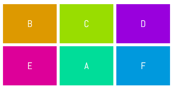
In the demo below, element A has been placed in the second row and second column using the following CSS:
[code language="css"]
.a {
grid-column-start: 2;
grid-column-end: 3;
grid-row-start: 2;
grid-row-end: 3;
}
[/code]
The same effect could be achieved by using:
[code language="css"]
.a {
grid-column-start: 2;
grid-row-start: 2;
}
[/code]
See the Pen Specifying Everything in individual Properties by SitePoint (@SitePoint) on CodePen.
#2 Using grid-row and grid-column

Even though the CSS in our first example was readable and easy to understand, we had to use four different properties to place a single element. Instead of using four properties, we can just use two — grid-column and grid-row. Both these properties will take two values separated by a slash where the first value will determine the start line and the second value will determine the end line of our element.
Here is the syntax you need to use with these properties:
[code language="css"]
.selector {
grid-row: row-start / row-end;
grid-column: col-start / col-end;
}
[/code]
To place item C in the bottom right corner of our grid, we can use the following CSS:
[code language="css"]
.c {
grid-row: 2 / 4;
grid-column: 2 / 4;
}
[/code]
See the Pen Using grid-row and grid-column by SitePoint (@SitePoint) on CodePen.
Continue reading %Seven Ways You Can Place Elements Using CSS Grid Layout%
by Nitish Kumar via SitePoint
No comments:
Post a Comment