If you work on the web, you probably already understand that most readers don't diligently read every word of your content. Instead, they begin by scanning across it almost unconsciously – similar to the way you might scan passing food labels in a supermarket aisle.
Why do we scan?
Simple. We scan because it demands much less mental effort and we prefer to save our focus for the important stuff. We ‘skim across’ content until we find something that really captures out attention – when we activate our “slow thinking”.
The supermarket is a classic example of a place where we scan. Our eyes might take in 50 different varieties of pasta sauce without properly reading any of the labels.
However, when we turn on our “slow, focused thinking” – perhaps reading the ingredients on a sauce jar – our brain starts consuming a lot more mental energy – which is a limited resource.
Introducing 'Focus Points'
So, let’s gamify this idea and call this brain energy 'Focus Points (FP)'. The more focus points we spend, the more tired we feel and the more our thinking power weakens.
When a user scans a long page of content, they are spending these 'focus points' each time they pay attention to pieces of content they find interesting. The longer they scroll, the more fatigued they get.
Of course, this means the content offerings they discover further down the page get less attention. Like trying to entice a shopper with an overstuffed trolley, they simply have less 'FPs' left to spend. Therefore even high-quality content options become less visible and engaging. We call this phenomenon a scrolling fatigue.
Let's draw some lines to visualize all this focus economy. If you are scanning a content without committing any effort, you just gradually burning your focus until you get tired and eventually quit.
[caption id="attachment_155906" align="aligncenter" width="800"] Chart: Focus vs scrolling distance. A smooth decrease.[/caption]
However, if you engage with the content without any 'reward', you just spend a bunch of focus points on a spot. For example, if you actively engage in each story in your social media feed, your brain will shut down just after a few meaningful interactions.
[caption id="attachment_155907" align="aligncenter" width="800"] Chart: Focus vs Scrolling distance. Interactions demand mental energy.[/caption]
Readability and Focus
Another factor you should keep in mind is readability. If your content is hardly readable, it requires more effort to digest, burning focus points faster. So unless you intentionally want to hurt your users, don't make your list difficult and expose only essential information. Do you really need the publish date? Do you need the topic on every listing?
[caption id="attachment_155908" align="aligncenter" width="800"] Chart: Focus vs Scroll distance. Increased readability translates to longer average engaged scrolls.[/caption]
Rage-quits and Zombies
[caption id="at" align="alignright" width="400"] Very long scrolling pages are bad for you.[/caption]
Generally, as users move into the zone of scrolling fatigue, their brain becomes less susceptible to standard hooks and reward mechanisms (the curve of focus points drops exponentially). This automatically lowers any motivation to put any effort into digesting information end eventually they quit.
It's almost as if scrolling fatigued users become zombified. To avoid this situation we have to minimize the consumption of focus points.
How Does Fatigue Impact on Different Types of Content Collections
If you are designing a large content collection with large scroll range - you also face fatigue problem. You must expose as much content as possible at the same time keep your users conscious enough to engage it.
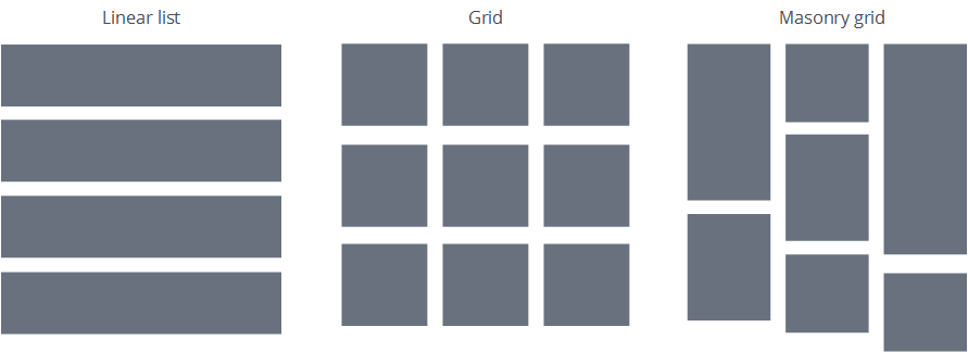
To understand how to deal with this, you should know how users scan different list layouts. Let’s get a little bit practical here. Today, there are three main types of content lists:
[caption id="attachment_155909" align="aligncenter" width="891"] Three grid types[/caption]
Linear lists
The most natural and common way to display chunks of content is just put them into rows. Google search results and eBay listings fit this classic pattern. Linear lists are the easiest to scan, it's hard to miss any content item and users can compare items side-by-side because they are all aligned together.
The downside of linear lists tends to be mostly aesthetic. Typically they take more space and can be visually boring (and I’m not talking about Excel here).
Classic Grids
The second most common option is to place your items in a 2D grid. This is a brilliant way to squeeze more content into the viewport – especially if your content is more graphical than text. Photo galleries and shopping sites love this pattern.
And this is perfectly fine – until you need your users to pay attention to every item. Since scanning a grid pattern is much more demanding than a linear list, you will burn through your user's focus points more quickly. Also, after a short time, users will typically start skipping chunks of content and your grid usability will fail.
The Masonry Grid
Masonry grids are a variation on the classic grid – but with much more unit-size variation. Many would argue that the Masonry grid is the most aesthetically pleasing way to display graphical content. It lets you tile the entire viewport and makes each content item a different size. Pinterest is probably the most famous Masonry grid layout, but you'll find masonry widely-used in mood boards and showcases.
However, on the downside, it is pure visual chaos. It has no obvious visual order and no clear eye lead pattern. So if you are trying to use masonry to represent some kind of IA structure, you will likely just end up confusing your users.
Continue reading %The UX of the Zombie Scroller (and How to Cure It)%
by Petras Baukys via SitePoint
No comments:
Post a Comment