This article was sponsored by MDBootstrap. Thank you for supporting the partners who make SitePoint possible.
As a SitePoint reader, you’re undoubtedly interested in creating bleeding-edge, sophisticated websites and applications. You may not write everything from scratch, but you want a deep understanding of the code. You need nothing more than a text editor to build your next award-winning masterpiece.
Unfortunately, working life isn’t always so simple. You could be taking your first steps toward becoming a web development ninja. Your boss may want something completed within hours rather than days. Your client could be at the lower end of the budgetary spectrum. You need something practical developed quickly and painlessly within a few hours.
Many would consider a CMS such as WordPress. It’s a good option but it can be overkill and take too much time. Novice coders may be daunted by hosting requirements, PHP setups, MySQL database creation and the WordPress ecosystem. Even if your initial installation goes smoothly, you need to locate, install, configure and use appropriate themes and plugins.
Enter the MDBootstrap UI Kit
Fortunately, there’s an easier alternative. Material Design for Bootstrap (mdbootstrap.com) provides a set of slick, responsive page templates, layouts, components and widgets to rapidly build web pages. There’s no complication or fuss: you just copy and paste code into one or more HTML files. It’ll help if you have a basic understanding of client-side web development, but even those with a rudimentary knowledge of HTML can build an attractive page within minutes.
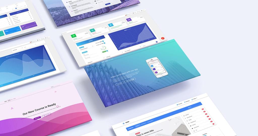
The free edition has more than 400 components to choose from. The commercial PRO edition contains more than 2,000 components with additional templates, tutorials, tools, and support. Both editions come in jQuery, Angular 4, or React flavors so you can select the most appropriate framework. (If in doubt, stick with jQuery, which has a shallower learning curve and legacy browser support.). If necessary, your resulting page templates can be imported into WordPress so your client can add and update content.
Here’s the final product we’ll be building in this tutorial:
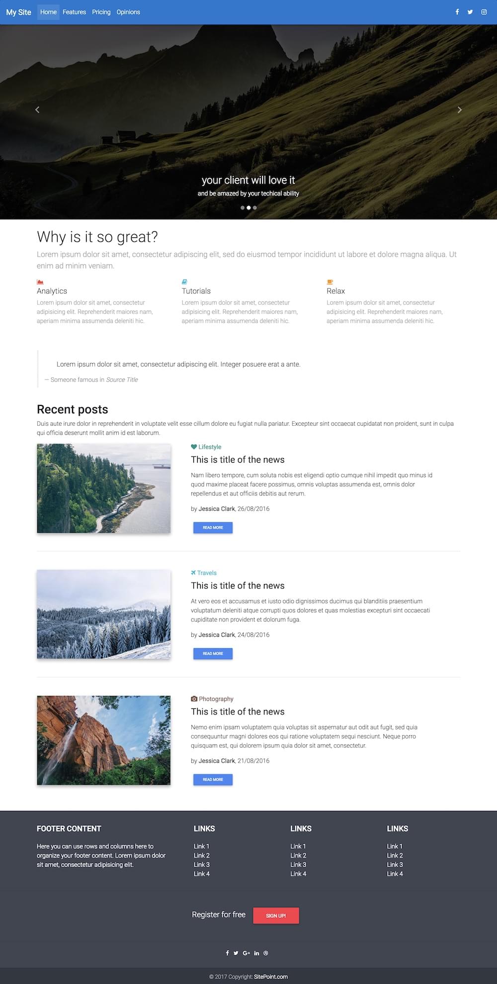
You can check out a live preview of our finished product here.
To create this, we’ll be incorporating a range of elements from Material Design for Bootstrap:
- navigation
- a carousel
- a feature overview section
- blockquote styling from the typography library
- a recent posts section
- a footer
Install MDBootstrap by downloading and extracting the ZIP file to an appropriate location on your PC. You can use any folder, since most pages will open in a browser directly from your file system. That said, I’d recommend you place them in a web server folder — especially if you intend to use JavaScript-powered components. If you don’t have a server installed, a quick option is http-server for Node.js (which exposes the current folder as a web root) or an all-in-one package such as XAMPP. Alternatively, you may be able to upload the files to your web host and edit there using a compatible editor such as codeanywhere.
Your First MDBootstrap Page
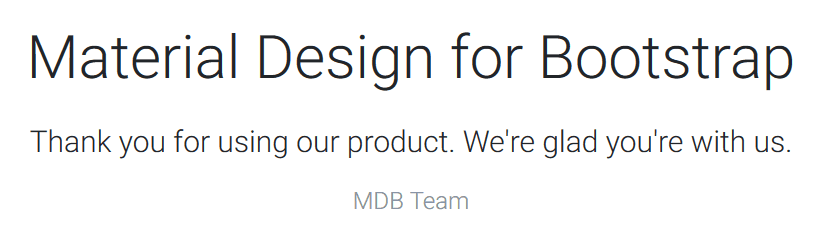
Open index.html in your web browser and you’ll see a home page with a welcome message:
Now open index.html in your text editor or IDE of choice (perhaps the fabulous and free VS Code or Atom). Delete the lines of HTML between:
<!-- Start your project here-->
and
<!-- /Start your project here-->
Then replace them with this:
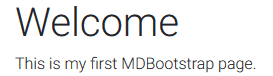
<div class="container-fluid">

  <h1>Welcome</h1>
  <p>This is my first MDBootstrap page.</p>

</div>
The code defines a container which provides a margin and responds to the browser width. It contains a title and paragraph:
Copying HTML and CSS
You’re now ready to insert your own components. Head over to mdbootstrap.com and click the menu icon at the top left of the page. A long list of categorized components can be selected.
Most components require you to insert HTML into your page. Some also require additional CSS styles which should be copied and pasted into the (initially empty) css/style.css file. A link to this stylesheet is already provided in the HTML <head>:
<link href="css/style.css" rel="stylesheet">
Creating an Advanced Layout
Now we’ll start building the more advanced layout that we previewed at the start of the tutorial.
Make sure you revert back to an empty page by removing the code between:
<!-- Start your project here-->
and
<!-- /Start your project here-->
Add Navigation
The MDBootstrap Layout / Navigation provides a variety of options which collapse to hamburger menus when space is limited. The Regular Fixed Navbar HTML can be copied into the page immediately after <!-- Start your project here-->.
I’ve added a couple of tweaks:
bg-pinkin thenavclass has been changed tobg-blue, and- the
Navbartitle has been changed toMy Site.
<!--Main Navigation-->
<header>
  <nav class="navbar fixed-top navbar-expand-lg navbar-dark bg-blue scrolling-navbar">
    <a class="navbar-brand" href="#"><strong>My Site</strong></a>
    <button class="navbar-toggler" type="button" data-toggle="collapse" data-target="#navbarSupportedContent" aria-controls="navbarSupportedContent" aria-expanded="false" aria-label="Toggle navigation">
        <span class="navbar-toggler-icon"></span>
    </button>
    <div class="collapse navbar-collapse" id="navbarSupportedContent">
      <ul class="navbar-nav mr-auto">
        <li class="nav-item active">
          <a class="nav-link" href="#">Home <span class="sr-only">(current)</span></a>
        </li>
        <li class="nav-item">
          <a class="nav-link" href="#">Features</a>
        </li>
        <li class="nav-item">
          <a class="nav-link" href="#">Pricing</a>
        </li>
        <li class="nav-item">
          <a class="nav-link" href="#">Opinions</a>
        </li>
      </ul>
      <ul class="navbar-nav nav-flex-icons">
          <li class="nav-item">
            <a class="nav-link"><i class="fa fa-facebook"></i></a>
          </li>
          <li class="nav-item">
            <a class="nav-link"><i class="fa fa-twitter"></i></a>
          </li>
          <li class="nav-item">
            <a class="nav-link"><i class="fa fa-instagram"></i></a>
          </li>
      </ul>
    </div>
  </nav>
</header>
<!--Main Navigation-->
The result:

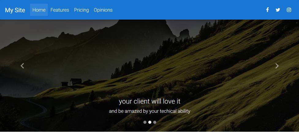
Add a Carousel
I’m not a big fan of carousels, but clients usually love them. The MDBootstrap JavaScript / Carousel provides numerous options, but we’ll use the Basic Example by pasting the HTML immediately after the navigation menu:
<!--Carousel Wrapper-->
<div id="carousel-example-2" class="carousel slide carousel-fade" data-ride="carousel">
  <!--Indicators-->
  <ol class="carousel-indicators">
    <li data-target="#carousel-example-2" data-slide-to="0" class="active"></li>
    <li data-target="#carousel-example-2" data-slide-to="1"></li>
    <li data-target="#carousel-example-2" data-slide-to="2"></li>
  </ol>
  <!--/.Indicators-->
  <!--Slides-->
  <div class="carousel-inner" role="listbox">
    <div class="carousel-item active">
      <div class="view hm-black-light">
        <img class="d-block w-100" src="https://mdbootstrap.com/img/Photos/Slides/img%20(68).jpg" alt="First slide">
        <div class="mask"></div>
      </div>
      <div class="carousel-caption">
        <h3 class="h3-responsive">Yeah, so carousels are a bit "meh"</h3>
        <p>But...</p>
      </div>
    </div>
    <div class="carousel-item">
      <!--Mask color-->
      <div class="view hm-black-strong">
        <img class="d-block w-100" src="https://mdbootstrap.com/img/Photos/Slides/img%20(6).jpg" alt="Second slide">
        <div class="mask"></div>
      </div>
      <div class="carousel-caption">
        <h3 class="h3-responsive">your client will love it</h3>
        <p>and be amazed by your techical ability</p>
      </div>
    </div>
    <div class="carousel-item">
      <!--Mask color-->
      <div class="view hm-black-slight">
        <img class="d-block w-100" src="https://mdbootstrap.com/img/Photos/Slides/img%20(9).jpg" alt="Third slide">
        <div class="mask"></div>
      </div>
      <div class="carousel-caption">
        <h3 class="h3-responsive">Be prepared</h3>
        <p>to have money thrown at you!</p>
      </div>
    </div>
  </div>
  <!--/.Slides-->
  <!--Controls-->
  <a class="carousel-control-prev" href="#carousel-example-2" role="button" data-slide="prev">
    <span class="carousel-control-prev-icon" aria-hidden="true"></span>
    <span class="sr-only">Previous</span>
  </a>
  <a class="carousel-control-next" href="#carousel-example-2" role="button" data-slide="next">
    <span class="carousel-control-next-icon" aria-hidden="true"></span>
    <span class="sr-only">Next</span>
  </a>
  <!--/.Controls-->
</div>
<!--/.Carousel Wrapper-->
It’s a lot of code, but don’t be afraid to change the image src attributes, h3 titles and p paragraph text. You can also add or remove <div class="carousel-item"> blocks as necessary.
Save and refresh your page in the browser:
Continue reading %How to Get Started with Material Design for Bootstrap%
by Craig Buckler via SitePoint
No comments:
Post a Comment