Showing posts with label Mobile Branding. Show all posts

Tuesday, October 20, 2020

How to Create a Reddit Clone Using React and Firebase

An inventor placing a FireBase heart into a robot creation

React is a fantastic front-end library for building user interfaces. When picking a back end to use alongside it, you can’t go far wrong with Firebase, a Backend-as-a-Service (Baas) that makes it easy to add data persistence (and much more besides) to your React app.

In this tutorial, we’ll be using Firebase along with Create React App to build an application that will function similarly to Reddit. It will allow the user to submit a new post that can then be voted on. I’ll also demonstrate how to deploy our Reddit clone to Vercel.

Once you’ve finished reading, you’ll understand how to set up Firebase, how to connect it to your React app and how to deploy the result.

An inventor placing a FireBase heart into a robot creation

Why Firebase?

One of Firebase’s strengths is that it makes it very easy for us to show real-time data to the user. Once a user votes on a link, the feedback will be instantaneous. Firebase’s Realtime Database will help us in developing this feature. Also, it will help us to understand how to bootstrap a React application with Firebase.

Why React?

React is particularly known for creating user interfaces using a component architecture. Each component can contain internal state or be passed data as props. State and props are the two most important concepts in React. These two things help us determine the state of our application at any point in time. If you’re not familiar with these terms, please head over to the React docs first.

Note: you can also use a state container like Redux or MobX, but for the sake of simplicity, we won’t be using one for this tutorial.

Here’s a live demo of what we’ll be building. The code for this application is available on GitHub.

Setting up the Project

To follow along, you’ll need to have Node and npm installed on your machine. If you haven’t, head to the Node.js download page and grab the latest version for your system (npm comes bundled with Node). Alternatively, you can consult our tutorial on installing Node using a version manager.

Let’s walk through the steps to set up our project structure and any necessary dependencies.

Bootstrapping a React App

We can create a new React application with the help of Create React App using the following command:

npx create-react-app reddit-clone

This will scaffold a new create-react-app project inside the reddit-clone directory. Our directory structure should be as follows:

Default structure of directory

Once the bootstrapping is done, we can enter the reddit-clone directory and fire up the development server:

cd reddit-clone && npm start

At this point, we can visit http://localhost:3000/ and see our application up and running.

Default page of Create React App

Structuring the App

It’s always a good practice to remove all the files that we don’t need after bootstrapping any application. There are a few files generated by Create React App that we won’t need, so we’ll remove them.

We can remove the following files:

  1. src/App.css
  2. src/App.test.js
  3. src/index.css
  4. src/logo.svg
  5. src/serviceWorker.js
  6. src/setupTests.js

We can also remove the following dependencies from our package.json file:

  1. @testing-library/jest-dom
  2. @testing-library/react
  3. @testing-library/user-event

We can also remove the test script from our package.json file. This is because we won’t be writing any tests for our application. If testing a React app is something you’d like to look into, please consult our tutorial, “How to Test React Components Using Jest”.

Our src/index.js file should contain the following:

import React from "react";
import ReactDOM from "react-dom";
import App from "./app";

ReactDOM.render(
  <React.StrictMode>
    <App />
  </React.StrictMode>,
  document.getElementById("root")
);

We’ll rename our src/App.js to src/app.js. Alter it to contain the following:

import React from "react";

function App() {
  return <div>Hello world!</div>;
}

export default App;

Now, we can restart our development server using the following command from our root directory:

npm start

Our development server should be up and running on http://localhost:3000/ and it should look like the following:

The UI of our application after removing unnecessary files

Creating a New Firebase Project

In this section, we’ll be installing and integrating Firebase with our application.

If you don’t have a Firebase account, you can create one free account now by visiting their website. After you’re done creating a new account, log in to your account and go to the console page and click on Create a project.

Enter the name of your project (I’ll call mine reddit-clone), accept the terms and conditions, and click on the Continue button.

Step 1 of creating a Firebase project

In the next step, you should choose whether to enable Google Analytics for the project, then click on the Continue button.

Step 2 of creating a Firebase project

In step three, we should select a Google Analytics account and then click on the Create project button:

Step 3 of creating a Firebase project

After a short while, you’ll see a notice that your new project is ready. Click Continue to exit the wizard.

Creating a New App in the Firebase Project

In this section, we’ll be creating a new Firebase app from the Firebase console. We can create a Web app by selecting the web option.

Creating a new Firebase web app: Step 1

Next, we’ll need to enter the name of the project and click on the Register app button, leaving the Also set up Firebase Hosting checkbox unchecked.

Creating a new Firebase web app: Step 2

Now you’ll see all the credentials for our new Firebase web app.

Creating a new Firebase web app: Step 3

Make a note of these credentials and click Continue to console.

We can now add our app’s credentials to an environment file:

// .env

REACT_APP_FIREBASE_API_KEY="123456"
REACT_APP_FIREBASE_AUTH_DOMAIN="reddit-clone-123456.firebaseapp.com"
REACT_APP_FIREBASE_PROJECT_ID="reddit-clone-123456"
REACT_APP_FIREBASE_STORAGE_BUCKET="reddit-clone-123456.appspot.com"
REACT_APP_FIREBASE_MESSAGING_SENDER_ID="123456"
REACT_APP_FIREBASE_APP_ID="1:123456:web:123456"
REACT_APP_FIREBASE_MEASUREMENT_ID="G-123456"

Note: it’s always a good idea to store all credentials in an environment file and add that file to .gitignore so that the credentials are never leaked into the source code.

Next, we can create a new file src/lib/firebase.js where we’ll store all our Firebase credentials:

import firebase from "firebase";

const firebaseConfig = {
  apiKey: process.env.REACT_APP_FIREBASE_API_KEY,
  authDomain: process.env.REACT_APP_FIREBASE_AUTH_DOMAIN,
  projectId: process.env.REACT_APP_FIREBASE_PROJECT_ID,
  storageBucket: process.env.REACT_APP_FIREBASE_STORAGE_BUCKET,
  messagingSenderId: process.env.REACT_APP_FIREBASE_MESSAGING_SENDER_ID,
  appId: process.env.REACT_APP_FIREBASE_APP_ID,
  measurementId: process.env.REACT_APP_FIREBASE_MEASUREMENT_ID,
};

const initFirebase = firebase.initializeApp(firebaseConfig);
const db = initFirebase.firestore();

export default db;

Finally, we’ll need to install the firebase package so that we can interact with our database:

npm install firebase

Continue reading How to Create a Reddit Clone Using React and Firebase on SitePoint.


by Nirmalya Ghosh via SitePoint

Monday, October 19, 2020

How to Create Your First REST API with Fastify

Fastify is a framework designed for back-end web development. It offers a more lightweight alternative to heavier Node.js API frameworks, such as Hapi and Express. From July 2020, Fastify has released its third version of the framework. This third version comes with improved validation abilities to verify incoming and outgoing requests, as request parameters. Moreover, the third version of the framework consolidates its throughput claims of being the fastest Node.js framework compared with Koa, Resitfy, Hapi, and Express. More information can be found on the benchmarks page.

Fastify has gained a lot of popularity due to its lightweight design. However, a lot of attention goes to its plugin ecosystem. Fastify has adopted the idea that everything is a plugin, whereas with JavaScript, everything is an object. This allows you to quickly encapsulate functionality for your project as a plugin and distribute it so other projects can use your code.

Let’s get started with this tutorial. You’ll learn the following aspects of Fastify:

  • How to set up your first Fastify API
  • How to define Fastify API routes
  • How to add schema validation to requests
  • How to load and use Fastify plugins
  • How to define Fastify hooks

Requirements and Installation

To follow this tutorial, you’ll need:

  1. the latest Node.js version
  2. a tool for sending requests, such as cURL or Postman

Next, make sure to create an empty Node.js project. If you don’t have one yet, you can use the following command to set up your project:

npm init -y

Lastly, we want to add this Fastify dependency to our project:

npm i fastify --save

All good? Let’s create our basic API setup in the next step.

Step 1: Basic API Setup

First, let’s create our basic API setup. To get started, we need to create a new file called index.js within our project root:

touch index.js

Next, let’s add the basic server setup. Copy the code below:

// Require the framework and instantiate it
const app = require('fastify')({
    logger: true
})

// Declare a route
app.get('/', function (req, reply) {
    reply.send({ hello: 'world' })
})

// Run the server!
app.listen(3000, (err, address) => {
    if (err) {
        app.log.error(err)
        process.exit(1)
    }
    app.log.info(`server listening on ${address}`)
})

There are a couple of things happening here. We first load the Fastify application object and enable logging. Next, we declare a root route that replies with a JSON response. The last part of the code snippet shows that we’re listening on port 3000 for the application to receive requests.

Let’s validate if your basic server setup works. First, we need to start the server by running the index.js file:

node index.js

Thereafter, navigate to http://localhost:3000 in your browser. You should see the following response:

{
    "hello": "world"
}

Success? Let’s go to Step 2 to define different CRUD routes.

Step 2: Define CRUD Routes

An API is useless with only GET routes. Let’s define more routes for handling blogs. Therefore, let’s create the following routes:

  • GET all blogs at /api/blogs
  • GET one blog at /api/blogs/:id
  • POST add blog at /api/blogs
  • PUT update blog at /api/blogs/:id
  • DELETE delete blog at /api/blogs/:id

The first thing to do is creating a blog controller.

Step 2.1: Create Blogs Controller

To keep our code clean, let’s define a controller folder in the project root. Here, we create a file called blogs.js.

This file contains some demo data to avoid complicating this tutorial with a database integration. Therefore, we use an array containing blog objects which each contain an ID and title field.

Moreover, we define the different handlers for all the above routes in this file. A handler always accepts a req (request) and reply parameter. The request parameter is useful to access request parameters or request body data.

Add the following code to your /controller/blogs.js file:

// Demo data
let blogs = [
    {
        id: 1,
        title: 'This is an experiment'
    },
    {
        id: 2,
        title: 'Fastify is pretty cool'
    },
    {
        id: 3,
        title: 'Just another blog, yea!'
    }
]

// Handlers
const getAllBlogs = async (req, reply) => {
    return blogs
}

const getBlog = async (req, reply) => {
    const id = Number(req.params.id) // blog ID
    const blog = blogs.find(blog => blog.id === id)
    return blog
}

const addBlog = async (req, reply) => {
    const id = blogs.length + 1 // generate new ID
    const newBlog = {
        id,
        title: req.body.title
    }

    blogs.push(newBlog)
    return newBlog
}

const updateBlog = async (req, reply) => {
    const id = Number(req.params.id)
    blogs = blogs.map(blog => {
        if (blog.id === id) {
            return {
                id,
                title: req.body.title
            }
        }
    })

    return {
        id,
        title: req.body.title
    }
}

const deleteBlog = async (req, reply) => {
    const id = Number(req.params.id)

    blogs = blogs.filter(blog => blog.id !== id)
    return { msg: `Blog with ID ${id} is deleted` }
}

module.exports = {
    getAllBlogs,
    getBlog,
    addBlog,
    updateBlog,
    deleteBlog
}

Note how we can access the request parameter for routes such as /api/blogs/:id via req.params.id. For POST and PUT routes, we can access the body of the request via req.body.

In step 2.2, we’ll connect the route handlers to the route objects.

Step 2.2: Define Blog Routes and Couple Blogs Controller

Again, to keep our code clean, let’s define a routes folder in the project root. Here, we create a file called blogs.js. This file holds the routes object for our blog routes:

mkdir routes
cd routes
touch blogs.js

Luckily, Fastify allows us to define an array containing route objects. Here, we can couple the handlers we’ve defined previously to the different routes. Don’t forget to require the blogs controller. Let’s take a look:

const blogController = require('../controller/blogs');

const routes = [{
        method: 'GET',
        url: '/api/blogs',
        handler: blogController.getAllBlogs
    },
    {
        method: 'GET',
        url: '/api/blogs/:id',
        handler: blogController.getBlog
    },
    {
        method: 'POST',
        url: '/api/blogs',
        handler: blogController.addBlog
    },
    {
        method: 'PUT',
        url: '/api/blogs/:id',
        handler: blogController.updateBlog
    },
    {
        method: 'DELETE',
        url: '/api/blogs/:id',
        handler: blogController.deleteBlog
    }
]
module.exports = routes

Now we’ve defined all routes. However, Fastify doesn’t know about these routes. The next step shows how you can register routes with your Fastify application object.

Continue reading How to Create Your First REST API with Fastify on SitePoint.


by Michiel Mulders via SitePoint

Thursday, October 15, 2020

Core Web Vitals: A Guide to Google’s Web Performance Metrics

Google wants people to have a good web experience, so it ranks fast sites higher in search results. Of course, that’s a gross simplification but, presuming you’re comparing two sites with similar content and audiences, the faster one should appear higher in results. But how Google measures this has always been a bit of a guessing game, so it introduced Core Web Vitals to provide site owners and developers with some much-needed clarity.

Unfortunately, “performance” is a catch-all term for dozens of metrics…

time to first byte, start render, CPU usage, JavaScript heap size, first contentful paint, first meaningful paint, first CPU idle, DOM loaded, page fully loaded, time to interactive, style recalculations per second, and more.

Different tools return different sets of results and it can be difficult to know where to start.

Google’s Web Vitals initiative aims to simplify performance assessment and help you concentrate on the improvements which matter most. The Core Web Vitals are critical performance metrics which reflect real-world user experiences. Some are reported by the Lighthouse panel in Chrome DevTools, PageSpeed Insights, and the Google Search Console.

The web-vitals JavaScript library can help measure more realistic metrics from real users accessing your site. Results can be posted to Google Analytics or other endpoints for further analysis.

Google advises using the 75th percentile, i.e. record multiple results for the same metric, sort them into order from best to worst, then analyse the figure at the three-quarters point. Three out of four site visitors will therefore experience that level of performance.

The current Core Web Vitals are Largest Contentful Paint, First Input Delay, and Cumulative Layout Shift which assess loading, interactivity, and visual stability accordingly.

Largest Contentful Paint (LCP)

LCP measures loading performance — how quickly content appears.

Historic metrics such as page load and DOMContentLoaded have struggled in this respect because they are not always indicative of the user experience. For example, a splash screen could appear almost instantly but usable content loaded by further Ajax requests could take much longer to appear.

Largest Contentful Paint (LCP) reports the render time of the largest image or text block visible within the viewport. A time under 2.5 seconds is considered good and anything above 4.0 seconds is considered poor.

The element types considered in LCP are:

Continue reading Core Web Vitals: A Guide to Google’s Web Performance Metrics on SitePoint.


by Craig Buckler via SitePoint

How to Test Responsive Web Design Cross-Browser Compatibility

HTML is an inherently fluid medium. Text and containers expand horizontally and vertically to use the available space. That fluidity made complex designs more difficult, so by the turn of the millennium, many sites adopted a fixed-width based on popular screen sizes.

The process remained viable as screen sizes kept increasing from 800×600 to 1024×768 and beyond. However, the rise of smartphones and the iPhone launch in 2007 reversed that trend. Today, more than half of users access web pages on a smaller mobile device.

Note: Technically, smartphones often have a higher resolution than many monitors, but individual pixels become invisible. An iPhone 11 Max translates its 2688 x 1242 hardware resolution to a more practical 896 × 414 logical resolution. Each logical pixel maps to a grid of 3×3 real pixels, which enables smoother fonts and increased image detail.

The initial workaround was two sites: one for desktop and one for mobile, often with user agent sniffing to redirect as necessary. This rapidly became impractical as the variety of devices grew exponentially.

Finally, the term Responsive Web Design (RWD) was devised by Ethan Marcotte in 2010. The technique allowed the same site to work on any device regardless of screen size or viewport dimensions.

How Does RWD Work?

There’s no single RWD approach or technology.

First, you must determine how a site design will react to differently sized displays. This is a challenge, and many of the first RWD sites took an existing desktop layout and removed sections as screen dimensions reduced.

A better technique was mobile first. It started with a linear mobile view, which worked on all devices then rearranged or adapted content as more space and supported browser features became available. More recently, many sites have adopted simpler layouts, where the mobile and desktop experience is mostly similar.

A typical example of RWD in action is the hamburger menu. Those on smaller screens can click an icon to view navigation links, while those with larger screens may see all the options in a horizontal list.

The following sections provide a number of technical implementation options.

HTML viewport Meta Tag

Regardless of any RWD technique, the following tag must be set in your HTML <head>:

<meta name="viewport" content="width=device-width,initial-scale=1">

The width=device-width setting ensures mobile browsers scale logical CSS pixels to the width of the screen. Without this, the browser will presume it’s rendering a desktop site and scale it accordingly so it can be panned and zoomed.

Media Queries

Media queries were the primary basis of the first RWD sites. They allow CSS to target specific ranges of viewport dimension. For example:

/* styles applied to all views */
p {
  font-size: 1rem;
}

/* styles applied to viewports
   with a width between 900px and 1200px */
@media (min-width: 900px) and (max-width: 1200px) {

  p {
    font-size: 1.5rem;
  }

}

Media queries are still used, although less explicit options are now available.

<picture> Elements

The HTML <picture> element uses media query syntax to control which image is displayed from a choice of <source> options. This is typically used for art direction in order to display a suitable image for device viewport. For example:

<picture>

  <!-- image shown when viewport
       width is greater than the height -->
  <source  srcset="landscape.jpg"
            media="(min-aspect-ratio:1/1)"
              alt="landscape" />

  <!-- default image -->
  <img src="portrait.jpg" alt="portrait" />

</picture>

CSS Viewport Units

The vw and vh CSS units represent 1% of the viewport’s width and height respectively. vmin is 1% of the smallest dimension, and vmax is 1% of the largest dimension.

These permit RWD flexibility, especially when used in conjunction with calc. For example:

/* font size increases with viewport width */
p {
  font-size: 1rem + 0.5vw;
}

CSS Columns

CSS multi-column layouts provide a way to create multiple text columns as the dimensions of a container increase. For example:

/*
columns must be a minimum width of 12rem
with a gap of 2rem between each
*/
.container {
  columns: 12rem auto;
  column-gap: 2rem;
}

CSS Flexbox and Grid

CSS Flexbox and CSS Grid provide modern techniques which lay out child elements depending on their content and the space available. The primary difference:

  • Flexbox is used for one-dimensional layouts. Elements can wrap (or not) to the next line as necessary so columns may not line up.
  • Grid is for two-dimensional layouts, usually with identifiable rows and columns.

Either can be used to create an intrinsic layout (a term devised by Jen Simmons). In essence, elements are sized according to the viewport dimensions without the need for media queries. For example:

/*
Child elements will be at least 20rem and fill the row.
Displays smaller than 20rem will have elements sized to 1fr
(100% of the available width).

A 1rem gap will always surround elements.
*/
.grid-container {
  display: grid;
  grid-template-columns: repeat(auto-fit, minmax(20rem, 1fr));
  grid-gap: 1rem;
}

JavaScript RWD Options

JavaScript can also be used to determine viewport dimensions and react accordingly. For example:

// get viewport width and height
const
  vw = window.innerWidth,
  vh = window.innerHeight;

Similarly, the dimensions of an individual element can be examined with offsetWidth and offsetHeight, although the getBoundingClientRect() method can return more information including fractions of a pixel:

const
  element = document.getElementById('myelement'),
  rect    = element.getBoundingClientRect(),
  ew      = rect.width,
  eh      = rect.height;

Window and element dimensions can change as a device is rotated or the browser window is resized. The matchMedia API can parse CSS media queries and trigger change events:

// media query
const mql = window.matchMedia('(min-width: 600px)');

// initial check
mqTest(mql);

// call mqTest when media query changes
mql.addListener(mqTest);

// media query testing function
function mqTest(e) {

  if (e.matches) {
    console.log('viewport is at least 600px width');
  }
  else {
    console.log('viewport is less than 600px width');
  }

}

Browser Support

The RWD technologies above all offer good browser support. The most recent option — CSS Grid — is supported by almost 95% of browsers in use today. However, it’s still necessary to test your site across a range of devices, resolutions, and browsers…

Continue reading How to Test Responsive Web Design Cross-Browser Compatibility on SitePoint.


by Craig Buckler via SitePoint

Tuesday, October 13, 2020

An Introduction to JSX

An Introduction to JSX

When React was first introduced, one of the features that caught most people’s attention (and drew the most criticism) was JSX. If you’re learning React, or have ever seen any code examples, you probably did a double-take at the syntax. What is this strange amalgamation of HTML and JavaScript? Is this even real code?

Let’s take a look at what JSX actually is, how it works, and why the heck we’d want to be mixing HTML and JS in the first place!

What is JSX?

Defined by the React Docs as an “extension to JavaScript” or “syntax sugar for calling React.createElement(component, props, ...children))”, JSX is what makes writing your React Components easy.

JSX is considered a domain-specific language (DSL), which can look very similar to a template language, such as Mustache, Thymeleaf, Razor, Twig, or others.

It doesn’t render out to HTML directly, but instead renders to React Classes that are consumed by the Virtual DOM. Eventually, through the mysterious magic of the Virtual DOM, it will make its way to the page and be rendered out to HTML.

How Does it Work?

JSX is basically still just JavaScript with some extra functionality. With JSX, you can write code that looks very similar to HTML or XML, but you have the power of seamlessly mixing JavaScript methods and variables into your code. JSX is interpreted by a transpiler, such as Babel, and rendered to JavaScript code that the UI Framework (React, in this case) can understand.

Don’t like JSX? That’s cool. It’s technically not required, and the React Docs actually include a section on using “React Without JSX”. Let me warn you right now, though, it’s not pretty. Don’t believe me? Take a look.

JSX:

class SitePoint extends Component {
  render() {
    return (
      <div>My name is <span>{this.props.myName}</span></div>
    )
  }
}

React Sans JSX:

class SitePoint extends Component {
  render() {
    return React.createElement(
      "div",
      null,
      "My name is",
      React.createElement(
        "span",
        null,
        this.props.myName
      )
    )
  }
}

Sure, looking at those small example pieces of code on that page you might be thinking, “Oh, that’s not so bad, I could do that.” But could you imagine writing an entire application like that?

The example is just two simple nested HTML elements, nothing fancy. Basically, just a nested Hello World. Trying to write your React application without JSX would be extremely time consuming and, if you’re like most of us other developers out here working as characters in DevLand™, it will very likely quickly turn into a convoluted spaghetti code mess. Yuck!

Using frameworks and libraries and things like that are meant to make our lives easier, not harder. I’m sure we’ve all seen the overuse and abuse of libraries or frameworks in our careers, but using JSX with your React is definitely not one of those cases.

Continue reading An Introduction to JSX on SitePoint.


by Matt Burnett via SitePoint

Tuesday, October 6, 2020

Build a Node.js CRUD App Using React and FeathersJS

An operator sat at an old-fashioned telephone switchboard

Building a modern project requires splitting the logic into front-end and back-end code. The reason behind this move is to promote code re-usability. For example, we may need to build a native mobile application that accesses the back-end API. Or we may be developing a module that will be part of a large modular platform.

An operator, sitting at an old-fashioned telephone switchboard - Build a CRUD App Using React, Redux and FeathersJS

The popular way of building a server-side API is to use Node.js with a library like Express or Restify. These libraries make creating RESTful routes easy. The problem with these libraries is that we’ll find ourselves writing a ton of repetitive code. We’ll also need to write code for authorization and other middleware logic.

To escape this dilemma, we can use a framework like Feathers to help us generate an API in just a few commands.

What makes Feathers amazing is its simplicity. The entire framework is modular and we only need to install the features we need. Feathers itself is a thin wrapper built on top of Express, where they’ve added new features — services and hooks. Feathers also allows us to effortlessly send and receive data over WebSockets.

Prerequisites

To follow along with this tutorial, you’ll need the following things installed on your machine:

  • Node.js v12+ and an up-to-date version of npm. Check this tutorial if you need help getting set up.
  • MongoDB v4.2+. Check this tutorial if you need help getting set up.
  • Yarn package manager — installed using npm i -g yarn.

It will also help if you’re familiar with the following topics:

Also, please note that you can find the completed project code on GitHub.

Scaffold the App

We’re going to build a CRUD contact manager application using Node.js, React, Feathers and MongoDB.

In this tutorial, I’ll show you how to build the application from the bottom up. We’ll kick-start our project using the popular Create React App tool.

You can install it like so:

npm install -g create-react-app

Then create a new project:

# scaffold a new react project
create-react-app react-contact-manager
cd react-contact-manager

# delete unnecessary files
rm src/logo.svg src/App.css src/serviceWorker.js

Use your favorite code editor and remove all the content in src/index.css. Then open src/App.js and rewrite the code like this:

import React from 'react';

const App = () => {
  return (
    <div>
      <h1>Contact Manager</h1>
    </div>
  );
};

export default App;

And in src/index.js, change the code like so:

import React from 'react';
import ReactDOM from 'react-dom';
import './index.css';
import App from './App';

ReactDOM.render(
  <React.StrictMode>
    <App />
  </React.StrictMode>,
  document.getElementById('root')
);

Run yarn start from the react-contact-manager directory to start the project. Your browser should automatically open http://localhost:3000 and you should see the heading “Contact Manager”. Quickly check the console tab to ensure that the project is running cleanly with no warnings or errors, and if everything is running smoothly, use Ctrl + C to stop the server.

Build the API Server with Feathers

Let’s proceed with generating the back-end API for our CRUD project using the feathers-cli tool:

# Install Feathers command-line tool
npm install @feathersjs/cli -g

# Create directory for the back-end code
# Run this command in the `react-contact-manager` directory
mkdir backend
cd backend

# Generate a feathers back-end API server
feathers generate app

? Do you want to use JavaScript or TypeScript? JavaScript
? Project name backend
? Description Contacts API server
? What folder should the source files live in? src
? Which package manager are you using (has to be installed globally)? Yarn
? What type of API are you making? REST, Realtime via Socket.io
? Which testing framework do you prefer? Mocha + assert
? This app uses authentication No
? Which coding style do you want to use? ESLint

# Ensure Mongodb is running
sudo service mongod start
sudo service mongod status

● mongod.service - MongoDB Database Server
   Loaded: loaded (/lib/systemd/system/mongod.service; disabled; vendor preset: enabled)
   Active: active (running) since Fri 2020-09-18 14:42:12 CEST; 4s ago
     Docs: https://docs.mongodb.org/manual
 Main PID: 31043 (mongod)
   CGroup: /system.slice/mongod.service
           └─31043 /usr/bin/mongod --config /etc/mongod.conf

# Generate RESTful routes for Contact Model
feathers generate service

? What kind of service is it? Mongoose
? What is the name of the service? contacts
? Which path should the service be registered on? /contacts
? What is the database connection string? mongodb://localhost:27017/contactsdb

# Install email and unique field validation
yarn add mongoose-type-email

Let’s open backend/config/default.json. This is where we can configure our MongoDB connection parameters and other settings. Change the default paginate value to 50, since front-end pagination won’t be covered in this tutorial:

{
  "host": "localhost",
  "port": 3030,
  "public": "../public/",
  "paginate": {
    "default": 50,
    "max": 50
  },
  "mongodb": "mongodb://localhost:27017/contactsdb"
}

Open backend/src/models/contact.model.js and update the code as follows:

require('mongoose-type-email');

module.exports = function (app) {
  const modelName = 'contacts';
  const mongooseClient = app.get('mongooseClient');
  const { Schema } = mongooseClient;
  const schema = new Schema({
    name : {
      first: {
        type: String,
        required: [true, 'First Name is required']
      },
      last: {
        type: String,
        required: false
      }
    },
    email : {
      type: mongooseClient.SchemaTypes.Email,
      required: [true, 'Email is required']
    },
    phone : {
      type: String,
      required: [true, 'Phone is required'],
      validate: {
        validator: function(v) {
          return /^\+(?:[0-9] ?){6,14}[0-9]$/.test(v);
        },
        message: '{VALUE} is not a valid international phone number!'
      }
    }
  }, {
    timestamps: true
  });

  // This is necessary to avoid model compilation errors in watch mode
  // see https://mongoosejs.com/docs/api/connection.html#connection_Connection-deleteModel
  if (mongooseClient.modelNames().includes(modelName)) {
    mongooseClient.deleteModel(modelName);
  }

  return mongooseClient.model(modelName, schema);
};

Mongoose introduces a new feature called timestamps, which inserts two new fields for you — createdAt and updatedAt. These two fields will be populated automatically whenever we create or update a record. We’ve also installed the mongoose-type-email plugin to perform email validation on the server.

Now, open backend/src/mongoose.js and change this line:

{ useCreateIndex: true, useNewUrlParser: true }

to:

{
  useCreateIndex: true,
  useNewUrlParser: true,
  useUnifiedTopology: true,
  useFindAndModify: false,
}

This will squash a couple of annoying deprecation warnings.

Open a new terminal and execute yarn test inside the backend directory. You should have all the tests running successfully. Then, go ahead and execute yarn start to start the back-end server. Once the server has initialized, it should print 'Feathers application started on localhost:3030' to the console.

Launch your browser and access the URL http://localhost:3030/contacts. You should expect to receive the following JSON response:

{"total":0,"limit":50,"skip":0,"data":[]}

Test the API with Hoppscotch

Now let’s use Hoppscotch (formerly Postwoman) to confirm all of our endpoints are working properly.

First, let’s create a contact. This link will open Hoppscotch with everything set up to send a POST request to the /contacts endpoint. Make sure Raw input is set to on, then press the green Send button to create a new contact. The response should be something like this:

{
  "_id": "5f64832c20745f4f282b39f9",
  "name": {
    "first": "Tony",
    "last": "Stark"
  },
  "phone": "+18138683770",
  "email": "tony@starkenterprises.com",
  "createdAt": "2020-09-18T09:51:40.021Z",
  "updatedAt": "2020-09-18T09:51:40.021Z",
  "__v": 0
}

Now let’s retrieve our newly created contact. This link will open Hoppscotch ready to send a GET request to the /contacts endpoint. When you press the Send button, you should get a response like this:

{
  "total": 1,
  "limit": 50,
  "skip": 0,
  "data": [
    {
      "_id": "5f64832c20745f4f282b39f9",
      "name": {
        "first": "Tony",
        "last": "Stark"
      },
      "phone": "+18138683770",
      "email": "tony@starkenterprises.com",
      "createdAt": "2020-09-18T09:51:40.021Z",
      "updatedAt": "2020-09-18T09:51:40.021Z",
      "__v": 0
    }
  ]
}

We can show an individual contact in Hoppscotch by sending a GET request to http://localhost:3030/contacts/<_id>. The _id field will always be unique, so you’ll need to copy it out of the response you received in the previous step. This is the link for the above example. Pressing Send will show the contact.

We can update a contact by sending a PUT request to http://localhost:3030/contacts/<_id> and passing it the updated data as JSON. This is the link for the above example. Pressing Send will update the contact.

Finally we can remove our contact by sending a DELETE request to the same address — that is, http://localhost:3030/contacts/<_id>. This is the link for the above example. Pressing Send will delete the contact.

Hoppscotch is a very versatile tool and I encourage you to use it to satisfy yourself that your API is working as expected, before moving on to the next step.

Build the User Interface

Originally, I had wanted to use Semantic UI for the styling, but at the time of writing, it hasn’t been updated in over two years. Fortunately, the open-source community has managed to keep the project alive by creating a popular fork, Fomantic-UI, and this is what we’ll use. There are plans to merge one back into the other when active development of Semantic UI resumes.

We’ll also use Semantic UI React to quickly build our user interface without having to define lots of class names. Fortunately, this project has been kept up to date as well.

Finally, we’ll be using React Router to handle the routing.

With that out of the way, open a new terminal in the react-contact-manager directory and enter the following commands:

# Install Fomantic UI CSS and Semantic UI React
yarn add fomantic-ui-css semantic-ui-react

# Install React Router
yarn add react-router-dom

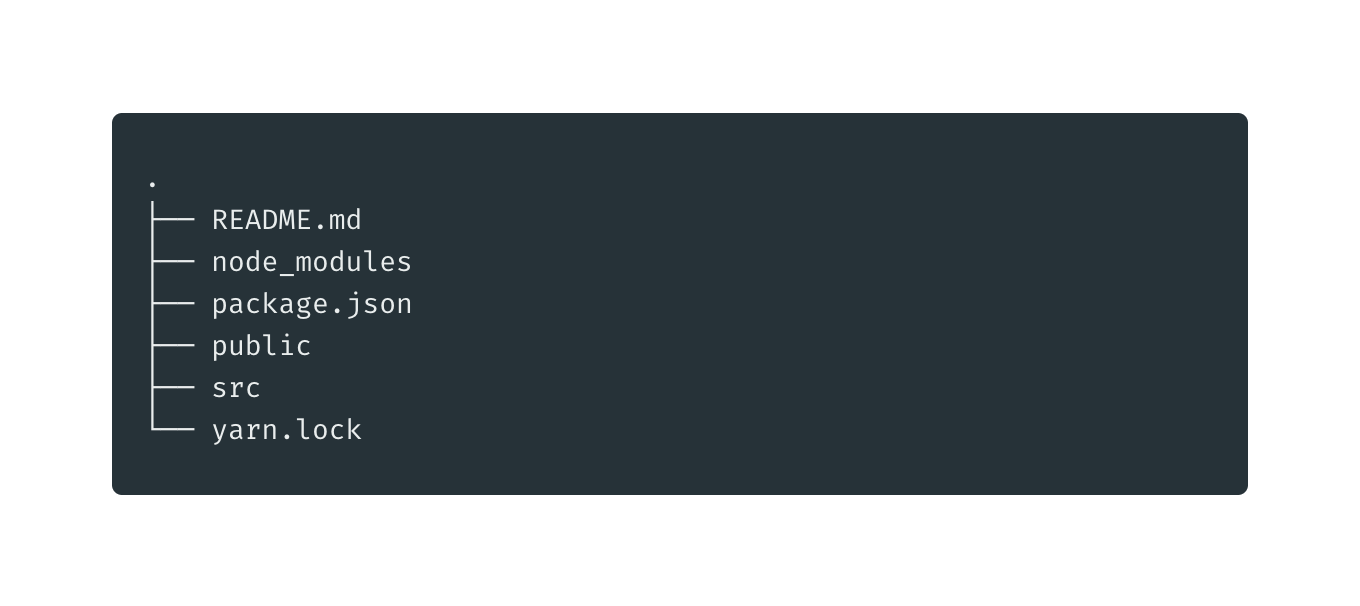
Update the project structure by adding the following directories and files to the src directory:

src
├── App.js
├── App.test.js
├── components #(new)
│   ├── contact-form.js #(new)
│   └── contact-list.js #(new)
├── index.css
├── index.js
├── pages #(new)
│   ├── contact-form-page.js #(new)
│   └── contact-list-page.js #(new)
├── serviceWorker.js
└── setupTests.js

From the terminal:

cd src
mkdir pages components
touch components/contact-form.js components/contact-list.js
touch pages/contact-form-page.js pages/contact-list-page.js

Let’s quickly populate the JavaScript files with some placeholder code.

The ContactList component will be a functional component (a plain JavaScript function which returns a React element):

// src/components/contact-list.js

import React from 'react';

const ContactList = () => {
  return (
    <div>
      <p>No contacts here</p>
    </div>
  );
}

export default ContactList;

For the top-level containers, I’m using pages. Let’s provide some code for the ContactListPage component:

// src/pages/contact-list-page.js

import React from 'react';
import ContactList from '../components/contact-list';

const ContactListPage = () => {
  return (
    <div>
      <h1>List of Contacts</h1>
      <ContactList />
    </div>
  );
};

export default ContactListPage;

The ContactForm component will need to be smart, since it’s required to manage its own state, specifically form fields. We’ll be doing this with React hooks:

// src/components/contact-form.js

import React from 'react';

const ContactForm = () => {
  return (
    <div>
      <p>Form under construction</p>
    </div>
  )
}

export default ContactForm;

Populate the ContactFormPage component with this code:

// src/pages/contact-form-page.js

import React from 'react';
import ContactForm from '../components/contact-form';

const ContactFormPage = () => {
  return (
    <div>
      <ContactForm />
    </div>
  );
};

export default ContactFormPage;

Now let’s create the navigation menu and define the routes for our App. App.js is often referred to as the “layout template” for a single-page application:

// src/App.js

import React from 'react';
import { NavLink, Route } from 'react-router-dom';
import { Container } from 'semantic-ui-react';
import ContactListPage from './pages/contact-list-page';
import ContactFormPage from './pages/contact-form-page';

const App = () => {
  return (
    <Container>
      <div className="ui two item menu">
        <NavLink className="item" activeClassName="active" exact to="/">
          Contacts List
        </NavLink>
        <NavLink
          className="item"
          activeClassName="active"
          exact
          to="/contacts/new"
        >
          Add Contact
        </NavLink>
      </div>
      <Route exact path="/" component={ContactListPage} />
      <Route path="/contacts/new" component={ContactFormPage} />
      <Route path="/contacts/edit/:_id" component={ContactFormPage} />
    </Container>
  );
};

export default App;

The above code uses React Router. If you’d like a refresher on this, please consult our tutorial.

Finally, update the src/index.js file with this code, where we import Formantic-UI for styling and the BrowserRouter component for using the HTML5 history API, which will keep our app in sync with the URL:

// src/index.js

import React from 'react';
import ReactDOM from 'react-dom';
import { BrowserRouter } from 'react-router-dom';
import App from './App';
import 'fomantic-ui-css/semantic.min.css';
import './index.css';

ReactDOM.render(
  <BrowserRouter>
    <App />
  </BrowserRouter>,
  document.getElementById('root')
);

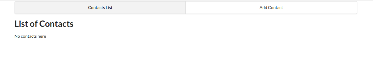
Make sure that the create-react-app server is running (if not, start it using yarn start), then visit http://localhost:3000. You should have a similar view to the screenshot below:

Screenshot of the empty list of contacts

Manage State with React Hooks and the Context API

Previously, one might have reached for Redux when tasked with managing state in a React app. However, as of React v16.8.0, it’s possible to manage global state in a React application using React Hooks and the Context API.

Using this new technique, you’ll write less code that’s easier to maintain. We’ll still use the Redux pattern, but just using React Hooks and the Context API.

Next, let’s look at hooking up the Context API.

Define a Context Store

This will be like our store for handling global state for contacts. Our state will consist of multiple variables, including a contacts array, a loading state, and a message object for storing error messages generated from the back-end API server.

In the src directory, create a context folder that contains a contact-context.js file:

cd src
mkdir context
touch context/contact-context.js

And insert the following code:

import React, { useReducer, createContext } from 'react';

export const ContactContext = createContext();

const initialState = {
  contacts: [],
  contact: {}, // selected or new
  message: {}, // { type: 'success|fail', title:'Info|Error' content:'lorem ipsum'}
};

function reducer(state, action) {
  switch (action.type) {
    case 'FETCH_CONTACTS': {
      return {
        ...state,
        contacts: action.payload,
      };
    }
    default:
      throw new Error();
  }
}

export const ContactContextProvider = props => {
  const [state, dispatch] = useReducer(reducer, initialState);
  const { children } = props;

  return (
    <ContactContext.Provider value={[state, dispatch]}>
      {children}
    </ContactContext.Provider>
  );
};

As you can see, we’re using the useReducer hook, which is an alternative to useState. useReducer is suitable for handling complex state logic involving multiple sub-values. We’re also using the Context API to allow sharing of data with other React components.

Continue reading Build a Node.js CRUD App Using React and FeathersJS on SitePoint.


by Michael Wanyoike via SitePoint

A Guide to HTML & CSS Forms (No Hacks!)

Historically, HTML forms have been quite tricky — firstly, because at least a little bit of JavaScript was required, and secondly, because no amount of CSS could ever make them behave.

However, this isn’t necessarily true in the case of the modern web, so let’s learn how to mark up forms using only HTML and CSS.

Form-ing the basic structure

A form input with a prefilled value

Start off with the <form> element.

Nothing fancy here. Just covering the basic structure.

<form>
    ...
</form>

If you’re submitting the form data naturally (that is, without JavaScript), you’ll need to include the action attribute, where the value is the URL you’ll be sending the form data to. The method should be GET or POST depending on what you’re trying to achieve (don’t send sensitive data with GET).

Additionally, there’s also the lesser-used enctype attribute which defines the encoding type of the data being sent. Also, the target attribute, although not necessarily an attribute unique to forms, can be used to show the output in a new tab.

JavaScript-based forms don’t necessarily need these attributes.

<form method="POST" action="/subscribe" enctype="application/x-www-form-urlencoded" target="_blank">
    ...
</form>

Forms are made up of inputs, which expect data values.

<form>
    <input type="text"><!-- text input -->
    <input type="text" value="Prefilled value">
</form>

See the Pen
Form 1
by SitePoint (@SitePoint)
on CodePen.

Including Labels for Better Usability & Accessibility

Every input needs a label.

A label is a text descriptor that describes what an input is for. There are three ways to declare a label, but one of them is superior to the other two. Let’s dive into these now.

Adjacent labels

Adjacent labels require the most code because we need to explicitly declare which input the label describes. To most, this is counterintuitive because we can instead wrap inputs inside labels to achieve the same effect with less code.

That being said, the adjacent method may be necessary in extenuating circumstances, so here’s what that would look like:

<label for="firstName">First name</label>
<input id="firstName">

As you can see from the example above, the for attribute of the <label> must match the id attribute of the input, and what this does is explain to input devices which text descriptor belongs to which input. The input device will then relay this to users (screen readers, for example, will dictate it via speech).

ARIA labels

While semantic HTML is better, ARIA (Accessible Rich Internet Applications) labels can compensate in their absence. In this case, here’s what a label might look like in the absence of an actual HTML <label>:

<input aria-label="First name">

Unfortunately, the downside of this approach is the lack of a visual label. However, this might be fine with some markups (for example, a single-input form with a heading and placeholder):

<h1>Subscribe</h1>
<form>
    <input aria-label="Email address" placeholder="bruce@wayneenterpris.es">
</form>

(I’ll explain what placeholders are for in a moment.)

Wrapping labels

Wrapping inputs within labels is the cleanest approach. Also, thanks to CSS’s :focus-within, we can even style labels while their child inputs receive focus, but we’ll discuss that later.

<label>
    First name<input>
</label>

Placeholders vs labels

Two inputs with placeholder text visible

A brief comparison:

  • Labels state what the input expects
  • Placeholders show examples of said expectations

Placeholders aren’t designed to be the alternative to labels, although as we saw in the ARIA example above, they can add back some of the context that’s lost in the absence of visual labels.

Ideally, though, we should use both:

<label>
    First name<input placeholder="Bruce">
</label>

See the Pen
Form 2
by SitePoint (@SitePoint)
on CodePen.

Choosing Input Types

Placeholders only apply to text-based inputs, but there are actually a whole range of different input types, which include:

<input type="button">
<input type="checkbox">
<input type="color">
<input type="date">
<input type="datetime-local">
<input type="email">
<input type="file">
<input type="hidden"> <!-- explained later -->
<input type="image">
<input type="month">
<input type="number">
<input type="password">
<input type="radio">
<input type="range">
<input type="reset">
<input type="search">
<input type="submit"> <!-- submits a form -->
<input type="tel">
<input type="text"> <!-- the default -->
<input type="time">
<input type="url">
<input type="week">

Semantic input types are useful during form validation, especially when relying on native validation, which we’ll take a look at shortly. First, let’s learn how to style these inputs.

Styling inputs

Arguably the most infuriating aspect of coding forms is overriding the browser’s default styling. Thankfully, today, appearance: none; has 96.06% browser support according to caniuse.com.

After resetting the web browser’s default styling with the following CSS code, we can then style inputs however we want, and this even includes both the radio and checkbox input types:

input {
 -webkit-appearance: none;
 -moz-appearance: none;
    appearance: none;
    ...
}

However, some of these inputs might come with quirks that are difficult or even impossible to overcome (depending on the web browser). For this reason, many developers tend to fall back to the default type="text" attribute=value if they find these quirks undesirable (for example, the “caret” on input type="number").

However, there is a silver lining …

Specifying an inputmode

With 82.3% web browser support according to caniuse.com, the new inputmode attribute specifies which keyboard layout will be revealed on handheld devices irrespective of the input type being used.

Better than nothing, right?

<input type="text" inputmode="none"> <!-- no keyboard 👀 -->
<input type="text" inputmode="text"> <!-- default keyboard -->
<input type="text" inputmode="decimal">
<input type="text" inputmode="numeric">
<input type="text" inputmode="tel">
<input type="text" inputmode="search">
<input type="text" inputmode="email">
<input type="text" inputmode="url">

Validating User Input

Should you choose native-HTML validation over a JavaScript solution, remember that inputmode achieves nothing in this regard. inputmode="email" won’t validate an email address, whereas input type="email" will. That’s the difference.

Putting this aside, let’s discuss what does trigger validation:

<input required> <!-- value is required -->
<form required> <!-- all values are required -->

<!-- alternative input types -->
<input type="email"> <!-- blank or a valid email address -->
<input type="email" required> <!-- must be a valid address -->

<!-- text-based inputs -->
<input minlength="8"> <!-- blank or min 8 characters -->
<input maxlength="32"> <!-- blank or max 32 characters -->
<input maxlength="32" required> <!-- max 32 characters -->

<!-- numeric-based inputs -->
<input type="date" min="yyyy-mm-dd"> <!-- min date -->
<input type="number" max="66" required> <!-- max number -->

Creating custom rules

Custom rules require knowledge of JavaScript regular expressions, as used by the RegExp object (but, without wrapping slashes or quotes). Here’s an example that enforces lowercase characters (a–z) and minlength/maxlength in one rule:

<input pattern="[a-z]{8,12}">

More info here.

Note: front-end validation (native-HTML or otherwise) should never, ever be used as a substitute for server-side validation!

Styling valid/invalid states

The form with placeholder text in form fields and a submit/subscribe button

Just for extra clarity, this is how we’d style validity:

input:valid {
    border-left: 1.5rem solid lime;
}

input:invalid {
    border-left: 1.5rem solid crimson;
}

form:invalid {
    /* this also works, technically! */
}

Houston, we have a problem!

Inputs attempt to validate their values (or lack thereof) immediately, so the following code (which only shows the valid/invalid states while the input holds a value) might be better:

Continue reading A Guide to HTML & CSS Forms (No Hacks!) on SitePoint.


by Daniel Schwarz via SitePoint

Wednesday, September 30, 2020

Getting Started with Gatsby: Build Your First Static Site

Thinking about getting on the Jamstack bandwagon? If your answer is Yes, then Gatsby, one of the hottest platforms around, could be just what you’re looking for.

JAM stands for JavaScript, APIs, and Markup. In other words, while the dynamic parts of a site or app during the request/response cycle are taken care of by JavaScript in the client, all server-side processes take place using APIs accessed over HTTPS by JavaScript, and templated markup is prebuilt at deploy time, often using a static site generator. That’s the Jamstack. It’s performant, inexpensive to scale and offers better security and a smooth developer experience.

Why Use a Static Site

The static site model doesn’t fit all kinds of projects, but when it does it has a number of advantages. Here are a few of them.

Speed

The time it takes a website to load in the browser as the request is made for the first time is an important factor for user experience. Users get impatient very quickly, and things can only get worse on slow connections. A lack of database calls and the content being pre-generated make static sites really fast-loading.

A static site is made of static files which can be easily served all over the world using content delivery networks (CDNs). This makes it possible to leverage the data center that’s closer to where the request is being made.

Simplified Hosting

Hosting for static sites can be set up in a snap. Because there’s no database or server-side code, special languages or frameworks to support, all the hosting has to do is to serve static files.

Better Security

Without server-side code or a database, there isn’t anything for hackers to hack. There’s no hassle keeping the server up to date with security fixes and patches. All this means a lot more peace of mind when it comes to the security of your website.

Better Developer Experience

Setting up your static website with a hosting company like Netlify or Vercel is straightforward and, with continuous deployment, you just push your changes to your code repo of choice and they’re immediately reflected in the live version.

What Is Gatsby?

Gatsby is one of the most popular tools for building websites today. It’s more than a static site generator. In fact, it is a “React-based, open-source framework for creating websites and apps.” As Gatsby is built on top of React, all the React goodness is at your fingertips, which enables you to take advantage of this powerful library to build interactive components right into your static website. Gatsby is also built with GraphQL, so you can query data and display it on your website any way you want.

Installing Gatsby and Creating Your Project

Gatsby is put together using webpack, but you don’t need to worry about complicated set-up maneuvers; Gatsby CLI will take care of everything for you.

For this tutorial, I’ll assume you have Node.js installed locally. If this isn’t the case, then head over to the Node home page and download the correct binaries for your system. Alternatively, you might consider using a version manager to install Node. We have a tutorial on using a version anager here.

Node comes bundled with npm, the Node package manager, which we’re going to use to install some of the libraries we’ll be using. You can learn more about using npm here.

You can check that both are installed correctly by issuing the following commands from the command line:

node -v
> 12.18.4

npm -v
> 6.14.8

The first thing you need to do is install the Gatsby CLI. This is an npm package that lets you create a Gatsby site in a few seconds. In your terminal, write:

npm install -g gatsby-cli

With the Gasby CLI installed on your machine, you can go ahead and create your website. I’ll call it sitepoint-demo, but you’re free to call it whatever you like. In your terminal, type:

gatsby new sitepoint-demo

Once Gatsby CLI has installed all the necessary files and configured them appropriately, you’ll have a fully functioning Gatsby website ready for you to customize and build upon. To access it, move into the sitepoint-demo folder:

cd sitepoint-demo

and start the local server:

gatsby develop

Finally, open a window on http://localhost:8000 where you’ll find your shiny Gatsby site looking something like this:

Gatsby default template

To quickly get a website up and running, Gatsby takes advantage of several official starter boilerplates as well as starters offered by the strong community around it. The site you’ve just created uses Gatsby default starter, but you can find plenty more on the Gatsby website.

If you’d like to use a different starter from the default one, you need to specify its URL in the command line, following this pattern:

gatsby new [SITE_DIRECTORY_NAME] [URL_OF_STARTER_GITHUB_REPO]

For instance, let’s say you’d like a Material Design look and feel for your site. The quickest way to create it is to use Gatsby Material Starter by typing the following command in your terminal:

gatsby new sitepoint-demo https://github.com/Vagr9K/gatsby-material-starter

Great! Now let’s take a look at the files inside your brand new Gatsby project.

A Tour Inside Your Gatsby Site

A good place to start is the /src/ directory. Here’s what you’ll find.

pages Directory

The /src/pages/ directory contains your site’s pages. Each page is a React component. For instance, your site’s home-page code is located in /pages/index.js and looks like this:

import React from "react"
import { Link } from "gatsby"
import Layout from "../components/layout"
import Image from "../components/image"
import SEO from "../components/seo"

const IndexPage = () => (
<Layout>
  <SEO title="Home" />
  <h1>Hi people</h1>
  <p>Welcome to your new Gatsby site.</p>
  <p>Now go build something great.</p>
  <div style=>
    <Image />
  </div>
  <Link to="/page-2/">Go to page 2</Link>
  <Link to="/using-typescript/">Go to "Using TypeScript"</Link>
</Layout>
)

export default IndexPage

That’s the typical code for a React component.

Components let you split the UI into independent, reusable pieces, and think about each piece in isolation. … Conceptually, components are like JavaScript functions. They accept arbitrary inputs (called “props”) and return React elements describing what should appear on the screen. — React docs.

components Directory

The /src/components/ directory is where you find general components for your website. The default starter comes with the following components: Header (header.js), Image (image.js), Layout (layout.js), and SEO (seo.js). You’re free to customize these components and add your own to the same directory.

Now you’re ready to start making changes to your new site and customize it to your taste.

How to Make Changes to Your Gatsby Site

Let’s have a go at modifying the message displayed on the home page. Open pages/index.js in your code editor and replace the two paragraphs below the <h1> tag with this paragraph:

<p>Welcome to my SitePoint Demo Site!</p>

Of course, you can add any text you want ibetween the <p> tags.

As soon as you hit Save, your changes are displayed in the browser thanks to Gatsby’s hot reloading development environment. This means that when you develop a Gatsby site, pages are being watched in the background so that when you save your work, changes will be immediately visible without needing a page refresh or a browser restart.

Gatsby makes it easy to add new pages. For instance, let’s add an About page by creating a new file, about.js, inside the /pages/ directory and enter this content:

import React from "react"

const AboutPage = () => <h1>About Me</h1>

export default AboutPage

The code above is a React functional component which displays some text.

Save your work and navigate to http://localhost:8000/about and you should see the About Me <h1> title on your screen.

You can quickly link to your new About page from the home page using the Gatsby Link component. To see how it works, open index.js in your code editor and locate this bit of code just before the </Layout> closing tag:

<Link to="/page-2/">Go to page 2</Link>

Next, replace the value of the to property with /about/ and the Go to page 2 text with About:

<Link to="/about/">About</Link>

Save your work and you should see your new link on the screen. Click on the About link and instantly you’re on the About page.

Gatsby uses the Link component for internal links. For external links, you should use the good old <a> tag, like you would on a regular vanilla HTML website.

Now, let’s experiment with your Gatsby site’s look and feel by changing a few styles.

Styling Your Gatsby Site

Gatsby offers a number of options for applying style rules to your website.

Global Stylesheet

A familiar choice is to use a global .css file which contains rules that apply to the entire website. To get started, add a /styles/ directory inside the /src/ directory and add a global.css file to it: /src/styles/global.css . You’re free to choose any name you like both for the directory and the style-sheet file. Inside global.css, add the following CSS declaration, which is going to be applied to the entire website:

body {
  background-color: yellow;
}

Now, save your work. Oops, nothing happened! Not yet, anyway. To make it work you need to take an extra step. Open gatsby-browser.js in your code editor and import the stylesheet you’ve just created:

import "./src/styles/global.css"

Head back to your browser and you should see that the background color of your website has turned into a bright yellow. Not ideal as a color choice, but it works!

Continue reading Getting Started with Gatsby: Build Your First Static Site on SitePoint.


by Maria Antonietta Perna via SitePoint

Create a Toggle Switch in React as a Reusable Component

Implementing a Toggle Switch in React JS as a Reusable Component

In this article, we’re going to create an iOS-inspired toggle switch using React. This will be a small, self-contained component that you’ll be able to reuse in future projects. As we go, we’ll also build a simple demo React app that uses our custom toggle switch component.

We could use third-party libraries for this, but building from scratch allows us to better understand how our code is working and allows us to customize our component completely.

Forms provide a major means for enabling user interactions. The checkbox is traditionally used for collecting binary data — such as yes or no, true or false, enable or disable, on or off, etc. Although some modern interface designs steer away from form fields when creating toggle switches, I’ll stick with them here due to their greater accessibility.

Here’s a screenshot of the component we’ll be building:

Two small and two large toggle switches in both a checked and unchecked state

Getting Started

Let’s use Create React App to get a React app up and running quickly. If you’re unfamiliar with Create React App, check out our getting started guide.

create-react-app toggleswitch

Once everything has installed, change into the newly created directory and start the server with yarn start (or npm start if you prefer). This will start the development server at http://localhost:3000.

Next, create a ToggleSwitch directory in the src directory. This is where we will make our component:

mkdir src/ToggleSwitch

In this directory, make two files: ToggleSwitch.js and ToggleSwitch.scss:

touch ToggleSwitch.js ToggleSwitch.scss

Finally, alter App.js as follows:

import React from 'react';
import ToggleSwitch from './ToggleSwitch/ToggleSwitch'

function App() {
  return (
    <ToggleSwitch />
  );
}

export default App;

The Markup

We can start with a basic HTML checkbox input form element with its necessary properties set:

<input type="checkbox" name="name" id="id" />

To build around it, we might need an enclosing <div> with a class, a <label> and the <input /> control itself. Adding everything, we might get something like this:

<div class="toggle-switch">
  <input type="checkbox" class="toggle-switch-checkbox" name="toggleSwitch" id="toggleSwitch" />
  <label class="toggle-switch-label" for="toggleSwitch">
    Toggle Me!
  </label>
</div>

In time, we can get rid of the label text and use the <label> tag to check or uncheck the checkbox input control. Inside the <label>, let’s add two <span> tags that help us construct the switch holder and the toggling switch itself:

<div class="toggle-switch">
  <input type="checkbox" class="toggle-switch-checkbox" name="toggleSwitch" id="toggleSwitch" />
  <label class="toggle-switch-label" for="toggleSwitch">
    <span class="toggle-switch-inner"></span>
    <span class="toggle-switch-switch"></span>
  </label>
</div>

Converting to a React Component

Now that we know what needs to go into the HTML, all we need to do is to convert the HTML into a React component. Let’s start with a basic component here. We’ll make this a class component, and then we’ll convert it into hooks, as it’s easier for new developers to follow state than useState.

Add the following to src/ToggleSwitch/ToggleSwitch.js:

import React, { Component } from "react";

class ToggleSwitch extends Component {
  render() {
    return (
      <div className="toggle-switch">
        <input
          type="checkbox"
          className="toggle-switch-checkbox"
          name="toggleSwitch"
          id="toggleSwitch"
        />
        <label className="toggle-switch-label" htmlFor="toggleSwitch">
          <span className="toggle-switch-inner" />
          <span className="toggle-switch-switch" />
        </label>
      </div>
    );
  }
}

export default ToggleSwitch;

At this point, it’s not possible to have multiple toggle switch sliders on the same view or same page due to the repetition of ids. We could leverage React’s way of componentization here, but in this instance, we’ll be using props to dynamically populate the values:

import React, { Component } from 'react';

class ToggleSwitch extends Component {
  render() {
    return (
      <div className="toggle-switch">
        <input
          type="checkbox"
          className="toggle-switch-checkbox"
          name={this.props.Name}
          id={this.props.Name}
        />
        <label className="toggle-switch-label" htmlFor={this.props.Name}>
          <span className="toggle-switch-inner" />
          <span className="toggle-switch-switch" />
        </label>
      </div>
    );
  }
}

export default ToggleSwitch;

The this.props.Name will populate the values of id, name and for (note that it is htmlFor in React JS) dynamically, so that you can pass different values to the component and have multiple instances on the same page. Also notice that the <span> tag doesn’t have an ending </span> tag. Instead, it’s closed in the starting tag like <span />, and in terms of JSX this is completely fine.

Test this out by changing the contents of App.js as follows:

function App() {
  return (
    <>
      <ToggleSwitch Name='newsletter' />
      <ToggleSwitch Name='daily' />
      <ToggleSwitch Name='weekly' />
      <ToggleSwitch Name='monthly' />
    </>
  );
}

Inspect the resultant output at http://localhost:3000/ (possibly using your browser’s dev tools) and ensure everything is working correctly.

Styling and SCSS

I recently wrote about styling React Components, where I compared the various ways this was possible. In that article, I concluded that SCSS is the best method, and that’s what we’ll use here.

For SCSS to work with Create React App, you’ll need to install the node-sass package:

yarn add node-sass

We’ll also need to import the correct file into our component:

// ToggleSwitch.js

import React, { Component } from 'react';
import './ToggleSwitch.scss';
...

Now for the styling. This is a rough outline of what we’re after:

  • By default, the switch is going to be only 75px wide and vertically aligned inline-block so that it’s inline with the text and doesn’t cause layout problems.
  • We’ll make sure that the control is not selectable so that users can’t drag and drop it.
  • We’ll be hiding the original checkbox input.
  • Both the ::after and ::before pseudo-elements needs to be styled and made into elements to get them into the DOM and style them.
  • We’ll also add some CSS transitions for a cool animated effect.

And this is what that looks like in SCSS. Add the following to src/ToggleSwitch/ToggleSwitch.scss:

.toggle-switch {
  position: relative;
  width: 75px;
  display: inline-block;
  vertical-align: middle;
  -webkit-user-select: none;
  -moz-user-select: none;
  -ms-user-select: none;
  text-align: left;
  &-checkbox {
    display: none;
  }
  &-label {
    display: block;
    overflow: hidden;
    cursor: pointer;
    border: 0 solid #bbb;
    border-radius: 20px;
    margin: 0;
  }
  &-inner {
    display: block;
    width: 200%;
    margin-left: -100%;
    transition: margin 0.3s ease-in 0s;
    &:before,
    &:after {
      display: block;
      float: left;
      width: 50%;
      height: 34px;
      padding: 0;
      line-height: 34px;
      font-size: 14px;
      color: white;
      font-weight: bold;
      box-sizing: border-box;
    }
    &:before {
      content: "Yes";
      text-transform: uppercase;
      padding-left: 10px;
      background-color: #f90;
      color: #fff;
    }
  }
  &-disabled {
    background-color: #ddd;
    cursor: not-allowed;
    &:before {
      background-color: #ddd;
      cursor: not-allowed;
    }
  }
  &-inner:after {
    content: "No";
    text-transform: uppercase;
    padding-right: 10px;
    background-color: #bbb;
    color: #fff;
    text-align: right;
  }
  &-switch {
    display: block;
    width: 24px;
    margin: 5px;
    background: #fff;
    position: absolute;
    top: 0;
    bottom: 0;
    right: 40px;
    border: 0 solid #bbb;
    border-radius: 20px;
    transition: all 0.3s ease-in 0s;
  }
  &-checkbox:checked + &-label {
    .toggle-switch-inner {
      margin-left: 0;
    }
    .toggle-switch-switch {
      right: 0px;
    }
  }
}

Assuming you’re following along, if you head to the dev server at http://localhost:3000/ you’ll now see four nicely styled toggle switches. Try toggling them; they should all work.

Also take a while to go through the code above. If there’s anything you’re unsure about, you can consult the Sass documentation, or head over to the SitePoint Forums and ask a question.

Dynamic Labels

Currently, the toggle options are hard coded:

.toggle-switch {
  ...
  &-inner {
    ...
    &:before {
      content: "Yes";
      ...
    }
  }
  ...
  &-inner:after {
    content: "No";
    ...
  }
  ...
}

To make the component more flexible, we can grab these dynamically from the control using HTML5 data-attributes:

&:before {
  content: attr(data-yes);
  ...
}
&-inner:after {
  content: attr(data-no);
  ...
}

We’ll hardcode the data attributes for testing, but will make this more flexible in the final version:

// ToggleSwitch.js

class ToggleSwitch extends Component {
  render() {
    return (
      <div className="toggle-switch">
        ...
        <label className="toggle-switch-label" htmlFor={this.props.Name}>
          <span className="toggle-switch-inner" data-yes="Ja" data-no="Nein"/>
          <span className="toggle-switch-switch" />
        </label>
      </div>
    );
  }
}

A Smaller Component Version

Also, for smaller screens, it would be a great idea to use a smaller version of switch, without the text. So let’s add the styling for it with some minimal sizes and removing the text:

.toggle-switch {
  ...
  &.small-switch {
    width: 40px;
    .toggle-switch-inner {
      &:after,
      &:before {
        content: "";
        height: 20px;
        line-height: 20px;
      }
    }
    .toggle-switch-switch {
      width: 16px;
      right: 20px;
      margin: 2px;
    }
  }
}

With respect to responsiveness, we should be changing the complete size, so let’s use the CSS scale function. Here we’ve covered all the Bootstrap-based responsive widths of devices:

.toggle-switch {
  ...
  @media screen and (max-width: 991px) {
    transform: scale(0.9);
  }
  @media screen and (max-width: 767px) {
    transform: scale(0.825);
  }
  @media screen and (max-width: 575px) {
    transform: scale(0.75);
  }
}

You can test this out by adding the small-switch class to the parent <div> element in ToggleSwitch.js:

class ToggleSwitch extends Component {
  render() {
    return (
      <div className="toggle-switch small-switch">
        ...
      </div>
    );
  }
}

Head back to the dev server and test your changes. If you’d like to check what you have against the finished SCSS file, you can find that here.

Theming in SCSS

Since we can use variables in SCSS, adding support for multiple color themes in our app is made easier. You can read more about this in “Sass Theming: The Never Ending Story”. We’ll be using some color themes here and change all the raw colors to variables. The first three lines are a configurable set of colors, which helps us theme our little control:

// Colors
$label-colour: #bbb;
$disabled-colour: #ddd;
$toggle-colour: #2F855A;
$white: #fff;

// Styles
.toggle-switch {
  ...
  &-label {
    ...
    border: 0 solid $label-colour;
  }
  &-inner {
    ...
    &:before {
      ...
      background-color: $toggle-colour;
      color: $white;
    }
  }
  &-disabled {
    background-color: $disabled-colour;
    cursor: not-allowed;
    &:before {
      background-color: $disabled-colour;
      cursor: not-allowed;
    }
  }
  &-inner:after {
    ...
    background-color: $label-colour;
    color: $white;
  }
  &-switch {
    ...
    background: $white;
    border: 0 solid $label-colour;
  }
  ...
}

And that’s it with the styling. Now let’s add some interactivity.

Continue reading Create a Toggle Switch in React as a Reusable Component on SitePoint.


by Praveen Kumar via SitePoint