Wednesday, November 9, 2016

Under the influence: Dark patterns and the power of persuasive design

As designers, we know that our decisions have a real impact on how people use products. On the downside, poor design decisions have the potential to cause annoyance, cost users a bit of cash, or at worst, have more catastrophic results. Figuring out the intent behind designs, however, can be more tricky.

We came across this recently at work, when our general manager Damian unboxed a new 12” Macbook. We quickly noticed a problem: the new Macbook only had one port, with no adapter in sight. How was he going to charge his phone, or charge his new Magic Mouse, or connect his keyboard or monitor?

He was faced with a choice to either buy the $129 Apple adapter to use his screen and keyboard, or change the way he works. Resigned, Damian ordered the adapter.

This is just one example of the far-reaching impact that small design decisions can have on a user, whether intended or not.

I’m not sure about the intent behind the decision for just one port. Was it made with good intent – perhaps to progress an ‘all wireless’ ecosystem that Apple is planning?

Or was it made with consciously bad intent – to push for an upswing in accessory sales?

Without inside knowledge, we can’t know if this particular example from Apple example is intentional trickery. But there are plenty of examples where designs have indeed been created intentionally to deceive, known as dark patterns.

In this article, I’ll explain dark patterns, the psychology behind them, and how you can use smart (but not deceptive) techniques instead.

What are dark patterns?

In the online world, designs that are intentionally created to trick and deceive users are called dark patterns. Designers have crafted these ingenious, yet ethically questionable patterns to trick users into doing something they don’t want to do.

To create dark patterns, designers rely heavily on a good understanding of cognitive science and human behaviours. These are used to benefit the company behind them, to achieve goals like increasing sales and improving numbers of sign-ups.

It’s worth mentioning that I’m not talking about Anti-patterns here. They are just design mistakes that might have a negative impact on the user experience, or break conventions. Here’s an example.

I’ve become interested in dark patterns of late, and more specifically, the convergence of human psychology and cognitive science.

At a high-level, you can think of dark patterns akin to the tricks of a dodgy car salesman. These tricks are even easier to pull off in the digital space – you can’t look under a website to see a tell-tale puddle of oil on the ground to identify a dark pattern.

Dark patterns in action

All across the web, you’ll find dark patterns being used through practices like friend spamming, disguised ads, hidden costs, and more. Luckily, the UX industry is fighting back against dodgy practices through websites like darkpatterns.org, which is dedicated to educating designers and calling out questionable digital practices. It currently lists 14 ‘types’ of dark pattern to watch for.

Here are a couple of examples to be wary of.

Trick questions

Here’s a recent example that was featured in The Age a couple of months ago.

screen-shot-2016-07-01-at-11-28-02-am-370

The article refers to “Simon”, who is extremely careful with his personal information, and is happy with his one bank. Simon was surprised when a rival bank, ANZ, sent a personalised letter to his home, inviting him to become a “platinum member”.

After digging and hassling on the phone, an ANZ representative finally revealed that they had received his details from Veda, who are Australia’s largest credit reporting agency.

It turns out that a few weeks earlier, Simon had been to the Veda website to fill out a form to obtain a personal credit report.

Veda form

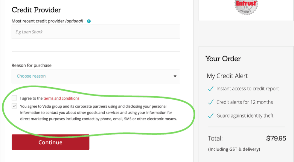
At the end of the form, Veda provides a pre-ticked checkbox that gives consent to Veda and its “corporate partners” to use his personal data for marketing purposes.

It’s a cheap trick, but it’s not an accident. The designers are playing to the fact that people tend to scan pages and don’t really read things properly. Especially when it comes to terms and conditions at the end of a long form.

The inclusion of a big, red button helps to distract the user away from the offending text even more.

Bait and switch

Candy Crush fans have probably fallen victim to the bait and switch, another common dark pattern.

candy crush 1

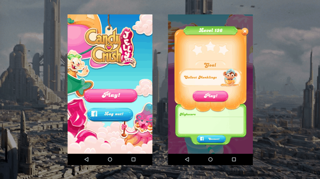
As you start playing, the game conditions you to hit the big button in the centre of the screen for all key actions. You hit play to start a game, and play – in the same position – to start a new level. You hit the retry button – still in the same position – to start a level again if you lose.

candy crush 2

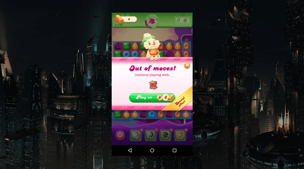
And if you’re out of moves and not looking closely, you could easily hit this button.

The difference is, it now has a different function. The UI baits you into thinking you know what the action will be, then sneakily switches this in to make you spend virtual currency, taking you one step closer to an in-app purchase.

The designer has taken advantage of human neuroscience here. By conditioning users to continually hit the call-to-action in the centre of the screen, the user’s mind recognises the pattern and over time diverts conscious attention away from reading the label.

Turning to persuasion over dark patterns

Why do people resort to dark patterns and underhanded trickery? It’s often when business needs are placed too far above user needs and design expertise. Perhaps when people are asked to do something unethical to please their boss, or to meet a particular KPI. It can be difficult for designers to push back on these priorities, forcing a moral and ethical dilemma.

This got me thinking. Is there another, more ethical way to achieve the same kinds of results? How can we, as designers persuade people to do stuff without trickery?

It turns out that we can use the same principles of psychology that dark patterns employ to persuade users instead, and to invoke positive behaviour changes.

It’s important to note that we’re talking about ethical use of persuasive techniques here – and not leveraging cognitive science against users to achieve business goals. Persuasive design, when used responsibly, can leverage a good understanding of cognitive science to add value to a user’s experience, and increase user engagement.

Above all else, it is our responsibility to ensure users retain their right of choice.

Fogg model

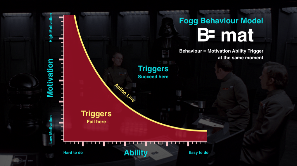
The Fogg Behaviour Model by Stanford University’s BJ Fogg, says that for a behaviour to occur, there needs to be a sufficient level of both motivation and ability.

So if you want to persuade someone to do something with your product, you need to first make them want to do it, then second, make it easy for them. Let’s take a look at how we can use motivation and ability in design.

Ability

As a designer, it’s typical for us to focus on ability first. That’s the part we usually have more control of. There are 6 basic elements of ability:

  • Time
  • Money
  • Effort
  • Cognitive load
  • Social acceptance
  • Routine

If you can influence these aspects, your user is far more likely to do the intended behaviour.

This might sound complex, but it isn’t always hard to make something easier, and it doesn’t even have to be a huge change to achieve a significant result. In fact, you’re probably already doing these sorts of things as a matter of best practice in making designs usable.

300 million dollar button

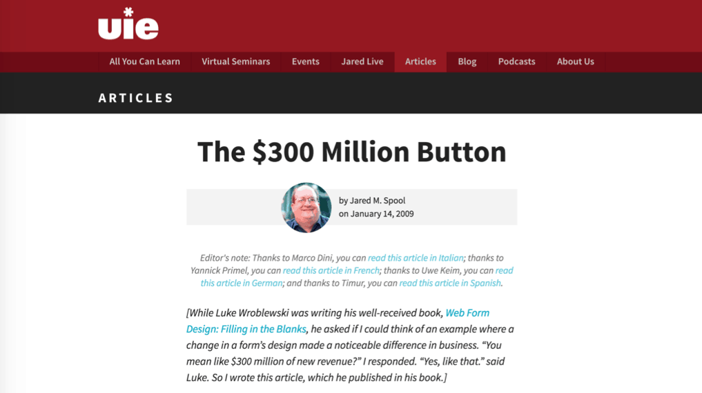
A great example is the $300 Million button story. In this well-known case study told by Jared Spool, he explains how simply changing the label on a single button increased an online retailer’s profit by $300 million in a single year.

There’s a little more to this story. The change removed the barrier of having to create an account before making a purchase. It’s a great example of how making a simple change to improve a user’s ability can have an enormous positive impact.

Persuasive techniques can be used for bad, too. Cash back on purchases are one way the ethical line gets blurred. When you have to jump through hoops to get your refund (filling in a long form, photocopying the receipt and mailing it), then the ‘ability’ to complete the cash-back is low. In this case, it’s likely that some buyers won’t bother to complete the action – which is exactly what the retailer wants. It hardly seems worth it for a $200 refund for a $1700 purchase, for example.

This isn’t a mistake – it’s designed to maximise purchases and minimise rebates through cognitive science.

Motivation

In the cash back example, you start to see how motivation part comes into play. It might be easier for a designer to control the ‘ability’, but we can also influence motivation with a good understanding of human psychology.

People’s key motivators include:

  • Desire for completion and order
  • Delight and emotional connection
  • Variable rewards

Understanding what motivates people is the powerful bit, and if you think back to those dark pattern examples now, you’ll realise that although they’re outrageously dodgy practices, it’s not just about the interfaces, but the way those interfaces are put together in response to a good understanding of human behaviour.

Fitbit, for example, is very effective in tapping into people’s desire for completion and order. Staying focussed on being active and keeping fit is a hard behaviour to crack. It’s very easy to put off heading out for a run and just sit on the couch instead.

fitbit

Fitbit knows this. By adding little achievements that need to be completed, like measuring 10,000 steps, they appeal to our natural tendency as humans to want to ‘complete’ the step goal.

These are powerful techniques. And the great thing about persuasive design is that its influence has the potential to do more than simply help us get people to use our product.

Design is more than aesthetics and usability

Us designers wield enormous power, but it’s easy to forget that when we’re deep at the coal face, buried in research findings and wireframes. Take a moment now and again to remember that it’s not just about aesthetics and usability. We help shape the lives of people everywhere, and our decisions can have significant impacts on the way we as a society behave.

Design is an evolutionary discipline. We don’t invent, we learn from the past. Designers practising the craft now are setting the example for the future generations.

Don’t always take the cheap, easy, dark patterns option. Understand that we do have great power and can use cognitive science to influence and persuade, but respect that power and use it for good, not evil. Think responsibly.

And as for Damian, he bought the expensive adapter for his new laptop. And it doesn’t even accommodate all the cables he needs!

Got a question about using persuasive design in your work? Join Ben Tollady in our next Ask the UXperts session on Dark Patterns and Persuasive Design.

3 pm Wednesday 9th November PDT or 10 am Thursday 10th November AEST (or find out what time that is for you)

This article is based on a presentation delivered at UX New Zealand 2016.

The post Under the influence: Dark patterns and the power of persuasive design appeared first on UX Mastery.


by Benjamin Tollady via UX Mastery

Tuesday, November 8, 2016

How to Establish Genuine Relationships with Powerful Influencers (infographic)

How to Establish Genuine Relationships with Powerful Influencers - infographic

No matter your business or area of work, it is helpful to have a supportive group of people willing to share and promote your brand. Whether you know it or not there are already people in your industry who have a strong audience with followers who love to hear what they say. These people are “influencers” and can be used as an effective marketing tool.

Influencer marketing offers great return on investment, but results won't happen overnight or even in a week — you must cultivate real relationships first.

Here are some tips and strategies that will help put you on your way to a successful influencer campaign.

by Guest Author via Digital Information World

Data Serialization Comparison: JSON, YAML, BSON, MessagePack

Data Serialization Comparison

JSON is the de facto standard for data exchange on the web, but it has its drawbacks, and there are other formats that may be more suitable for certain scenarios. I’ll compare the pros and cons of the alternatives, including ease of use and performance.

Note: I won't cover implementation details here, but if you're a Ruby programmer, check out this article, where Dhaivat writes about implementing some serialization formats in Ruby.

What Is Data Serialization

According to Wikipedia, serialization is:

the process of translating data structures or object state into a format that can be stored (for example, in a file or memory buffer, or transmitted across a network connection link) and reconstructed later in the same or another computer environment.

Let's say you want to collect certain data about a group of people --- name, last name, nickname, date of birth, instruments they play. You could easily set a spreadsheet, define some columns, and make every row an entry. You could go just a little further, define that the date of birth column must be a number, and that the instruments columns could be a list of options. It'd look like this:

name last name dob nickname instruments
William Bailey 1962 Axl Rose vocals, piano
Saul Hudson 1965 Slash guitar

More or less, what you did there was define a data structure; and you'll do just fine if you only need this on a spreadsheet format. The problem is that, if you ever want to exchange this information with a database or a website, the mechanics by which these data structures are implemented on these other platforms --- even if the underlying semantics are overall the same --- will be dramatically different. You can't just plug-n-play a spreadsheet into a web application, unless the application has been specifically designed for it. And you can't transfer that info from the website to the database unless you have some sort of export tool or gateway for it.

Let's assume that our website already has these data structures implemented in its internal logic, and that it just cannot deal with a spreadsheet format. In order to solve these problems, you can translate these data structures into a format that can be easily shared across different applications, architectures, or what have you: you serialize them. And by doing so, you ensure not only that you can transfer this data across platforms, but that they can be reconstructed in the reverse process called deserialization. Furthermore, if exchanged back from the website to the spreadsheet, you'll get a semantically identical clone of the original object --- that is, a row that looks exactly the same as the one you originally sent.

In short: serializing data is finding some sort of universal format that can be easily shared across different applications.

The Formats

JSON

JSON logo

JSON (JavaScript Object Notation) is a lightweight data-interchange format. It's easy for humans to read and write; it's easy for machines to parse and generate.

JSON is the most widespread format for data serialization, and it has the following features:

  • (Mostly) human readable code: even if the code has been obscured or minified, you can always indent with tools such as JSONLint and make it readable again.
  • Very simple and straightforward specification: a summary of the whole spec fits on a single page (as displayed on the JSON site).
  • Widespread support: not only does every programming language or IDE come with JSON support, but also many web services APIs offer JSON as a means of data interchange.
  • As a subset of JavaScript, it supports the following JavaScript data types:
    • string
    • number
    • object
    • array
    • true and false
    • null

This is how our previous spreadsheet would look, after being serialized in JSON:

[
  {
    "name": "William",
    "last name": "Bailey",
    "dob": 1962,
    "nickname": "Axl Rose",
    "instruments": [
      "vocals",
      "piano"
    ]
  },
  {
    "name": "Saul",
    "last name": "Hudson",
    "dob": 1965,
    "nickname": "Slash",
    "instruments": [
      "guitar"
    ]
  }
]

BSON

BSON logo

BSON, short for Bin­ary JSON, is a bin­ary-en­coded seri­al­iz­a­tion of JSON-like doc­u­ments. … It also con­tains ex­ten­sions that al­low rep­res­ent­a­tion of data types that are not part of the JSON spec.

JSON is a plain text format, and while binary data can be encoded in text, this has certain limitations and can make JSON files very big. BSON comes in to deal with these problems.

It has the following features:

  • convenient storage of binary information: better suitable for exchanging images and attachments
  • designed for fast in-memory manipulation
  • simple specification: like JSON, BSON has a very short and simple spec
  • primary data rep­res­ent­a­tion for Mon­goDB: BSON is de­signed to be tra­versed eas­ily
  • extra data types:
    • double (64-bit IEEE 754 floating point number)
    • date (integer number of milliseconds since the Unix epoch)
    • byte array (binary data)
    • BSON object and BSON array
    • JavaScript code
    • MD5 binary data
    • regular expressions

Continue reading %Data Serialization Comparison: JSON, YAML, BSON, MessagePack%


by Lucero del Alba via SitePoint

How Asking Visitors One Simple Question Boosted My Conversion Rate by 27%

Skyrocketing conversions

One year ago, I was in-between jobs and living in my parents’ house. I was 28. Back then, my days consisted of two tasks:

  1. Finding a new job
  2. Doing whatever I could to earn money to help pay my bills while embarking on task number 1.

I am a former teacher and have an extensive background in test prep, so I decided to tutor at the local library for a little cash.

When I was not tutoring, I began writing test prep materials for a widely used pre-employment exam called the Wonderlic. Within a month, I launched a small website selling practice tests and a study guide for the Wonderlic test.

For anyone who is wondering what the Wonderlic is, I have a free practice test on my site that you can try.

Soon after the launch, I received an offer for a full-time gig and accepted.

I loved my new 9-5, but I also continued working on Beat the Wonderlic at night and on weekends, slowly growing it to the point where that business alone was completely covering all of my monthly expenses.

After a year, I decided to make the terrifying leap into full-time entrepreneurship and place all of my efforts into scaling my company.

Over these past few months of working on Beat the Wonderlic full-time, I have learned a great deal, but my greatest nugget of knowledge was acquired by accident.

My Conversion Rate Sucked — and Wasn’t Improving

I broke out my plan to scale three main pillars:

  1. Lift conversion rate
  2. Increase traffic
  3. Boost AOV (average order value)

I started with focusing on conversion rate as investing in more traffic would be a waste of time and money if none of that traffic converted.

My conversion rate was hovering around a stagnant 1%.

Like many entrepreneurs, I (ridiculously) found this offensive.

This business was my baby. I was immensely prideful and protective of it. I also knew that it was the best Wonderlic prep product on the market – I had purchased all of my competitors' products, researched real Wonderlic tests, and knew that nobody in the market had a more complete and accurate study guide than the one I had created.

Naively, I thought this must be the problem — people don't know how great my product is… Maybe I should shout it from the rooftops so they understand the value of my study guide and then they’ll buy it!

Why My Initial Plan to Improve Conversions Didn’t Work

I planned to clarify and amplify what I thought was my value proposition.

I added bullets to the cover of my study guide, laying out all the reasons why I thought my customers wanted to know.

Cover with bullet points

I added a PayPal badge to try to build trust with international customers, and I added an MSRP price to highlight how my product was less expensive than the competition.

MSRP comparison

I even decided to add a chat widget to my site in case visitors had any questions for me when they were browsing my site — and, better yet, maybe I could turn some of these questions into conversations and then, conversations into sales!

Live chat widget

Now, the sum of these changes was important and did lift conversions, but it was certainly not the success I was expecting. My sales were still relatively stagnant, and I was getting desperate. If I could not lift conversions, my business would likely never grow, and I would have to go crawling back to my 9-5 begging for them to take me back.

Do You Know Why People Don’t Buy from You?

I was desperate to improve my sales. I needed to grow, and it needed to happen quickly.

I was in the admin view of my chat widget, watching as people entered my site, only to leave without purchasing moments later. I began to stare at the anonymous visitors as they landed, browsed, and left.

Continue reading %How Asking Visitors One Simple Question Boosted My Conversion Rate by 27%%


by Alex Hollis via SitePoint

Logging Errors in Client-Side Applications

Logging is an important part of any software application, both during active development and when it's running in production mode.

When you're working on the server, there are hundreds of libraries available to you regardless of your server-side language of choice, a wide range of storage mechanisms, and all sorts of tools you can use to work with the resulting logs.

However, when it comes to client-side applications, logging is something that often gets overlooked, and the options open to you are rather more limited.

In this article I'll look at some of the ways in which you can implement logging in a client-side application; particularly in a JavaScript-heavy, single-page application (SPA).

The Console

Perhaps the most common and obvious way to log errors and messages is the console. While it might appear a primitive solution, there's absolutely no doubt that it's an invaluable tool for debugging during development, so it's probably a good place to start.

The implementation of console isn't always consistent — particularly in IE, perhaps unsurprisingly — but in general there are four key methods available to you:

console.log()
console.info()
console.warn()
console.error()

The output from each of these four methods is subtly different, and most web console implementations (i.e., Dev Tools) allow you to filter messages based on the method used; that is, the logging level.

In order to mitigate the differences between browsers, you can use a wrapper function — such as this one from Paul Irish. The WHATWG is attempting to standardize the console API, but the spec is still at an early stage and unlikely to be implemented for some time.

Tip: If you find that your code is littered with console.log() statements, you might find tools such as grunt-remove-logging or grunt-strip for Grunt, or gulp-strip-debug for Gulp useful for when you move an application into production.

Enhancing the console

There are a couple of libraries you can use to "super-charge" the console.

Logdown

Logdown is a tiny library which provides a few enhancements to the console. You'll find a demo here.

Logdown allows you to specify prefixes upon instantiation; one possible use for this is to separate out your log messages by module, for example:

var uiLogger = new Logdown({prefix: 'MyApp:UI'});
var networkServiceLogger = new Logdown({prefix: 'MyApp:Network'});

You can then enable or disable the loggers by their prefix, for example:

Logdown.disable('MyApp:UI');
Logdown.enable('MyApp:Network');
Logdown.disable('MyApp:*'); // wildcards are supported, too

Disabling a logger effectively silences it.

Once you've instatatied one or more loggers, you can log messages using the log(), warn(), info() and error() methods:

var logger = new Logdown();
logger.log('Page changed');
logger.warn('XYZ has been deprecated in favour of 123');
logger.info('Informational message here');
logger.error('Server API not available!');

Logdown also provides Markdown support:

var logger = new Logdown({markdown: true}); // Technically "markdown: true" isn't required; it's enabled by default
logger.warn('_XYZ_ has been *deprecated* in favour of _123_');

console.message

console.message is another library for beautifying the console's output.

Here's a quick animation from the documentation, that shows off some of its features:

console.message in action

Essentially the library provides a chainable interface with methods which allow you to format text, group messages together and make them collapsible, send interactive DOM elements or objects to the log — and even include images.

Limitations of the console

The console is great while you're building an application and you can have it open in front of you, but unless you happen to be looking over a user's shoulders, and they happen to have the web console open in their browser, you won't get to see the result.

What we can do instead is send any errors — or even debug messages during development — to a server somewhere, so that we can access them remotely.

Other Things to Consider

Now that we've looked at some of the solutions available to you, let's look at a few additional considerations.

Capturing global errors

At the very least, it's worth capturing and logging any unhandled exceptions. You can do this using window.onerror. Here's a really simple example:

window.onerror = function(message, file, line) {
  console.log('An error occured at line ' + line + ' of ' + file + ': ' + message);
};

Stack traces

Stack traces provide an additional level of detail when an error occurs, which you may wish to make use of in development. There are a couple of libraries that help to build them.

TraceKit

TraceKit allows you to inject stack traces into exceptions, and do something with them (e.g. send them to your server-side logging component) by subscribing to them.

Here's what the code might look like:

TraceKit.report.subscribe(function yourLogger(errorReport) {
  //send via ajax to server, or use console.error in development
  //to get you started see: http://ift.tt/2ejuu03
});

Then, in your application:

try {
  /*
   * your application code here
   *
   */
  throw new Error('oops');
} catch (e) {
  TraceKit.report(e); //error with stack trace gets normalized and sent to subscriber
}

stacktrace.js

stacktrace.js is, to quote the documentation , "[a] framework-agnostic, micro-library for getting stack traces in all web browsers".

It provides a method named printStackTrace() which you can use in an error handler to add a stack trace to your logging function. For example, we could enhance our server-side logger as follows:

Continue reading %Logging Errors in Client-Side Applications%


by Lukas White via SitePoint

meSing.js – JavaScript Singing Synthesis Library

meSing.js is a JavaScript singing synthesis library that uses the Web Audio API's DSP capabilities in conjunction with the meSpeak.js speech synthesis library to provide a vocal synthesizer for the web.


by via jQuery-Plugins.net RSS Feed

Review: Extra – a New Type of WordPress Magazine Theme

If you’ve read some of my previous posts, I've reviewed the Divi WordPress theme by Elegant Themes. The makers of Divi have created a newer theme, centred more around bloggers and websites that publish a wide variety of articles and content types.

That theme is called Extra, and it has some pretty amazing and unique features. Let’s take a look at Extra, and some of the things you can do with that make it stand out.

Extra Contains All Divi Modules

If you’ve gotten used to creating your sites with Divi, then you’ll be pleased to know that all of the modules you’ve grown accustomed to are included with Extra.

You can still use the drag and drop page builder, with all of the layout modules you’ve seen in Divi. You can create nearly any layout, and customize it to your liking.

You’ll still have all of the options that come with each module, such as font choices, color choices, formatting, and the ability to add custom CSS to each module.

Where Extra Stands Out

Layouts

Extra gives you the ability to create custom layouts for your blog page, with the Category Builder.

Go down to the Divi menu in the admin section of WordPress, and one of the submenus will be called the category builder. This is where you will be able to construct your own blog pages. However, this doesn’t have to be confined to a blog page.

Continue reading %Review: Extra – a New Type of WordPress Magazine Theme%


by James George via SitePoint