"Mr Branding" is a blog based on RSS for everything related to website branding and website design, it collects its posts from many sites in order to facilitate the updating to the latest technology.
To suggest any source, please contact me: Taha.baba@consultant.com
Monday, July 23, 2018
A Friendly Introduction to Flexbox for Beginners
In recent years, CSS layout has come of age, with dedicated tools for complex layouts replacing the various workarounds of using tables, floating, absolute positioning and so on. Flexbox (or the Flexible Box Layout Module) was the first of these dedicated layout modules, followed by CSS Grid Layout. In this article, we provide a user-friendly introduction to flexbox.
With the introduction of CSS Grid Layouts, you may be asking if flexbox is needed at all. While there is some overlap in what they can do, they each have very specific purposes and roles within CSS layout. As a very general rule, the sweet spot for flexbox is layout in one dimension (say, a string of similar items), while Grid is ideal for layout in two dimensions (such as the elements of a whole page).
That said, flexbox can be used for full-page layouts, and thus provides a handy fallback for Grid layouts in browsers that don't yet support Grid. (Admittedly, support for Grid has rapidly spread across most modern browsers, but support for flexbox is still wider, which is handy if you need your layouts to work in some of the slightly older browsers.)
Advantages of Using Flexbox
Some of the advantages of flexbox are:
- page content can be laid out in any direction (to the left, to the right, downwards or even upwards)
- bits of content can have their visual order reversed or rearranged
- items can “flex” their sizes to respond to the available space and can be aligned with respect to their container or each other
- achieving equal-column layouts (irrespective of the amount of content inside each column) is a breeze.
To illustrate the various properties and possibilities, let’s assume the following simple layout for some of the demos in this article:
[code language="html"]
<div class="example">
<header>
header content here
</header>
<main class="main">
<nav>
nav content here
</nav>
<div class="content">
main content here
</div>
<aside>
aside content here
</aside>
</main>
<footer>
footer content here
</footer>
</div>
[/code]
The first step is to place the elements within .main, i.e., <nav> and <aside>, side by side. Without flexbox, we’d probably float all the three elements, but making it work as desired wouldn't be very straightforward. Moreover, the traditional way of doing things would present a well-known problem: every column is just as high as its content. As a consequence, you would need to set an equal height for all three columns to have the same length, or use some sort of hack.
Enter flexbox to the rescue.
The post A Friendly Introduction to Flexbox for Beginners appeared first on SitePoint.
by Christian Krammer via SitePoint
Sunday, July 22, 2018
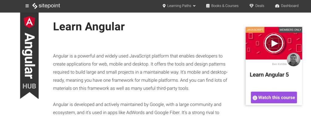
Introducing Hubs: Learn Modern Development Skills
One of the issues with trying to learn a new web technology today is figuring out where to start: the sheer amount of material available in a variety of formats can be overwhelming. SitePoint’s new Hubs remedy that issue by providing comprehensive learning destinations on a multitude of web development topics; each comprising a curated selection of up-to-the-minute articles, books and video courses that offer trusted, practical knowledge presented in a friendly and approachable way.

Steered by each Hub’s editor, users are walked through concepts; build complete example projects; and get detailed guidance on the best supporting tools available.
Perfect for a complete novice just starting out with a new framework or language, and also ideal for experienced developers wanting to brush up on the latest techniques, SitePoint’s Hubs offer tutorials, best practice advice and real-world knowledge for everyone.
The post Introducing Hubs: Learn Modern Development Skills appeared first on SitePoint.
by SitePoint Team via SitePoint
Geracao S Mais
Geração S+ is a healthy life project for young people. We want you to grow + Healthy, + Sustainable, + Fun, + Sense, because we are sure that your happiness of tomorrow depends on which path you start choosing today.
by csreladm via CSSREEL | CSS Website Awards | World best websites | website design awards | CSS Gallery
WunderChild
Your kids have talents you may have not uncovered yet! Our fun talent game for kids between 3 and 6 can show you early on what inspires your child and what his/her gifts are.
by csreladm via CSSREEL | CSS Website Awards | World best websites | website design awards | CSS Gallery
Micropayment.io – Micropayments on
Easily add micropayments to your WordPress site or WooCommerce store with the easy to install and use plugin from Micropayment.io. Protect content with microtransaction powered paywalls, and regain some of the lost revenue from ad blockers.
by csreladm via CSSREEL | CSS Website Awards | World best websites | website design awards | CSS Gallery
Studio Digital Storytelling
The studio is based in Munich and focuses on content strategies, Digital Storytelling formats, digital brand and visibility strategies.
by csreladm via CSSREEL | CSS Website Awards | World best websites | website design awards | CSS Gallery