Tuesday, October 2, 2018

94 Photography

one page portfolio website

Amazing example of a creative one page photography studio website. The portfolio work is great, design clean and functional, only thing we would recommend is speeding everything up a little. Overall, nice work!

We created this site for a small photo studio in NYC specializing in makeup and skincare images. We accidentally discovered a cool effect using combinations of CSS transitions and filter effects that made the background look like it was being “burned away” with white. When you open the nav menu or enlarge any photo, you’ll see the background “burn” away.

The post 94 Photography appeared first on One Page Mania.


by Michael via One Page Mania

AWS, Azure & Google Cloud Backup Solutions Compared

Cloud backup is a form of cloud storage where data is stored and then retrieved from different distributed and interconnected cloud-based resources. Cloud-based backup solutions allow businesses and enterprises as well as individuals to safely store their data on the internet via a storage service provider.

This cloud-based storage solution can be used instead of storing data locally on a physical disk like a hard drive. Cloud backup also allows users to access the provider's services remotely via a secure client login application. This can be used to back up files either from the user's computer or data center onto the online storage server by way of a secure and encrypted connection.

In this article, we're going to dig deep into various characteristics of cloud pricing. We'll primarily focus on the top three cloud platforms - Google, Azure and AWS. We'll have a look at some of the factors like their features and capabilities, pricing, support and documentation etc.

Features and Capabilities

All the cloud vendors offer a large array of features and backup solutions. Let's have a look at what the top three offer.

Microsoft Azure

Microsoft Azure backup can be used to backup, protect as well as restore your data in the Microsoft Cloud. It replaces any existing on-premise, local or off-site backup solution by deploying a cloud-based reliable and secure solution.

Microsoft Azure has a number of different components that can be downloaded and deployed either on the appropriate server or computer or in the cloud. Irrespective of what you want to protect, all backup components provide users with the ability to back up data to a Recovery Services vault provided by Azure.

Some of Microsoft Azure's key features include:

  • Automatic Storage Management
  • Unlimited Scaling
  • Multiple Storage Options
  • Unlimited Data Transfer
  • Data Encryption
  • Application-Consistent Backup, and
  • Long-Term Retention

Amazon Web Services S3

Amazon S3 or Simple Storage Service was designed keeping developers in mind and with the aim to help them build cloud computing tools.

Among the different cloud storage services available, only few can compare with the number of data center regions globally as Amazon S3 – 14. This is because AWS S3 shares the same infrastructure being used by Amazon's shopping platform.

Given the global presence of its data center regions, AWS S3 allows users to select a region near them or a region close to where most of their web traffic originates. The benefit here is that it enables quicker transfers to and from the cloud.

Some of AWS S3's key features include:

  • Durability and Availability
  • Flexibility and Scalability
  • Cost Effectiveness
  • Security
  • Compliance
  • Flexible Data Transfer
  • Largest Partner Ecosystem, and
  • Additional Backup and Restore Resources

Google Cloud Storage

Google Cloud Storage is an enterprise-focused public cloud storage platform where users can store large unstructured data sets. Organizations can purchase storage for either primary or infrequently required data.

As a service within the Google Cloud Platform, Google Cloud Storage allows unified object storage for live as well as archived data. Objects that have been stored here are grouped into buckets or containers within the cloud and can be individually assigned to different storage classes.

Users can access their data via a web browser or a command line interface. Similar to AWS S3, Google Cloud Storage also gives users the option to select the geographical location where they prefer their data stored.

Some of Google Cloud Storage's key features include:

  • Single API across storage classes
  • High availability across all storage classes
  • Ability to scale to exabytes of data
  • Time to first byte measured in milliseconds
  • Strongly consistent listing, and
  • Designed for 99.99% durability

Which one should you choose?

AWS is the most popular choice for cloud backup solutions. It provides temporary storage which is allocated when an instance is started and is destroyed when the instance is terminated. It also provides Block Storage which is equivalent to hard disks, i.e., you have the choice to either attach it to any instance or keep it separate.

Additionally, AWS also provides object storage as part of its S3 Service as well as archiving services with Glacier.

Service Provider Temporary Storage Block Storage Object Storage
Amazon S3 Yes EBS S3
Microsoft Azure Temporary Storage – D Drive Page Blobs Block Blobs and Files
Google Cloud Storage Yes Persistent Disks Google Cloud Storage

Cloud Pricing

Each of the three services offers outstanding scalability and use the monthly cost-per-GB model. This makes comparisons between the three extremely easy. There are a certain amount of variations among the services mainly coming from the complexity of the different storage classes involved and how storing data in one class vs. another can impact rates. Here is a little more detail on the pricing front for each of the three service providers.

Microsoft Azure

Microsoft Azure's storage rates are based on the amount of storage you need, your geographical location, how frequently you need to access the stored data and the kind of data redundancy you choose. Though sophisticated, Azure's pricing model allows users to control costs when appropriately managed.

The table below illustrates the prices for blob storage for a data center located in the Eastern United States -

LRS - Cool LRS - Hot GRS - Cool GRS - Hot
First 50 TB per month $0.0152 $0.0208 $0.0334 $0.0458
Next 450 TB per month $0.0152 $0.0200 $0.0334 $0.0440
Over 500 TB per month $0.0152 $0.0192 $0.0334 $0.0422

*LRS - Local Redundant Storage. LRS allows for multiple and synchronous copies of your data to be stored in a single data center.

**GRS - Geographically Redundant Storage. GRS is used to store a second synchronized set of your data in a different data center hundreds of miles away from the first. The benefit is that GRS provides an additional layer of redundancy enabling quicker access times for users in a different geographical location.

If you want to cut down pricing, there are third-party vendors for the Azure platform that offers low priced backup solutions that are optimized for a category of users. Nimble, HPE and NetApp are popular in that regard.

Amazon S3

Amazon S3 provides a lot of the similar flexibility for scaling storage as Azure. Users are charged for storage used with no upfront costs or termination fees.

The most substantial difference between Amazon S3 and Microsoft Azure lies in the fact that, unlike Azure, Amazon S3 does not have multi-regional storage. However, S3 does provide a middle tier class between standard and archival storage. This is known as 'Standard-Infrequent Access.'

The table below illustrates the prices for storage in the Eastern United States (North Virginia) region:

Tier Standard per gigabyte Standard - infrequent access per gigabyte
First 50 TB / month $0.023 $0.0125
Next 450 TB / month $0.022 $0.0125
Over 500 TB / month $0.021 $0.0125

Note: Costs may differ slightly by region, either intra-country or inter-country. However, intra-country cost differences usually amount to within a few cents.

The third-party AWS backup solutions offer low-priced storage volumes that you can deploy in a region of your choice. You can also set up VPC network for all your AWS resources. Some of the popular vendors for AWS backup include CyberDuck, CloudBerry and N2WS.

Google Cloud

With Google Cloud, users get the benefit of a nice mix of the different storage class options that Microsoft Azure and Amazon S3 offer. This makes Google Cloud fairly more scalable than the other two. The combination provided by Google includes multi-regional as well as regional options, a mid-range option known as 'nearline' and an archival option similar to Glacier, known as 'coldline'.

Here's a look at the costs that Google Cloud Storage charges:

Multi-regional per GB Regional per GB Nearline per GB Coldline per GB
General pricing $0.026 $0.020 $0.010 $0.007
Tokyo pricing N/A $0.023 $0.016 $0.010

An important aspect to keep in mind here is that Google Cloud Storage takes an approach similar to Microsoft Azure and Amazon S3 in that it does away with the option of variable pricing by region as well as tier based pricing per total GB stored.

The post AWS, Azure & Google Cloud Backup Solutions Compared appeared first on SitePoint.


by Gilad Maayan via SitePoint

Custom Landing Page Designs

custom designed landing page

What better way to market your landing page design service than to offer it in a landing page? Nice one pager selling you on a custom landing page design and build.

Custom Landing Page Designs Built for Conversion” is a landing page built to sell specific product to specific type of costumers. The goal was to build a landing page that works as an extension os existing website – One page layout with simple anchor navigation, decent scroll interactions, hover effects and fixed background images creating subtle parallax effect.

The post Custom Landing Page Designs appeared first on One Page Mania.


by Michael via One Page Mania

YouTube Introduces More Ad Extensions for the Brand Enhancement

YouTube is going to offer new extensions options to its advertisers for their ads to provide them with more opportunities to enhance their brands. Why you should be interested in this?Google is continuously extending the extensions to view in-stream ads. Form and location extensions were already...

[ This is a content summary only. Visit our website https://ift.tt/1b4YgHQ for full links, other content, and more! ]

by Sahir via Digital Information World

The Perfect Portfolio Website Builder: 5 Examples

This article was created in partnership with BAWMedia. Thank you for supporting the partners who make SitePoint possible.

Creating a portfolio website is a lot easier than once was the case. You don't need to learn HTML and CSS or rely on someone else to present you or your business in a shining light. Now, you can create a very professional portfolio in minutes. You will just need to use your mouse.

You work hard to create a product or service, and you work hard at trying to be the best that you can be. That's a given. It doesn't mean however that you must work extra hard to showcase your work.

If you have something to show off, it's almost ridiculously easy to do so. Try the portfolio-building tools described below. Any one of them will give you the shining light you seek. You will get it in the form of an eye-catching and engaging portfolio website with a few clicks of a mouse.

1. Elementor Page Builder

Elementor solved a major website-building problem – feeling constrained by a certain theme design. This is great news for designers with portfolio websites who want to improve their visual presentation.

Using Elementor, you will build your portfolio website from the frontend. You'll always have complete control over customizing every part of your site, whether it's a portfolio page, gallery page, blog post or any other page.

This free open-source page builder is super-fast, built with the strictest coding standards in mind. It works with any theme or template you choose, and comes with over 130 designer-made templates. Elementor is developer friendly, and has a large developer community supporting it.

While the free version may for starting out, you should also check out what the pro version has to offer. Pro features include the superior workflow, marketing integrations, and visual form builder. These features make Elementor Pro a top choice for any WordPress professional.

Check out its recent WordPress Custom Post Type feature, which allows you to create your own unique and dynamic portfolio website.

Use the many widgets in Elementor to best showcase your accomplishments and create a unique portfolio for your business.

2. Mobirise Website Builder

Mobirise would be another excellent choice. Since it's an offline builder, you're not tied to any platform and you have total control over how you choose to go about building a perfect online portfolio, or any other type of website.

Everything about using Mobirise is intuitive. It's all drag and drop so you'll never have a need for coding, it's lightning-fast as well, and your site or portfolio is guaranteed to be 100% mobile friendly.

Whether the portfolio you build is for your use or for a client, Mobirise is free to use for both commercial and personal uses.

There's no shortage of tools to work with either. The package features a library of 7,000 icons, 850 Google fonts, 500,000 or so free images, and a large selection of trendy pre-made website blocks.

Mobirise works on both Windows and Mac OS. An Android version is available as well.

3. Portfoliobox

Portfoliobox was designed with photographers/designers/artists and other creative professionals in mind. That doesn't mean you can't use it to build an online portfolio if you don't fit squarely into one of those categories.

It simply means that in putting together a business-oriented portfolio or a personal portfolio to supplement your resume, the tools are there to help you showcase who you are or what you've done in the best possible light.

And with Portfoliobox, you can create that showcase within a few hours and with no coding required.

Choose either the free plan or the pro plan. The former has everything needed to create an outstanding portfolio website, but you should give the pro plan a careful look to, especially if you have several websites in mind.

The post The Perfect Portfolio Website Builder: 5 Examples appeared first on SitePoint.


by SitePoint Team via SitePoint

How Entrepreneurs Can Stay Positive in the Face of Adversity

When Tobi Skovron landed in LA, he had a great idea, a start-up mentality, and the Global Financial Crisis awaiting his arrival. Luckily he doesn’t believe in negative thinking.

Tobi Skovron explains:

I’ve got this unbreakable spirit, I can’t explain where I got it from but it’s just deep inside. When something like the GFC presented itself, I just felt there was no alternative other than to keep going. To me, the glass is always half full and I never once looked at that situation with doom and gloom.

Skovron puts his positive attitude down to many things, the most significant being the death of his father when he was just 16.

It was a life-changing experience. My mom didn’t focus on the loss, she focused us on what we had, and so perhaps this played into the way that when things go sour I can just shake it off. It’s just who I am.

This relentlessly positive attitude is paired with an incredible ambition to succeed, which came in handy when Skovron first launched Pet Loo into the Australian market in 2003. It flew off the shelves, and so Skovron and his wife made the decision to expand their horizons and take Pet Loo to The United States.

He laughs when asked about his experience of starting, growing and selling a business in America.

It was horrible. We ate cereal for dinner for 4 years! I had no money and it was all hustle and very hard, but once someone gave me a chance, Pet Loo became really popular. When it came to the eventual success of the business, there were no tricks, it was all hard work. It sounds crazy to say, but something I did quickly learn was just how huge the US is. As the business took off, we quickly started to ship to a number of different states and cities and I think we went too quickly. If I could do it again, I would start with one city at a time instead of the whole country. It put pressure on everything. However, it was great, in hindsight, and I certainly learned a lot about my limits. Saying that, when it came to launching Creative Cubes, I ignored everything I learned!

The post How Entrepreneurs Can Stay Positive in the Face of Adversity appeared first on SitePoint.


by Nikki Stefanoff via SitePoint

Creating Layouts with CSS Grid

The following introduction to CSS Grid is an extract from Tiffany’s upcoming book, CSS Master, 2nd Edition, which will be available shortly.

CSS Grid is a relatively recent layout specification, shipping in most browsers as of October 2017. Grid allows us to create layouts that were previously impossible, or only possible with lots of DOM operations.

Keep in mind that the CSS Grid specification is dense, and introduces several new concepts that are quite complex. Consider this an overview rather than a comprehensive look at Grid. Don’t worry, we’ll point you to lots of resources for learning more.

The Grid Formatting Context

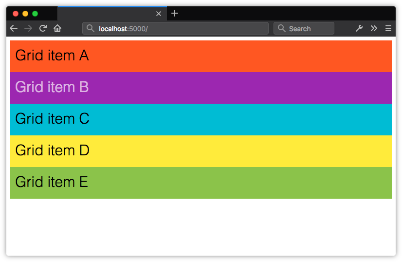
Adding display: grid to an element triggers a grid formatting context for that element and its children. In a grid formatting context, three things happen:

  1. The element becomes a block-level element that participates in the normal flow.
  2. Its children—whether elements or text nodes—create block-like, grid-level boxes that can be arranged into rows and columns. Immediate children of a grid container are grid items.
  3. In a horizontal writing mode, each member in a grid row will have the same height as its tallest element (as determined by content), unless an explicit height value is set. When the document uses a vertical writing mode, it takes on the same length as its longest element (as determined by content).
Using display: grid creates a block-level container, and block boxes for its childrenUsing display: grid creates a block-level container, and block boxes for its children

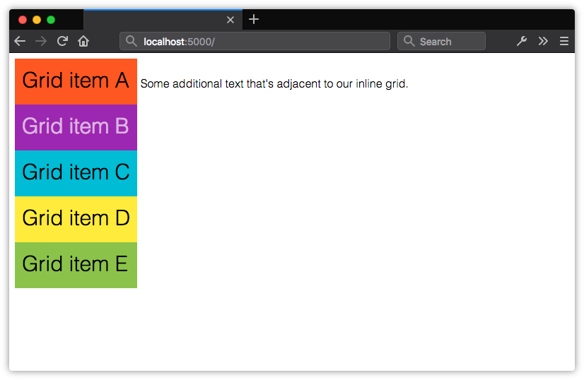
Using display: inline-grid works similarly. Children of inline-level grid containers create grid-level boxes, but the container itself participates in an inline formatting context.

Using display: inline-grid creates an inline-level box for the container, but block boxes for its childrenUsing display: inline-grid creates an inline-level box for the container, but block boxes for its children

By themselves, display: grid and display: inline-grid won’t automatically arrange these boxes into rows and columns. We also need to tell the browser where and how to place things.

Before creating your grid, determine whether you want a fixed number of columns and/or rows, whether you’d like the browser to calculate the number of columns and rows automatically, or whether you’d like a mix of the two. Knowing what kind of grid you want to create determines the approach you’ll take. Let’s look at a few techniques.

Defining a Grid Layout

After defining a grid container, we’ll need to tell the browser how many rows and columns our grid should contain. We can define the number of rows and columns using the grid-template-rows and grid-template-columns properties. They’re applied to the grid container.

Both grid-template-rows and grid-template-columns accept what’s known as a track list. The track list is a space-separated string that specifies grid line names and sizes of each position in the row or column.

Each value in a track list creates a new space—a track—within the row or column. You can use lengths, flexible length units (discussed later in this chapter), or percentages. You can also use sizing values such as auto, min-content and max-conent.

.grid {
    display: grid;
    grid-template-columns: 25rem 25rem 25rem;
    grid-template-rows: 10rem 10rem;
}

In the code above, we’ve defined a grid with three columns, each 25rem units wide and two rows, each 10rem units tall. Let’s apply it to the following HTML. Yes, this is all the markup required:

<div class="grid">
    <div>Grid item A</div>
    <div>Grid item B</div>
    <div>Grid item C</div>
    <div>Grid item D</div>
    <div>Grid item E</div>
</div>

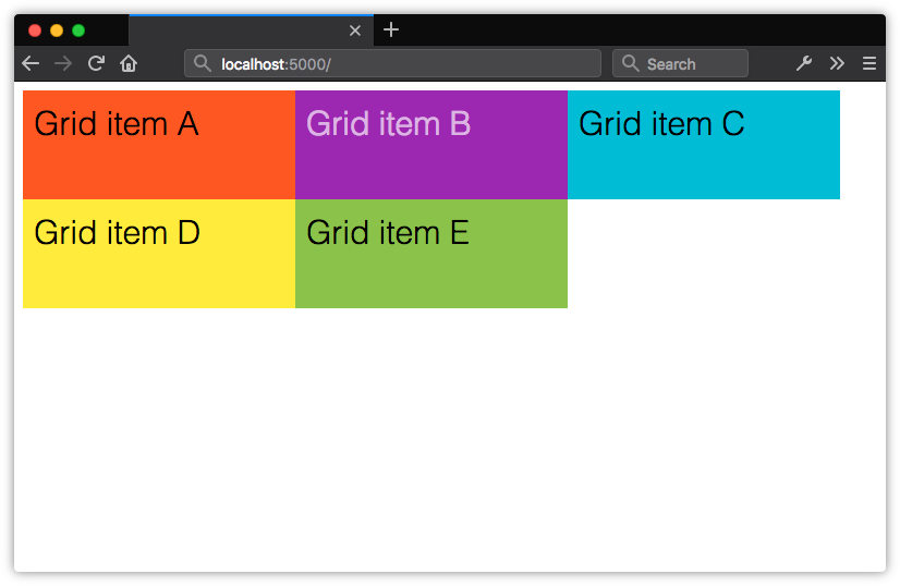
Our grid items get organized into the columns and rows shown below.

Creating an explicit grid with grid-template-columns and grid-template-rowsCreating an explicit grid with grid-template-columns and grid-template-rows

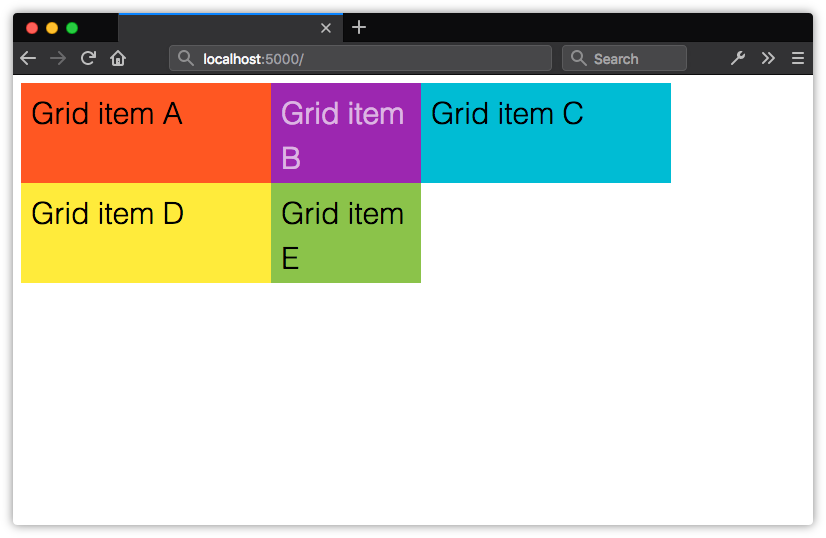
Here, we’ve created a grid of evenly sized rows and columns, but that isn’t a requirement of Grid. Let’s tweak our CSS slightly. We’ll change the value of grid-template-columns to 25rem 15rem 25rem:

.grid {
    display: grid;
    grid-template-columns: 25rem 15rem 25rem;
    grid-template-rows: 10rem 10rem;
}

Now the second column in our grid is narrower than the first and third.

Grid columns and rows don’t have to be the same widthGrid columns and rows don’t have to be the same width

Explicit Grid versus Implicit Grids

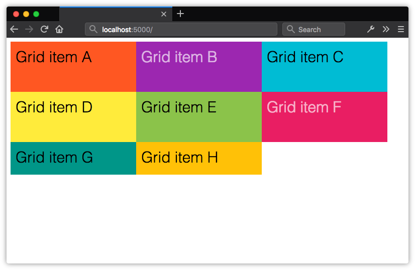
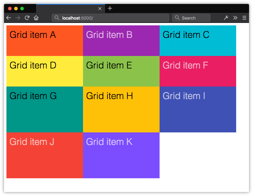
In the previous section, we explicitly stated that this grid should have six available grid cells formed by three columns and two rows. This is what’s known as an explicit grid. Here, our grid container only has five children. The remaining position is empty. Let’s see what happens when we add more children to the container.

When grid items exceed the number of explicitly defined cells, the remaining items are arranged in an implicit gridWhen grid items exceed the number of explicitly defined cells, the remaining items are arranged in an implicit grid

Now we have three rows. Notice, however, that our third row is only as tall as its contents and padding. It’s part of the grid because these items are the children of a grid container. Yet the row isn’t explicitly defined by grid-template-rows. What we have instead is an implicit grid—an explicit grid with additional grid items that exceed the defined number of explicit grid cells.

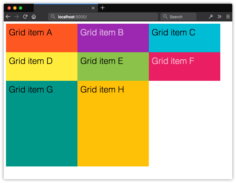
Items within an implicit grid are auto sized by default. Grid items will expand to accommodate their contents, or fill the remaining vertical space in the container—whichever is taller. If, for example, we set the height property of our container to 50rem, our implicit grid track will expand to be 30rem tall.

Implicit grid rows expand to fill the available height of the containerImplicit grid rows expand to fill the available height of the container

If we add enough items to create a fourth row, the height of our implicit grid items will be distributed evenly across the remaining 30rem of vertical space in the container. Their computed height will be 15rem each.

The height of implicit grid rows will be evenly distributed based on the remaining space in the grid containerThe height of implicit grid rows will be evenly distributed based on the remaining space in the grid container

In our original example, we’ve explicitly defined only two rows with a height of 10rem each, so our third row defaults to auto sizing. Its height will adjust to the size of its contents and padding.

The post Creating Layouts with CSS Grid appeared first on SitePoint.


by Tiffany Brown via SitePoint