The post Hover Effect Style 252 appeared first on Best jQuery.
by Admin via Best jQuery
"Mr Branding" is a blog based on RSS for everything related to website branding and website design, it collects its posts from many sites in order to facilitate the updating to the latest technology.
To suggest any source, please contact me: Taha.baba@consultant.com
A contact form is a quick way for users to get in touch with you. Some of the benefits of a contact form include the following.
One of the ways to cut down on spam is to use a contact form. You will no longer have to put your email address out there, which makes it harder for people to send you spam mail.
A contact form allows you to request specific information or control the information a user provides. Since you are at liberty to add or remove any form field you wish, you can make particular fields required with a contact form.
People find it easy to fill a contact form as opposed to calling or sending an email. Having a contact form is an effective way to collect leads and hence, increase conversion rates. Even the simplest contact form can lead to an increase in leads.
You can use a contact form to create a specific form geared towards obtaining questions and feedback from customers, especially for new products or services. This kind of information can be used to make better marketing decisions or improvements,
You can also use a contact form to allow customers to request quotes, especially for service-oriented businesses. You can also use it to receive quotes from customers.
A contact form provides an easy way for customers to get in touch with you. Instead of scouring through your website to obtain your email, you can place the form in an accessible page where users will find it easy to contact you.
Free plugins are great when you're getting started with WordPress, but if you want to go to the next level with your sites and save yourself time while you're doing it, you should consider a premium contact form plugin from CodeCanyon.


This tutorial will show to add Google Maps to a contact form using Contact Form 7 and the Google Maps Extension for CF7 WordPress plugin. By the end of the tutorial, we should have something like this:
.png)
Contact Form 7 provide a simple and flexible contact form for your WordPress website. You can customize the design of the form and configure where information is sent when users contact you. Contact Form 7 is very popular and hence has tons of free and paid add-ons that provide extra features such as Dropbox integration, maps integration, and so on.
The plugin comes with additional features such as AJAX submission, Akismet spam filtering, form upload files, and even the ability to add a CAPTCHA to the form. The most significant advantage of this form is that its free to use.
Many plugins can help you create a contact form for your WordPress website: Contact Form 7 is one of those plugins. Since its flexible and easy to use, Contact Form 7 is considered the top choice when choosing a contact form.
This plugin provides a straightforward and uncomplicated way to get set up, especially if you don't know much about coding.
The fastest way to install the CF7 contact form plugin is to use the plugin search feature from within WordPress. Go to Plugins > Add New and search for CF7 contact form with the search bar. Click on it and click Install. After the plugin has installed, click on the Activate link to activate the plugin.
The Google Maps Extension for CFP provides a great way to enhance your form by adding a map field to it. This allows you to obtain the user's location. Some of the notable features of this plugin include:
Purchase and download the Google Maps Extension for CF7. You can find your installable WordPress files in the download section of your account.
Once you download the WordPress files, log in to your WordPress site, and install the plugin. Go to Plugins > Add New and upload the WordPress zip file you got from CodeCanyon. After uploading, click Install Now, wait a few seconds, and then click Activate. You can now start using the plugin.
Google maps are now integrated with the contact form, as shown below.

To add a map to our contact form, we need to generate a Google Maps API Key.
To obtain an API key:

The Google Maps extension for CF7 provides various ways in which you can configure maps.
Edit the rest of the settings such as markers, map types, and other attributes from the settings page, as shown below, and save the changes.

Go to Contact > Add New from your WordPress Dashboard menu. Contact Form 7 comes pre-configured with a ready-to-use template which looks like this:

To add a map field, click the Google Maps button and you should see a popup like this:

Click on Insert Tag, and the map appears as a field on your form. Your form should now look something like this:

Go to the Mail tab and paste the [maps] shortcode in your email component to receive maps data in an email. Save all the changes. Each form, once created, generates a unique shortcode that you will use to embed it on a page.
The last step is to embed the form on a page or any other place you want it to appear. Go to Pages > Add New, give the page a title and paste the shortcode on the body of the page as shown below.

The complete form with a map will look like this:

As you can see, visitors can put markers on their location or use the search feature to search for their location. They can also draw shapes as well as zoom in and out just like a normal map
Knowing the locations of visitors filling out your WordPress forms can help you identify who is coming to your site and showing interest. Collecting location information can help you make better decisions about the type of services or products you offer.


In this article, we're going to create an iOS-inspired toggle switch using React components. By the end, we'll have built a simple demo React App that uses our custom toggle switch component.
We could use third-party libraries for this, but building from scratch allows us to better understand how our code is working and allows us to customize our component completely.
Forms provide a major means for enabling user interactions. The checkbox is traditionally used for collecting binary data — such as yes or no, true or false, enable or disable, on or off, etc. Although some modern interface designs steer away from form fields when creating toggle switches, I'll stick with them here due to their greater accessibility.
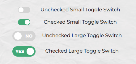
Here's a screenshot of the component we'll be building:

We can start with a basic HTML checkbox input form element with its necessary properties set:
<input type="checkbox" name="name" id="id" />
To build around it, we might need an enclosing <div> with a class, a <label> and the <input /> control itself. Adding everything, we might get something like this:
<div class="toggle-switch">
  <input type="checkbox" class="toggle-switch-checkbox" name="toggleSwitch" id="toggleSwitch" />
  <label class="toggle-switch-label" for="toggleSwitch">
        Toggle Me!
  </label>
</div>
In time, we can get rid of the label text and use the <label> tag to check or uncheck the checkbox input control. Inside the <label>, let's add two <span>s that help us construct the switch holder and the toggling switch itself:
<div class="toggle-switch">
  <input type="checkbox" class="toggle-switch-checkbox" name="toggleSwitch" id="toggleSwitch" />
  <label class="toggle-switch-label" for="toggleSwitch">
    <span class="toggle-switch-inner"></span>
    <span class="toggle-switch-switch"></span>
  </label>
</div>
Now that we know what needs to go into the HTML, all we need to do is to convert the HTML into a React component. Let's start with a basic component here. We'll make this a class component, and then we'll convert it into hooks, as it's easier for new developers to follow state than useState:
import React, { Component } from "react";

class ToggleSwitch extends Component {
  render() {
    return (
      <div className="toggle-switch">
        <input
          type="checkbox"
          className="toggle-switch-checkbox"
          name="toggleSwitch"
          id="toggleSwitch"
        />
        <label className="toggle-switch-label" htmlFor="toggleSwitch">
          <span className="toggle-switch-inner" />
          <span className="toggle-switch-switch" />
        </label>
      </div>
    );
  }
}

export default ToggleSwitch;
At this point, it's not possible to have multiple toggle switch sliders on the same view or same page due to the repetition of ids. We could leverage React's way of componentization here, but in this instance, we'll be using props to dynamically populate the values:
import React, { Component } from "react";

class ToggleSwitch extends Component {
  render() {
    return (
      <div className="toggle-switch">
        <input
          type="checkbox"
          className="toggle-switch-checkbox"
          name={this.props.Name}
          id={this.props.Name}
        />
        <label className="toggle-switch-label" htmlFor={this.props.Name}>
          <span className="toggle-switch-inner" />
          <span className="toggle-switch-switch" />
        </label>
      </div>
    );
  }
}

export default ToggleSwitch;
The this.props.Name will populate the values of id, name and for (note that it is htmlFor in React JS) dynamically, so that you can pass different values to the component and have multiple of them on the same page. Also, the <span> tag doesn't have an ending </span> tag; instead it's closed in the starting tag like <span />, and this is completely fine.
The post Create a Toggle Switch in React as a Reusable Component appeared first on SitePoint.
Neat illustrations in this Landing Page to try kick off an interactive Personalization Maturity Assessment quiz by Cordial.
Vintage-style Landing Page promoting a book feature the photography of Hardwicke Knight taken between 1921 and 1979.