We are Crush Pixels, a dedicated web design agency in Leeds, working wonders with WordPress to offer design, development and support services.
by csreladm via CSSREEL | CSS Website Awards | World best websites | website design awards | CSS Gallery
We are Crush Pixels, a dedicated web design agency in Leeds, working wonders with WordPress to offer design, development and support services.
D-FACTORY IS A HIGH-END DIGITAL CAPTURE AND POST-PRODUCTION COMPANY, OFFERING DIGITAL TECHS, ON-SET RETOUCHERS, DIGITAL EQUIPMENT AND RETOUCHING SERVICES.
MulberDen is a creative agency for overall planning Website Design 


![]()
By far the most popular article I’ve written was how to create a long-scrolling Landing Page using Squarespace back in 2017.
A lot has changed since then including the brand-new Squarespace 7.1 platform with a fresh user-interface.
In this new tutorial (plus video!) I cover exactly how to create a long-scrolling Landing Page, for any business, using Squarespace. I start from scratch with a blank page, go through adding page sections, content creation and setting a fixed header navigation that scrolls to page sections.
Squarespace really nailed their 7.1 launch and I’m excited to show you just how easy we can put a One Pager together. Let’s begin!
Yay! Squarespace has been kind enough to give One Page Love readers the exclusive coupon OPL10 for 10% Off your first website or domain purchase. (There is a free 14-day trial with no credit card needed, so you can try risk free.)
Squarespace 7.1 has a more streamlined setup process for styling your site and adding content. There is no need to start with a specific template. If you are wondering if your website is on Squarespace 7.0 or 7.1 – simply identify where the demo expansion arrow is. Left is Squarespace 7.0, right is Squarespace 7.1:
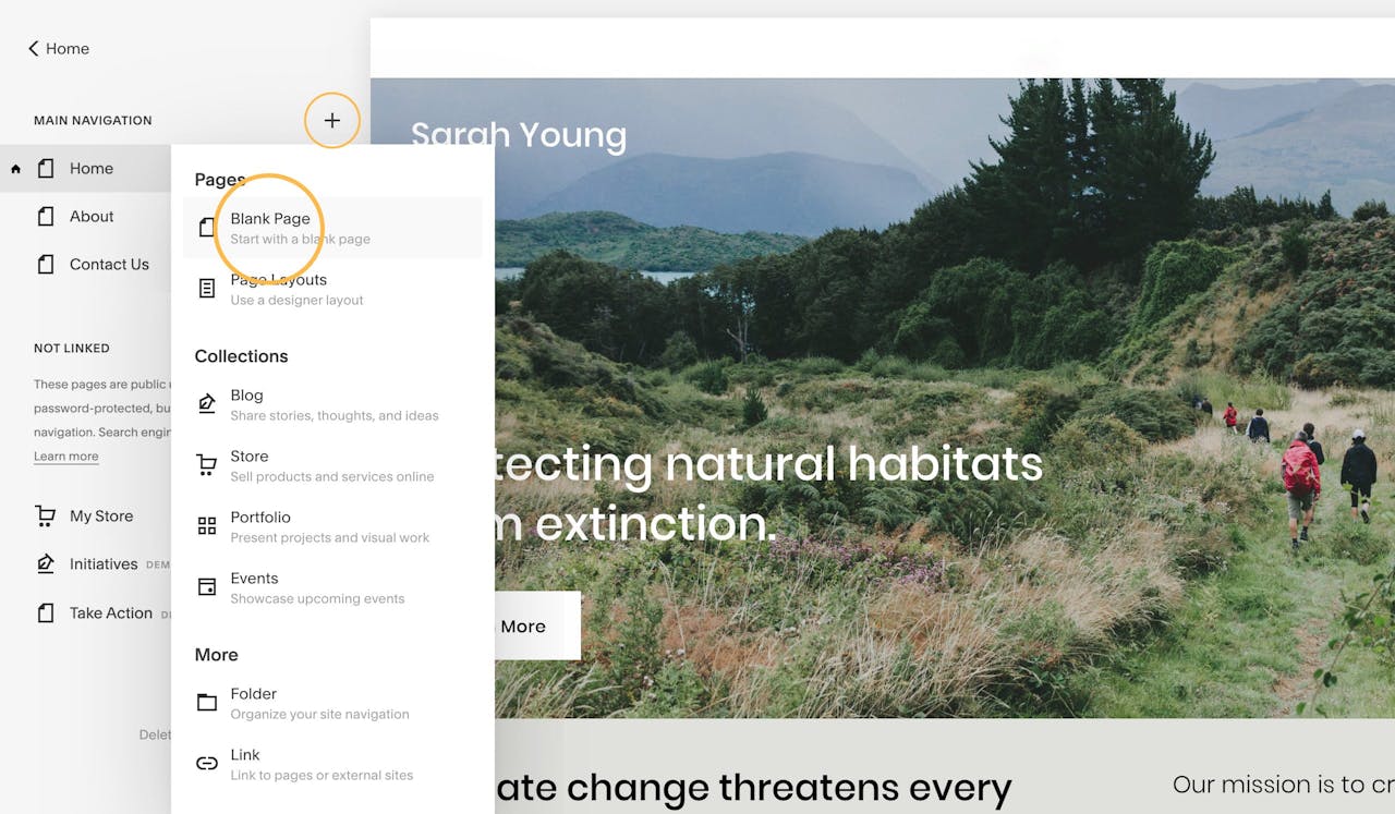
When logged in, using the main Squarespace left navigation, head to Pages → Main Navigation, then click the + icon. When prompted select the Blank Page option out the Pages options:
For better context in the tutorial we are putting together a website for a New Orleans dog walking side hustle by (an ambitious but fictitious) Sarah Young.
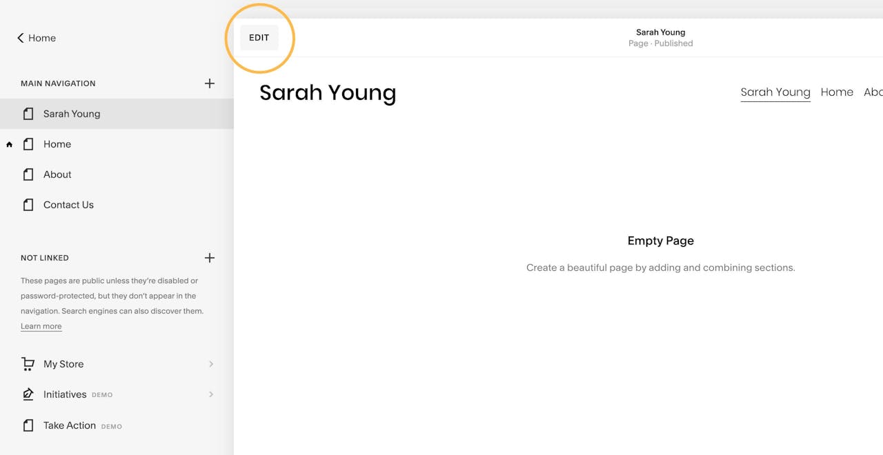
After you’ve added your new page, name it accordingly. I’m simply naming mine Sarah Young as I’m planning to make this the only page on my site.
Squarespace 7.1 has a new Edit button shown here:
Once clicked, the page editor opens up.
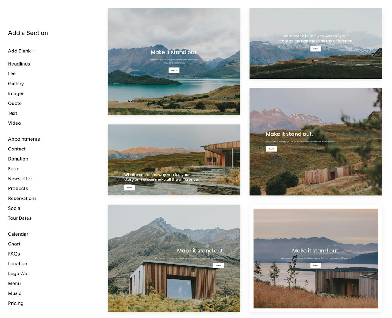
Now your blank page should have a standard header and footer, with a big empty area in the middle. This is where we are going to add our page sections. Squarespace 7.1 boasts beautifully pre-built page sections to create layouts with text, images and galleries – saving us a ton of time:
Let’s take a step back for a second to consider what content we are going to need in our Landing Page to convince potential clients to hire Sarah. These are the questions they could possibly have and the content needed to answer:
And that’s it, those are our 4 Landing Page sections.
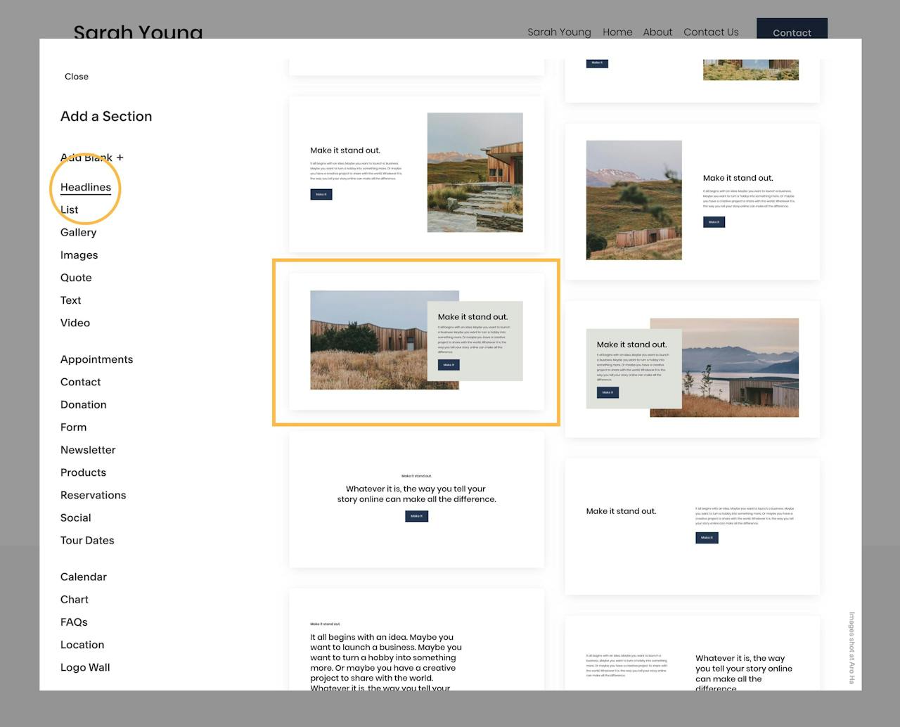
Let’s add our first section by clicking the Add Page Content button:

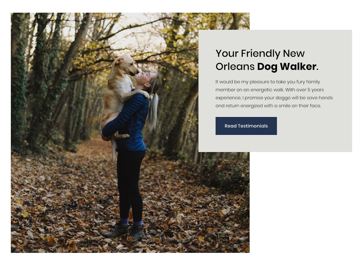
This kicks off the page sections pop-up. For the introduction/about section I really like the look of this overlapping design:
Just click the item to insert the design.
If you would like to get more detail on the content editing and styling, I’d strongly recommend watching the embedded video above.
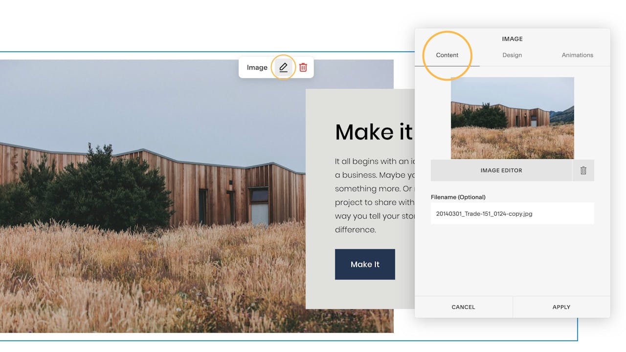
Simply put, each element is editable inline. Meaning you hover over elements and select the edit icons. Then continue to go through the options available. In the Content tab (shown here) you can change the background image. In the next Design tab you can change the alignments and the button text + link (I’m going to show you how to link to the various sections within the long-scrolling page at the end of this tutorial).
After some quick edits and uploading the pic of Sarah, our intro looks like this:
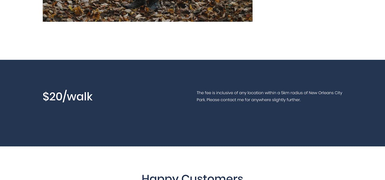
Next is the Rates section. Add another section by clicking the blue + icon below the section we just added. In the Text sections, I quite like this minimal layout which could have the price to the left:
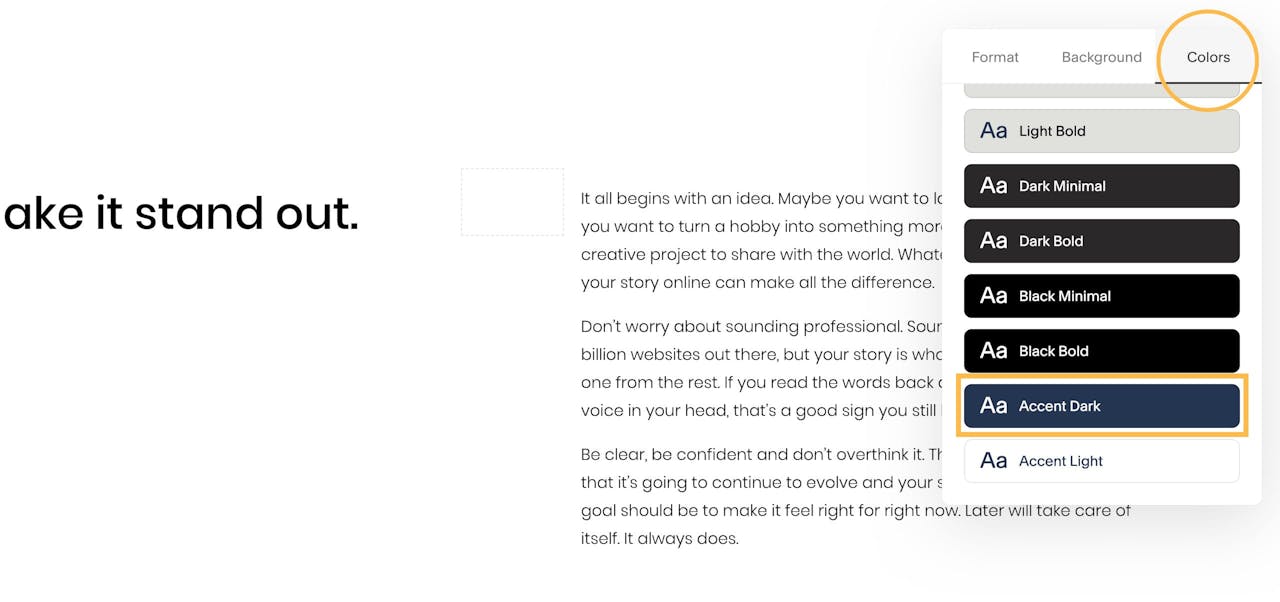
This Rates section feels quite bare with the white background, so we can change the aesthetic using the color scheme options to the right:
A few minor content edits along with the Accent Dark color scheme option really did the trick:
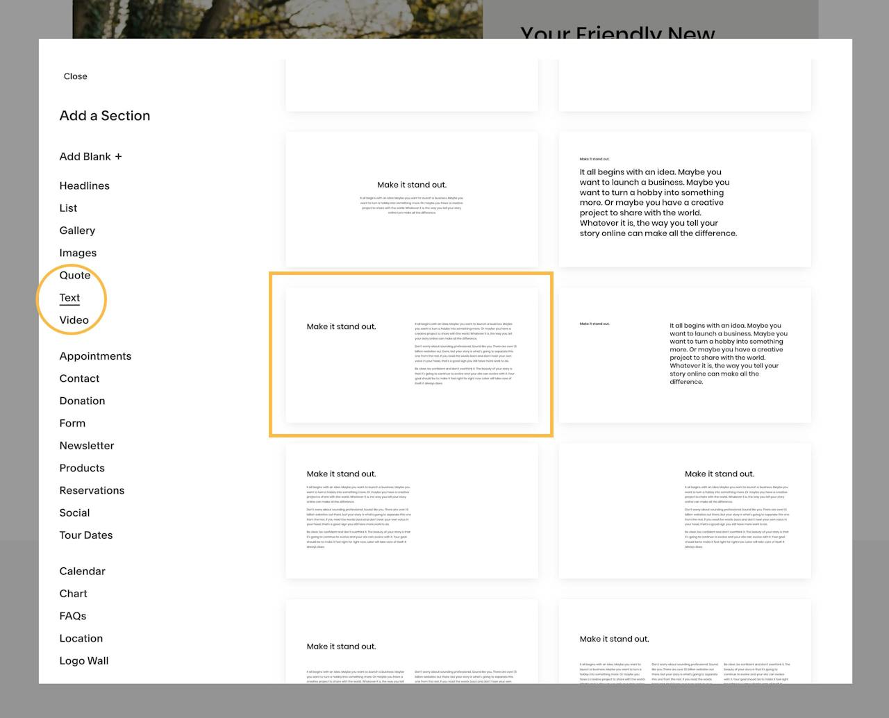
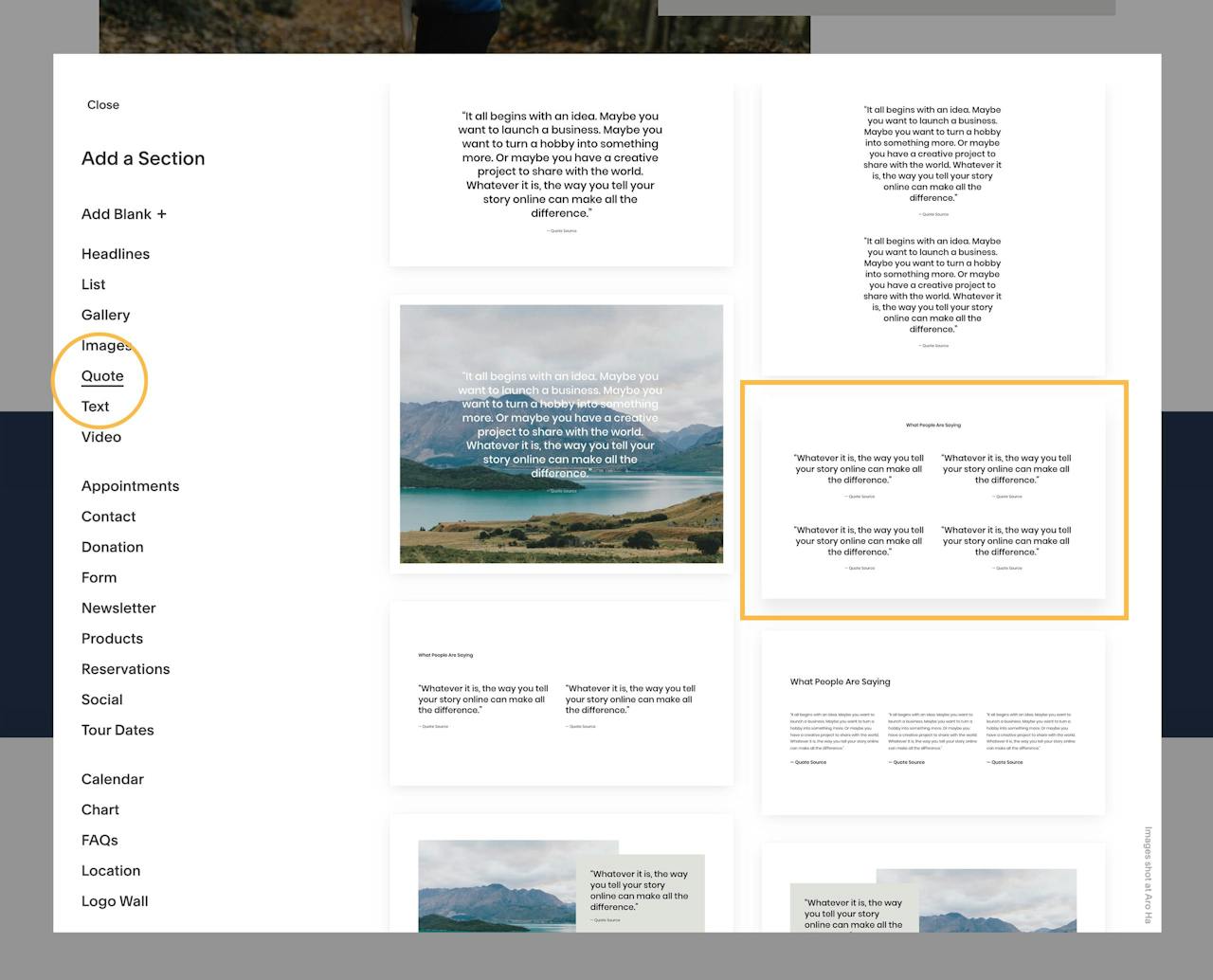
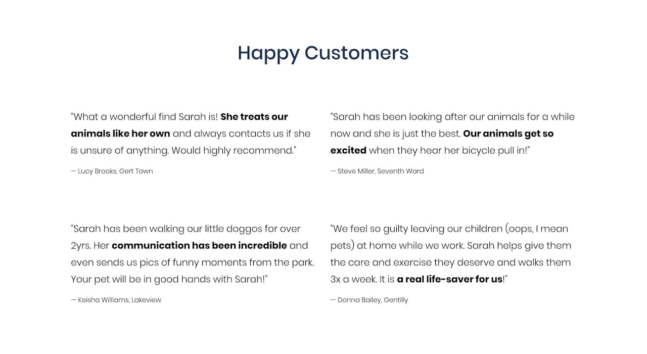
Next up is Testimonials. Within the Quote page section options I like this layout with 4 clear testimonials in 2 columns:
Considering how often people skim website content, it is good practice to highlight the main takeaway using bold text. Another tip is including the location of the New Orleans clients (next to their name) – adding local authenticity to the Landing Page:
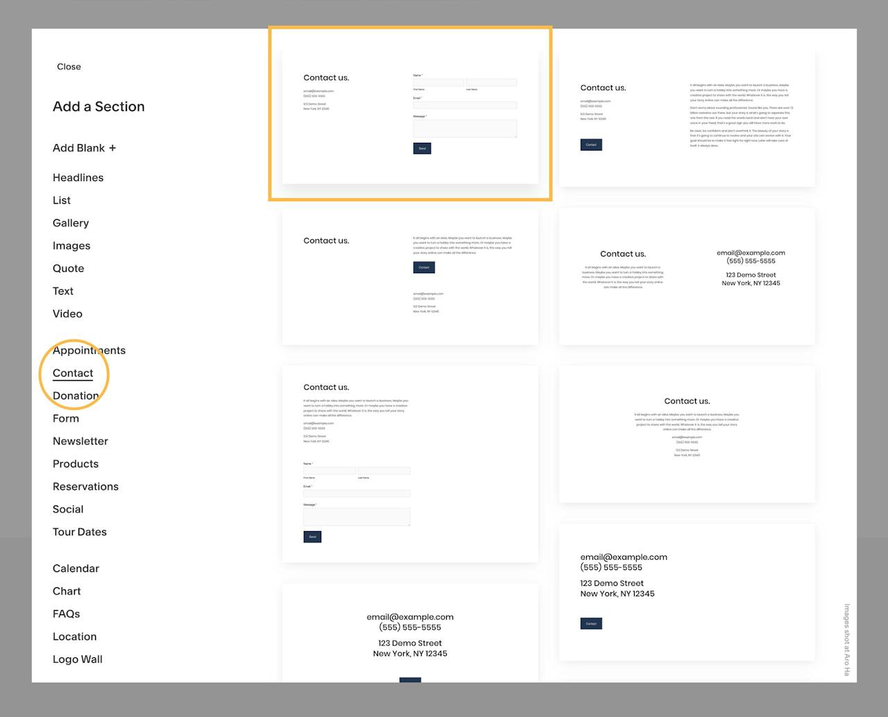
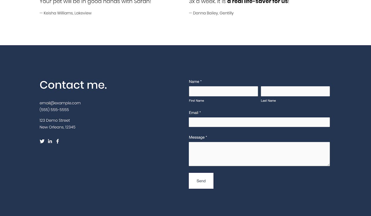
Finishing up Sarah’s Landing Page is the footer contact form. Out the Contact page section options, I like the first option with the form to the right:
Just like the Rates section above, I think the white background is a bit bland, so I’m going to change it to the Accent Dark color scheme:
Having alternate color sections also divides up the page content a bit better for the visitor. That’s it for the Landing Page content! Let’s take a step back and have a look at the Landing Page:

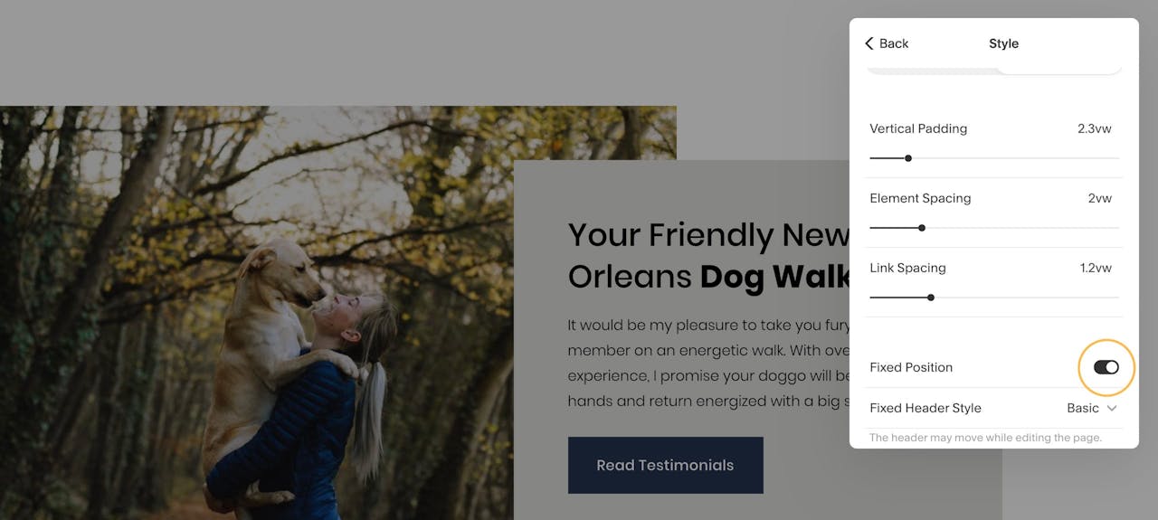
Ideally we’d like the header navigation to remain fixed while the visitor scrolls. This allows the visitor to easily navigate between page sections at any time.
To kick off the header options, hover over the header area and hit the big Edit Site Header button. This opens up an option panel to the right.
This panel is where you would upload your logo if needed but I’m happy with the default, plain-text “Sarah Young” for this Landing Page.
Within the header option list, open up the Style options. Now enable the Fixed Position option:
We want the user to click a website header link and be transported to the relative section. Example: clicking the Testimonials header link, scrolls the user to the Testimonials section within the Landing Page.
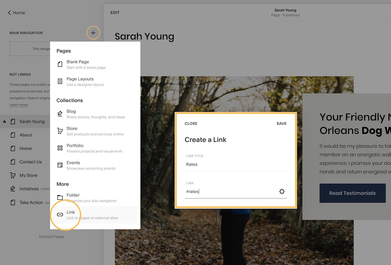
To begin, the need to remove the default header links set by Squarespace. Simply drag those links out of the Main Navigation area and into the Not Linked area:

Then we need to add custom links to the Main Navigation area. In this use-case I’m adding links to Rates and Testimonials. Click the Main Navigation + icon then select the Link option at the bottom. For the Rates link, enter in the Link Title Rates and under the Link URL setting, enter in #rates like this:
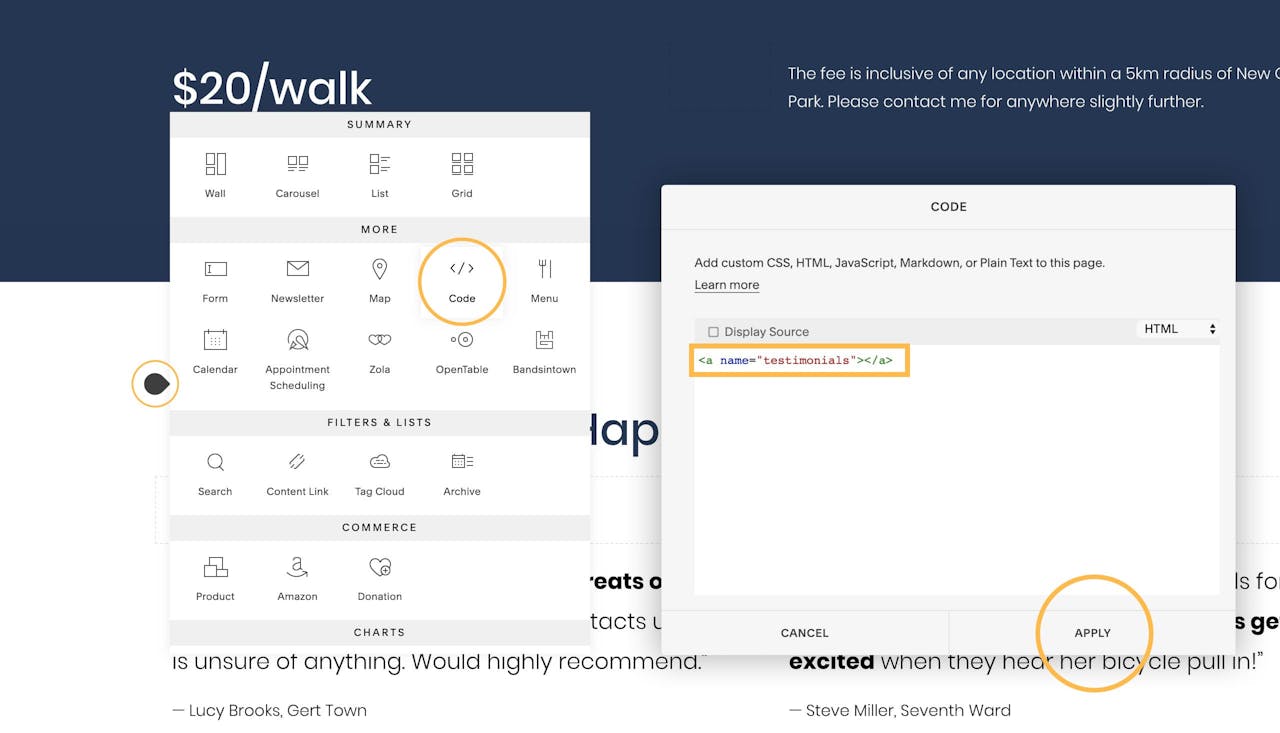
Repeat for Testimonials, ensuring #testimonials is the link URL.
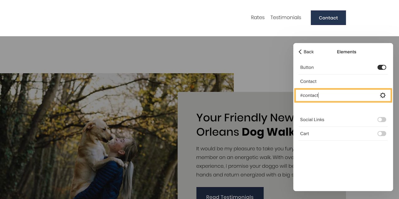
Same will go for the Contact button. Head back to the header options from earlier but steer to the Elements option. Set the button link to #contact like this:
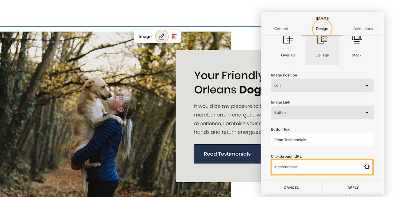
Lastly, the same applies for the Read Testimonials button featured in the intro section. Click the edit icon, switch to the Design tab and set the URL to #testimonials like this:
Think of anchors as positions within our long-scrolling webpage. Anchors are assigned a name like ‘projects’. We can navigation to these anchor positions by linking to the anchor name with a hashtag (#) prefix. Example #projects
To add an anchor link, we need to add a tiny bit of custom code above the relevant section, it’s real easy.
When editing the page, hover your tear drop cursor above the section to kick off the content block option panel. Select the Code block and proceed to enter in an anchor link matching the links set in the previous step. Example:
Simply repeat for the Rates section:
<a name="rates"></a>
and the Contact section:
<a name="contact"></a>
Once completed your website header links (set in Step Four) should now change your Landing Page position when clicked.
To enable that graceful smooth scroll motion when clicking links, head over to Design → Custom CSS in the main Squarespace menu and paste in the following code:
html {

scroll-behavior: smooth;

}
… and that’s it! Our long-scrolling Landing Page now features a fixed header navigation that smooth scrolls to the relevant sections:

Squarespace is a leading online website builder. What sets them apart from the rest is their superior level of design and customer support. They have a huge support team and are available 24/7. Other main benefits are:
I hope you enjoyed this tutorial on how to build a long-scrolling Landing Page using Squarespace. Props to Squarespace for creating a platform where we can create beautiful Ecommerce websites, easily. In case you missed it last month, I wrote a tutorial how to start selling online with Squarespace.