[ This is a content summary only. Visit our website https://ift.tt/1b4YgHQ for full links, other content, and more! ]


by Zia Muhammad via Digital Information World

Building a modern project requires splitting the logic into front-end and back-end code. The reason behind this move is to promote code re-usability. For example, we may need to build a native mobile application that accesses the back-end API. Or we may be developing a module that will be part of a large modular platform.

The popular way of building a server-side API is to use Node.js with a library like Express or Restify. These libraries make creating RESTful routes easy. The problem with these libraries is that we’ll find ourselves writing a ton of repetitive code. We’ll also need to write code for authorization and other middleware logic.
To escape this dilemma, we can use a framework like Feathers to help us generate an API in just a few commands.
What makes Feathers amazing is its simplicity. The entire framework is modular and we only need to install the features we need. Feathers itself is a thin wrapper built on top of Express, where they’ve added new features — services and hooks. Feathers also allows us to effortlessly send and receive data over WebSockets.
To follow along with this tutorial, you’ll need the following things installed on your machine:
npm i -g yarn.It will also help if you’re familiar with the following topics:
async ... await)Also, please note that you can find the completed project code on GitHub.
We’re going to build a CRUD contact manager application using Node.js, React, Feathers and MongoDB.
In this tutorial, I’ll show you how to build the application from the bottom up. We’ll kick-start our project using the popular Create React App tool.
You can install it like so:
npm install -g create-react-app
Then create a new project:
# scaffold a new react project
create-react-app react-contact-manager
cd react-contact-manager

# delete unnecessary files
rm src/logo.svg src/App.css src/serviceWorker.js
Use your favorite code editor and remove all the content in src/index.css. Then open src/App.js and rewrite the code like this:
import React from 'react';

const App = () => {
  return (
    <div>
      <h1>Contact Manager</h1>
    </div>
  );
};

export default App;
And in src/index.js, change the code like so:
import React from 'react';
import ReactDOM from 'react-dom';
import './index.css';
import App from './App';

ReactDOM.render(
  <React.StrictMode>
    <App />
  </React.StrictMode>,
  document.getElementById('root')
);
Run yarn start from the react-contact-manager directory to start the project. Your browser should automatically open http://localhost:3000 and you should see the heading “Contact Manager”. Quickly check the console tab to ensure that the project is running cleanly with no warnings or errors, and if everything is running smoothly, use Ctrl + C to stop the server.
Let’s proceed with generating the back-end API for our CRUD project using the feathers-cli tool:
# Install Feathers command-line tool
npm install @feathersjs/cli -g

# Create directory for the back-end code
# Run this command in the `react-contact-manager` directory
mkdir backend
cd backend

# Generate a feathers back-end API server
feathers generate app

? Do you want to use JavaScript or TypeScript? JavaScript
? Project name backend
? Description Contacts API server
? What folder should the source files live in? src
? Which package manager are you using (has to be installed globally)? Yarn
? What type of API are you making? REST, Realtime via Socket.io
? Which testing framework do you prefer? Mocha + assert
? This app uses authentication No
? Which coding style do you want to use? ESLint

# Ensure Mongodb is running
sudo service mongod start
sudo service mongod status

● mongod.service - MongoDB Database Server
   Loaded: loaded (/lib/systemd/system/mongod.service; disabled; vendor preset: enabled)
   Active: active (running) since Fri 2020-09-18 14:42:12 CEST; 4s ago
     Docs: https://docs.mongodb.org/manual
 Main PID: 31043 (mongod)
   CGroup: /system.slice/mongod.service
           └─31043 /usr/bin/mongod --config /etc/mongod.conf

# Generate RESTful routes for Contact Model
feathers generate service

? What kind of service is it? Mongoose
? What is the name of the service? contacts
? Which path should the service be registered on? /contacts
? What is the database connection string? mongodb://localhost:27017/contactsdb

# Install email and unique field validation
yarn add mongoose-type-email
Let’s open backend/config/default.json. This is where we can configure our MongoDB connection parameters and other settings. Change the default paginate value to 50, since front-end pagination won’t be covered in this tutorial:
{
  "host": "localhost",
  "port": 3030,
  "public": "../public/",
  "paginate": {
    "default": 50,
    "max": 50
  },
  "mongodb": "mongodb://localhost:27017/contactsdb"
}
Open backend/src/models/contact.model.js and update the code as follows:
require('mongoose-type-email');

module.exports = function (app) {
  const modelName = 'contacts';
  const mongooseClient = app.get('mongooseClient');
  const { Schema } = mongooseClient;
  const schema = new Schema({
    name : {
      first: {
        type: String,
        required: [true, 'First Name is required']
      },
      last: {
        type: String,
        required: false
      }
    },
    email : {
      type: mongooseClient.SchemaTypes.Email,
      required: [true, 'Email is required']
    },
    phone : {
      type: String,
      required: [true, 'Phone is required'],
      validate: {
        validator: function(v) {
          return /^\+(?:[0-9] ?){6,14}[0-9]$/.test(v);
        },
        message: '{VALUE} is not a valid international phone number!'
      }
    }
  }, {
    timestamps: true
  });

  // This is necessary to avoid model compilation errors in watch mode
  // see https://mongoosejs.com/docs/api/connection.html#connection_Connection-deleteModel
  if (mongooseClient.modelNames().includes(modelName)) {
    mongooseClient.deleteModel(modelName);
  }

  return mongooseClient.model(modelName, schema);
};
Mongoose introduces a new feature called timestamps, which inserts two new fields for you — createdAt and updatedAt. These two fields will be populated automatically whenever we create or update a record. We’ve also installed the mongoose-type-email plugin to perform email validation on the server.
Now, open backend/src/mongoose.js and change this line:
{ useCreateIndex: true, useNewUrlParser: true }
to:
{
  useCreateIndex: true,
  useNewUrlParser: true,
  useUnifiedTopology: true,
  useFindAndModify: false,
}
This will squash a couple of annoying deprecation warnings.
Open a new terminal and execute yarn test inside the backend directory. You should have all the tests running successfully. Then, go ahead and execute yarn start to start the back-end server. Once the server has initialized, it should print 'Feathers application started on localhost:3030' to the console.
Launch your browser and access the URL http://localhost:3030/contacts. You should expect to receive the following JSON response:
{"total":0,"limit":50,"skip":0,"data":[]}
Now let’s use Hoppscotch (formerly Postwoman) to confirm all of our endpoints are working properly.
First, let’s create a contact. This link will open Hoppscotch with everything set up to send a POST request to the /contacts endpoint. Make sure Raw input is set to on, then press the green Send button to create a new contact. The response should be something like this:
{
  "_id": "5f64832c20745f4f282b39f9",
  "name": {
    "first": "Tony",
    "last": "Stark"
  },
  "phone": "+18138683770",
  "email": "tony@starkenterprises.com",
  "createdAt": "2020-09-18T09:51:40.021Z",
  "updatedAt": "2020-09-18T09:51:40.021Z",
  "__v": 0
}
Now let’s retrieve our newly created contact. This link will open Hoppscotch ready to send a GET request to the /contacts endpoint. When you press the Send button, you should get a response like this:
{
  "total": 1,
  "limit": 50,
  "skip": 0,
  "data": [
    {
      "_id": "5f64832c20745f4f282b39f9",
      "name": {
        "first": "Tony",
        "last": "Stark"
      },
      "phone": "+18138683770",
      "email": "tony@starkenterprises.com",
      "createdAt": "2020-09-18T09:51:40.021Z",
      "updatedAt": "2020-09-18T09:51:40.021Z",
      "__v": 0
    }
  ]
}
We can show an individual contact in Hoppscotch by sending a GET request to http://localhost:3030/contacts/<_id>. The _id field will always be unique, so you’ll need to copy it out of the response you received in the previous step. This is the link for the above example. Pressing Send will show the contact.
We can update a contact by sending a PUT request to http://localhost:3030/contacts/<_id> and passing it the updated data as JSON. This is the link for the above example. Pressing Send will update the contact.
Finally we can remove our contact by sending a DELETE request to the same address — that is, http://localhost:3030/contacts/<_id>. This is the link for the above example. Pressing Send will delete the contact.
Hoppscotch is a very versatile tool and I encourage you to use it to satisfy yourself that your API is working as expected, before moving on to the next step.
Originally, I had wanted to use Semantic UI for the styling, but at the time of writing, it hasn’t been updated in over two years. Fortunately, the open-source community has managed to keep the project alive by creating a popular fork, Fomantic-UI, and this is what we’ll use. There are plans to merge one back into the other when active development of Semantic UI resumes.
We’ll also use Semantic UI React to quickly build our user interface without having to define lots of class names. Fortunately, this project has been kept up to date as well.
Finally, we’ll be using React Router to handle the routing.
With that out of the way, open a new terminal in the react-contact-manager directory and enter the following commands:
# Install Fomantic UI CSS and Semantic UI React
yarn add fomantic-ui-css semantic-ui-react

# Install React Router
yarn add react-router-dom
Update the project structure by adding the following directories and files to the src directory:
src
├── App.js
├── App.test.js
├── components #(new)
│   ├── contact-form.js #(new)
│   └── contact-list.js #(new)
├── index.css
├── index.js
├── pages #(new)
│   ├── contact-form-page.js #(new)
│   └── contact-list-page.js #(new)
├── serviceWorker.js
└── setupTests.js
From the terminal:
cd src
mkdir pages components
touch components/contact-form.js components/contact-list.js
touch pages/contact-form-page.js pages/contact-list-page.js
Let’s quickly populate the JavaScript files with some placeholder code.
The ContactList component will be a functional component (a plain JavaScript function which returns a React element):
// src/components/contact-list.js

import React from 'react';

const ContactList = () => {
  return (
    <div>
      <p>No contacts here</p>
    </div>
  );
}

export default ContactList;
For the top-level containers, I’m using pages. Let’s provide some code for the ContactListPage component:
// src/pages/contact-list-page.js

import React from 'react';
import ContactList from '../components/contact-list';

const ContactListPage = () => {
  return (
    <div>
      <h1>List of Contacts</h1>
      <ContactList />
    </div>
  );
};

export default ContactListPage;
The ContactForm component will need to be smart, since it’s required to manage its own state, specifically form fields. We’ll be doing this with React hooks:
// src/components/contact-form.js

import React from 'react';

const ContactForm = () => {
  return (
    <div>
      <p>Form under construction</p>
    </div>
  )
}

export default ContactForm;
Populate the ContactFormPage component with this code:
// src/pages/contact-form-page.js

import React from 'react';
import ContactForm from '../components/contact-form';

const ContactFormPage = () => {
  return (
    <div>
      <ContactForm />
    </div>
  );
};

export default ContactFormPage;
Now let’s create the navigation menu and define the routes for our App. App.js is often referred to as the “layout template” for a single-page application:
// src/App.js

import React from 'react';
import { NavLink, Route } from 'react-router-dom';
import { Container } from 'semantic-ui-react';
import ContactListPage from './pages/contact-list-page';
import ContactFormPage from './pages/contact-form-page';

const App = () => {
  return (
    <Container>
      <div className="ui two item menu">
        <NavLink className="item" activeClassName="active" exact to="/">
          Contacts List
        </NavLink>
        <NavLink
          className="item"
          activeClassName="active"
          exact
          to="/contacts/new"
        >
          Add Contact
        </NavLink>
      </div>
      <Route exact path="/" component={ContactListPage} />
      <Route path="/contacts/new" component={ContactFormPage} />
      <Route path="/contacts/edit/:_id" component={ContactFormPage} />
    </Container>
  );
};

export default App;
The above code uses React Router. If you’d like a refresher on this, please consult our tutorial.
Finally, update the src/index.js file with this code, where we import Formantic-UI for styling and the BrowserRouter component for using the HTML5 history API, which will keep our app in sync with the URL:
// src/index.js

import React from 'react';
import ReactDOM from 'react-dom';
import { BrowserRouter } from 'react-router-dom';
import App from './App';
import 'fomantic-ui-css/semantic.min.css';
import './index.css';

ReactDOM.render(
  <BrowserRouter>
    <App />
  </BrowserRouter>,
  document.getElementById('root')
);
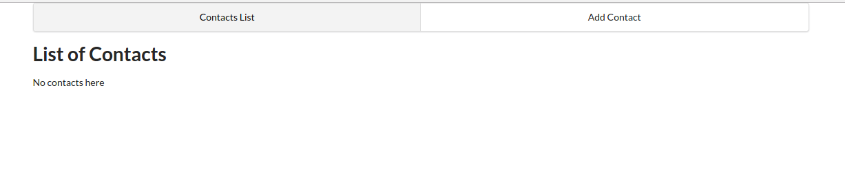
Make sure that the create-react-app server is running (if not, start it using yarn start), then visit http://localhost:3000. You should have a similar view to the screenshot below:
Previously, one might have reached for Redux when tasked with managing state in a React app. However, as of React v16.8.0, it’s possible to manage global state in a React application using React Hooks and the Context API.
Using this new technique, you’ll write less code that’s easier to maintain. We’ll still use the Redux pattern, but just using React Hooks and the Context API.
Next, let’s look at hooking up the Context API.
This will be like our store for handling global state for contacts. Our state will consist of multiple variables, including a contacts array, a loading state, and a message object for storing error messages generated from the back-end API server.
In the src directory, create a context folder that contains a contact-context.js file:
cd src
mkdir context
touch context/contact-context.js
And insert the following code:
import React, { useReducer, createContext } from 'react';

export const ContactContext = createContext();

const initialState = {
  contacts: [],
  contact: {}, // selected or new
  message: {}, // { type: 'success|fail', title:'Info|Error' content:'lorem ipsum'}
};

function reducer(state, action) {
  switch (action.type) {
    case 'FETCH_CONTACTS': {
      return {
        ...state,
        contacts: action.payload,
      };
    }
    default:
      throw new Error();
  }
}

export const ContactContextProvider = props => {
  const [state, dispatch] = useReducer(reducer, initialState);
  const { children } = props;

  return (
    <ContactContext.Provider value={[state, dispatch]}>
      {children}
    </ContactContext.Provider>
  );
};
As you can see, we’re using the useReducer hook, which is an alternative to useState. useReducer is suitable for handling complex state logic involving multiple sub-values. We’re also using the Context API to allow sharing of data with other React components.
Continue reading Build a Node.js CRUD App Using React and FeathersJS on SitePoint.

Historically, HTML forms have been quite tricky — firstly, because at least a little bit of JavaScript was required, and secondly, because no amount of CSS could ever make them behave.
However, this isn’t necessarily true in the case of the modern web, so let’s learn how to mark up forms using only HTML and CSS.

Start off with the <form> element.
Nothing fancy here. Just covering the basic structure.
<form>
    ...
</form>
If you’re submitting the form data naturally (that is, without JavaScript), you’ll need to include the action attribute, where the value is the URL you’ll be sending the form data to. The method should be GET or POST depending on what you’re trying to achieve (don’t send sensitive data with GET).
Additionally, there’s also the lesser-used enctype attribute which defines the encoding type of the data being sent. Also, the target attribute, although not necessarily an attribute unique to forms, can be used to show the output in a new tab.
JavaScript-based forms don’t necessarily need these attributes.
<form method="POST" action="/subscribe" enctype="application/x-www-form-urlencoded" target="_blank">
    ...
</form>
Forms are made up of inputs, which expect data values.
<form>
    <input type="text"><!-- text input -->
    <input type="text" value="Prefilled value">
</form>
See the Pen
Form 1 by SitePoint (@SitePoint)
on CodePen.
Every input needs a label.
A label is a text descriptor that describes what an input is for. There are three ways to declare a label, but one of them is superior to the other two. Let’s dive into these now.
Adjacent labels require the most code because we need to explicitly declare which input the label describes. To most, this is counterintuitive because we can instead wrap inputs inside labels to achieve the same effect with less code.
That being said, the adjacent method may be necessary in extenuating circumstances, so here’s what that would look like:
<label for="firstName">First name</label>
<input id="firstName">
As you can see from the example above, the for attribute of the <label> must match the id attribute of the input, and what this does is explain to input devices which text descriptor belongs to which input. The input device will then relay this to users (screen readers, for example, will dictate it via speech).
While semantic HTML is better, ARIA (Accessible Rich Internet Applications) labels can compensate in their absence. In this case, here’s what a label might look like in the absence of an actual HTML <label>:
<input aria-label="First name">
Unfortunately, the downside of this approach is the lack of a visual label. However, this might be fine with some markups (for example, a single-input form with a heading and placeholder):
<h1>Subscribe</h1>
<form>
    <input aria-label="Email address" placeholder="bruce@wayneenterpris.es">
</form>
(I’ll explain what placeholders are for in a moment.)
Wrapping inputs within labels is the cleanest approach. Also, thanks to CSS’s :focus-within, we can even style labels while their child inputs receive focus, but we’ll discuss that later.
<label>
    First name<input>
</label>

A brief comparison:
Placeholders aren’t designed to be the alternative to labels, although as we saw in the ARIA example above, they can add back some of the context that’s lost in the absence of visual labels.
Ideally, though, we should use both:
<label>
    First name<input placeholder="Bruce">
</label>
See the Pen
Form 2 by SitePoint (@SitePoint)
on CodePen.
Placeholders only apply to text-based inputs, but there are actually a whole range of different input types, which include:
<input type="button">
<input type="checkbox">
<input type="color">
<input type="date">
<input type="datetime-local">
<input type="email">
<input type="file">
<input type="hidden"> <!-- explained later -->
<input type="image">
<input type="month">
<input type="number">
<input type="password">
<input type="radio">
<input type="range">
<input type="reset">
<input type="search">
<input type="submit"> <!-- submits a form -->
<input type="tel">
<input type="text"> <!-- the default -->
<input type="time">
<input type="url">
<input type="week">
Semantic input types are useful during form validation, especially when relying on native validation, which we’ll take a look at shortly. First, let’s learn how to style these inputs.
Arguably the most infuriating aspect of coding forms is overriding the browser’s default styling. Thankfully, today, appearance: none; has 96.06% browser support according to caniuse.com.
After resetting the web browser’s default styling with the following CSS code, we can then style inputs however we want, and this even includes both the radio and checkbox input types:
input {
 -webkit-appearance: none;
 -moz-appearance: none;
    appearance: none;
    ...
}
However, some of these inputs might come with quirks that are difficult or even impossible to overcome (depending on the web browser). For this reason, many developers tend to fall back to the default type="text" attribute=value if they find these quirks undesirable (for example, the “caret” on input type="number").
However, there is a silver lining …
inputmodeWith 82.3% web browser support according to caniuse.com, the new inputmode attribute specifies which keyboard layout will be revealed on handheld devices irrespective of the input type being used.
Better than nothing, right?
<input type="text" inputmode="none"> <!-- no keyboard 👀 -->
<input type="text" inputmode="text"> <!-- default keyboard -->
<input type="text" inputmode="decimal">
<input type="text" inputmode="numeric">
<input type="text" inputmode="tel">
<input type="text" inputmode="search">
<input type="text" inputmode="email">
<input type="text" inputmode="url">
Should you choose native-HTML validation over a JavaScript solution, remember that inputmode achieves nothing in this regard. inputmode="email" won’t validate an email address, whereas input type="email" will. That’s the difference.
Putting this aside, let’s discuss what does trigger validation:
<input required> <!-- value is required -->
<form required> <!-- all values are required -->

<!-- alternative input types -->
<input type="email"> <!-- blank or a valid email address -->
<input type="email" required> <!-- must be a valid address -->

<!-- text-based inputs -->
<input minlength="8"> <!-- blank or min 8 characters -->
<input maxlength="32"> <!-- blank or max 32 characters -->
<input maxlength="32" required> <!-- max 32 characters -->

<!-- numeric-based inputs -->
<input type="date" min="yyyy-mm-dd"> <!-- min date -->
<input type="number" max="66" required> <!-- max number -->
Custom rules require knowledge of JavaScript regular expressions, as used by the RegExp object (but, without wrapping slashes or quotes). Here’s an example that enforces lowercase characters (a–z) and minlength/maxlength in one rule:
<input pattern="[a-z]{8,12}">
Note: front-end validation (native-HTML or otherwise) should never, ever be used as a substitute for server-side validation!

Just for extra clarity, this is how we’d style validity:
input:valid {
    border-left: 1.5rem solid lime;
}

input:invalid {
    border-left: 1.5rem solid crimson;
}

form:invalid {
    /* this also works, technically! */
}
Houston, we have a problem!
Inputs attempt to validate their values (or lack thereof) immediately, so the following code (which only shows the valid/invalid states while the input holds a value) might be better:
Continue reading A Guide to HTML & CSS Forms (No Hacks!) on SitePoint.


