D3.js is a JavaScript library for manipulating documents based on data. D3 helps you bring data to life using HTML, SVG, and CSS.
There are only three JavaScript libraries that I would suggest every web developer should learn: jQuery, Underscore and D3. These are libraries that allow you to think about code in new ways: jQuery allows you to write less and do more with the DOM, Underscore (or lodash) gives you functional tools for changing the way you write programs and D3 gives you a rich tool-set for data manipulation and graphics programming. If you're unfamiliar with D3 please take a moment to look at the impressive gallery of examples to see what can be done with it.
This aint' your daddy's charting library.
William Playfair invented the bar, line and area charts in 1786 and the pie chart in 1801. Today, these are still the primary ways that most data sets are presented. Now, these charts are excellent but D3 gives you the tools and the flexibility to make unique data visualizations for the web, your creativity is the only limiting factor.
D3 is an extremely flexible low-level visualization library with a jQuery-like API for mapping data to HTML and SVG documents. It contains a wealth of helpful mathematical functions for data transformation and physics calculations, although most of it's power comes from manipulating geometries and paths in SVG.
This article aims to give you a high level overview of D3's capabilities, in each example you'll be able to see the input data, transformation and the output document. Rather than explaining what every function does I'll show you the code and you should be able to get a rough understanding of how things work. I'll only dig into details for the most important concepts, Scales and Selections.
A Bar Chart
I promised you more than William Playfair's charts but making the humble bar chart with HTML is one of the easiest ways to understand how D3 transforms data into a document. Here's what that looks like:
d3.select('#chart')
  .selectAll("div")
  .data([4, 8, 15, 16, 23, 42])
  .enter()
  .append("div")
  .style("height", (d)=> d + "px")
The selectAll function returns a D3 "selection": an array of elements that get created when we enter and append a div for each data point.
This code maps the input data [4, 8, 15, 16, 23, 42] to this output HTML.
<div id="chart">
  <div style="height: 4px;"></div>
  <div style="height: 8px;"></div>
  <div style="height: 15px;"></div>
  <div style="height: 16px;"></div>
  <div style="height: 23px;"></div>
  <div style="height: 42px;"></div>
</div>
All of the style properties that don't change can go in the CSS.
#chart div {
  display: inline-block;
  background: #4285F4;
  width: 20px;
  margin-right: 3px;
}
GitHub's Contribution Chart
With a few lines of extra code we can convert the bar chart above to a contribution chart similar to Github's.
Rather than setting a height based on the data's value we can set a background-color instead.
const colorMap = d3.interpolateRgb(
  d3.rgb('#d6e685'),
  d3.rgb('#1e6823')
)

d3.select('#chart')
  .selectAll("div")
  .data([.2, .4, 0, 0, .13, .92])
  .enter()
  .append("div")
  .style("background-color", (d)=> {
    return d == 0 ? '#eee' : colorMap(d)
  })
The colorMap function takes an input value between 0 and 1 and returns a color along the gradient of colors between the two we provide. Interpolation is a key tool in graphics programming and animation, we'll see more examples of it later.
An SVG Primer
Much of D3's power comes from the fact that it works with SVG, which contains tags for drawing 2D graphics like circles, polygons, paths and text.
<svg width="200" height="200">
  <circle fill="#3E5693" cx="50" cy="120" r="20" />
  <text x="100" y="100">Hello SVG!</text>
  <path d="M100,10L150,70L50,70Z" fill="#BEDBC3" stroke="#539E91" stroke-width="3">
</svg>
The code above draws:
- A circle at 50,120 with a radius of 20
- The text "Hello SVG!" at 100,100
- A triangle with a 3px border, the
dattribute has the following instructions- Move to 100,10
- Line to 150,70
- Line to 50,70
- Close path(Z)
<path> is the most powerful element in SVG.
Circles

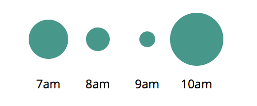
The data sets in the previous examples have been a simple array of numbers, D3 can work with more complex types too.
const data = [{
  label: "7am",
  sales: 20
},{
  label: "8am",
  sales: 12
}, {
  label: "9am",
  sales: 8
}, {
  label: "10am",
  sales: 27
}]
For each point of data we will append a <g>(group) element to the #chart and append <circle> and <text> elements to each with properties from our objects.
const g = d3.select('#chart')
  .selectAll("g")
  .data(data)
  .enter()
  .append('g')
g.append("circle")
  .attr('cy', 40)
  .attr('cx', (d, i)=> (i+1) * 50)
  .attr('r', (d)=> d.sales)
g.append("text")
  .attr('y', 90)
  .attr('x', (d, i)=> (i+1) * 50)
  .text((d)=> d.label)
The variable g holds a d3 "selection" containing an array of <g> nodes, operations like append() append a new element to each item in the selection.
This code maps the input data into this SVG document, can you see how it works?
Continue reading %Learn to Create D3.js Data Visualizations by Example%
by Mark Brown via SitePoint
No comments:
Post a Comment