In a previous post, I covered the process of converting a Bootstrap carousel into a full-screen carousel with a random initial image. In this article, I’ll build on that and cover the art of animating Bootstrap carousels, drawing on the assistance of GSAP (GreenSock Animation Platform), a popular JavaScript library.

Before going any further, let’s look at what we’ll be building.
Building the Carousel
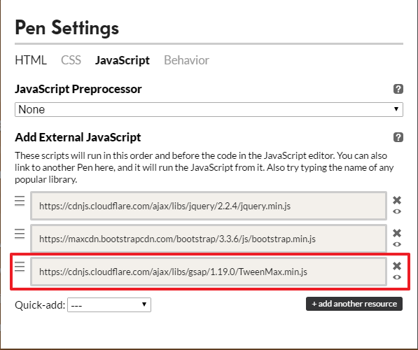
Be sure to include Bootstrap and jQuery (Bootstrap’s JavaScript components require it) in your page — for example, from a CDN:
<!DOCTYPE HTML>
<html>
  <head>
    <meta charset="utf-8">
    <title>Using GSAP to Animate Bootstrap Carousels</title>
    <link rel="stylesheet" type="text/css" href="https://maxcdn.bootstrapcdn.com/bootstrap/4.0.0/css/bootstrap.min.css">
  </head>
  <body>
    ...
    <script src="https://code.jquery.com/jquery-3.2.1.slim.min.js"></script>
    <script src="https://maxcdn.bootstrapcdn.com/bootstrap/4.0.0/js/bootstrap.min.js"></script>
  </body>
</html>
The basic structure of our carousel looks like this:
<div id="mycarousel" class="carousel slide" data-ride="carousel">
  <ol class="carousel-indicators">
    <li data-target="#mycarousel" data-slide-to="0" class="active"></li>
    <li data-target="#mycarousel" data-slide-to="1"></li>
  </ol>

  <div class="carousel-inner">

    <!-- first slide -->
    <div class="carousel-item first active" id="1">
      <!-- content here -->
    </div>

    <!-- second slide -->
    <div class="carousel-item second" id="2">
      <!-- content here -->
    </div>

  </div><!-- /carousel-inner -->

</div>
As you can see, it contains two slides. The first slide has a class of first and an ID of 1, while the second one has a class of second and an ID of 2.
Regarding their styles:
- we set their height equal to the viewport height
- we give them different background colors.
The associated CSS rules:
.item {
  height: 100vh;
}

.first {
  background: #D98F4F; /*orange*/
}

.second {
  background: #2c9cae; /*lightblue*/
}
This should be enough to give us a working carousel.
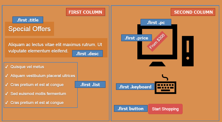
Building the First Slide
Next, we take advantage of Bootstrap’s helper classes (e.g. grid classes) to set up the contents for our slides.
The markup for the first slide is the following:
<div class="carousel-item first active" id="1">
  <div class="carousel-caption">
    <div class="container">
      <div class="row justify-content-md-center">

        <div class="col">
          <h2 class="title">
            <!-- content here -->
          </h2>
          <p class="desc">
            <!-- content here -->
          </p>
          <ul class="list">
            <!-- list items here -->
          </ul>
        </div>

        <div class="col">
          <div class="pc-wrapper">
            <img class="pc" src="IMG_PATH" alt="" width="" height="">
            <div class="price">
              <!-- content here -->
            </div><!-- /price -->
          </div><!-- /pc-wrapper -->
          <img class="keyboard" src="IMG_PATH" alt="" width="" height="">
          <button type="button" class="btn btn-danger btn-lg">
            <!-- content here -->
          </button>
        </div>

      </div><!-- /row -->
    </div><!-- /container -->
  </div><!-- /carousel-caption -->
</div><!-- /carousel-item -->
If you’re following along, be sure to replace IMG_PATH with something sensible.
Here’s what the result looks like:

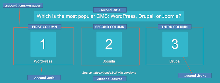
Building the Second Slide
In the same way, here’s the markup for the second slide:
<div class="carousel-item second" id="2">
  <div class="carousel-caption">
    <div class="container">

      <h2 class="title">
        <span>
          <!-- content here -->
        </span>
      </h2>

      <div class="row justify-content-md-center">

        <div class="col cms-wrapper">
          <div class="cms">
            <div class="front">
              <!-- content here -->
            </div>
            <div class="back">
              <img class="img-fluid" src="IMG_PATH" alt="">
            </div><!-- /back -->
          </div><!-- /cms -->
          <p class="info">
            <!-- content here -->
          </p>
        </div><!-- /cms-wrapper -->

        <!-- two more columns here -->

      </div><!-- /row -->

      <div class="source">
        <!-- content here -->
      </div><!-- /source -->

    </div><!-- /container -->
  </div><!-- /carousel-caption -->
</div><!-- /carousel-item -->
And its visualization:

Note: For simplicity, we won’t extensively cover the styles for the inner parts of our slides. We’ll only refer to the styles that are important for the animations.
Initializing the Carousel
Next we initialize the carousel and disable default autoplay by passing interval:false to the configuration object:
var $carousel = $("#mycarousel");

$carousel.carousel({
  interval: false
});
Adding Keyboard Navigation
By default, Bootstrap carousel isn’t compliant with accessibility standards. In our case, though, let’s make the carousel a bit more accessible by adding keyboard navigation.
Here’s the required code:
$(document).keyup(function(e) {
  // right arrow
  if(e.which === 39) {
    $carousel.carousel("next");
  // left arrow
  } else if(e.which === 37) {
    $carousel.carousel("prev");
  }
});
So far, we’ve built a basic carousel which supports keyboard navigation.
Animating Bootstrap Carousels: First Animations
At this point, let’s try to make the carousel more appealing by adding some animations. To achieve this, we’ll take advantage of GSAP, one of the most powerful JavaScript animation libraries out there. If you’re looking for a thorough introduction to GreenSock, check out GreenSock for Beginners: a Web Animation Tutorial (Part 1).
Getting Started With GSAP
To incorporate GSAP into our projects, we have to visit its site and from there click the download button, which appears in the top-right corner of the page. This will open a modal dialog with a link to the project on a CDN.

If we then select the Customize radio button, we can select the parts of the library we want to use. For our project, however, we’ll keep things simple and include just the full robust version of it.

Remember that we had to add jQuery to our project because Bootstrap’s carousel depends on it. But, keep in mind that GSAP is a pure JavaScript library, and thus it doesn’t require it.
Continue reading %Animating Bootstrap Carousels with GSAP’s Animation Library%
by George Martsoukos via SitePoint
No comments:
Post a Comment