On the Masonry website, we read that Masonry is …
a JavaScript grid layout library. It works by placing elements in optimal position based on available vertical space, sort of like a mason fitting stones in a wall.
Bootstrap is one of the most widely adopted, open-source, front-end frameworks. Include Bootstrap in your project, and you’ll be able to whip up responsive web pages in no time.
If you tried using Masonry together with the Tabs widget, one of the many JavaScript components Bootstrap has to offer, chances are you’ve stumbled on some kind of annoying behavior.
I did, and this article highlights what the issue is and what you can do to solve it.
Bootstrap Tabs Explained
Bootstrap’s Tabs component includes two key, related pieces: a tabbed navigation element and a number of content panels. On page load, the first panel has the class .active applied to it. This enables the panel to be visible by default. This class is used via JavaScript to toggle the panel’s visibility via the events triggered by the tabbed navigation links: if .active is present the panel is visible, otherwise the panel is hidden.
If you have some web content that’s best presented in individual chunks, rather than crammed all in one spot, this kind of tabs component might come in handy.
Why Masonry?
In some cases, the content inside each panel is suited to being displayed in a responsive grid layout. For instance, a range of products, services, and portfolio items are types of content that can be displayed in grid format.
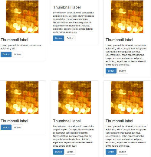
However, if grid cells are not of the same height, something like what you see below can happen.

A wide gap separates the two rows of content and the layout appears broken.
Nowadays, Bootstrap solves the equal-width issue with the brand new card component, which is based on Flexbox. Just adding the card-deck class to a group of card components is sufficient to achieve equal-width columns.
If you like your cards to be of uneven length, you could use CSS3 Multi Column Layout. (After all, even though there are some browser support bugs, overall it’s quite good.) This underlies the new card columns option that comes packaged with the card component. However, if you still love the nice animation that the Masonry JavaScript library provides out of the box, and its wide browser compatibility, JavaScript is still a viable option in this case.
Setting Up a Demo Page
Getting a demo page up and running helps to show how integrating Bootstrap’s Tabs with Masonry is not as straightforward as one might expect.
This article’s demo page is based on the starter template, available on the Bootstrap website.
Below is the skeleton of the markup for the tabs component:
<ul class="nav nav-tabs" id="myTab" role="tablist">

  <!-- nav item 1 -->
  <li class="nav-item">
    <a class="nav-link active" id="home-tab" data-toggle="tab" href="#home" role="tab" aria-controls="home" aria-selected="true">Home</a>
  </li>

  <!-- nav item 2 -->
  <li class="nav-item">
    <a class="nav-link" id="profile-tab" data-toggle="tab" href="#profile" role="tab" aria-controls="profile" aria-selected="false">Profile</a>
  </li>

  <!-- nav item 3 -->
  <li class="nav-item">
    <a class="nav-link" id="contact-tab" data-toggle="tab" href="#contact" role="tab" aria-controls="contact" aria-selected="false">Contact</a>
  </li>
</ul>
The nav nav-tabs classes are responsible for giving the tabs their characteristic appearance. The value of the href attribute forms the relationship between a single tab and its corresponding tabbed content. For instance, an href value of #home creates a relationship with the tabbed content with id="home": clicking that particular tab reveals the contents inside the div with the id value of home.
Also, notice how Bootstrap pays attention to accessibility attributes like role, aria-controls, etc.
Here’s a code snippet to illustrate the tabbed content’s structure:
<!-- content 1 -->
<div class="tab-pane fade show active" id="home" role="tabpanel" aria-labelledby="home-tab">
  <h3>Tab 1 Content</h3>
<div class="card-group">

  <!-- first card -->
  <div class="card">
    <img class="card-img-top" src="path/to/img" alt="Card image cap">
    <div class="card-body">
      <h5 class="card-title">Card title</h5>
      <p class="card-text">Card text here.</p>
      <p class="card-text"><small class="text-muted">Last updated 3 mins ago</small></p>
    </div>
  </div>

  <!-- second card -->
  <div class="card">
    <!-- card markup here -->
  </div&lgt;

  <!-- third card -->
  <div class="card">
    <!-- card markup here -->
  </div>

  </div>
</div>
Just add a similar structure for each tabbed content section corresponding to the tabs elements you coded above.
For the full code, check out the CodePen demo.
Continue reading %Getting Bootstrap Tabs to Play Nice with Masonry%
by Maria Antonietta Perna via SitePoint
No comments:
Post a Comment