It can be difficult to achieve complex yet flexible and responsive grid layouts. Various techniques have evolved over the years but most, such as faux columns, were hacks rather than robust design options.
Most of these hacks were built on top of the CSS float property. When the flexbox layout module was introduced to the list of display property options, a new world of options became possible. Now you can not only define the direction the container is going to stack the items but also wrap, align (items and lines), order, shrink, etc. them in a container.
With all that power in their hands, developers started to create their own combinations of rules for all sorts of layouts. Flexibility reigned. However, flexbox was designed to deal with one-dimensional layouts: either a row or a column. CSS Grid Layout, in contrast, permitted two-dimensional row and column layouts.
Progressive Enhancement vs Graceful Degradation
It’s difficult to create a website that supports every user’s browser. Two options are commonly used — “graceful degradation” and “progressive enhancement”.
Graceful degradation ensures a website continues to function even when something breaks. For example, float: right may fail if an element is too big for the screen but it wraps to the next empty space so the block remains usable.
Progressive enhancement takes the opposite approach. The page starts with minimum functionality and features are added when they’re supported. The example above could use a CSS media query to verify the screen is a minimum width before allowing an element to float.
When it comes to grid layouts, each browser determines the appearance of its components. In this article, you’re going to understand with some real samples how to evolve some web contents from an old strategy to a new one. More specifically, how to progressively enhance the model from a float-based layout to flexbox, and then CSS Grid, respectively.
Your Old Float Layout for a Page
Take a look at the following HTML page:
<main>
  <article>
    article content
  </article>

  <aside>
    aside content
  </aside>
</main>
It’s a small, common example of grid disposition you can have in a webpage: two divs sharing the same container (body).

The following CSS can be used in all the examples we’ll create to set the body style:
body {
  font-family: Segoe UI;
  font-style: normal;
  font-weight: 400;
  font-size: 1rem;
}
Plus, the CSS snippet for each of our divs, enabling the floating effect:
main {
  width: 100%;
}

main, article, aside {
  border: 1px solid #fcddd1;
  padding: 5px;
  float: left;
}

article {
  background-color: #fff4dd;
  width: 74%;
}

aside {
  width: 24%;
}
You can see the example in action here:
See the Pen Float Layout Example by SitePoint (@SitePoint) on CodePen.
You can float as many elements as you want, one after another, in a way all of them suit the whole available width. However, this strategy has some downsides:
- it’s hard to manage the heights of the container elements
- Vertical centering, if needed, can be painfully hard to manage
- depending on the content you have inside the elements (along with each inner container’s CSS properties), the browser may wrap elements to the next free line and break the layout.
One solution is the display: table layout:
main {
  display: table;
}

main, article, aside {
  display: table-cell;
}
However, using display: table becomes less convenient as your layouts get more complex, and it can get messy to work with in responsive layouts. display: table works best with small sections of a page, rather than major layout sections.
Flexbox Approach
The flexible box module, known by the name of flexbox, is a more recent layout model capable of distributing space and powerfully aligning items of a container (the box) in a one-dimensional way. Its one dimensional nature, though, does not impede you to design multidimensional layouts (rows and columns), but flexbox may not result in reliable row stacking.
Besides the float approach being very popular and broadly adopted by popular grid frameworks, flexbox presents a series of benefits over float:
- vertical alignment and height equality for the container’s items on each wrapped row
- the container (box) can increase/decrease based on the available space, and you determine whether it is a column or a row
- source independence — meaning that the order of the items doesn’t matter, they just need to be inside the box.
To initiate a flexbox formatting strategy, all you need to do is set the CSS display property with a flex value:
main {
  width: 100%;
  display: flex;
}

main, article, aside {
  border: 1px solid #fcddd1;
  padding: 5px;
  float: left;
}

article {
  background-color: #fff4dd;
  width: 74%;
}

aside {
  width: 24%;
}
The following image shows the result:

Here’s a live example:
See the Pen Flexbox Layout Example by SitePoint (@SitePoint) on CodePen.
Progressing to CSS Grid Layout
The CSS Grid layout follows up closely the flexbox one, the big difference being that it works in two dimensions. That is, if you need to design a layout that deals with both rows and columns, the grid layout will most likely suit better. It has the same aligning and space distribution factors of flexbox, but now acting directly to the two dimensions of your container (box). In comparison to the float property, it has even more advantages: easy elements disposition, alignment, row/column/cell control, etc.
Working with CSS Grid is as simple as changing the display property of your container element to grid. Inside the container, you can also create columns and rows with divs, for example. Let’s consider an example of an HTML page with four inner container divs.
Regarding the CSS definitions, let’s start with the grid container div:
div.container {
  display: grid;
  grid-template-columns: 24% 75%;
  grid-template-rows: 200px 300px;
  grid-column-gap: 15px;
  grid-row-gap: 15px;
}
The property grid-template-columns defines the same configuration you had before: two grid columns occupying 24% and 75% of the whole container width, respectively. The grid-template-rows do the same, applying 200px and 300px as height for the first and second rows, respectively.
Use the properties grid-column-gap and grid-row-gap to allocate space around the grid elements.
In regards to applying grid alignment properties to specific cells, let’s take a look:
.div1 {
  background-color: #fff4dd;
  align-self: end;
  justify-self: end;
}

.div4 {
  align-self: center;
}
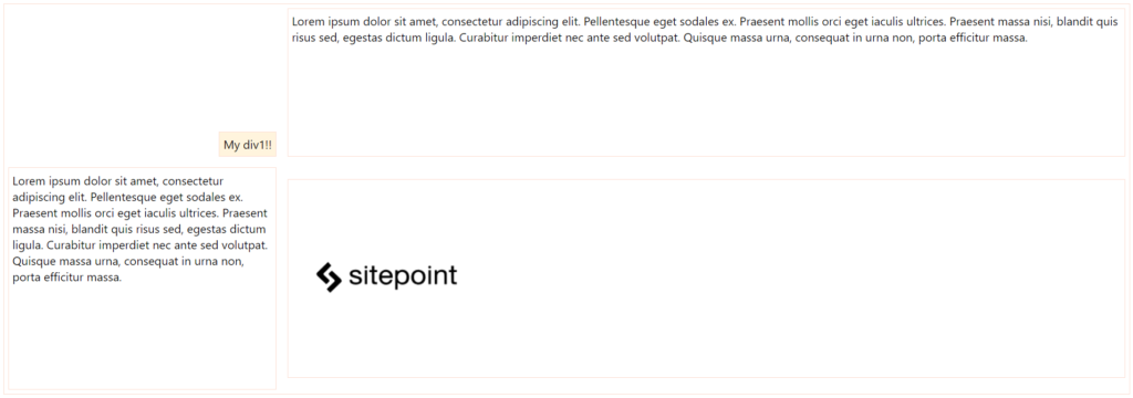
For the div of class div1, you’re aligning and justifying it at the end of the grid cell. The properties align-self and justify-self are valid for all flex items you have in the layout, including, in this case, the grid cells. div4 was set only the centered alignment, for you to check the difference between both.
Here’s how the elements are positioned now:
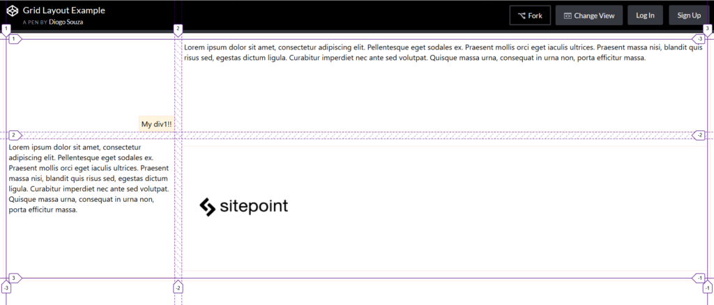
You can check out the final grid layout example here:
See the Pen Grid Layout Example by SitePoint (@SitePoint) on CodePen.
Most browsers also offer native support for grid layout inspections, which is great for seeing how it handles the grid mechanism internally. Let’s try our grid example on Firefox with its Grid Inspector, available via Firefox DevTools. In order to open it, right-click the container element and, at the CSS pane’s Rules view, find and click the grid icon right after the display: grid:
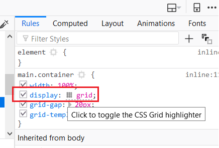
This will toggle the Grid highlighter. You can also control more display settings at the CSS pane’s Layout view like the line numbers or the area names exhibition:
The post Progressively Enhanced CSS Layouts: Floats to Flexbox & Grid appeared first on SitePoint.
by Diogo Souza via SitePoint
No comments:
Post a Comment