This includes GPS users and the platform’s former designer who refuses to understand why a change was made in the first place when the old one was so much better. Hence, many people did not hesitate one bit to express their criticism on the matter and how irritated they were with the latest design.
The company announced the news through its blog post last week where they happened to share details regarding the change that was coming soon. Google also spoke about a few updates that would be included for both iPhone and Android users in the next few weeks.
This included detailed directions regarding public transit as well as address details for places where users can have their electric vehicles charged. With that came the news about an innovative feature that gave your close contacts the chance to share popular destinations amongst other things.
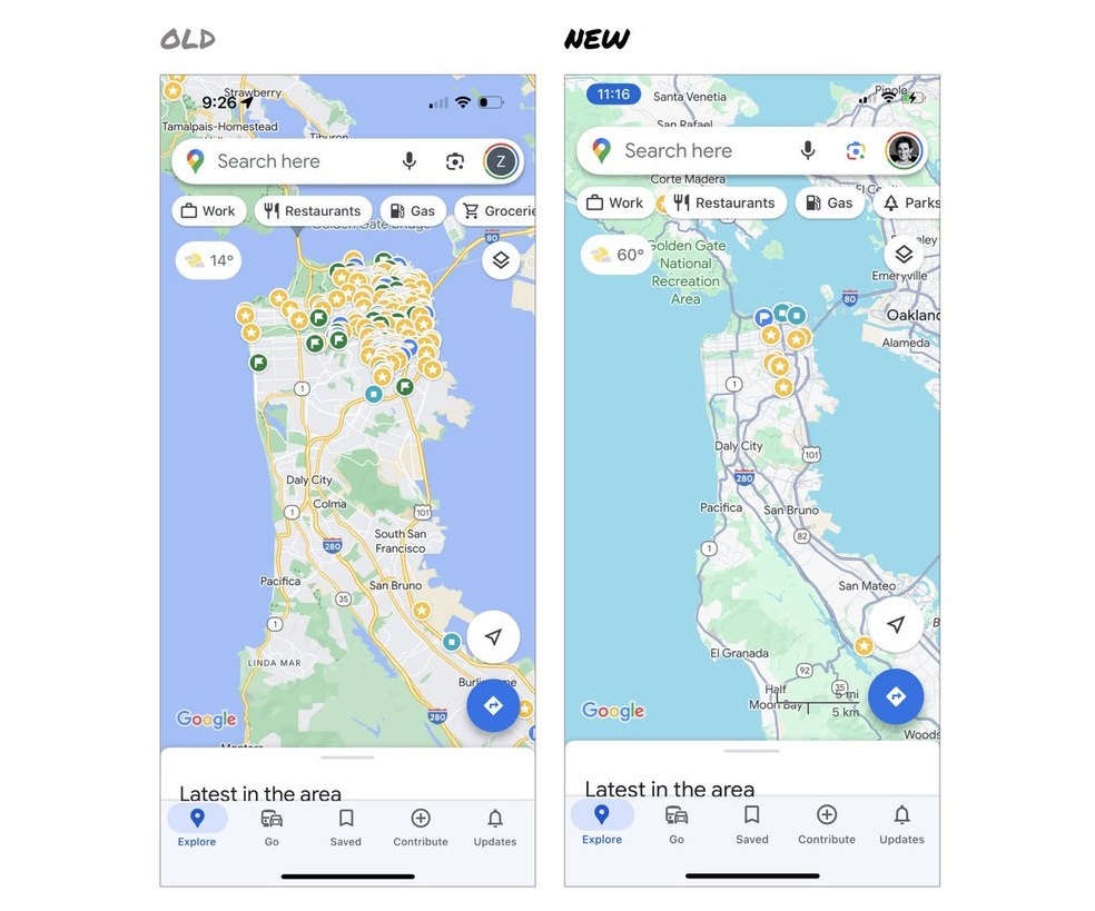
While the rest may be loved and appreciated, not everyone sees eye to eye with the fact that there’s a color upgrade on Maps and the latest color scheme has people talking for not some great reasons.
The latest facelift has new coding for roads that are gray while the hue for water has gone from a darker shade of blue to a lighter one that represents the clearest of skies. Other features included parks and public spots being represented in the shade green.
Elizabeth Laraki says she takes great pride in the app’s design and aesthetics that arose 15 years back. And it’s safe to say that she’s disappointed with the latest outcome that the company has made in the name of a revamp. She continues to make use of it on a daily basis and calls it a feature that’s very close to her heart.
But she is not loving it right now, referring to the change as one that’s unrelatable, less human, and lacking the warmth that it was once famous for. She similarly deemed it less useful as it lost that touch of accuracy that was visible in the past.
Seeing hues blend together and the color palette appearing like it was made by a machine instead of humans was just the start of her rant. But in case you’re wondering, she’s not the only one who was left less than impressed.
The reviews from other top users similarly echoed her thoughts and critique regarding the latest color scheme as many kept scratching their heads as to why Google would roll out an unappealing design despite the old one being loved.
Other people directly asked Google to respond to their queries after tagging it on the X thread which soon went viral. And it was disheartening to see how the change was trashed soon after the launch. Moreover, others were just shocked at how they could no longer relate or recognize it after the updates.
Another fan went on about their dismay and how they literally failed to recognize it after the latest change. Thankfully, some were optimistic and did fairly review the update. They did not slam all of the changes regarding the design.
Features they loved included seeing roads, trails, and even areas with congested traffic standing out better than before with the new colors. And then some praised the company for making the effort to try and make it simpler to use. What about you?
Read next: The Unstoppable Surge of Cyber Week Online Shopping
by Dr. Hura Anwar via Digital Information World
No comments:
Post a Comment