Monday, February 5, 2018

Web Design Weekly #306

Headlines

Sketching in the Browser

Mark Dalgleish shares some great insight into the search for the perfect design system. If you happen to be struggling in finding a good workflow within your team, make sure you read this. (medium.com)

Hard and Soft Skills in Tech (newco.co)

Sponsor Web Design Weekly and reach over 27,636 passionate designers and developers

Articles

A Field Guide for Better Build Performance

If you use Webpack and are having a few issues with build performance this article by Rowan Oulton explains what the Slack engineering team learnt during some recent optimisations. (slack.engineering)

CSS Paint API

The CSS Paint API (also known as “CSS Custom Paint” or “Houdini’s paint worklet”) is about to be enabled by default in Chrome Stable. What is it? What can you do with it? And how does it work? Das Surma explains. (google.com)

Where Style Guides Fit Into Process

Chris Coyier shares a few thoughts about the different approaches you can take when integrating a style guide into your project. (css-tricks.com)

The Mosaic web browser just turned 25 years old (zdnet.com)

Tools / Resources

Stimulus 1.0

Stimulus is a JavaScript framework with modest ambitions. It doesn’t seek to take over your entire front-end—in fact, it’s not concerned with rendering HTML at all. Instead, it’s designed to augment your HTML with just enough behavior to make it shine. (signalvnoise.com)

Gain new skills to boost your career – Learn CSS with Treehouse

Add to your creative tool box. You can push pixels, but can you build a responsive web design? Start your path to becoming a front-end web developer, or brush up on your skills with our CSS course. We’ll walk through everything you need to know to build web pages. Claim your free trial. (teamtreehouse.com)

Outline

Outline is a wiki and knowledge base built for growing teams. Oh yeah and it is open source. (getoutline.com)

Purgecss

A tool to remove unused CSS. It can be used as part of your development workflow. Purgecss comes with a JavaScript API, a CLI and plugins for popular build tools. (purgecss.com)

Jest WebDriver Integration – Connect Jest tests to Selenium WebDriver. (github.com)

An “Awesome” list of code review resources – articles, papers, tools, etc (github.com)

Glow – Pretty-printed, code highlighted type errors (github.com)

Track the changes you make in Chrome’s developer tools (mikerogers.io)

Greenlet – move an async function into its own thread (github.com)

Inspiration

Designing beautiful mobile apps from scratch (freecodecamp.org)

Syntax Snack Pack – Episode 30 (syntax.fm)

Jobs

Senior Node/React Developer at Humanitix

Looking to work on an amazing platform that has a purpose? Come help disrupt the events industry! Are you a passionate developer who has delivered amazing projects using Node and/or React? then this is great opportunity to work with a fun team on an important problem. (humanitix.com)

Front-End Developer at Gravity Works

Love semantic HTML, powerful CSS, and elegant JavaScript? Gravity Works is looking for a front-end developer to join our team. If you have a stellar web portfolio, are excited to learn new technologies, and thrive in a fast-paced environment, let us know. (gravityworksdesign.com)

Need to find passionate developers or designers? Why not advertise in the next newsletter

Last but not least…

I Turned Slack Off for a Week. Here’s What Happened. (buffer.com)

The post Web Design Weekly #306 appeared first on Web Design Weekly.


by Jake Bresnehan via Web Design Weekly
VanillaMasker – Pure Javascript Input Masker

VanillaMasker is a simple and pure javascript library to mask your input elements. It's a cross-browser and cross-device library.


by via jQuery-Plugins.net RSS Feed

Local Authentication Using Passport in Node.js

In Passport Authentication for Node.js Applications, we talked about authentication using Passport as it relates to social login (Google, Facebook, GitHub, etc.). In this article, we’ll see how we can use Passport for local authentication with a MongoDB back end.

All of the code from this article is available for download on GitHub.

Prerequisites

  • Node.js — Download and install Node.js.
  • MongoDB — Download and install MongoDB Community Server. Follow the instructions for your OS. Note, if you’re using Ubuntu, this guide can help you get Mongo up and running.

Creating the Project

Once all of the prerequisite software is set up, we can get started.

We’ll begin by creating the folder for our app and then accessing that folder on the terminal:

mkdir AuthApp
cd AuthApp

To create the node app, we’ll use the following command:

npm init

You’ll be prompted to provide some information for Node’s package.json. Just hit enter until the end to leave the default configuration.

HTML

Next, we’ll need a form with username and password inputs as well as a Submit button. Let’s do that! Create a file called auth.html in the root folder of your app, with the following contents:

<html>
  <body>
    <form action="/" method="post">
      <div>
        <label>Username:</label>
        <input type="text" name="username" />
        <br/>
      </div>
      <div>
        <label>Password:</label>
        <input type="password" name="password" />
      </div>
      <div>
        <input type="submit" value="Submit" />
      </div>
    </form>
  </body>
</html>

That will do just fine.

Setting up Express

Now we need to install Express, of course. Go to the terminal and write this command:

npm install express --save

We’ll also need to install the body-parser middleware which is used to parse the request body that Passport uses to authenticate the user.

Let’s do that. Run the following command:

npm install body-parser --save

When that’s done, create a file index.js in the root folder of your app and add the following content to it:

/*  EXPRESS SETUP  */

const express = require('express');
const app = express();

const bodyParser = require('body-parser');
app.use(bodyParser.urlencoded({ extended: true }));

app.get('/', (req, res) => res.sendFile('auth.html', { root : __dirname}));

const port = process.env.PORT || 3000;
app.listen(port , () => console.log('App listening on port ' + port));

We’re doing almost the same as in the previous tutorial. First we require Express and create our Express app by calling [express()](http://expressjs.com/en/api.html#express). The next line is the only difference with our previous Express setup. We’ll need the body-parser middleware this time, in order for authentication to work correctly. Then we declare the route for the home page of our app. There we send the HTML file we created to the client accessing that route. Then, we use process.env.PORT to set the port to the environment port variable if it exists. Otherwise, we’ll default to 3000, which is the port we’ll be using locally. This gives you enough flexibility to switch from development, directly to a production environment where the port might be set by a service provider like, for instance, Heroku. Right below we called [app.listen()](http://expressjs.com/en/api.html#app.listen) with the port variable we set up and a simple log to let us know that it’s all working fine and on which port is the app listening.

That’s all for the Express setup. Now we have to set up Passport, exactly as we did the last time. I’ll show you how to do that in case you didn’t read the previous tutorial.

Setting up Passport

First, we install passport with the following command:

npm install passport --save

Then, add the following lines at the bottom of your index.js file:

/*  PASSPORT SETUP  */

const passport = require('passport');
app.use(passport.initialize());
app.use(passport.session());

app.get('/success', (req, res) => res.send("Welcome "+req.query.username+"!!"));
app.get('/error', (req, res) => res.send("error logging in"));

passport.serializeUser(function(user, cb) {
  cb(null, user.id);
});

passport.deserializeUser(function(id, cb) {
  User.findById(id, function(err, user) {
    cb(err, user);
  });
});

Here, we require passport and initialize it along with its session authentication middleware, directly inside our Express app. Then, we set up the '/success' and '/error' routes which will render a message telling us how the authentication went. If it succeeds, we’re going to show the username parameter, which we’ll pass to the request. We’re using the same syntax for our last route, only this time instead of using [res.SendFile()](http://expressjs.com/en/api.html#res.sendFile) we’re using [res.send()](http://expressjs.com/en/api.html#res.send), which will render the given string as text/html on the browser. Then we’re using serializeUser and deserializeUser callbacks. The first one will be invoked on authentication, and its job is to serialize the user instance with the information we pass to it (the user ID in this case) and store it in the session via a cookie. The second one will be invoked every subsequent request to deserialize the instance, providing it the unique cookie identifier as a “credential”. You can read more about that in the Passprot documentation.

As a side note, this very simple sample app of ours will work just fine without deserializeUser, but it kills the purpose of keeping a session, which is by all means something you’ll need in every app that requires login.

Continue reading %Local Authentication Using Passport in Node.js%


by Paul Orac via SitePoint

Google AMP & WordPress: Everything You Need to Know

This article was created in partnership with Elevation Marketing. Thank you for supporting the partners who make SitePoint possible.

Just about a year ago, Google introduced a technology that rocked mobile SEO called AMP.

If you’re unfamiliar with the term, AMP stands for Accelerated Mobile Project. With AMP technology, Google wants to drive faster mobile page loading, especially for those users still stuck on 3G speeds. Google uses AMP to ensure that they’re still able to view the content they’re searching for as fast as possible.

Why AMP Matters

Naturally, when Google releases updates like this, the end goal is to ensure that the maximum number of websites possible are using the technology. Otherwise it would be a waste to spend millions in research and development to develop the overall functionality.

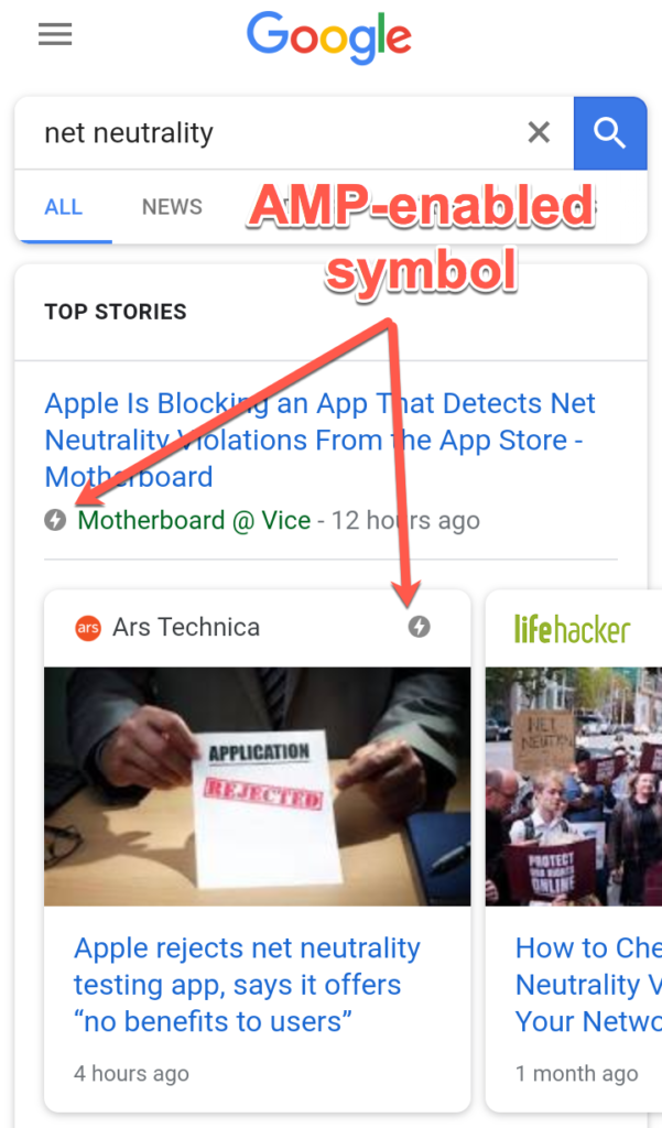
The way Google encourages AMP use is by reserving premium real estate in the search results for AMP-enabled websites — particularly for any searches related to news or blog-type pieces. Take a look at the screenshots below as an example:

As you can see in the screenshot, these card-like results are all AMP-enabled sites. Your site will not show up in this section of the results unless it is AMP optimized. If you’re trying to rank for any keywords where these card snippets are used in the SERPs, you’re missing out if you don’t use AMP. The cards are given premium real estate in the mobile internet world.

Even for those searches that don’t use AMP-optimized card snippets, whether or not you’re using accelerated mobile pages is still a factor. In fact, the lightning AMP symbol pointed out in the screenshot above will still appear next to the links.

Does AMP Affect Search Engine Optimization?

AMP’s effect on SEO strategy is still unclear. At the Search Engine Journal Summit in mid-2016, Gary Illyes, who holds the title of Webmaster Trends Analyst at Google, announced that "currently, AMP is not a ranking signal."

Of course, given Google’s constant evolution of their search algorithm and Gary’s use of the word "currently," it’s hard to bank on the idea that Google hasn’t yet incorporated it into the search algorithm. When you consider that a significant percentage of the websites that make it to the first page of results are AMP enabled, you have to wonder about the strong correlation.

However, even if AMP isn’t a ranking signal, it’s still a signal to users who search on mobile. When they see that little lightning icon next to your link, they recognize that the page will load near-instantaneously, and may decide to head to your website rather than clicking on a higher-ranking link that doesn’t use AMP.

So regardless of whether or not AMP affects SEO, it will still net you a positive effect in the SERPs.

How to Add Google AMP to Your WordPress Website

With WordPress websites, setting up support for Google AMP is a smooth and easy process. There’s virtually zero backend work or coding that you have to do on your own. The process is in fact so easy that the balance vs. results is too far in your favor for you to ignore.

Automattic, the team behind WordPress, has developed a plugin for this process named simply AMP.

However, this plugin has received poor ratings for errant functionality and frequent issues, despite having come from the big boss of WordPress. Instead, most marketing professionals, myself included, would recommend AMP for WP. It was created by an independent developer, but is far more popular with its users and has received much better ratings.

Continue reading %Google AMP & WordPress: Everything You Need to Know%


by Ryan Gould via SitePoint

Passport Authentication for Node.js Applications

In this tutorial, we'll be implementing authentication via Facebook and GitHub in a Node.js web application. For this, we'll be using Passport, an authentication middleware for Node.js. Passport supports authentication with OpenId/OAuth providers.

Express Web App

Before getting started, make sure you have Node.js installed on your machine.

We'll begin by creating the folder for our app and then accessing that folder on the terminal:

mkdir AuthApp
cd AuthApp

To create the node app we'll use the following command:

npm init

You'll be prompted to provide some information for Node's package.json. Just hit enter until the end to leave the default configuration.

Next, we'll need an HTML file to send to the client. Create a file called auth.html in the root folder of your app, with the following contents:

&lt;html&gt;
  &lt;head&gt;
    &lt;title&gt;Node.js OAuth&lt;/title&gt;
  &lt;/head&gt;
  &lt;body&gt;
    &lt;a href=auth/facebook&gt;Sign in with Facebook&lt;/a&gt;
    &lt;br&gt;&lt;/br&gt;
    &lt;a href=auth/github&gt;Sign in with Github&lt;/a&gt;
  &lt;/body&gt;
&lt;/html&gt;

That's all the HTML we'll need for this tutorial.

You’ll also require Express, a framework for building web apps that’s inspired by Ruby's Sinatra. In order to install Express, from the terminal type the following command:

npm install express --save

Once you’ve done that, it's time to write some code.

Create a file index.js in the root folder of your app and add the following content to it:

/*  EXPRESS SETUP  */

const express = require('express');
const app = express();

app.get('/', (req, res) =&gt; res.sendFile('auth.html', { root : __dirname}));

const port = process.env.PORT || 3000;
app.listen(port , () =&gt; console.log('App listening on port ' + port));

In the code above, we require Express and create our Express app by calling express(). Then we declare the route for the home page of our app. There we send the HTML file we’ve created to the client accessing that route. Then, we use process.env.PORT to set the port to the environment port variable if it exists. Otherwise, we'll default to 3000, which is the port we'll be using locally. This gives you enough flexibility to switch from development, directly to a production environment where the port might be set by a service provider like, for instance, Heroku. Right below, we call app.listen() with the port variable we set up, and a simple log to let us know that it's all working fine, and on which port is the app listening.

Now we should start our app to make sure all is working correctly. Simply write the following command on the terminal:

node index.js

You should see the message: App listening on port 3000. If that’s not the case, you probably missed a step. Go back and try again.

Moving on, let's see if our page is being served to the client. Go to your web browser and navigate to http://localhost:3000.

If you can see the page we created in auth.html, we're good to go.

Head back to the terminal and stop the app with ctrl + c. So remember, when I say start the app, you write node index.js, and when I say stop the app, you do ctrl + c. Clear? Good, you've just been programmed :-)

Setting up Passport

As you'll soon come to realize, Passport makes it a breeze to provide authentication for our users. Let's install Passport with the following command:

npm install passport --save

Now we have to set up Passport. Add the following code at the bottom of the index.js file:

/*  PASSPORT SETUP  */

const passport = require('passport');
app.use(passport.initialize());
app.use(passport.session());

app.get('/success', (req, res) =&gt; res.send("You have successfully logged in"));
app.get('/error', (req, res) =&gt; res.send("error logging in"));

passport.serializeUser(function(user, cb) {
  cb(null, user);
});

passport.deserializeUser(function(obj, cb) {
  cb(null, obj);
});

Here we require Passport and initialize it along with its session authentication middleware, directly inside our Express app. Then, we set up the '/success' and '/error' routes, which will render a message telling us how the authentication went. It’s the same syntax for our last route, only this time instead of using [res.SendFile()](http://expressjs.com/en/api.html#res.sendFile) we're using [res.send()](http://expressjs.com/en/api.html#res.send), which will render the given string as text/html in the browser. Then we're using serializeUser and deserializeUser callbacks. The first one will be invoked on authentication and its job is to serialize the user instance and store it in the session via a cookie. The second one will be invoked every subsequent request to deserialize the instance, providing it the unique cookie identifier as a “credential”. You can read more about that in the Passport documentation.

As a side note, this very simple sample app of ours will work just fine without deserializeUser, but it kills the purpose of keeping a session, which is something you'll need in every app that requires login.

That's all for the actual Passport setup. Now we can finally get onto business.

Continue reading %Passport Authentication for Node.js Applications%


by Paul Orac via SitePoint

7 Digital Marketing Trends to Watch in 2018 - #infographic

What are the biggest digital marketing trends in 2018? With so many research and studies out there on the latest marketing technologies and tools, how do you keep up and know which ones you should be paying attention to? To help marketers stay ahead of the curve, the team at BannerOwl created the...

[ This is a content summary only. Visit our website http://ift.tt/1b4YgHQ for full links, other content, and more! ]

by Irfan Ahmad via Digital Information World

Understanding Bootstrap: How it Works, and What’s New

Version 4 of Bootstrap is a major change from all its past versions. It’s a mobile-first framework and can claim to be one of the best CSS frameworks for building responsive website designs.

Since Bootstrap is a mobile-first framework, by default whatever you design or create will be mobile compatible or responsive. Isn’t that cool?

Getting Started

Bootstrap has a new website design which is itself built using the latest version of the Bootstrap framework (version 4 at the time of writing).

Bootstrap

You can either include the precompiled version of Bootstrap using a CDN or download the archive file here.

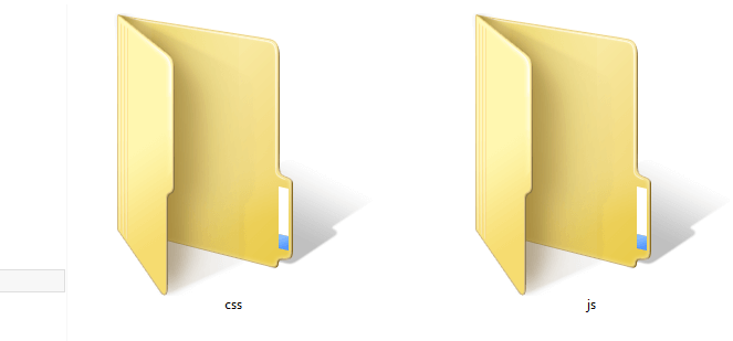
Once you unzip the archive file, you’ll see lots of files and folders that aren’t required for our tutorial. Jump directly into the dist directory and copy all the folders to a new destination, which will be your project home.

Bootstrap folder structure

In previous versions of the framework, the download included an additional fonts folder. Now, no fonts are included, but we can easily grab some nice ones from Font Awesome, for example, or from your favorite resource for icon fonts. In our case, we have two directories, so let's look at each of them. The css folder contains six CSS files:

  • bootstrap.css
  • bootstrap.min.css
  • bootstrap-grid.css
  • bootstrap-grid.min.css
  • bootstrap-reboot.css
  • bootstrap-reboot.min.css

As you can see, the latest version of Bootstrap is a lot more modular than previous ones. If you just need a nice CSS reset, just use bootstrap-reboot.css (and its minified version for production). Similarly, if you just want to use the grid, include bootstrap-grid.css (or bootstrap-grid.min.css for production) in your project.

For this tutorial, our main CSS file will be bootstrap.css, and we must include that in all our HTML pages. bootstrap.min.css is just the minified version of bootstrap.css. It’s needed when we’re actually deploying our application online.

Moving on to the js folder, we have the following four files:

  • bootstrap.bundle.js
  • bootstrap.bundle.min.js
  • bootstrap.js
  • bootstrap.min.js

These files contain Bootstrap’s main JavaScript libraries for things like carousels, drop-down menus, search auto suggest and many other powerful JavaScript functionalities. We’ll use the minified version when the application is ready for deployment.

Since Bootstrap 4 beta 2, the js folder has included two new folders, bootstrap-bundle.js (along with its minified version for production), and also Popper.js, a smart JavaScript library for managing poppers in web applications.

So What Exactly Are We Going to Build?

In this article, we’re going to build a static landing page using Bootstrap 4, which will be called “Rental Vacations”. Have a look at the demo page first.

See the Pen Bootstrap Landing Page Demo by SitePoint (@SitePoint) on CodePen.

Resize your browser window and you'll see some amazing transformations in the layout of the web page. It adjusts to the size of the window. You’ll also notice that the menu bar is hiding automatically into a nice touch-compatible menu.

So we are going to build this! Excited? Yeah … me, too!

The Structure

Bootstrap understands HTML5 elements, so we need to add an appropriate doctype tag to our web page. Let’s create a new HTML page and add the following doctype tag.

<!DOCTYPE html>

Now we’ll add the basic tags that are present in every HTML document:


<html>
  <head>
    <title>Bootstrap 101 Template</title>
    <meta name="viewport" content="width=device-width, initial-scale=1.0">
    <!-- Bootstrap -->
    <link href="css/bootstrap.min.css" rel="stylesheet" media="screen">
  </head>

<body>
    <h1>Hello, world!</h1>

&lt;script src=&quot;//code.jquery.com/jquery.js&quot;&gt;&lt;/script&gt;
  &lt;script src=&quot;js/bootstrap.min.js&quot;&gt;&lt;/script&gt;

</body>
</html>

Looking inside the <head>, we have the title element, which is easy enough to understand: it gives a title to the page.

Then we have the meta element, which is very important to understand when using Bootstrap. Since this version of Bootstrap is built to be compatible with various types of devices (mobiles, tablets, desktops, Retina displays, etc.), you need to let the browser know that it has to scale your web page appropriately on every device.

The viewport meta element does this. Here, we’ve set the initial content-width to the width of the device and scaled it one time only.

After setting the viewport meta element, we’ve imported the development version of the Bootstrap CSS file, bootstrap.css.

Let’s move on to the body section of the above HTML snippet. Just to output something, we’ve written “Hello, world” inside the h1 element. Then we’ve included the required JavaScript files from the `js` folder. Make sure these JavaScript files are included on every page. The Bootstrap documentation recommends including all the JavaScript at the end of the page.

Continue reading %Understanding Bootstrap: How it Works, and What’s New%


by Syed Fazle Rahman via SitePoint