Version 4 of Bootstrap is a major change from all its past versions. It’s a mobile-first framework and can claim to be one of the best CSS frameworks for building responsive website designs.
Since Bootstrap is a mobile-first framework, by default whatever you design or create will be mobile compatible or responsive. Isn’t that cool?
Getting Started
Bootstrap has a new website design which is itself built using the latest version of the Bootstrap framework (version 4 at the time of writing).
You can either include the precompiled version of Bootstrap using a CDN or download the archive file here.
Once you unzip the archive file, you’ll see lots of files and folders that aren’t required for our tutorial. Jump directly into the dist directory and copy all the folders to a new destination, which will be your project home.
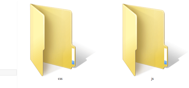
In previous versions of the framework, the download included an additional fonts folder. Now, no fonts are included, but we can easily grab some nice ones from Font Awesome, for example, or from your favorite resource for icon fonts. In our case, we have two directories, so let's look at each of them. The css folder contains six CSS files:
bootstrap.cssbootstrap.min.cssbootstrap-grid.cssbootstrap-grid.min.cssbootstrap-reboot.cssbootstrap-reboot.min.css
As you can see, the latest version of Bootstrap is a lot more modular than previous ones. If you just need a nice CSS reset, just use bootstrap-reboot.css (and its minified version for production). Similarly, if you just want to use the grid, include bootstrap-grid.css (or bootstrap-grid.min.css for production) in your project.
For this tutorial, our main CSS file will be bootstrap.css, and we must include that in all our HTML pages. bootstrap.min.css is just the minified version of bootstrap.css. It’s needed when we’re actually deploying our application online.
Moving on to the js folder, we have the following four files:
bootstrap.bundle.jsbootstrap.bundle.min.jsbootstrap.jsbootstrap.min.js
These files contain Bootstrap’s main JavaScript libraries for things like carousels, drop-down menus, search auto suggest and many other powerful JavaScript functionalities. We’ll use the minified version when the application is ready for deployment.
Since Bootstrap 4 beta 2, the js folder has included two new folders, bootstrap-bundle.js (along with its minified version for production), and also Popper.js, a smart JavaScript library for managing poppers in web applications.
So What Exactly Are We Going to Build?
In this article, we’re going to build a static landing page using Bootstrap 4, which will be called “Rental Vacations”. Have a look at the demo page first.
See the Pen Bootstrap Landing Page Demo by SitePoint (@SitePoint) on CodePen.
Resize your browser window and you'll see some amazing transformations in the layout of the web page. It adjusts to the size of the window. You’ll also notice that the menu bar is hiding automatically into a nice touch-compatible menu.
So we are going to build this! Excited? Yeah … me, too!
The Structure
Bootstrap understands HTML5 elements, so we need to add an appropriate doctype tag to our web page. Let’s create a new HTML page and add the following doctype tag.
<!DOCTYPE html>
Now we’ll add the basic tags that are present in every HTML document:
<html>
<head>
<title>Bootstrap 101 Template</title>
<meta name="viewport" content="width=device-width, initial-scale=1.0">
<!-- Bootstrap -->
<link href="css/bootstrap.min.css" rel="stylesheet" media="screen">
</head>
<body>
<h1>Hello, world!</h1>
<script src="//code.jquery.com/jquery.js"></script>
<script src="js/bootstrap.min.js"></script>
</body>
</html>
Looking inside the <head>, we have the title element, which is easy enough to understand: it gives a title to the page.
Then we have the meta element, which is very important to understand when using Bootstrap. Since this version of Bootstrap is built to be compatible with various types of devices (mobiles, tablets, desktops, Retina displays, etc.), you need to let the browser know that it has to scale your web page appropriately on every device.
The viewport meta element does this. Here, we’ve set the initial content-width to the width of the device and scaled it one time only.
After setting the viewport meta element, we’ve imported the development version of the Bootstrap CSS file, bootstrap.css.
Let’s move on to the body section of the above HTML snippet. Just to output something, we’ve written “Hello, world” inside the h1 element. Then we’ve included the required JavaScript files from the `js` folder. Make sure these JavaScript files are included on every page. The Bootstrap documentation recommends including all the JavaScript at the end of the page.
Continue reading %Understanding Bootstrap: How it Works, and What’s New%
by Syed Fazle Rahman via SitePoint
No comments:
Post a Comment