[ This is a content summary only. Visit our website https://ift.tt/1b4YgHQ for full links, other content, and more! ]


by Madiha via Digital Information World


In this article, we review the art of creating printer-friendly web pages with CSS.
"Who prints web pages?" I hear you cry! Relatively few pages will ever be reproduced on paper. But consider:
Unfortunately, printing pages can be a frustrating experience:
Many developers advocate web accessibility, yet few remember to make the printed web accessible!
Converting responsive, continuous media to paged paper of any size and orientation can be challenging. However, CSS print control has been possible for many years, and a basic style sheet can be completed within hours. The following sections describe well-supported and practical options for making your pages printer-friendly.
Print CSS can either be:
The choice will depend on your site/app. Personally, I use screen styles as a print base most of the time. However, I have used separate style sheets for applications with radically different outputs — such as a conference session booking system which displayed a timetable grid on-screen but a chronological schedule on paper.
A print style sheet can be added to the HTML <head> after the standard style sheet:
<link rel="stylesheet" href="main.css" />
<link rel="stylesheet" media="print" href="print.css" />
The print.css styles will be applied in addition to screen styles when the page is printed.
To separate screen and print media, main.css should target the screen only:
<link rel="stylesheet" media="screen" href="main.css" />
<link rel="stylesheet" media="print" href="print.css" />
Alternatively, print styles can be included within an existing CSS file using @media rules. For example:
/* main.css */
body {
  margin: 2em;
  color: #fff;
  background-color: #000;
}

/* override styles when printing */
@media print {

  body {
    margin: 0;
    color: #000;
    background-color: #fff;
  }

}
Any number of @media print rules can be added, so this may be practical for keeping associated styles together. Screen and print rules can also be separated if necessary:
/* main.css */

/* on-screen styles */
@media screen {

  body {
    margin: 2em;
    color: #fff;
    background-color: #000;
  }

}

/* print styles */
@media print {

  body {
    margin: 0;
    color: #000;
    background-color: #fff;
  }

}
It's not necessary to kill trees and use outrageously expensive ink every time you want to test your print layout! The following options replicate print styles on-screen.
The most reliable option is the print preview option in your browser. This shows how page breaks will be handled using your default paper size.
Alternatively, you may be able to save or preview the page by exporting to a PDF.
The DevTools (F12 or Cmd/Ctrl + Shift + I) can emulate print styles, although page breaks won't be shown.
In Chrome, open the Developer Tools and select More Tools, then Rendering from the three-dot icon menu at the top right. Change the Emulate CSS Media to print at the bottom of that panel.
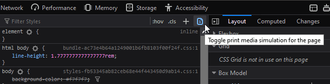
In Firefox, open the Developer Tools and click the Toggle print media simulation icon on the Inspector tab's style pane:
Presuming you're using a <link> tag to load printer CSS, you could temporarily change the media attribute to screen:
<link rel="stylesheet" href="main.css" />
<link rel="stylesheet" media="screen" href="print.css" />
Again, this won't reveal page breaks. Don't forget to restore the attribute to media="print" once you finish testing.
Before doing anything else, remove and collapse redundant content with display: none;. Typical unnecessary sections on paper could include navigation menus, hero images, headers, footers, forms, sidebars, social media widgets, and advertising blocks (usually anything in an iframe):
/* print.css */
header, footer, aside, nav, form, iframe, .menu, .hero, .adslot {
  display: none;
}
It may be necessary to use display: none !important; if CSS or JavaScript functionality is showing elements according to particular UI states. Using !important isn't normally recommended, but we can justify its use in a basic set of printer styles which override screen defaults.
It pains me to say this, but Flexbox and Grid rarely play nicely with printer layouts in any browser. If you encounter issues, consider using display: block; or similar on layout boxes and adjust dimensions as necessary. For example, set width: 100%; to span the full page width.
Printer-friendly styling can now be applied. Recommendations:
12pt or highercm, mm, or in units may be more practical.Further suggestions include …
The post How to Create Printer-friendly Pages with CSS appeared first on SitePoint.


