In this tutorial we’re going to retrofit a grid-based design to a layout inspired by the What’re you into? Tumblr page, where the user can select a set of topics to tailor their recommended content.

Only the visual design of the grid is executed, not the selection functionality, as shown in the Pen we’ll be building:
See the Pen MBdNav by SitePoint (@SitePoint) on CodePen.
The main goal is to implement the design with CSS Grid, but a fallback layout with floats is outlined in the Support section below.
Markup
Essentially, the page content consists of a list of cards:
<ul class="grid">
  <li class="card header">
    <h1>Which foods do you like?</h1>
    <p>Tell us what you crave for and we'll get you the tasty bits</p>
  </li>
  <li class="card">
    <a href="...">
      <h2>Pizza</h2>
      <img src="..." alt="A salami pizza">
    </a>
  </li>
  <!-- ... -->
</ul>
A card that represents a topic proposed to the user (food in our example) has a title and an illustrative image, both wrapped in a link element. Others could be adopted; see for instance the excellent article on the card component on Inclusive Components, where the pros and cons of such alternatives are analyzed.
Structural Layout
In this section, the foundations of the grid design will be implemented. The next section will style the cards. This Pen shows the bare-bones layout using placeholders for grid items. Run it on a browser that supports CSS Grid.
See the Pen JBqgGm by SitePoint (@SitePoint) on CodePen.
Before going ahead with the code, it’s important to specify the features and the responsive behavior of the grid. Let’s try to write down some properties it must satisfy.
Design Specs
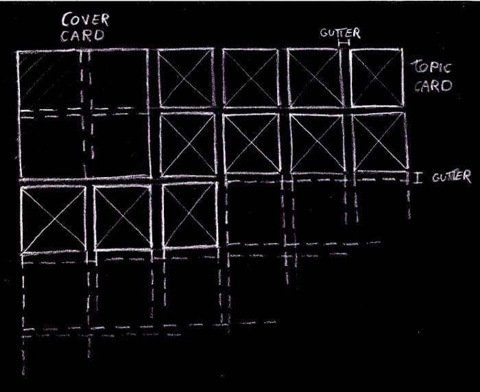
Two kinds of cards are featured in the design: a series of topic cards, and an introductory cover card. We arrange them on an underlying grid composed of square cells of fixed size. Each topic card occupies just one of these cells, while the cover spans a larger area of adjacent cells, whose extent depends on the viewport width. Furthermore, rows and columns are separated by the same fixed-size gutter.
The grid has as many (fixed-sized) columns as they fit into the viewport:
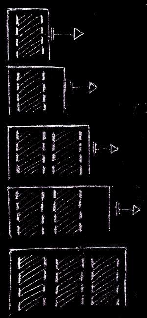
But we don’t want a zillion columns on large screens, so let’s limit the maximum number of columns:

The columns are always horizontally centered in the viewport:
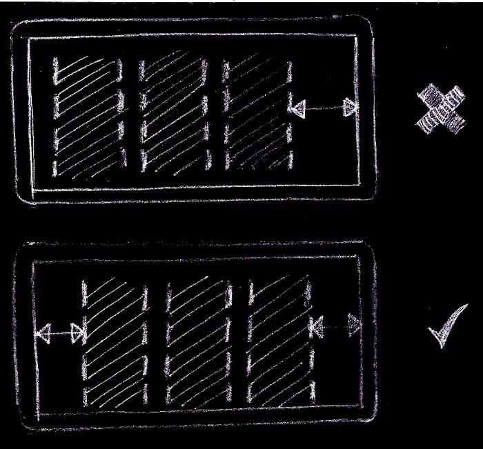
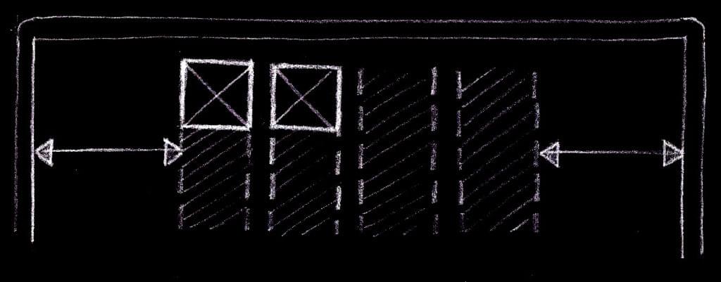
Only the columns are centered, not the grid items. This means that the cards on an incomplete row are aligned to the left of the grid, not at the center of the viewport:
Check out these requirements in the above Pen. Also, it’s useful to inspect the layout with the CSS Grid tools provided by some browsers, such as the Firefox’s Grid Inspector.
Keeping in mind this checklist, we can fire up our favorite development environment and start coding.
Implementation
Let’s introduce a couple of Sass global variables to represent the layout parameters defined in the specs, namely:
$item-sizefor the size of the side of the grid cells$col-gutterfor the gutter between the tracks of the grid$vp-gutterfor a safety space to leave between the grid items and the viewport edges$max-colsfor the maximum number of columns the grid can have
We could use CSS custom properties for these variables, avoiding the need of a preprocessor and allowing us to edit them with the in-browser development tools and watch the changes happen instantly. But we’re going to use these values even for a fallback layout suitable for older browsers, where CSS variables aren’t supported. Moreover, we use expressions with these values even in media query selectors, where custom properties and the calc() function aren’t fully available even on recent browsers:
$item-size: 210px;
$col-gutter: 10px;
$vp-gutter: $col-gutter;
$max-cols: 5;
We must establish a grid formatting context on the grid element:
.grid {
  display: grid;
}
The grid-gap property separates the grid tracks by the specified amount of space.
But these gutters are only inserted between the tracks and not before the first track and after the last one. A horizontal padding on the grid container prevents the columns from touching the viewport edges:
.grid {
  grid-gap: $col-gutter;
  padding: 0 $vp-gutter;
}
The columns of the grid can be defined with the grid-template-columns property and the repeat function with the auto-fill value as the repetition number and the $item-size variable for the track list argument:
.grid {
  grid-template-columns: repeat(auto-fill, $item-size);
}
This tells the browser to fill the grid container (the .grid element) width with as many fixed-size columns as possible, keeping account of the vertical gutters.
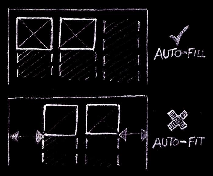
It’s worth pointing out that we could have used the auto-fit mode, and in many combinations of viewport sizes and number of grid items we could not tell the difference with auto-fill. But when there are only a few items in the grid, with just an incomplete row, with auto-fit the items would be centered, instead of starting from the left of the grid, as detailed in the design specs. This happens because, while with auto-fill the grid has always as many columns as possible, with auto-fit empty columns are removed, and the centering of the remaining columns places the items at the center of the viewport:
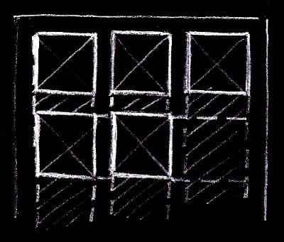
If the first row of the grid is complete, no columns are removed and there’s no difference between the two modes:
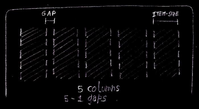
Back to the grid columns. Up to this point, the number of columns had no limit. It can arbitrarily grow as the viewport width increases. But according to the spec, the grid must have a maximum number of columns. It’s possible to fix this with the max-width property:
.grid {
  max-width: grid-width($max-cols);
}
grid-width is a custom Sass function that returns the width of a grid with n columns:
@function grid-width($num-cols) {
  @return $num-cols * $item-size + ($num-cols - 1) * $col-gutter;
}
The first multiplication accounts for the size required by the columns, while the second one represents the space required by the gutters.
According to the specs, the grid must be always horizontally centered. We can combine the old auto margins trick with justify-content to accomplish this task:
.grid {
  justify-content: center;
  margin: 40px auto;
}
justify-content centers the columns when there’s available space left inside the grid container. This happens when the container bleeds from one viewport edge to the other. The lateral auto margins center the .grid container itself when it has reached its maximum width.
Now for the rows. They’re not explicitly specified, as done with the columns. Rather, they’re implicitly added by the browser as needed, and we just tell it their size with the grid-auto-rows property. Reusing the $item-size variable, each grid cell is shaped like a square, as per the specs:
.grid {
  grid-auto-rows: $item-size;
}
Let’s move on by sizing the cards. On small viewports, when the grid configures itself on a single column, the cover card spans only a grid cell, while when there are two or more columns, it must span a 4x4 grid area:
@include when-n-cols(2) {
  .grid .header {
    grid-row: span 2;
    grid-column: span 2;
  }
}
when-n-cols() is a Sass mixin to express a media query suitable for a grid with the given number of columns:
@mixin when-n-cols($n) {
  @media screen and (min-width: #{grid-width($n) + 2 * $vp-gutter + $scrollbar-size}) {
    @content;
  }
}
The CSS rules represented by @content are active whenever the viewport width is equal or greater than the width of a grid with $n columns plus the two safety spaces to separate the grid items from the viewport edges. $scrollbar-size is just an upper bound on the size of a vertical scrollbar, to account for the fact that the width reported in the media query is the entire viewport width, including an eventual vertical scrollbar.
Regarding the topic cards, there’s nothing to do, because the default Grid behavior makes them the same size as their assigned grid cells.
Okay, we got it! Refer to the structural Pen at the beginning of this section to see all these code snippets put together in the complete code.
The post Redesigning a Card-based Tumblr Layout with CSS Grid appeared first on SitePoint.
by Giulio Mainardi via SitePoint
No comments:
Post a Comment