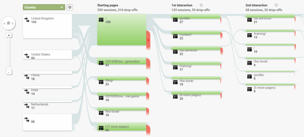
UX and analytics make a great team. Your website analytics can give you insights enabling you to learn about your users, track their journeys, and find potential problem areas. You can use the quantitative data to inform your qualitative UX approach. Remember, your analytics tell you what’s happening on your website, while UX techniques such as usability testing will help uncover why things are happening.
There are various ways that Google Analytics can be used to uncover how your users are navigating your website. Within the Pages report you can drill down to see how users are navigating to, and from, a selected page in your website. But the User Flow and Behavior Flow reports give more information on multi-step journeys from your most popular landing pages onwards.

These reports can be hard to analyze, particularly for large websites, due to the fact that there are unlikely to be a series of clear pathways through your website. You’ll find that there are huge numbers of paths that different users can take, which makes finding insights from these reports quite challenging. However, they can be useful for getting a good top-level overview and showing the most dominant pathways through a site. While they suffer from grouping multiple pages, you can often get a good idea of the most common journeys taken by users.
One example of how I’ve used these reports in the past to inform my UX work has been looking out for pogo sticking.
Pogo Sticking
Pogo sticking describes where users bounce between two pages on a website instead of progressing their journey through the site. It can be a sign of confusion on the users’ part and is unlikely to help you convert those users.
The Nielson/Norman group wrote this guide to pogo sticking, which explains it in more detail. It covers some possible reasons behind pogo sticking behavior, and also gives some potential solutions to these problems.
The post How Analytics Helped Solve a UX Issue appeared first on SitePoint.
by Daniel Schwarz via SitePoint
No comments:
Post a Comment