In this article, you’ll learn how to style form elements with the Bootstrap form component, and how to take advantage of the grid system to align these elements. Also, we’ll see horizontal and inline forms in action, as well as discuss form validation.
I still remember the (not so good) old days when we had to code all the styling for websites manually. There were very few solid CSS solutions, and creating complex UIs used to be a huge pain. It was like an arcane lore that developers were sharing with each other: they told tales on how to make rounded circles, how to highlight focused elements or create a gradient background … I don’t really miss those days. Luckily, there are many new technologies out there that help us to speed the process of styling web applications. One such technology is Bootstrap, and today we will discuss one of its most-used component: forms.
There are loads of predefined styles that can be applied to forms, and by using them you can create fancy UIs with little effort.
Getting Started
If you’d like to follow along, create the following boilerplate HTML:
<!DOCTYPE html>
<html>
<head>
  <meta charset="utf-8">
  <link href="https://maxcdn.bootstrapcdn.com/bootstrap/4.0.0/css/bootstrap.min.css"
        rel="stylesheet">
</head>
<body>

    <div class="container">
    </div>

    <script src="https://code.jquery.com/jquery-3.2.1.slim.min.js"></script>
    <script src="https://cdnjs.cloudflare.com/ajax/libs/popper.js/1.12.9/umd/popper.min.js"></script>
    <script src="https://maxcdn.bootstrapcdn.com/bootstrap/4.0.0/js/bootstrap.min.js"></script>
</body>
</html>
We load the Bootstrap’s styles and some scripts that will be required in one of the examples. This is it! All the markup should be placed inside the container block that acts as a main element for our page.
We can proceed to the next section and start crafting our first form.
Creating a Simple Form
Suppose we’re creating a registration form for our new shiny website. Our form should provide, at the very least, fields for an email address and a password:
<div class="container">
    <p class="h1">Register</p>

    <form>
        <label for="email">Email address</label>
      <input type="email" id="email" placeholder="Enter email">

        <label for="password">Password</label>
        <input type="password" id="password" placeholder="Password">
    </form>
</div>
Now let’s style these fields a bit. First and foremost, the label and input should be wrapped inside an element with the Bootstrap form component form-group class, which is going to add a small top margin. Also, we assign a form-control class to the inputs to make them look nicer:
<form>
    <div class="form-group">
        <label for="email">Email address</label>
      <input type="email" id="email" placeholder="Enter email" class="form-control">
    </div>

    <div class="form-group">
        <label for="password">Password</label>
        <input type="password" id="password" placeholder="Password" class="form-control">
    </div>
</form>
Note that Bootstrap automatically reboots form elements so that the new styles can be applied easily.
Why don’t we also display some help text beneath the email form to inform users that we won’t be using their data in any malicious way? In Bootstrap 3, help text is marked with the help-block class, but the latest release of the framework uses a class called form-text. Let’s place it right beneath the input (inside the form-group). Also, let’s make the text look more subtle by applying the Bootstrap form component text-muted class:
<div class="form-group">
  <label for="email">Email address</label>
  <input type="email" class="form-control"
     id="email" aria-describedby="emailHelp" placeholder="Enter email"> <!-- #1 -->
  <small id="emailHelp" class="form-text text-muted"> <!-- #2 -->
    For authentication purposes only. We will never share your email with anyone!
  </small>
</div>
Note how we added the aria-describedby attribute (point #1) for the input to explain that this field is being described by our help block (#2).
Why don’t we also make our two fields a bit larger to emphasize their importance? Inputs can be easily sized with the Bootstrap form component’s form-control-lg and form-control-sm classes:
<div class="form-group">
  <label for="email">Email address</label>
  <input type="email" class="form-control form-control-lg"
     id="email" aria-describedby="emailHelp" placeholder="Enter email"> <!-- #1 -->
  <small id="emailHelp" class="form-text text-muted">
    For authentication purposes only. We will never share your email with anyone!
  </small>
</div>

<div class="form-group">
  <label for="password">Password</label>
  <input type="password" class="form-control form-control-lg"
     id="password" placeholder="Password"> <!-- #2 -->
</div>
Here’s the result:
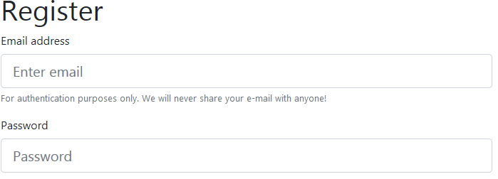
The form looks very clear, and the currently selected input gets a nice blue border. Cool!
Read-only Elements
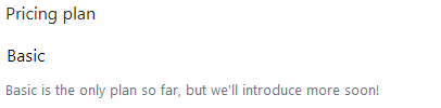
Suppose now we’d like to introduce multiple pricing plans for our users, but at the moment only a “Basic” plan is available. Let’s add a Bootstrap form component read-only input styled as plain text. It’s as simple as assigning the form-control-plaintext class:
<div class="form-group">
  <label for="pricingPlan">Pricing plan</label>
  <input type="text" readonly class="form-control-plaintext"
     id="pricingPlan" value="Basic" aria-describedby="pricingPlanHelp"> <!-- #1 -->
  <small id="pricingPlanHelp" class="form-text text-muted">
    Basic is the only plan so far, but we'll introduce more soon!
  </small>
</div>
Here’s the result:
Other Types of Input
Bootstrap supports styling for inputs of all types. For example, we may opt for a dropdown to allow users to choose their role:
<div class="form-group">
  <label for="role">Your role</label>
  <select class="form-control" id="role">
    <option>Developer</option>
    <option>Designer</option>
    <option>Manager</option>
  </select>
</div>
Once again, we’re simply wrapping everything inside a container with the Bootstrap form component form-group class and assigning the form-control class to the dropdown.
What about the textarea? We just follow the same principle:
<div class="form-group">
  <label for="comments">Comments (optional)</label>
  <textarea class="form-control" id="comments" rows="3"></textarea>
</div>
File uploading control? No problem here either:
<div class="form-group">
  <label for="photo">Your photo</label>
  <input type="file" class="form-control-file" id="photo">
</div>
Checkboxes? Easy! The only thing to remember is that checkboxes and radios should be wrapped inside an element with the form-check, not form-group, class. This class adds some extra padding to make these elements look nicer. Also, we assign form-check-input (#1) to the checkbox and form-check-label (#2) to the label so that they are aligned properly:
<div class="form-check">
  <input class="form-check-input" type="checkbox" value="1" id="userAgreement"> <!-- #1 -->
  <label class="form-check-label" for="userAgreement"> <!-- #2 -->
    I accept <a href="#">user agreement</a>
  </label>
</div>

<div class="form-check">
  <input class="form-check-input" type="checkbox" value="1" id="newsletter">
  <label class="form-check-label" for="newsletter">
    I'd like to receive newsletters
  </label>
</div>
Let’s reload the page and observe the result:
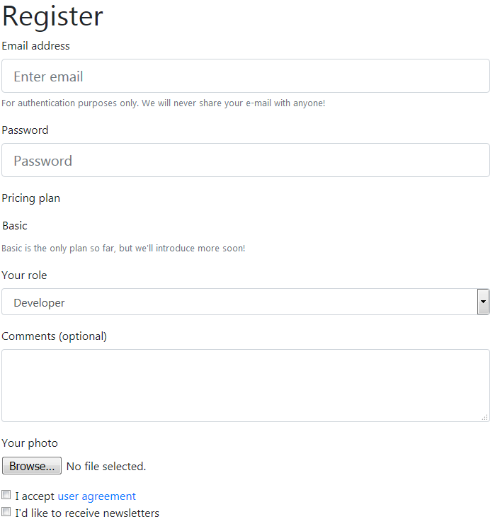
Looking quite nice for a page that has no custom styles at all.
Continue reading %A Deep Dive into the Bootstrap Form Component%
by Ilya Bodrov-Krukowski via SitePoint
No comments:
Post a Comment