“Insights” are the de facto word of choice when it comes to analytics — and for good reason. Teams need to know critical information about their product, users, website performance (and more) to make decisions.
When it comes to web analytics, the typical insights are metrics that are built around clicks and taps, page visits, session durations, bounce rates, conversion rates, and other aggregated data points. These metrics are useful for diagnosing problems (or spotting opportunities) relating to UX or otherwise, but once identified, this is often where teams get stuck.
The solution to this data quandary is to have a way to "zoom in" on an identified issue to see what’s going on, learn more, and then come up with viable solutions. This hybrid, quantitative-qualitative strategy takes advantage of both diagnostic and descriptive analytics tools. But just how does it work, in practice? And what kinds of insights can be discovered?
In this article, we’ll be focusing on bounce rates, looking specifically at how a bounce rate can be used as a way to identify opportunities for search engine optimization, app copy optimization, landing page optimization (including identifying fake paid traffic), and overall UX optimization.
Bounce rates mean something — but what?
If you’re wondering how the qual-quant strategy works in real life, consider one of the most commonly used metrics in web analytics: the bounce rate.
As a refresher, a bounce is defined as "a session that triggers only a single request to the analytics server, such as when a user opens a single page on your site and then exits without triggering any other requests to the analytics server during that session". (Source: Google Analytics.)
Bounce rates are bad, right? Well, as Google Analytics explains on its help page, "it depends." The thing about bounce rates is that, while they might point to something going wrong, or signal the relative performance of different traffic sources, or sub-optimal UX, they tell you next to nothing about what is actually working (or not working) on the page.
Using bounce rates as a signal of high- or low-performing web pages and then analyzing those pages using a session replay tool like FullStory can help provide the needed answers to optimize the page.
Here’s how it works.
Optimizing UX with Bounce Rates and FullStory
First, identify underperforming pages using Google Analytics (or your preferred analytics platform). Then, search for session recordings on those pages in FullStory using the URL in question as your segmenting parameter. You can then refine your results further, based on other criteria (such as sessions referred from a specific URL, or visits with a duration of 60 seconds or less).
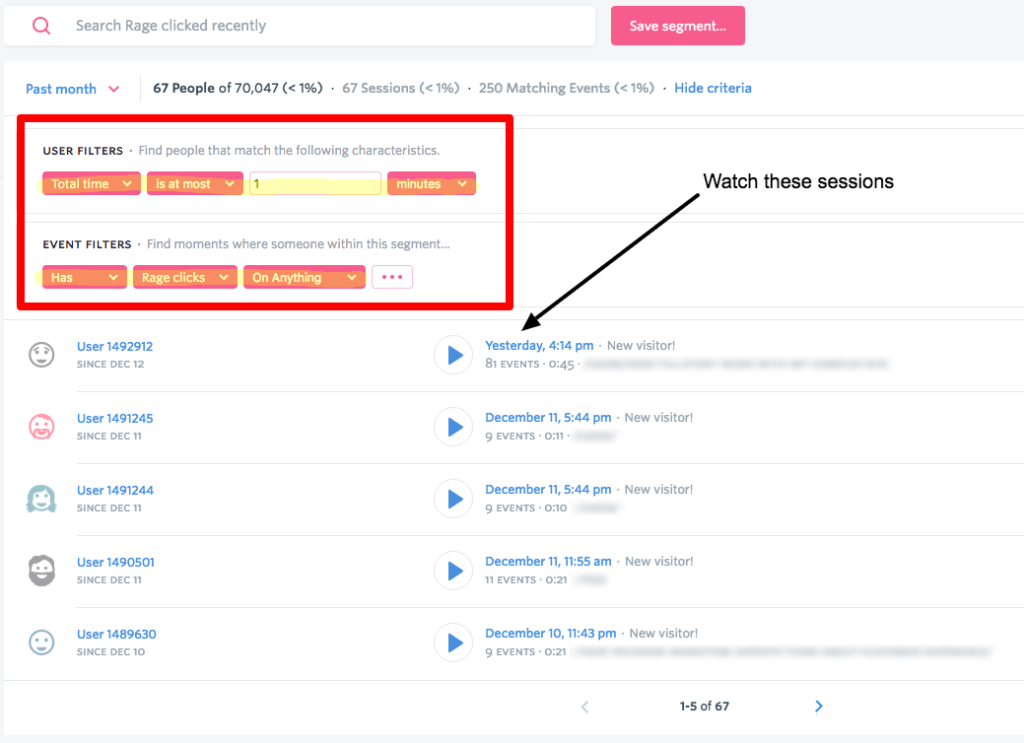
You can also cut your search by sessions that contain signals of user frustration. At FullStory, we call these "Rage Clicks"."

You can search in FullStory for all sessions that contain Rage Clicks.
Once you have a list of sessions to watch, set aside an hour to make observations. Take notes in a spreadsheet of any surprising behaviors:
- What’s being clicked — or not clicked?
- Where does user attention seem to drop?
- Is anything on the page breaking?
- Are key elements being obscured?
As you make observations, take notes in a spreadsheet. After an hour — or once you hit a point of diminishing returns — review your notes and see if any trends appear. After a while, this qualitative analysis will lead to a couple immediate improvements and a handful of ideas about how to optimize the user experience. Execute the immediate improvements and use your ideas (and a handy A/B testing tool) to experiment.
Sounds simple, right? But does this work in all cases?
The post Optimizing Bounce Rates with FullStory’s Session Replay Tool appeared first on SitePoint.
by Justin Owings via SitePoint
No comments:
Post a Comment