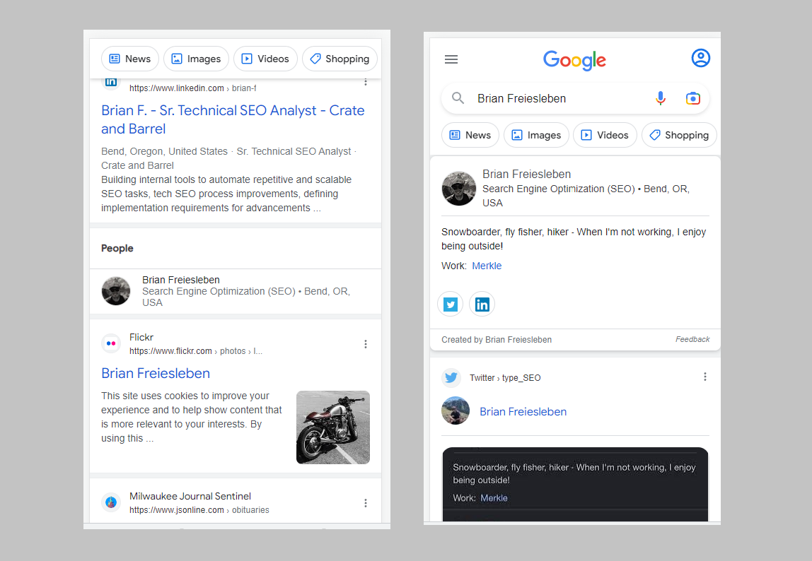
Google’s first change is that the search feed would now incorporate People’s Cards. These are profiles of people from various platforms that showcase their info. These were first introduced and limited only to India. But recently, it has been brought to our attention that the geographical limitation has been lifted.
The feature is also available in the US now. An SEO expert, Brian Freiesleben made his own People’s Card when he got to know about it in 2020. After its introduction in the US, Brian remembered his Card and now pledges to remove it as it is quite embarrassing.
Here's what it looks like before clicking on it - pic.twitter.com/7mdTSbRo1w
— Brian Freiesleben (@type_SEO) February 3, 2023
Yes, I did just Google myself…
— Brian Freiesleben (@type_SEO) February 3, 2023
but I found my name now triggers a ‘people card’.
This was introduced in Google India back in 2020. I spoofed my location back then to create the card and now (finally) it’s appearing.
It’s a little out of date, but pretty cool! pic.twitter.com/TmwSLrUSGp
Keeping Brian’s personal feelings aside, we believe the feature to be an excellent way for people to interact with one another and network. It is also a good way of providing opportunities and searching for potential work partners or employees.
H/T: Glenn Gabe / Twitter
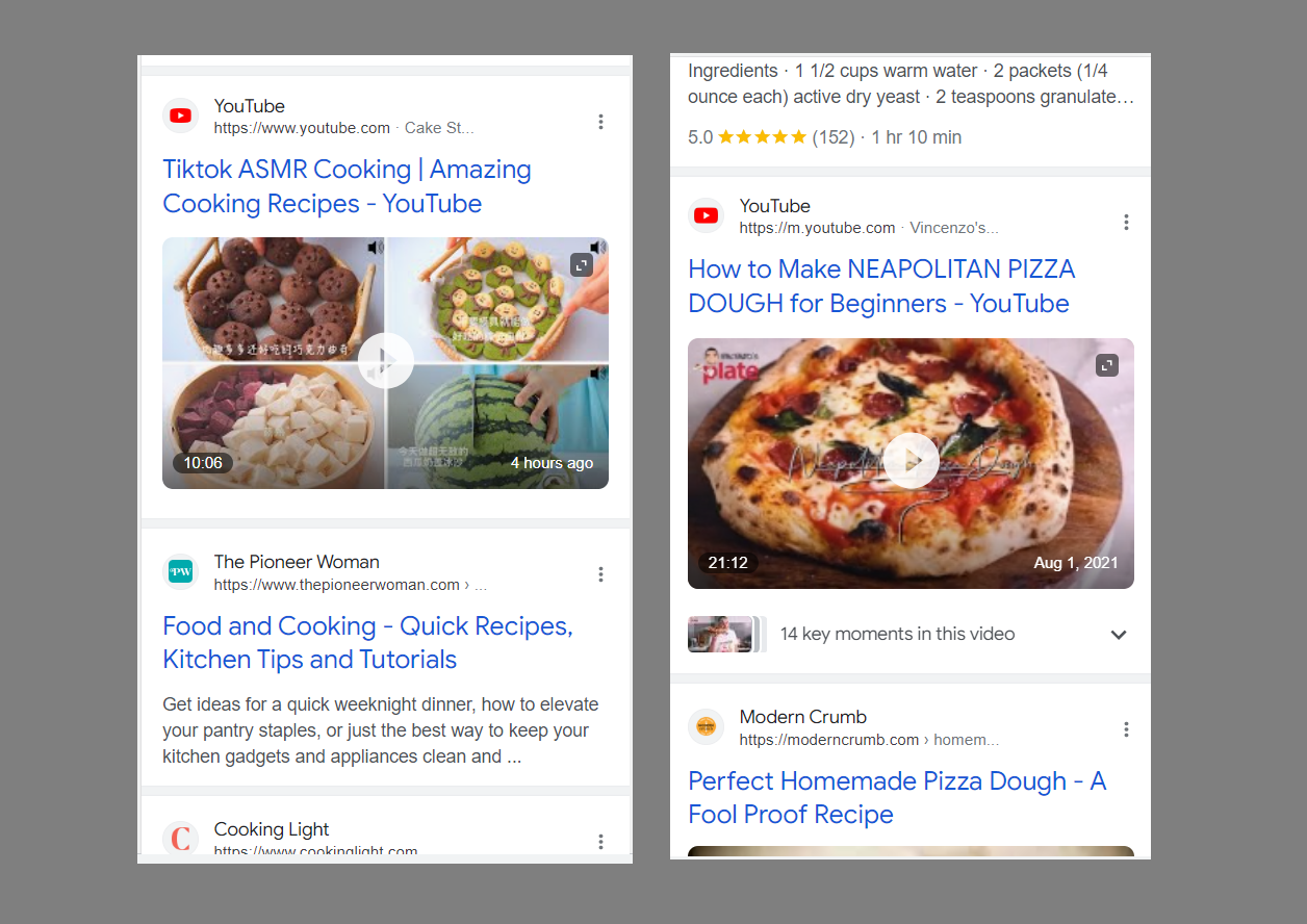
The second change that Google incorporated is larger video thumbnails (as reported by Khushal Bherwani and Anuj thaker). We’re not sure how we feel about this one after checking them out.
The previous thumbnails were comparatively smaller and had the details of the video written next to them. However, the new thumbnail occupies all that space and is placed directly beneath the title with no other text.
We will find out how users feel about this change after a while although we believe this might be a tad too simplified for most of our tastes.
🤔 Is Google testing a new layout for YouTube videos on mobile search?
— Khushal Bherwani (@b4k_khushal) January 30, 2023
↗️ Here is the full, normal layout.
Any have also noticed this ? pic.twitter.com/NXPrSrYUYX
The thing with these changes is that you can never know if they would turn out to be good or bad. Although users like simplified formats, oversimplification is not everyone’s cup of tea.
Via: Anuj thaker
While it takes a little while and a lot of disapproval, simplified formats eventually turn out to be the best. For instance, when Instagram changed its logo, few people liked it. But can you imagine Instagram without the purple and pink gradient now?
Similarly, only time will tell whether these changes are for the better or worse. Till then, Google can keep working to make the space a better place.
Read next: Google Gears Up for the Future with Major Focus on Augmented Reality
by Arooj Ahmed via Digital Information World


No comments:
Post a Comment