This article was created in partnership with Mockplus. Thank you for supporting the partners who make SitePoint possible.
I’ve been a fan of science fiction for a long time, and sci-fi films have often been a crystal ball into the future of technology. Tricorders can easily be reimagined as cell phones, and wrist communication devices can easily be seen as paralleling the Apple Watch.
On the other hand, many technological wonders that we thought would have come to pass by now have yet to materialize -- things like hoverboards and flying cars.
But there’s one thing I’ve always really hoped I would not have to use: those complicated computer interfaces.
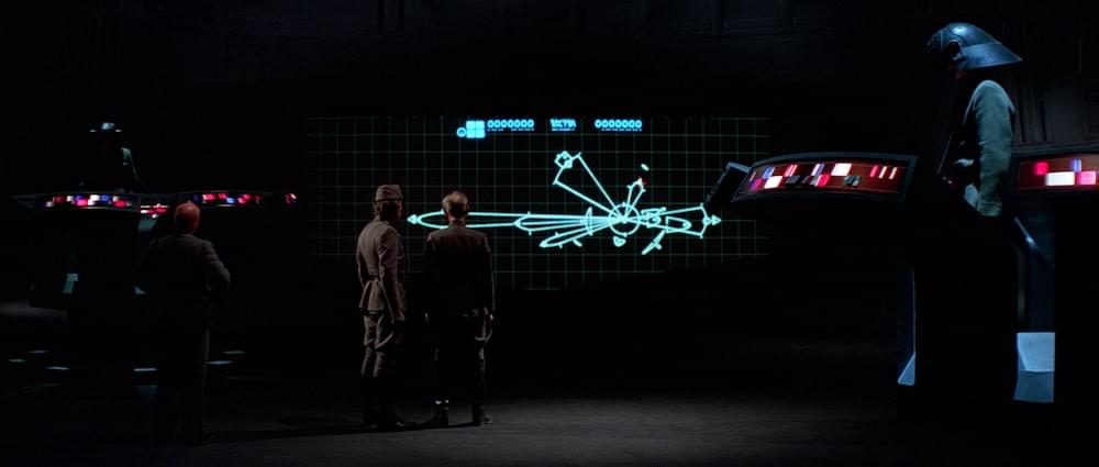
They looked clunky and too overwhelming to be used efficiently. I remember watching some of these movies, thinking to myself: "How would they know what anything is? All of the buttons and lights look the same." If you go back and watch some of your favorite sci-fi movies, you’ll see what I am talking about. One example, shown below, shows a bunch of colored blocks, with no labels or any other way of determining one from the other. There also don’t seem to be any controls on the screen, cluing you in on what to do with the content.
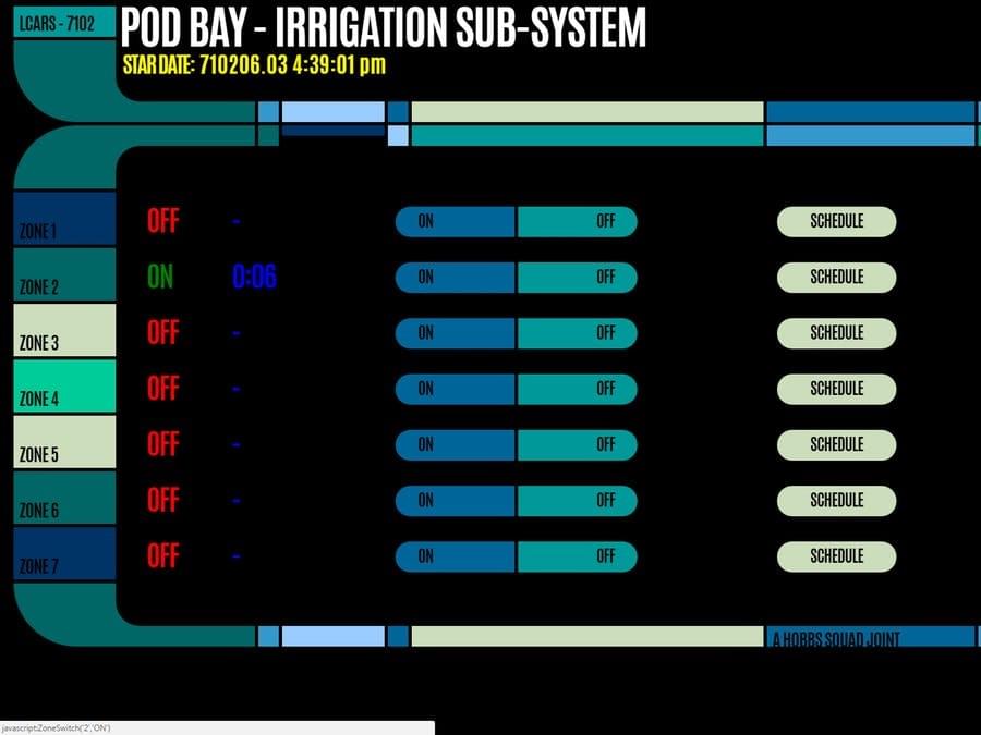
Another good example is the LCARS pod bay interface below, from Star Trek. There are a number of zones, on and off switches and schedule buttons. How would you know where each zone’s physical location is? It would make more sense to have a touch interface in the shape of the bay, where you could select the zone visually. The biggest problem I see with these interfaces is trying to do everything on one screen.
You Can Prototype Your Own with Mockplus
If the makers of the interfaces above would have had a tool like Mockplus, they could have foreseen the problems a user would have with this type of interface. Let’s take a look at how you can use Mockplus to create your own starship computer interface.
Let’s say I wanted to create a simple crew interface that showed the crew member’s photo, name, rank, and a short bio. The tools are intuitive, and I was able to create the simple layout for the first person in around 30 seconds. You’ll find align tools to select and align elements, and you have control over things like fonts, sizes, colors, etc. Mockplus also has a lot of templates to start you off with. If you’re using some common interface elements, you can find a lot of them in Mockplus’ template library. If you don’t want to create the design of the interface in Mockplus, you can import your designs and layouts from Sketch.
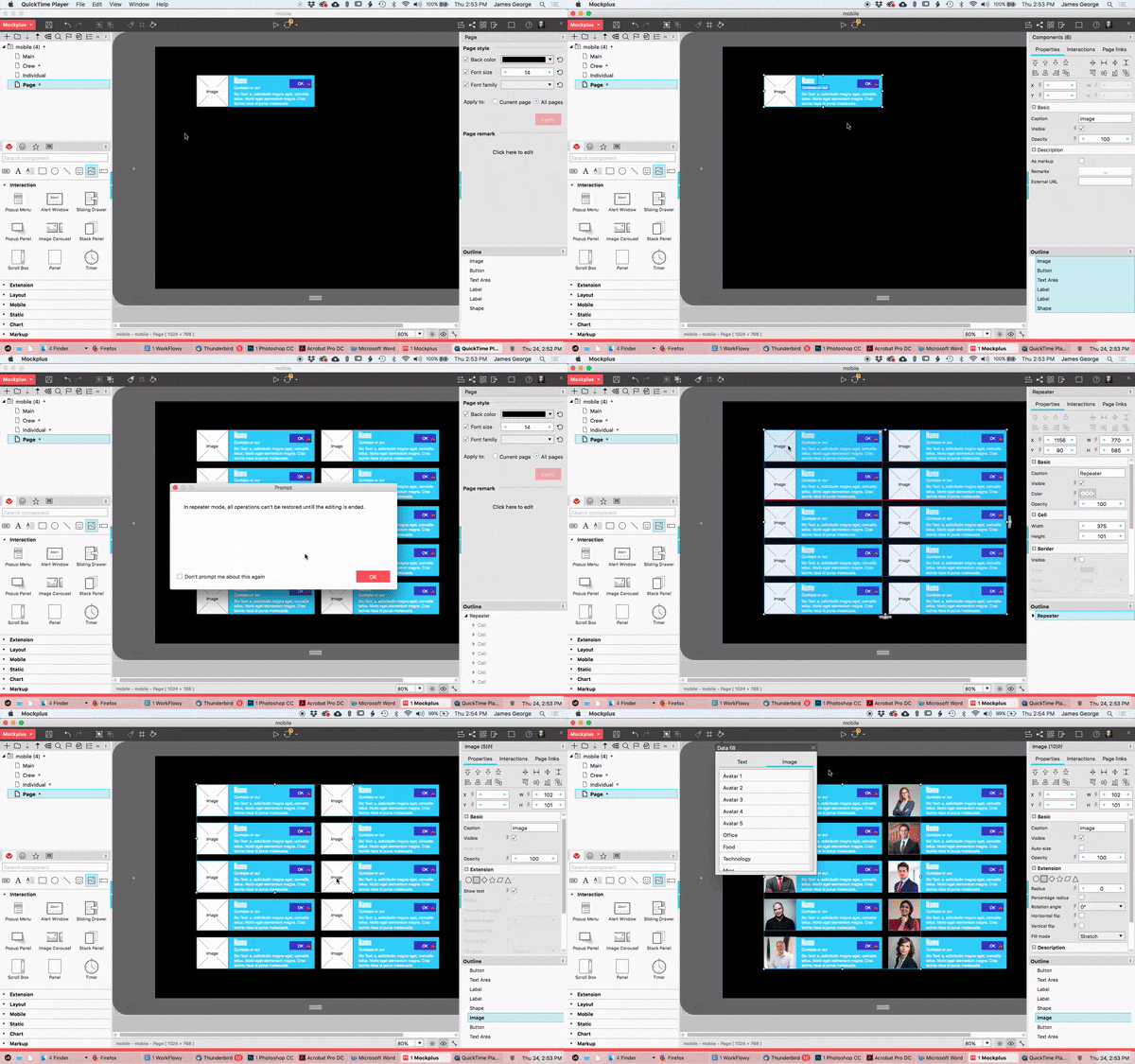
What really stands out with Mockplus is its automatic data fill feature, and the ability to turn objects into repeating elements. With the outlines of the person’s image, the heading where their name goes, their title, and a short bio, I was able to select all of those elements. Then, I right-clicked on them, and selected Convert to Repeater. Then, I could click for the number of times I wanted the object repeated vertically or horizontally.
What gets even better is that I can ungroup those elements, and select them. Then I click the paint bucket icon at the top, which allows me to populate each field with names, similar photos, and more. This makes dummy content more realistic, but also quick and easy to replicate.
UI Flow
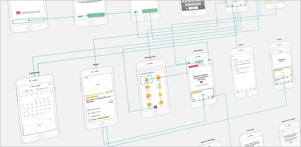
One of the most important aspects of user interface design is the UI flow. That is how you flow from one screen to the next, and how you interact with the elements. In our futuristic design, we’ve created the crew area, but it’s just floating there in space. Mockplus allows you to decide how you get there, and what it leads to. You can create new pages, enabling you to create the different screens you would cycle through in your actual interface.
Step 1
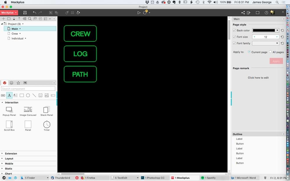
I decided I would create the main page that takes you into the crew page first. The main page will be made of a few buttons in a column, with different side buttons, colored coded in other areas on the page. To do this, I grabbed the rounded rectangle tool and drew out a single rectangle. I set the fill to none, the stroke to 2 and the color to a neon green.
Step 2
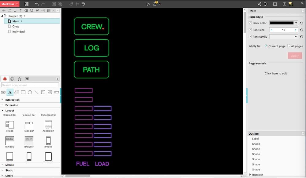
I double clicked each button to add text to it. I clicked "Convert to repeater." I then clicked the down arrow twice to create two copies. Then, I changed the text to other ship related terms. You can change the colors, fonts, borders and more in the right column. The great thing about the repeater function is that when you create the number of elements you want, they are automatically grouped, so you can adjust the spacing.
Step 3
Next, I will add a couple of gauges, typical of a futuristic interface. They will show the ship’s fuel level, as well as the current load on the ship. It’s easy to create the bars and repeat them, the same way we did with the top buttons. I made them a pinkish color, for their importance. A simple text label at the bottom shows which is which.
The post How to Prototype a Starship Computer Interface with Mockplus appeared first on SitePoint.
by James George via SitePoint
No comments:
Post a Comment