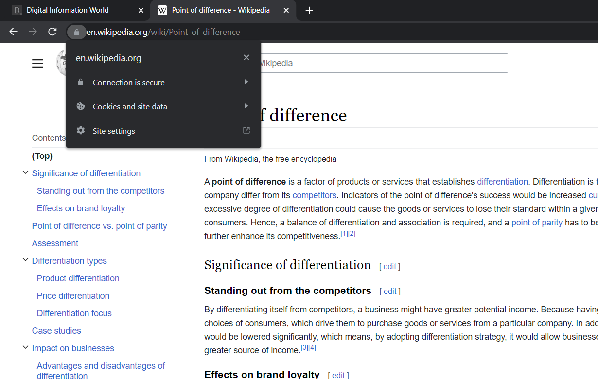
The Chrome Browser’s lock icon is going away and it’s getting replaced with another option that is deemed to be more neutral in design.
The news was published today where Chrome revealed how it was keen on transitioning the browser that is known to alert users about their connection being a secure one. Now, the plan is to put forward an option that is not only more neutral but a design that sets forward a better experience for users.
The reason for this great change is linked to research that proves how this current lock icon might serve as a security risk and is misleading as well.
For those wondering why the lock icon is going away? Well, it’s an artifact that arises from a period when we saw secure connections as the exception and not a norm. At that time, users were counting on this green-toned lock as a reminder that all connections were secure and there was nothing to worry about.
In the past, a lot of people assumed that sites such as finance and e-commerce used to require secure connections and such sites did not carry out transactions or did not need to have connections that were secure.
With time, that attitude was changing and we saw Android maker Google and a few other firms reveal how they wished to encourage publishers to go from one secure connection to the next to better the privacy of users and their respective safety.
The tech giant went as far as making this HTTPS connection a factor for ranking. But mind you, still, some experts feel HTTPS is pointless for sites that are non-commerce.
There was a recently published announcement set out by Chrome that states how HTTPS is rare and at one point, the Internet Explorer showed up as alerts so users would be aware of secure connections through HTTPS and how things were alright. In cases when the whole HTTPS was not common, this lock icon got attention to further protections given by HTTPS.
But that’s not true today as HTTPS has turned into a norm and not an exception. And Google is making sure Chrome evolves accordingly with time.
Google’s own latest research shed light on how such lock icons are misleading for so many people and it creates a sense of false security across the board.
This lock icon doesn’t mean that this site is safe but it means such connections are coming forward through a secure protocol.
Some people used to think that this lock icon was a clear definition of a safe website and hence it automatically trusted that this website people were visiting was completely safe. But that is quite a harmful ordeal as phishing and malware websites tend to commonly showcase lock icons.
Today, Google says its studies prove that people keep on thinking that this lock icon is linked to safety.
Therefore, they want the world to know that this lock icon arose in the year 2016 after the research arose proved how so many people misunderstood the true meaning. And despite the firm’s efforts into clearing up the misconception, just a small majority, 11% understood what that lock really represented.
While the misunderstanding isn’t harmless, all phishing websites make use of HTTPS and tend to put out lock icons.
And now that this confusion is increasing as we speak, even organizations like the FBI are putting out guidance regarding the icon and how it doesn’t confirm website safety.
As a replacement, we’re hearing about a Tune Icon. This is a better representation of how secure a website is without trying too hard to imply safety.
Read next: Google Bans More Than 173,000 Developer Accounts And 1.4 Million Play Store Apps To Combat Malicious Fraud
by Dr. Hura Anwar via Digital Information World


No comments:
Post a Comment