For years now, we’ve been accustomed to seeing the Google homepage as one that’s crisp, clean, and as minimalistic as can be.
There’s adequate room to add in your search queries in the space bar and that’s about it. But if you’ve wanted a little more in terms of the homepage’s interface, well, you might be in luck.
Google is carrying out a test that could possibly revamp its search page after years.
The company is experimenting with different rows of widgets that it feels can possibly serve useful purposes. And while nothing is final yet, we’re definitely loving the sounds of it so far.
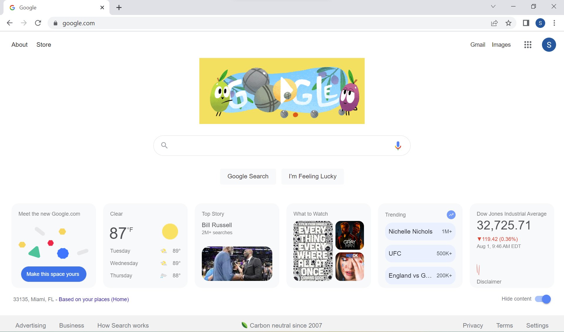
Dubbed as the ‘new Google.com’, you can soon find apps like weather, your standard news, and a few other cards offering a wide array of features. And by the sounds of it, it’s definitely going to be diverse and innovative.
The move to transform Google’s desktop webpage has begun and the entire ordeal is more or less similar to its Discover endeavor.
Google announced its decision for the test in February, where it highlighted the possibility to introduce a few useful widgets to its homepage. They’ve even spoken about how two users have already written in and talked about seeing it happen live.
So what’s new? Well, for starters, you’ll be seeing a new ‘Meet the new Google’ card pop up on your home screens. This requests users to sign into their accounts and allow for the customization process to begin.
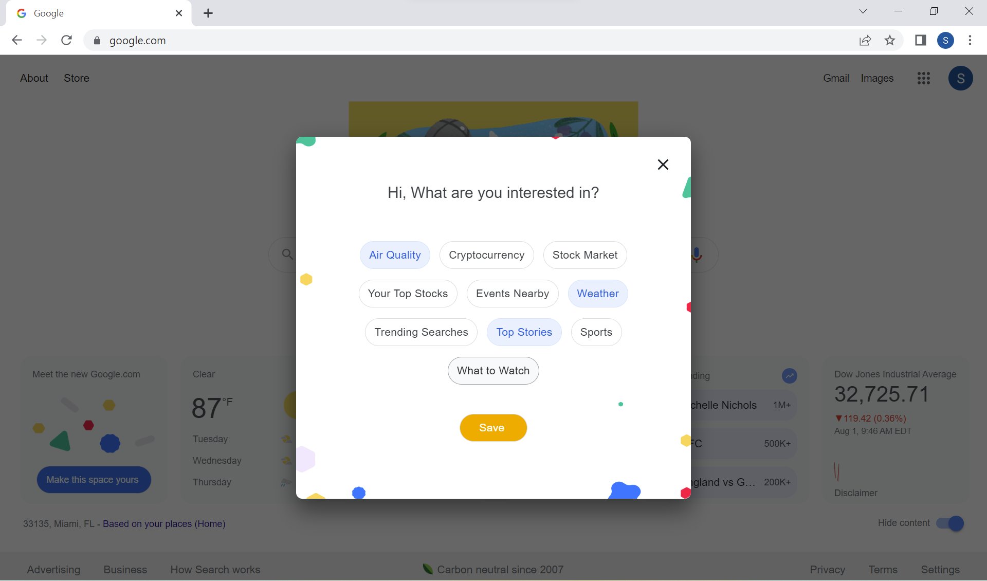
Next, users can press on the ‘make this space yours’ tab which allows for a hello pop-up to enter, followed by ‘what are you interested in’ to arrive next on your screens. This way, you can play around and carry out customization of the various widgets on offer.
Some common and fun selections that you can utilize include cryptocurrency, air quality, weather, news, sports, and stock exchange. What to watch, events happening near you, and more.
For now, as per default settings on the page, these cards are made to appear as small rectangular tiles. This way, you can benefit from seeing a wider view at first glance.
We definitely find the change to be very unique and interesting because Google used to talk about how important it was for homepages to remain basic, to the point, and as minimalistic as can be.
However, we do feel change is necessary and much overdue, as far as Google is concerned. Hence, we could well be seeing a bigger launch soon and we’re excited to see what the final outlook seems like.
You’ll find the new set of cards to pop up at the bottom of the page because Google says it’s not ready to do something too drastic. Moreover, you can even click on Hide if you don’t wish to clutter your page too much as customization is key.
Also, the company says the overall number of cards users get on the page varies depending on their screen size.
H/T: GreenShades
Read next: Google’s Quoted Searches Will Now Appear In Bold So Users Can See The Most Relevant Results
by Dr. Hura Anwar via Digital Information World


No comments:
Post a Comment