The digital world that we live in today is all about experimenting and staying in line with trends. It’s no wonder why big tech giants like Google are conducting more tests to see what really works best.
It’s the ultimate way to ensure your users get the best and that’s why you’ll often find YouTube, Gmail, and even Google Discover undergoing scores of changes.
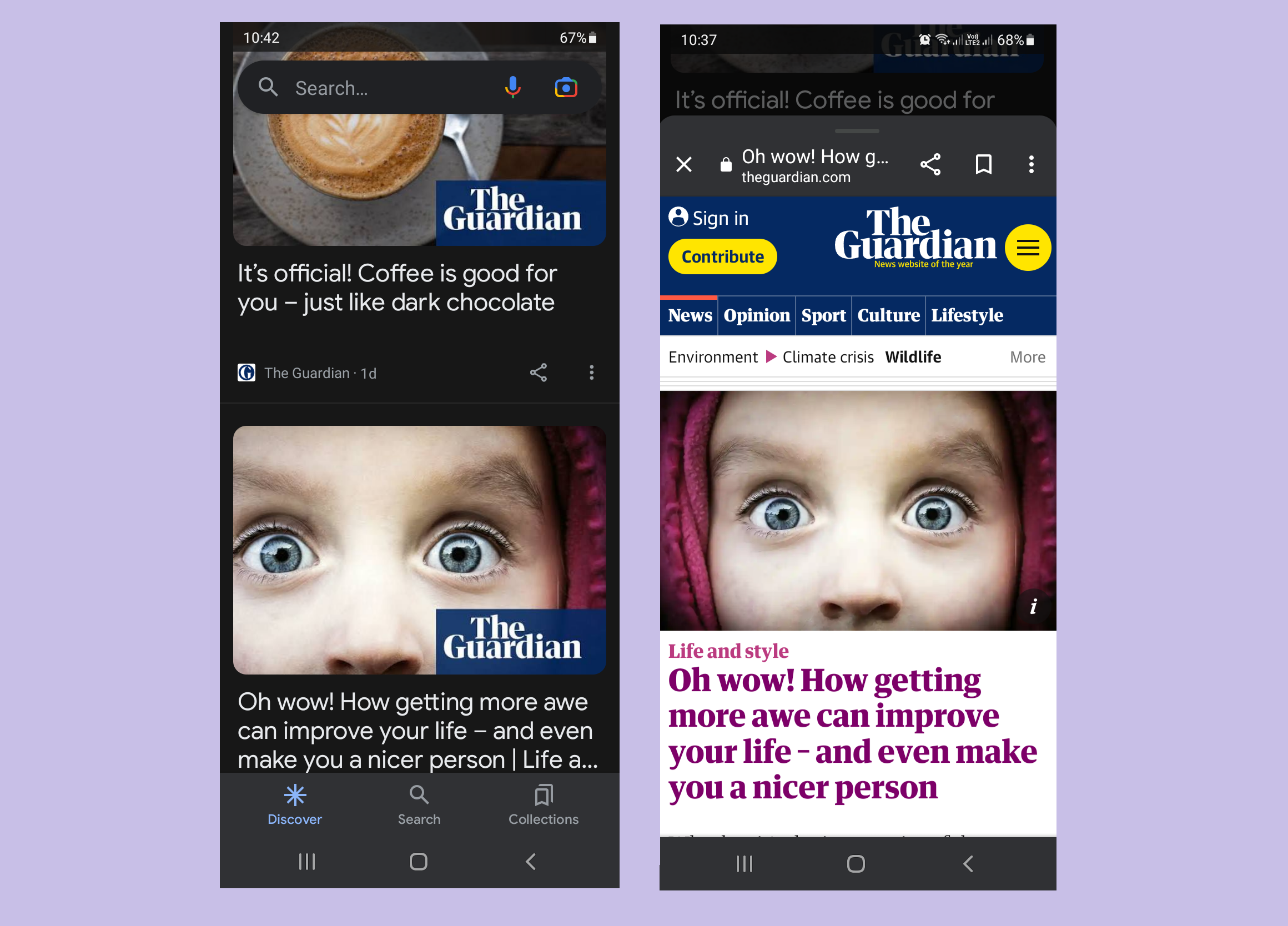
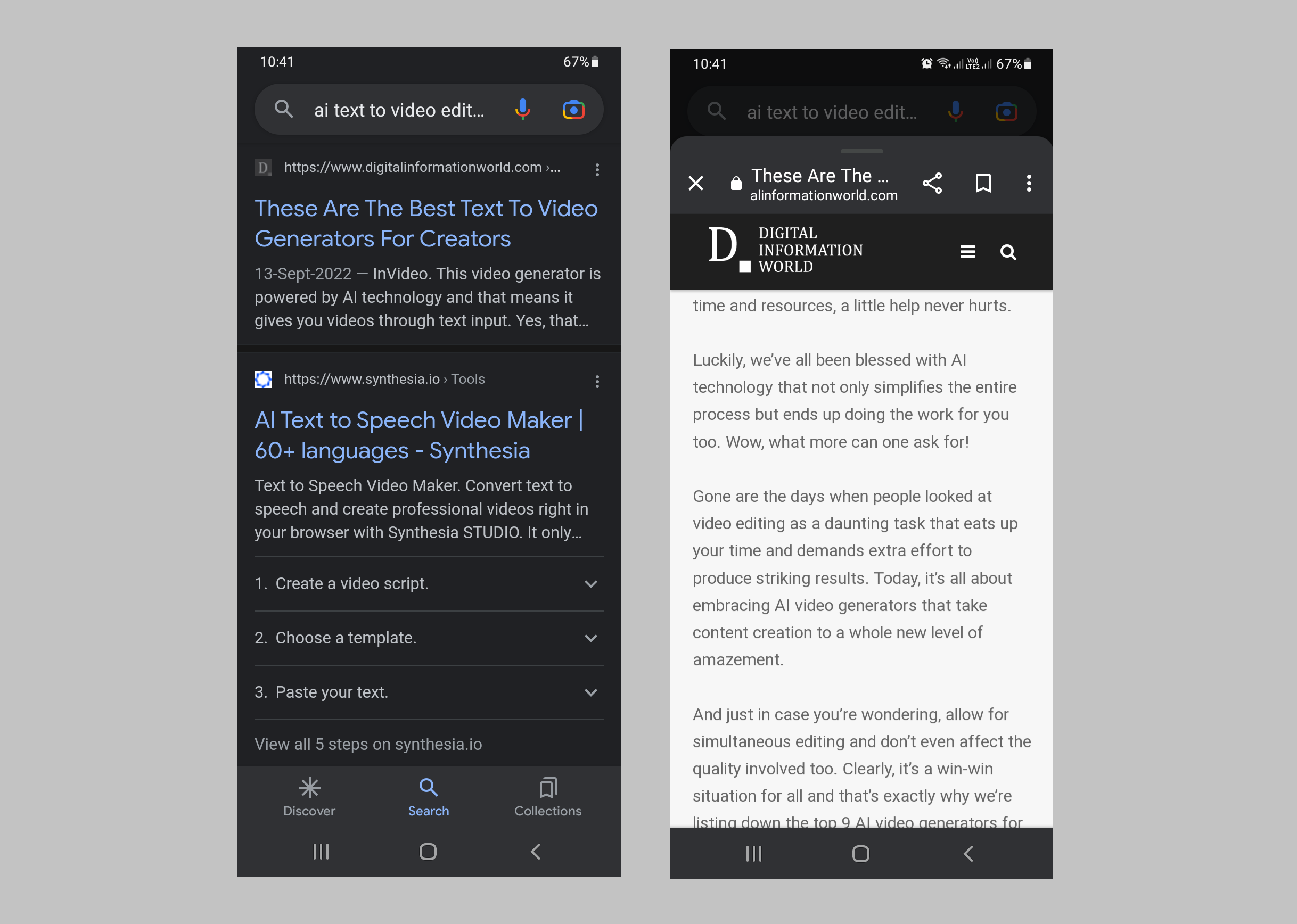
As a part of its latest trial, the company has opted to make use of card-style views in a pop-up form whenever an article pops up. Hence, it’s like shunning the classic fullscreen preview that many of us have been used to over time.
The change, if approved, will be applied to Google Discover and also to Google’s Search results.
The news comes to us thanks to 9to5Google. Their report says the test will now allow Google Discover and Search to open up like a card on the upper part of your screen. These changes were seen on the pixel phone’s home screen and also across the feed for the Discover app. And it’s definitely a new and happening interface that’s very different from what we’re usually accustomed to.
To open up the articles, you still need Google Chrome and many famous icons are still seen in the same locations, as noted by the testers. When you swipe in a downward direction, it shuts and you’re taken back to the Discover feed or your results for Search. And in case you wish to enter the full-screen mode, the app will allow you to do that with a simple swipe.
One interesting point noted by users is how the app continues to use the fullscreen method for previewing in certain scenarios like when you open up a particular video.
There is definitely plenty of ambiguity regarding the whole situation as to why Google is switching in the first place. But we do feel it’s so much more convenient now to get back to your search results in a more seamless manner.
In the end, you do lose up a bit on vertical space, thanks to the feed seen in the background. But we do feel the change is very welcoming in terms of an overall user experience.
9to5Google claims this new design may be rolling out soon as a test for users but there are rumors that it’s a widespread beta test across the company’s app as many people can see it running across their devices.
We do hope a wider rollout comes about sooner than later.
Read next: App Developers Are Scrambling To Find New Avenues For Monetization After The Discontinuation Of IDFAs And Cookies
by Dr. Hura Anwar via Digital Information World


No comments:
Post a Comment