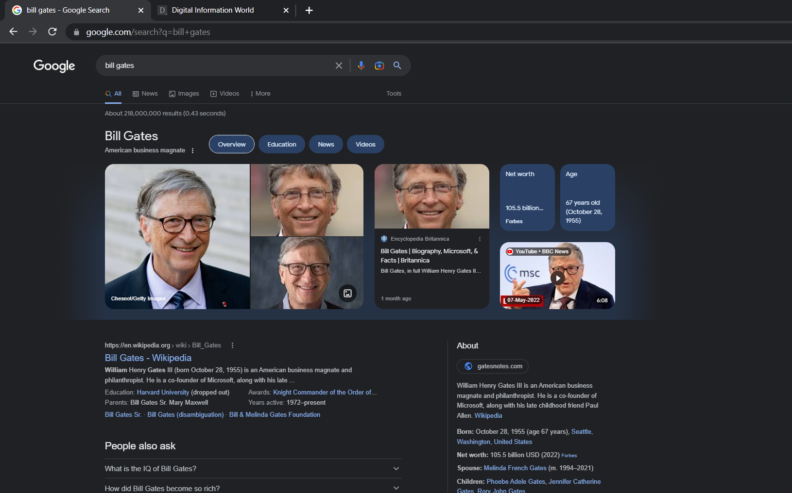
At the Search On event this year, we saw Google go public on how it wished to make exploring easier for its users on the platform.
In September, Google mentioned how it would be highlighting some of the greatest and most useful information out there through its Knowledge Panel redesigning venture.
This project would entail the likes of cards that were arranged in the form of a grid layout. Whatever is shown totally depends on the subject of interest. But we do feel a range of pictures might be the first thing that appears on sites.
For instance, when we talk about cities, we’re talking about ‘weather averages’. These could be highs or lows for the month and how long it actually takes for a user to travel from one destination to the next via your description.
If you’re a foodie that loves to cook, well, you can search for recipes and dishes that appear in the description. This would be closely followed by so much content in the form of a carousel that states, ‘things to know’.
On a smart device, this would be in the form of a card that tries to explore content that is themed accordingly. You could have green for pesto and red for ragu. Meanwhile, other cards are blue in hue.
While scrolling away, you’ll find the usual results on the web appear. On the smartphone, we will only be seeing something like this as a ‘knowledge panel’ for redesign purposes in those aforementioned categories.
When you log in through your Desktop, you’ll just be seeing the category reserved for people. But now, you’ll also be able to find a bigger Knowledge Panel grid. It begins with pictures and even goes on to highlight stuff like age, content from social media, and also your spouse.
If you happen to be an athlete, you’ll find information like cards for height, your net worth, and even a recently published video of a recap. The sidebar located on the right side is solely for the purpose of an About description and a range of other types of information.
We won’t lie, it’s quite a prominent feature. It’s the first thing seen after the big Search Bar comes into play and starts to capture the users’ attention.
For now, Google isn’t mentioning the rollout as a feature in terms of a new redesign for cards on the Knowledge Panel or even if there is a result within a single category. But other than information, the tech giant hopes to put other content from creators in the spotlight on the web through such endeavors.
Read next: SEOs And Web Searchers Have Mixed Feelings on the State of the Internet According to This Poll
by Dr. Hura Anwar via Digital Information World

No comments:
Post a Comment