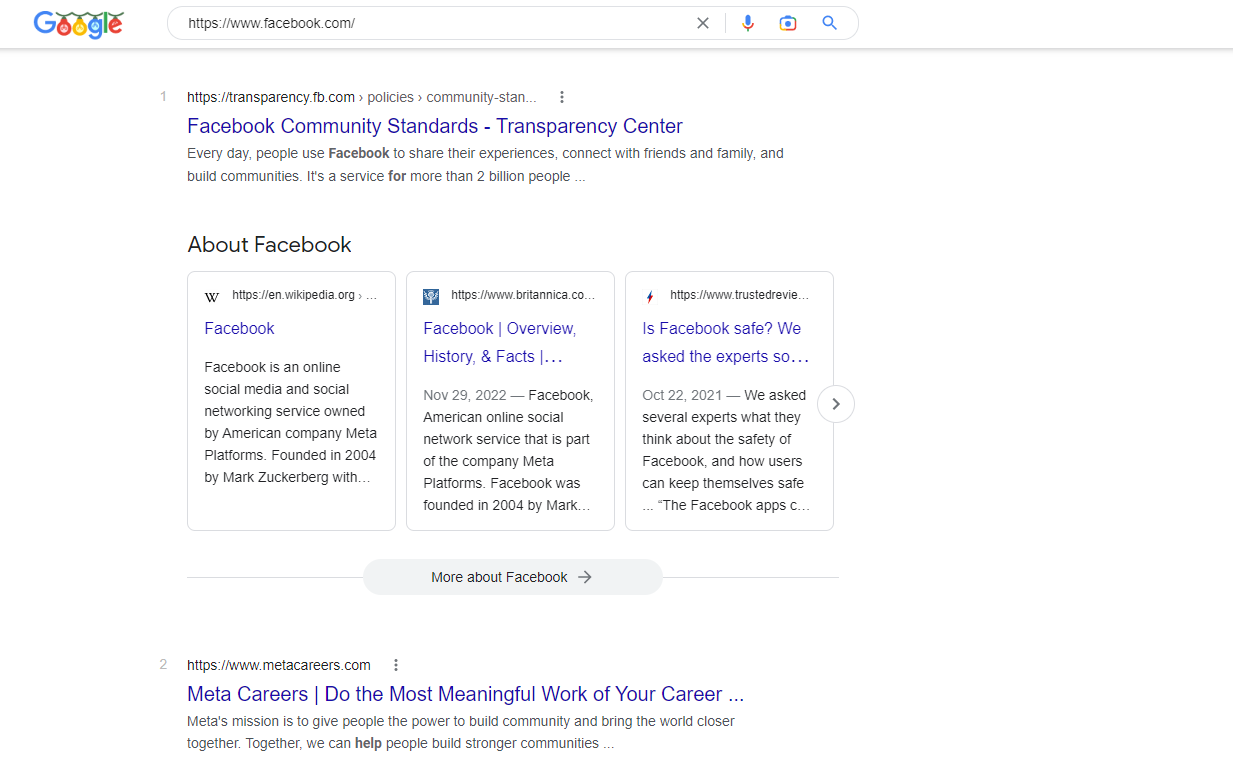
Talking about the carousel first, Google has incorporated carousels on their search page. We are well familiar with the carousels on Instagram but having them on the Google search page? We’re not so sure about how that’ll work out.
So here’s how the carousels are currently playing out. When you scroll down the search page, you will see the ‘About’ section of the searched term. For instance, when you search ‘Instagram’, you will see the link to the main Instagram page. You will also find a carousel below that mentions three to four different sites with basic information about Instagram.
#NewTest
— Punit (@Punit6008) December 21, 2022
Google added "About" carousel in SER, also "In their own words" linked with about us Page. pic.twitter.com/Uu2cDn5uuU
Users can swipe the carousel to find out more about whatever they are searching for. It is a fresh initiative although we do think it is new since we have seen something similar before.
The second thing that Google has been playing around with on the search page is incorporating features that will enable a wider display page. To widen the display page, Google has added carousels (as mentioned before) and split the ‘related questions’ section into two. Users can now see six related questions at a time instead of the usual three.
🆕 It appears to be a completely new desktop SERP interface.
— Khushal Bherwani (@b4k_khushal) December 22, 2022
↗️ It's in wide mode; you can see the widest difference in site links, PAA, 4 Twitter posts in carousel (normally 3), and related searches in 3 rows (normally 2). With a favicon, site name. cc - @rustybrick pic.twitter.com/BE9huBMAke
The ‘related searches’ have also been expanded to nine at a time in three columns instead of the two columns that were previously present. Google sure has a lot of things going on a single page and we’re not sure if it is going to play out neatly or if it is going to turn into a densely packed space.
Another new feature on this wider page includes the top stories going sideways. This allows for more stories to be displayed on the front page. So while it does let for more content to be included, the question is if it’s really necessary or not. Only time will tell.
For now, these changes have been spotted as tests only. We will have to wait and see how the users react to these changes once these features are released.
Read next: New study reveals Email is the most used channel for gathering customer feedback
by Arooj Ahmed via Digital Information World

No comments:
Post a Comment